react native dialogs
v1.1.2
僅用於材料設計對話的Android模塊。這是對Afollestad/材料劃分的包裝紙。該模塊是為Android設計的,只有沒有支持iOS的計劃。
defaultsactionDismissactionNegativeactionNeutralactionPositivelistPlainlistRadiolistCheckboxprogressHorizontalalertassignDefaultsdismisspromptshowPickershowProgresstype ActionTypetype ListItemtype ListTypetype OptionsAlerttype OptionsCommontype OptionsProgresstype OptionsPickertype OptionsPrompttype ProgressStyle安裝:
npm install react-native-dialogs --saveyarn add react-native-dialogs關聯:
react-native link react-native-dialogs使用react-native run-android編譯應用程序
如果自動鏈接( react-native link )失敗,請按照以下步驟操作。
在android/app/build.gradle中,將依賴關係添加到您的應用程序構建中:
 dependencies {
    ...
    compile project(':react-native-dialogs') // Add this
}
在android/build.gradle中,它應該已經存在,但是如果不是,則添加Jitpack Maven存儲庫以下載圖書館Afollestad/Material-Dialogs:
 allprojects {
    repositories {
        ...
        jcenter() // Add this if it is not already here
        ...
    }
}
在android/settings.gradle中:
 rootProject.name = ...
...
include ':react-native-dialogs' // Add this
project(':react-native-dialogs').projectDir = new File(rootProject.projectDir, '../node_modules/react-native-dialogs/android') // Add this

...
include ':app'
導入並添加android/app/src/main/.../MainApplication.java中的軟件包:
...
import android . app . Application ;
...

import com . aakashns . reactnativedialogs . ReactNativeDialogsPackage ; // Add new import

...

public class MainApplication extends Application implements ReactApplication {
  ...
  @ Override
  protected List < ReactPackage > getPackages () {
    return Arrays .< ReactPackage > asList (
      new MainReactPackage (),
      ...
      new ReactNativeDialogsPackage () // Add the package here
    );
  }
}在您的JS中導入它:
import DialogAndroid from 'react-native-dialogs' ;致電API:
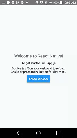
 class Blah extends Component {
    render ( ) {
        return < Button title = "Show DialogAndroid" onPress = { this . showDialogAndroid } />
    }

    showDialogAndroid = async ( ) => {
        const { action } = await DialogAndroid . alert ( 'Title' , 'Message' ) ;
        switch ( action ) {
            case DialogAndroid . actionPositive :
                console . log ( 'positive!' )
                break ;
            case DialogAndroid . actionNegative :
                console . log ( 'negative!' )
                break ;
            case DialogAndroid . actionNeutral :
                console . log ( 'neutral!' )
                break ;
            case DialogAndroid . actionDismiss :
                console . log ( 'dismissed!' )
                break ;
        }
    }
}defaults{potitiveText:'ok'}
所有方法要使用的默認選項。為了修改此問題,要么直接用DialogAndroid.defaults = { ... }進行操作,要么使用assignDefaults
actionDismiss靜態ActionDismiss =“ ActionDismiss”
actionNegative靜態動作觸覺=“動作不關”
actionNeutral靜態動作nutral =“ Action Neutral”
actionPositive靜態動作陽性=“ Action -Prodistive”
listPlain靜態listPlain =“ listplain”
listRadio靜態listradio =“ listradio”
listCheckbox靜態ListCheckbox =“ ListCheckbox”
progressHorizontal靜態progresshorizontal =“ progresshorizontal”
alertstatic alert( title: Title, content: Content, options: OptionsAlert ): Promise< {| action: "actionDismiss" | "actionNegative" | "actionNeutral" | "actionPositive" |} | {| action: "actionDismiss" | "actionNegative" | "actionNeutral" | "actionPositive", checked: boolean |} >
顯示一個對話框。
| 範圍 | 類型 | 預設 | 必需的 | 描述 |
|---|---|---|---|---|
| 標題 | string, null, void | 對話的標題 | ||
| 內容 | string, null, void | 對話的消息 | ||
| 選項 | OptionsAlert | 請參閱OptionsAlert |
assignDefaultsstatic assignDefaults({ [string]: value ): void
例如,設置默認顏色,因此您不必在每個方法調用上提供它。
{potitiveText:'ok'}
dismissstatic dismiss(): void
隱藏當前顯示的對話框。
promptstatic prompt( title?: null | string, content?: null | string, options: OptionsPrompt ): Promise< {| action: "actionNegative" | "actionNeutral" | "actionDismiss" |} | {| action: "actionNegative" | "actionNeutral", checked: boolean |} | {| action: "actionPositive", text: string |} | {| action: "actionPositive", text: string, checked: boolean |} >
顯示帶有文本輸入字段的對話框。
| 範圍 | 類型 | 預設 | 必需的 | 描述 |
|---|---|---|---|---|
| 標題 | string, null, void | 對話的標題 | ||
| 內容 | string, null, void | 對話的消息 | ||
| 選項 | OptionsPrompt | 請參閱OptionsPrompt |
showPickerstatic showPicker( title?: null | string, content?: null | string, options: OptionsPicker ): Promise< {| action: "actionNegative" | "actionNeutral" | "actionDismiss" |} | {| action: "actionNegative" | "actionNeutral" | "actionDismiss", checked: boolean |} | {| action: "actionSelect", selectedItem: ListItem |} | {| action: "actionSelect", selectedItem: ListItem, checked: boolean |} | {| action: "actionSelect", selectedItems: ListItem[] |} | {| action: "actionSelect", selectedItems: ListItem[], checked: boolean |} >
顯示常規警報,還顯示可以選擇的項目。
| 範圍 | 類型 | 預設 | 必需的 | 描述 |
|---|---|---|---|---|
| 標題 | string, null, void | 對話的標題 | ||
| 內容 | string, null, void | 對話的消息 | ||
| 選項 | OptionsPicker | 請參閱OptionsPrompt |
showProgressstatic showProgress( content?: null | string, options: OptionsProgress ): Promise<{| action:"actionDismiss" |}>
顯示一個進度對話框。默認情況下,沒有顯示任何按鈕,並且硬件返回按鈕不會關閉它。您必須使用DialogAndroid.dismiss()將其關閉。
| 範圍 | 類型 | 預設 | 必需的 | 描述 |
|---|---|---|---|---|
| 內容 | string, null, void | 對話的消息 | ||
| 選項 | OptionsProgress | 請參閱OptionsPrompt |
流程用作打字系統。
type ActionType"actionDismiss" | "actionNegative" | "actionNeutral" | "actionPositive" | "actionSelect"
type ListItem{ label:string } | { label:string, id:any } | {}
筆記
label密鑰,請指定具有OptionsPicker的labelKey屬性的標籤。selectedId / selectedIds時,才需要id 。id密鑰,請指定應將哪個鍵用作OptionsPicker的idKey屬性的ID。 type ListType"listCheckbox" | "listPlain" | "listRadio"
type OptionsAlert{ ...OptionsCommon }
| 鑰匙 | 類型 | 預設 | 必需的 | 描述 |
|---|---|---|---|---|
| ... options common | OptionsCommon | 請參閱OptionsCommon |
type OptionsCommon{ cancelable?: boolean, checkboxDefaultValue?: boolean checkboxLabel?: string, content?: string, contentColor?: string, contentIsHtml?: boolean, forceStacking?: boolean, linkColor?: ColorValue, negativeColor?: ColorValue, negativeText?: string, neutralColor?: ColorValue, neutralText?: string, positiveColor?: ColorValue, positiveText?: string, // default "OK" backgroundColor?: ColorValue, title?: string, titleColor?: ColorValue, }
| 鑰匙 | 類型 | 預設 | 必需的 | 描述 |
|---|---|---|---|---|
| 可取消 | boolean | 如果在對話框區域或硬件返回按鈕外敲擊,則應刪除對話框。 | ||
| CheckboxDefaultValue | boolean | false | 複選框的初始狀態。如果未設置checkboxLabel ,則無能為力。 | |
| CheckboxLabel | string | 如果設置,則使用此標籤在對話框的底部顯示一個複選框 | ||
| 內容 | string | 對話消息 | ||
| ContentColor | ColorValue | 對話的顏色消息 | ||
| contentishtml | boolean | 如果對話消息應解析為HTML。 (受支持的標籤包括: <a> , <img>等) | ||
| 反對 | boolean | 如果您有多個操作按鈕,這些按鈕太寬而無法放在一行上,則對話框將堆疊要垂直面向的按鈕。 | ||
| LinkColor | ColorValue | 如果contentIsHtml為true,並且content包含<a>標籤,則這些顏色為 | ||
| 負面的 | ColorValue | |||
| NegativeText | string | 如果虛假,則未顯示按鈕。 | ||
| 中性顏色 | ColorValue | |||
| 中性文本 | string | 在最左側顯示該字符串作為標籤。如果虛假,則未顯示按鈕。 | ||
| potitiveColor | ColorValue | |||
| potitivetext | string | 如果虛假,則未顯示按鈕。 | ||
| 背景色 | ColorValue | |||
| 標題 | string | 對話的標題 | ||
| titlecolor | ColorValue | 標題的顏色 |
type OptionsProgress{ contentColor: $PropertyType<OptionsCommon, 'contentColor'>, contentIsHtml: $PropertyType<OptionsCommon, 'contentIsHtml'>, linkColor: $PropertyType<OptionsCommon, 'linkColor'>, style?: ProgressStyle, title: $PropertyType<OptionsCommon, 'title'>, titleColor: $PropertyType<OptionsCommon, 'titleColor'>', widgetColor: $PropertyType<OptionsCommon, 'widgetColor'> }
| 鑰匙 | 類型 | 預設 | 必需的 | 描述 |
|---|---|---|---|---|
| ContentColor | OptionsCommon#contentColor | 請參閱OptionsCommon#contentColor | ||
| contentishtml | OptionsCommon#contentIsHtml | 請參閱OptionsCommon#contentIsHtml | ||
| LinkColor | OptionsCommon#linkColor | 請參閱OptionsCommon#linkColor | ||
| 風格 | ProgressStyle | 參見ProgressStyle | ||
| 標題 | OptionsCommon#title | 請參閱OptionsCommon#title | ||
| titlecolor | OptionsCommon#titleColor | 請參閱OptionsCommon#titleColor | ||
| widgetcolor | ColorValue | 進度指示器的顏色 |
type OptionsPicker{| ... options common,type? :typeof listType.listplain,maxNumberofitems? :編號,項目:listitemjustlabel [],|} | {| ... options common,type? :typeof listType.listplain,maxNumberofitems? :編號,項目:listitembare [],labelkey:string |} | {| //廣播 - 沒有預選的...選項common,類型:typeof listType.listradio,widgetColor? :colorValue //無線電顏色項目:listitemjustlabel [],|} | {| //廣播 - 沒有預選...選項common,類型:typeof listType.listradio,widgetColor? :colorValue //無線電顏色項目:listitembare [],labelkey:string |} | {| //廣播 - 預選 - listItemfull ... optionsCommon,類型:typeof listType.listradio,widgetColor? :colorValue //無線電顏色項目:listItemfull [],SelectedID:任何|} | {| //廣播 - 預選 - listItemJustlabel ... optionsCommon,類型:typeof listType.listradio,widgetColor? :colorValue //無線電顏色項目:listItemjustlabel [],idkey [],idkey:string:string,selectedID,selectedingID:nocy |} | nose |} | {| //廣播 - 預選 - listItemJustid ... optionsCommon,類型:typeof listType.listradio,widgetColor? :colorValue //無線電顏色項目:listItemJustid [],labelkey:string,string,selectedid,selectedID:nocy |} | {| //廣播 - 預選 - listItembare ... optionsCommon,類型:typeof listType.listradio,widgetColor? :colorValue //無線電顏色項目:listitembare [],idkey [],idkey:string,labelkey:string,string:string,selectedid,selectedID:任何|} |任何|} | {| //清單 - 無預選 - listItemJustlabel ... optionsCommon,類型:type of listType.listCheckbox,NeutralisClear? :boolean,widgetColor? :colorValue,// ColorVbox顏色項目:listitemjustlabel [listitemjustlabel [] {| //清單 - 無預選 - listItembare ... optionsCommon,類型:typeof listType.listCheckbox,中intralisclear? :boolean,widgetColor? :colorValue,// colorvbox顏色,複選框顏色項目:listItembare [] {| // checklist - preselected - ListItemFull ...OptionsCommon, type: typeof ListType.listCheckbox, neutralIsClear?: boolean, widgetColor?: ColorValue, // checkbox color items: ListItemFull[], selectedIds: any[] |} | {| //清單 - 預選 - listItemJustlabel ... optionsCommon,類型:type of listType.listCheckbox,中式插曲? :布爾值,widgetColor? :colorValue,// colorvbox顏色,listitemjustlabel [listitemjustlabel [] {| //清單 - 預選 - listItemJustid ... optionsCommon,類型:typeof listType.listCheckbox,中式插圖? :布爾值,widgetColor? :colorValue,// colorvbox顏色,複選框顏色項目:listItemJustid [] {| //清單 - 預選 - listItembare ... optionsCommon,類型:typeof listType.listCheckbox,NetralisClear? :Boolean,Boolean,WidgetColor? :colorValue,// ColorVbox,Checkbox顏色,listItembare [],listItembare [],idkey:idkey:idkey:didkey:didkey:string,labelkey:string,selectionIds:string,selectedids:noy | nose | whore | nose |}:
| 鑰匙 | 類型 | 預設 | 必需的 | 描述 |
|---|---|---|---|---|
| optionsCommon | OptionsCommon | 請參閱OptionsCommon | ||
| idkey | string | “ID” | ||
| 專案 | ListItem [] | 是的 | 請參閱ListItem | |
| labelkey | string | “標籤” | ||
| maxnumberofitems | number | 如果您想在列表中設置最大數量可見的項目 | ||
| 中額捕集 | boolean | 按下中性按鈕會導致對話框關閉,而selectedItems為空數組。僅當還提供neutralText時才有效。 | ||
| SelectedID | any | 各自的收音機將在對話顯示上選擇。如果找不到這樣的ID,那麼什麼也不會選擇。僅當type是DialogAndroid.listRadio時才適用。要求該items[]包含idKey描述的密鑰。 | ||
| SelectedID | any[] | 各自的複選框將在對話框顯示上選擇。如果找不到這樣的ID,則該ID沒有選擇。僅當type為DialogAndroid.listCheckbox時才適用。要求該items[]包含idKey描述的密鑰。 | ||
| 類型 | ListType | DialogAndroid.listPlain | 請參閱ListType | |
| widgetcolor | ColorValue | 收音機或複選框的顏色 |
type OptionsPrompt{ ...OptionsCommon, keyboardType?: | 'numeric' | 'number-pad' | 'numeric-password' | 'decimal-pad' | 'email-address' | 'password' | 'phone-pad' | 'url', defaultValue?: string, placeholder?: string, allowEmptyInput?: boolean, minLength?: number, maxLength?: number, widgetColor?: ColorValue }
| 鑰匙 | 類型 | 預設 | 必需的 | 描述 |
|---|---|---|---|---|
| optionsCommon | OptionsCommon | 請參閱OptionsCommon | ||
| widgetcolor | ColorValue | 野外顏色和光標的顏色 |
type ProgressStyle"progressHorizontal"
要查看與checkboxLabel重做的示例
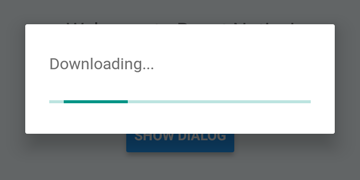
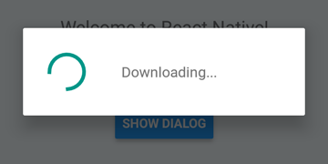
 DialogAndroid . showProgress ( 'Downloading...' , {
    style : DialogAndroid . progressHorizontal // omit this to get circular
} ) ;
setTimeout ( DialogAndroid . dismiss , 5000 ) ; 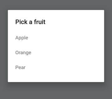
 const { selectedItem } = await DialogAndroid . showPicker ( 'Pick a fruit' , null , {
    items : [
        { label : 'Apple' , id : 'apple' } ,
        { label : 'Orange' , id : 'orange' } ,
        { label : 'Pear' , id : 'pear' }
    ]
} ) ;
if ( selectedItem ) {
    // when negative button is clicked, selectedItem is not present, so it doesn't get here
    console . log ( 'You selected item:' , selectedItem ) ;
} 
將positiveText設置為null ,以在單選按鈕項目的按下自動dismiss行為。
 const { selectedItem } = await DialogAndroid . showPicker ( 'Pick a fruit' , null , {
    // positiveText: null, // if positiveText is null, then on select of item, it dismisses dialog
    negativeText : 'Cancel' ,
    type : DialogAndroid . listRadio ,
    selectedId : 'apple' ,
    items : [
        { label : 'Apple' , id : 'apple' } ,
        { label : 'Orange' , id : 'orange' } ,
        { label : 'Pear' , id : 'pear' }
    ]
} ) ;
if ( selectedItem ) {
    // when negative button is clicked, selectedItem is not present, so it doesn't get here
    console . log ( 'You picked:' , selectedItem ) ;
} 
在這裡,我們將字符串傳遞到positiveText ,這可以防止選擇無線電項目的自動障礙。
 const { selectedItem } = await DialogAndroid . showPicker ( 'Pick a fruit' , null , {
    positiveText : 'OK' , // this is what makes disables auto dismiss
    negativeText : 'Cancel' ,
    type : DialogAndroid . listRadio ,
    selectedId : 'apple' ,
    items : [
        { label : 'Apple' , id : 'apple' } ,
        { label : 'Orange' , id : 'orange' } ,
        { label : 'Pear' , id : 'pear' }
    ]
} ) ;
if ( selectedItem ) {
    // when negative button is clicked, selectedItem is not present, so it doesn't get here
    console . log ( 'You picked:' , selectedItem ) ;
} 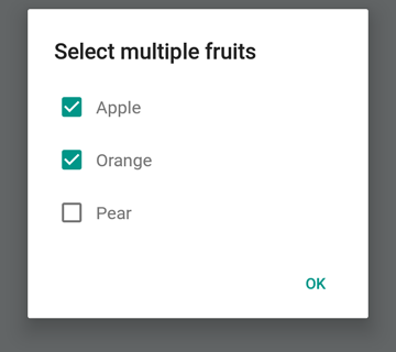
 const { selectedItems } = await DialogAndroid . showPicker ( 'Select multiple fruits' , null , {
    type : DialogAndroid . listCheckbox ,
    selectedIds : [ 'apple' , 'orange' ] ,
    items : [
        { label : 'Apple' , id : 'apple' } ,
        { label : 'Orange' , id : 'orange' } ,
        { label : 'Pear' , id : 'pear' }
    ]
} ) ;
if ( selectedItems ) {
    if ( ! selectedItems . length ) {
        console . log ( 'You selected no items.' ) ;
    } else {
        console . log ( 'You selected items:' , selectedItems ) ;
    }
} 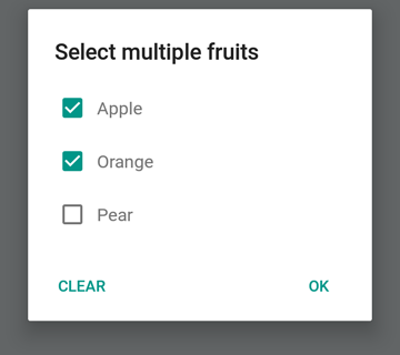
我們可以使中立按鈕成為一個特殊的按鈕。按下它將清除列表並關閉對話框。如果您想要這種行為,請將neutralIsClear設置為true ,並將neutralText設置為字符串。必須設置這兩個屬性。
 const { selectedItems } = await DialogAndroid . showPicker ( 'Select multiple fruits' , null , {
    type : DialogAndroid . listCheckbox ,
    selectedIds : [ 'apple' , 'orange' ] ,
    neutralIsClear : true , /////// added this
    neutralText : 'Clear' , /////// added this
    items : [
        { label : 'Apple' , id : 'apple' } ,
        { label : 'Orange' , id : 'orange' } ,
        { label : 'Pear' , id : 'pear' }
    ]
} ) ;
if ( selectedItems ) {
    if ( ! selectedItems . length ) {
        console . log ( 'You selected no items.' ) ;
    } else {
        console . log ( 'You selected items:' , selectedItems ) ;
    }
} 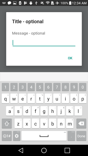
 const { action , text } = await DialogAndroid . prompt ( 'Title - optional' , 'Message - optional' ) ;
if ( action === DialogAndroid . actionPositive ) {
    console . log ( `You submitted: " ${ text } "` ) ;
} 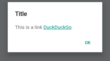
 DialogAndroid . alert ( 'Title' , `This is a link <a href="https://www.duckduckgo.com/">DuckDuckGo</a>` , {
    contentIsHtml : true
} ) ; 您可以設置一些默認設置,因此您不必每次都更改它。
 DialogAndroid . assignDefaults ( {
    title : 'Default Title' ,
    positiveText : null ,
    contentColor : 'rgba(0, 0, 0, 0.2)' ,
    widgetColor : 'blue'
} )現在,每當您省略或將undefined傳遞給contentColor , widgetColor或title時,它都會使用我們在此處分配的默認值。
DialogAndroid . alert ( undefined , 'message here' )這將顯示標題為“默認標題”,沒有正面按鈕,並且該消息的顏色將為黑色20%。如果您做了Dialog.showProgress 。 ETC。
謝謝這些好人(表情符號鑰匙):
Vojtech Novak ? ? | noitidart ? | Alisson Carvalho | 安東尼·奧 | 阿什利·懷特(Ashley White) | 蜜蜂 | 布萊恩索 |
|---|---|---|---|---|---|---|
拜倫·王 | 法爾扎德·阿卜杜勒霍斯尼 | 杰弗裡·戈 ? | GustavoFãoValvassori ? | 亨里克 | heydabop | 黃Yu |
伊拉格 | Janic Duplessis | Jeffchienzabinet | 傑里米·達戈恩(Jeremy Dagorn) | jykun | Mattias Pfeiffer | 純淨 |
Radek Czemerys | Ricardo Fuhrmann | 羅斯 | Vinicius Zaramella |
該項目遵循全企業規範。歡迎任何形式的貢獻!


