react native dialogs
v1.1.2
An Android only module for Material Design dialogs. This is a wrapper over afollestad/material-dialogs. This module is designed for Android only with no plans to support iOS.
defaultsactionDismissactionNegativeactionNeutralactionPositivelistPlainlistRadiolistCheckboxprogressHorizontalalertassignDefaultsdismisspromptshowPickershowProgresstype ActionTypetype ListItemtype ListTypetype OptionsAlerttype OptionsCommontype OptionsProgresstype OptionsPickertype OptionsPrompttype ProgressStyleInstall:
npm install react-native-dialogs --saveyarn add react-native-dialogsLink:
react-native link react-native-dialogsCompile application using react-native run-android
Follow these steps if automatic linking (react-native link) failed.
In android/app/build.gradle, add the dependency to your app build:
dependencies {
    ...
    compile project(':react-native-dialogs') // Add this
}
In android/build.gradle, it should already be there, but in case it is not, add Jitpack maven repository to download the library afollestad/material-dialogs:
allprojects {
    repositories {
        ...
        jcenter() // Add this if it is not already here
        ...
    }
}
In android/settings.gradle:
rootProject.name = ...
...
include ':react-native-dialogs' // Add this
project(':react-native-dialogs').projectDir = new File(rootProject.projectDir, '../node_modules/react-native-dialogs/android') // Add this

...
include ':app'
Import and add package, in android/app/src/main/.../MainApplication.java:
...
import android.app.Application;
...

import com.aakashns.reactnativedialogs.ReactNativeDialogsPackage; // Add new import

...

public class MainApplication extends Application implements ReactApplication {
  ...
  @Override
  protected List<ReactPackage> getPackages() {
    return Arrays.<ReactPackage>asList(
      new MainReactPackage(),
      ...
      new ReactNativeDialogsPackage() // Add the package here
    );
  }
}Import it in your JS:
import DialogAndroid from 'react-native-dialogs';Call API:
class Blah extends Component {
    render() {
        return <Button title="Show DialogAndroid" onPress={this.showDialogAndroid} />
    }

    showDialogAndroid = async () => {
        const { action } = await DialogAndroid.alert('Title', 'Message');
        switch (action) {
            case DialogAndroid.actionPositive:
                console.log('positive!')
                break;
            case DialogAndroid.actionNegative:
                console.log('negative!')
                break;
            case DialogAndroid.actionNeutral:
                console.log('neutral!')
                break;
            case DialogAndroid.actionDismiss:
                console.log('dismissed!')
                break;
        }
    }
}defaults{ positiveText: 'OK' }
The default options to be used by all methods. To modify this, either directly manipulate with DialogAndroid.defaults = { ... } or use assignDefaults
actionDismissstatic actionDismiss = "actionDismiss"
actionNegativestatic actionNegative = "actionNegative"
actionNeutralstatic actionNeutral = "actionNeutral"
actionPositivestatic actionPositive = "actionPositive"
listPlainstatic listPlain = "listPlain"
listRadiostatic listRadio = "listRadio"
listCheckboxstatic listCheckbox = "listCheckbox"
progressHorizontalstatic progressHorizontal = "progressHorizontal"
alertstatic alert( title: Title, content: Content, options: OptionsAlert ): Promise< {| action: "actionDismiss" | "actionNegative" | "actionNeutral" | "actionPositive" |} | {| action: "actionDismiss" | "actionNegative" | "actionNeutral" | "actionPositive", checked: boolean |} >
Shows a dialog.
| Parameter | Type | Default | Required | Description |
|---|---|---|---|---|
| title | string, null, void |
Title of dialog | ||
| content | string, null, void |
Message of dialog | ||
| options | OptionsAlert |
See OptionsAlert |
assignDefaultsstatic assignDefaults({ [string]: value ): void
Set default colors for example, so you don't have to provide it on every method call.
{ positiveText: 'OK' }
dismissstatic dismiss(): void
Hides the currently showing dialog.
promptstatic prompt( title?: null | string, content?: null | string, options: OptionsPrompt ): Promise< {| action: "actionNegative" | "actionNeutral" | "actionDismiss" |} | {| action: "actionNegative" | "actionNeutral", checked: boolean |} | {| action: "actionPositive", text: string |} | {| action: "actionPositive", text: string, checked: boolean |} >
Shows a dialog with a text input field.
| Parameter | Type | Default | Required | Description |
|---|---|---|---|---|
| title | string, null, void |
Title of dialog | ||
| content | string, null, void |
Message of dialog | ||
| options | OptionsPrompt |
See OptionsPrompt |
showPickerstatic showPicker( title?: null | string, content?: null | string, options: OptionsPicker ): Promise< {| action: "actionNegative" | "actionNeutral" | "actionDismiss" |} | {| action: "actionNegative" | "actionNeutral" | "actionDismiss", checked: boolean |} | {| action: "actionSelect", selectedItem: ListItem |} | {| action: "actionSelect", selectedItem: ListItem, checked: boolean |} | {| action: "actionSelect", selectedItems: ListItem[] |} | {| action: "actionSelect", selectedItems: ListItem[], checked: boolean |} >
Shows a regular alert, but also with items that can be selected.
| Parameter | Type | Default | Required | Description |
|---|---|---|---|---|
| title | string, null, void |
Title of dialog | ||
| content | string, null, void |
Message of dialog | ||
| options | OptionsPicker |
See OptionsPrompt |
showProgressstatic showProgress( content?: null | string, options: OptionsProgress ): Promise<{| action:"actionDismiss" |}>
Shows a progress dialog. By default no buttons are shown, and hardware back button does not close it. You must close it with DialogAndroid.dismiss().
| Parameter | Type | Default | Required | Description |
|---|---|---|---|---|
| content | string, null, void |
Message of dialog | ||
| options | OptionsProgress |
See OptionsPrompt |
Flow is used as the typing system.
type ActionType"actionDismiss" | "actionNegative" | "actionNeutral" | "actionPositive" | "actionSelect"
type ListItem{ label:string } | { label:string, id:any } | {}
Notes
label key does not exist, specify which key should be used as the label with labelKey property of OptionsPicker.id is only required if selectedId/selectedIds needs to be used.
id key does not exist, specify which key should be used as the id with idKey property of OptionsPicker.type ListType"listCheckbox" | "listPlain" | "listRadio"
type OptionsAlert{ ...OptionsCommon }
| Key | Type | Default | Required | Description |
|---|---|---|---|---|
| ...OptionsCommon | OptionsCommon |
See OptionsCommon |
type OptionsCommon{ cancelable?: boolean, checkboxDefaultValue?: boolean checkboxLabel?: string, content?: string, contentColor?: string, contentIsHtml?: boolean, forceStacking?: boolean, linkColor?: ColorValue, negativeColor?: ColorValue, negativeText?: string, neutralColor?: ColorValue, neutralText?: string, positiveColor?: ColorValue, positiveText?: string, // default "OK" backgroundColor?: ColorValue, title?: string, titleColor?: ColorValue, }
| Key | Type | Default | Required | Description |
|---|---|---|---|---|
| cancelable | boolean |
If tapping outside of dialog area, or hardware back button, should dismiss dialog. | ||
| checkboxDefaultValue | boolean |
false |
The initial state of the checkbox. Does nothing if checkboxLabel is not set. |
|
| checkboxLabel | string |
If set, then there is a checkbox shown at the bottom of the dialog with this label | ||
| content | string |
Dialog message | ||
| contentColor | ColorValue |
Color of dialog message | ||
| contentIsHtml | boolean |
If dialog message should be parsed as html. (supported tags include: <a>, <img>, etc) |
||
| forceStacking | boolean |
If you have multiple action buttons that together are too wide to fit on one line, the dialog will stack the buttons to be vertically oriented. | ||
| linkColor | ColorValue |
If contentIsHtml is true, and content contains <a> tags, these are colored with this color |
||
| negativeColor | ColorValue |
|||
| negativeText | string |
If falsy, button is not shown. | ||
| neutralColor | ColorValue |
|||
| neutralText | string |
Shows button in far left with this string as label. If falsy, button is not shown. | ||
| positiveColor | ColorValue |
|||
| positiveText | string |
If falsy, button is not shown. | ||
| backgroundColor | ColorValue |
|||
| title | string |
Title of dialog | ||
| titleColor | ColorValue |
Color of title |
type OptionsProgress{ contentColor: $PropertyType<OptionsCommon, 'contentColor'>, contentIsHtml: $PropertyType<OptionsCommon, 'contentIsHtml'>, linkColor: $PropertyType<OptionsCommon, 'linkColor'>, style?: ProgressStyle, title: $PropertyType<OptionsCommon, 'title'>, titleColor: $PropertyType<OptionsCommon, 'titleColor'>', widgetColor: $PropertyType<OptionsCommon, 'widgetColor'> }
| Key | Type | Default | Required | Description |
|---|---|---|---|---|
| contentColor | OptionsCommon#contentColor |
See OptionsCommon#contentColor |
||
| contentIsHtml | OptionsCommon#contentIsHtml |
See OptionsCommon#contentIsHtml |
||
| linkColor | OptionsCommon#linkColor |
See OptionsCommon#linkColor |
||
| style | ProgressStyle |
See ProgressStyle |
||
| title | OptionsCommon#title |
See OptionsCommon#title |
||
| titleColor | OptionsCommon#titleColor |
See OptionsCommon#titleColor |
||
| widgetColor | ColorValue |
Color of progress indicator |
type OptionsPicker{| ...OptionsCommon, type?: typeof ListType.listPlain, maxNumberOfItems?: number, items: ListItemJustLabel[], |} | {| ...OptionsCommon, type?: typeof ListType.listPlain, maxNumberOfItems?: number, items: ListItemBare[], labelKey: string |} | {| // radio - no preselected ...OptionsCommon, type: typeof ListType.listRadio, widgetColor?: ColorValue // radio color items: ListItemJustLabel[], |} | {| // radio - no preselected ...OptionsCommon, type: typeof ListType.listRadio, widgetColor?: ColorValue // radio color items: ListItemBare[], labelKey: string |} | {| // radio - preselected - ListItemFull ...OptionsCommon, type: typeof ListType.listRadio, widgetColor?: ColorValue // radio color items: ListItemFull[], selectedId: any |} | {| // radio - preselected - ListItemJustlabel ...OptionsCommon, type: typeof ListType.listRadio, widgetColor?: ColorValue // radio color items: ListItemJustLabel[], idKey: string, selectedId: any |} | {| // radio - preselected - ListItemJustId ...OptionsCommon, type: typeof ListType.listRadio, widgetColor?: ColorValue // radio color items: ListItemJustId[], labelKey: string, selectedId: any |} | {| // radio - preselected - ListItemBare ...OptionsCommon, type: typeof ListType.listRadio, widgetColor?: ColorValue // radio color items: ListItemBare[], idKey: string, labelKey: string, selectedId: any |} | {| // checklist - no preselected - ListItemJustLabel ...OptionsCommon, type: typeof ListType.listCheckbox, neutralIsClear?: boolean, widgetColor?: ColorValue, // checkbox color items: ListItemJustLabel[] |} | {| // checklist - no preselected - ListItemBare ...OptionsCommon, type: typeof ListType.listCheckbox, neutralIsClear?: boolean, widgetColor?: ColorValue, // checkbox color items: ListItemBare[], labelKey: string |} | {| // checklist - preselected - ListItemFull ...OptionsCommon, type: typeof ListType.listCheckbox, neutralIsClear?: boolean, widgetColor?: ColorValue, // checkbox color items: ListItemFull[], selectedIds: any[] |} | {| // checklist - preselected - ListItemJustlabel ...OptionsCommon, type: typeof ListType.listCheckbox, neutralIsClear?: boolean, widgetColor?: ColorValue, // checkbox color items: ListItemJustLabel[], idKey: string, selectedIds: any |} | {| // checklist - preselected - ListItemJustId ...OptionsCommon, type: typeof ListType.listCheckbox, neutralIsClear?: boolean, widgetColor?: ColorValue, // checkbox color items: ListItemJustId[], labelKey: string, selectedIds: any |} | {| // checklist - preselected - ListItemBare ...OptionsCommon, type: typeof ListType.listCheckbox, neutralIsClear?: boolean, widgetColor?: ColorValue, // checkbox color items: ListItemBare[], idKey: string, labelKey: string, selectedIds: any |}
| Key | Type | Default | Required | Description |
|---|---|---|---|---|
| OptionsCommon | OptionsCommon |
See OptionsCommon |
||
| idKey | string |
"id" | ||
| items | ListItem[] |
Yes | See ListItem |
|
| labelKey | string |
"label" | ||
| maxNumberOfItems | number |
If you want to set a max amount of visible items in a list | ||
| neutralIsClear | boolean |
Pressing the neutral button causes the dialog to be closed and selectedItems to be an empty array. Only works if neutralText is also supplied. |
||
| selectedId | any |
The respective radio will be selected on dialog show. If no such id is found, then nothing is selected. Only applicable if type is DialogAndroid.listRadio. Requires that items[] contain key described by idKey. |
||
| selectedIds | any[] |
The respective checkbox will be selected on dialog show. If no such id is found, nothing is selected for that id. Only applicable if type is DialogAndroid.listCheckbox. Requires that items[] contain key described by idKey. |
||
| type | ListType |
DialogAndroid.listPlain |
See ListType |
|
| widgetColor | ColorValue |
Color of radio or checkbox |
type OptionsPrompt{ ...OptionsCommon, keyboardType?: | 'numeric' | 'number-pad' | 'numeric-password' | 'decimal-pad' | 'email-address' | 'password' | 'phone-pad' | 'url', defaultValue?: string, placeholder?: string, allowEmptyInput?: boolean, minLength?: number, maxLength?: number, widgetColor?: ColorValue }
| Key | Type | Default | Required | Description |
|---|---|---|---|---|
| OptionsCommon | OptionsCommon |
See OptionsCommon |
||
| widgetColor | ColorValue |
Color of field underline and cursor |
type ProgressStyle"progressHorizontal"
To see the examples redone with checkboxLabel see this PR - Github :: aakashns/react-native-dialogs - #86
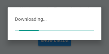
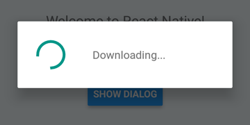
DialogAndroid.showProgress('Downloading...', {
    style: DialogAndroid.progressHorizontal // omit this to get circular
});
setTimeout(DialogAndroid.dismiss, 5000);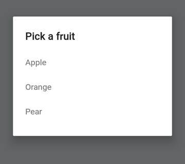
const { selectedItem } = await DialogAndroid.showPicker('Pick a fruit', null, {
    items: [
        { label:'Apple', id:'apple' },
        { label:'Orange', id:'orange' },
        { label:'Pear', id:'pear' }
    ]
});
if (selectedItem) {
    // when negative button is clicked, selectedItem is not present, so it doesn't get here
    console.log('You selected item:', selectedItem);
}
Set positiveText to null for auto-dismiss behavior on press of a radio button item.
const { selectedItem } = await DialogAndroid.showPicker('Pick a fruit', null, {
    // positiveText: null, // if positiveText is null, then on select of item, it dismisses dialog
    negativeText: 'Cancel',
    type: DialogAndroid.listRadio,
    selectedId: 'apple',
    items: [
        { label:'Apple', id:'apple' },
        { label:'Orange', id:'orange' },
        { label:'Pear', id:'pear' }
    ]
});
if (selectedItem) {
    // when negative button is clicked, selectedItem is not present, so it doesn't get here
    console.log('You picked:', selectedItem);
}
Here we pass in a string to positiveText, this prevents the auto-dismiss on select of a radio item.
const { selectedItem } = await DialogAndroid.showPicker('Pick a fruit', null, {
    positiveText: 'OK', // this is what makes disables auto dismiss
    negativeText: 'Cancel',
    type: DialogAndroid.listRadio,
    selectedId: 'apple',
    items: [
        { label:'Apple', id:'apple' },
        { label:'Orange', id:'orange' },
        { label:'Pear', id:'pear' }
    ]
});
if (selectedItem) {
    // when negative button is clicked, selectedItem is not present, so it doesn't get here
    console.log('You picked:', selectedItem);
}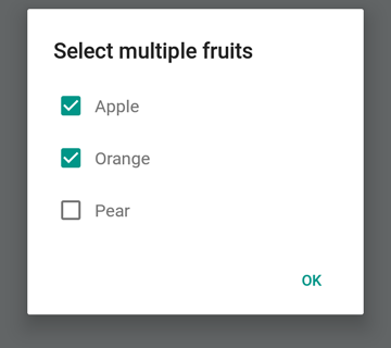
const { selectedItems } = await DialogAndroid.showPicker('Select multiple fruits', null, {
    type: DialogAndroid.listCheckbox,
    selectedIds: ['apple', 'orange'],
    items: [
        { label:'Apple', id:'apple' },
        { label:'Orange', id:'orange' },
        { label:'Pear', id:'pear' }
    ]
});
if (selectedItems) {
    if (!selectedItems.length) {
        console.log('You selected no items.');
    } else {
        console.log('You selected items:', selectedItems);
    }
}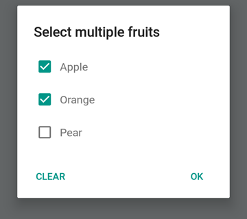
We can make the neutral button be a special button. Pressing it will clear the list and close the dialog. If you want this behavior, set neutralIsClear to true and also set neutralText to a string. Both of these properties must be set.
const { selectedItems } = await DialogAndroid.showPicker('Select multiple fruits', null, {
    type: DialogAndroid.listCheckbox,
    selectedIds: ['apple', 'orange'],
    neutralIsClear: true, /////// added this
    neutralText: 'Clear', /////// added this
    items: [
        { label:'Apple', id:'apple' },
        { label:'Orange', id:'orange' },
        { label:'Pear', id:'pear' }
    ]
});
if (selectedItems) {
    if (!selectedItems.length) {
        console.log('You selected no items.');
    } else {
        console.log('You selected items:', selectedItems);
    }
}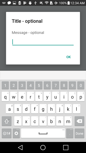
const { action, text } = await DialogAndroid.prompt('Title - optional', 'Message - optional');
if (action === DialogAndroid.actionPositive) {
    console.log(`You submitted: "${text}"`);
}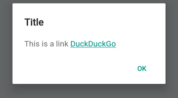
DialogAndroid.alert('Title', `This is a link <a href="https://www.duckduckgo.com/">DuckDuckGo</a>`, {
    contentIsHtml: true
});You can set some defaults so you don't have to change it everytime.
DialogAndroid.assignDefaults({
    title: 'Default Title',
    positiveText: null,
    contentColor: 'rgba(0, 0, 0, 0.2)',
    widgetColor: 'blue'
})
Now any time you omit or pass undefined to contentColor, widgetColor, or title, it will use the defaults we assigned here.
DialogAndroid.alert(undefined, 'message here')This will show title "Default Title", with no positive button, and the color of the message will be 20% black. If you did Dialog.showProgress, the progress indicator would be blue. etc.
Thanks goes to these wonderful people (emoji key):
Vojtech Novak ? ? |
Noitidart ? |
Alisson Carvalho |
Anthony Ou |
Ashley White |
Bee |
BrianSo |
|---|---|---|---|---|---|---|
Byron Wang |
Farzad Abdolhosseini |
Geoffrey Goh ? |
Gustavo Fão Valvassori ? |
Henrik |
heydabop |
Huang Yu |
Iragne |
Janic Duplessis |
jeffchienzabinet |
Jeremy Dagorn |
jykun |
Mattias Pfeiffer |
pureday |
Radek Czemerys |
Ricardo Fuhrmann |
Ross |
Vinicius Zaramella |
This project follows the all-contributors specification. Contributions of any kind welcome!


