react native dialogs
v1.1.2
โมดูล Android เท่านั้นสำหรับกล่องโต้ตอบการออกแบบวัสดุ นี่คือเสื้อคลุมเหนือ Afollestad/วัสดุ dialogs โมดูลนี้ออกแบบมาสำหรับ Android เท่านั้นโดยไม่มีแผนที่จะสนับสนุน iOS
defaultsactionDismissactionNegativeactionNeutralactionPositivelistPlainlistRadiolistCheckboxprogressHorizontalalertassignDefaultsdismisspromptshowPickershowProgresstype ActionTypetype ListItemtype ListTypetype OptionsAlerttype OptionsCommontype OptionsProgresstype OptionsPickertype OptionsPrompttype ProgressStyleติดตั้ง:
npm install react-native-dialogs --saveyarn add react-native-dialogsลิงค์:
react-native link react-native-dialogs คอมไพล์แอปพลิเคชันโดยใช้ react-native run-android
ทำตามขั้นตอนเหล่านี้หากการเชื่อมโยงอัตโนมัติ ( react-native link ) ล้มเหลว
ใน android/app/build.gradle เพิ่มการพึ่งพาแอพสร้างของคุณ:
 dependencies {
    ...
    compile project(':react-native-dialogs') // Add this
}
ใน android/build.gradle มันควรจะอยู่ที่นั่นแล้ว แต่ในกรณีที่ไม่ได้เพิ่ม jitpack maven repository เพื่อดาวน์โหลดห้องสมุด Afollestad/วัสดุ-ไดอารี่:
 allprojects {
    repositories {
        ...
        jcenter() // Add this if it is not already here
        ...
    }
}
ใน android/settings.gradle :
 rootProject.name = ...
...
include ':react-native-dialogs' // Add this
project(':react-native-dialogs').projectDir = new File(rootProject.projectDir, '../node_modules/react-native-dialogs/android') // Add this

...
include ':app'
นำเข้าและเพิ่มแพ็คเกจใน android/app/src/main/.../MainApplication.java :
...
import android . app . Application ;
...

import com . aakashns . reactnativedialogs . ReactNativeDialogsPackage ; // Add new import

...

public class MainApplication extends Application implements ReactApplication {
  ...
  @ Override
  protected List < ReactPackage > getPackages () {
    return Arrays .< ReactPackage > asList (
      new MainReactPackage (),
      ...
      new ReactNativeDialogsPackage () // Add the package here
    );
  }
}นำเข้าใน JS ของคุณ:
import DialogAndroid from 'react-native-dialogs' ;โทร API:
 class Blah extends Component {
    render ( ) {
        return < Button title = "Show DialogAndroid" onPress = { this . showDialogAndroid } />
    }

    showDialogAndroid = async ( ) => {
        const { action } = await DialogAndroid . alert ( 'Title' , 'Message' ) ;
        switch ( action ) {
            case DialogAndroid . actionPositive :
                console . log ( 'positive!' )
                break ;
            case DialogAndroid . actionNegative :
                console . log ( 'negative!' )
                break ;
            case DialogAndroid . actionNeutral :
                console . log ( 'neutral!' )
                break ;
            case DialogAndroid . actionDismiss :
                console . log ( 'dismissed!' )
                break ;
        }
    }
}defaults{positiveText: 'ตกลง'}
ตัวเลือกเริ่มต้นที่จะใช้โดยทุกวิธี ในการแก้ไขสิ่งนี้ไม่ว่าจะจัดการโดยตรงกับ DialogAndroid.defaults = { ... } หรือใช้ assignDefaults
actionDismissStatic ActionDismiss = "ActionDismiss"
actionNegativeStatic ActionNegative = "ActionNegative"
actionNeutralStatic ActionNeutral = "ActionNeutral"
actionPositiveStatic ActionPositive = "ActionPositive"
listPlainStatic ListPlain = "ListPlain"
listRadioListradio Static = "Listradio"
listCheckboxStatic ListCheckBox = "ListCheckBox"
progressHorizontalprogresshorizontal = "progresshorizontal"
alertstatic alert( title: Title, content: Content, options: OptionsAlert ): Promise< {| action: "actionDismiss" | "actionNegative" | "actionNeutral" | "actionPositive" |} | {| action: "actionDismiss" | "actionNegative" | "actionNeutral" | "actionPositive", checked: boolean |} >
แสดงกล่องโต้ตอบ
| พารามิเตอร์ | พิมพ์ | ค่าเริ่มต้น | ที่จำเป็น | คำอธิบาย |
|---|---|---|---|---|
| ชื่อ | string, null, void | ชื่อเรื่องของกล่องโต้ตอบ | ||
| เนื้อหา | string, null, void | ข้อความของกล่องโต้ตอบ | ||
| ตัวเลือก | OptionsAlert | ดู OptionsAlert |
assignDefaultsstatic assignDefaults({ [string]: value ): void
ตั้งค่าสีเริ่มต้นเช่นดังนั้นคุณไม่จำเป็นต้องระบุทุกวิธีการโทร
{positiveText: 'ตกลง'}
dismissstatic dismiss(): void
ซ่อนกล่องโต้ตอบแสดงในปัจจุบัน
promptstatic prompt( title?: null | string, content?: null | string, options: OptionsPrompt ): Promise< {| action: "actionNegative" | "actionNeutral" | "actionDismiss" |} | {| action: "actionNegative" | "actionNeutral", checked: boolean |} | {| action: "actionPositive", text: string |} | {| action: "actionPositive", text: string, checked: boolean |} >
แสดงกล่องโต้ตอบที่มีฟิลด์อินพุตข้อความ
| พารามิเตอร์ | พิมพ์ | ค่าเริ่มต้น | ที่จำเป็น | คำอธิบาย |
|---|---|---|---|---|
| ชื่อ | string, null, void | ชื่อเรื่องของกล่องโต้ตอบ | ||
| เนื้อหา | string, null, void | ข้อความของกล่องโต้ตอบ | ||
| ตัวเลือก | OptionsPrompt | ดู OptionsPrompt |
showPickerstatic showPicker( title?: null | string, content?: null | string, options: OptionsPicker ): Promise< {| action: "actionNegative" | "actionNeutral" | "actionDismiss" |} | {| action: "actionNegative" | "actionNeutral" | "actionDismiss", checked: boolean |} | {| action: "actionSelect", selectedItem: ListItem |} | {| action: "actionSelect", selectedItem: ListItem, checked: boolean |} | {| action: "actionSelect", selectedItems: ListItem[] |} | {| action: "actionSelect", selectedItems: ListItem[], checked: boolean |} >
แสดงการแจ้งเตือนปกติ แต่ยังมีรายการที่สามารถเลือกได้
| พารามิเตอร์ | พิมพ์ | ค่าเริ่มต้น | ที่จำเป็น | คำอธิบาย |
|---|---|---|---|---|
| ชื่อ | string, null, void | ชื่อเรื่องของกล่องโต้ตอบ | ||
| เนื้อหา | string, null, void | ข้อความของกล่องโต้ตอบ | ||
| ตัวเลือก | OptionsPicker | ดู OptionsPrompt |
showProgressstatic showProgress( content?: null | string, options: OptionsProgress ): Promise<{| action:"actionDismiss" |}>
แสดงกล่องโต้ตอบความคืบหน้า โดยค่าเริ่มต้นจะไม่มีการแสดงปุ่มและปุ่มย้อนกลับของฮาร์ดแวร์จะไม่ปิด คุณต้องปิดด้วย DialogAndroid.dismiss()
| พารามิเตอร์ | พิมพ์ | ค่าเริ่มต้น | ที่จำเป็น | คำอธิบาย |
|---|---|---|---|---|
| เนื้อหา | string, null, void | ข้อความของกล่องโต้ตอบ | ||
| ตัวเลือก | OptionsProgress | ดู OptionsPrompt |
การไหลใช้เป็นระบบการพิมพ์
type ActionType"actionDismiss" | "actionNegative" | "actionNeutral" | "actionPositive" | "actionSelect"
type ListItem{ label:string } | { label:string, id:any } | {}
หมายเหตุ
label ให้ระบุคีย์ที่ควรใช้เป็นฉลากที่มีคุณสมบัติ labelKey ของ OptionsPickerid เฉพาะในกรณีที่จำเป็นต้องใช้ selectedId / selectedIdsid ให้ระบุคีย์ที่ควรใช้เป็น ID ที่มีคุณสมบัติ idKey ของ OptionsPicker type ListType"listCheckbox" | "listPlain" | "listRadio"
type OptionsAlert{ ...OptionsCommon }
| สำคัญ | พิมพ์ | ค่าเริ่มต้น | ที่จำเป็น | คำอธิบาย |
|---|---|---|---|---|
| ... ตัวเลือก SSCOMMON | OptionsCommon | ดู OptionsCommon |
type OptionsCommon{ cancelable?: boolean, checkboxDefaultValue?: boolean checkboxLabel?: string, content?: string, contentColor?: string, contentIsHtml?: boolean, forceStacking?: boolean, linkColor?: ColorValue, negativeColor?: ColorValue, negativeText?: string, neutralColor?: ColorValue, neutralText?: string, positiveColor?: ColorValue, positiveText?: string, // default "OK" backgroundColor?: ColorValue, title?: string, titleColor?: ColorValue, }
| สำคัญ | พิมพ์ | ค่าเริ่มต้น | ที่จำเป็น | คำอธิบาย |
|---|---|---|---|---|
| ยกเลิกได้ | boolean | หากแตะนอกพื้นที่โต้ตอบหรือปุ่มย้อนกลับของฮาร์ดแวร์ควรยกเลิกการโต้ตอบ | ||
| checkboxDefaultValue | boolean | false | สถานะเริ่มต้นของช่องทำเครื่องหมาย ไม่ทำอะไรเลยถ้าไม่ได้ตั้งค่า checkboxLabel | |
| CheckBoxLabel | string | หากตั้งค่าแล้วจะมีช่องทำเครื่องหมายที่แสดงที่ด้านล่างของกล่องโต้ตอบด้วยป้ายกำกับนี้ | ||
| เนื้อหา | string | ข้อความโต้ตอบ | ||
| contentColor | ColorValue | สีของข้อความโต้ตอบ | ||
| contentishtml | boolean | หากข้อความโต้ตอบควรแยกวิเคราะห์เป็น HTML (แท็กที่รองรับรวมถึง: <a> , <img> , ฯลฯ ) | ||
| การบังคับ | boolean | หากคุณมีปุ่มแอคชั่นหลายปุ่มที่อยู่ด้วยกันกว้างเกินไปที่จะพอดีกับบรรทัดเดียวกล่องโต้ตอบจะวางปุ่มที่จะเน้นในแนวตั้ง | ||
| linkcolor | ColorValue | หาก contentIsHtml เป็นจริงและ content มีแท็ก <a> สิ่งเหล่านี้มีสีนี้ด้วยสีนี้ | ||
| การลบสี | ColorValue | |||
| negativetext | string | หาก Falsy ไม่แสดงปุ่ม | ||
| สีเป็นกลาง | ColorValue | |||
| ข้อความที่เป็นกลาง | string | ปุ่มแสดงทางด้านซ้ายสุดของสตริงนี้เป็นป้ายกำกับ หาก Falsy ไม่แสดงปุ่ม | ||
| สี Positivecolor | ColorValue | |||
| positiveText | string | หาก Falsy ไม่แสดงปุ่ม | ||
| พื้นหลัง | ColorValue | |||
| ชื่อ | string | ชื่อเรื่องของกล่องโต้ตอบ | ||
| เสื้อคลุมสี | ColorValue | สีของชื่อ |
type OptionsProgress{ contentColor: $PropertyType<OptionsCommon, 'contentColor'>, contentIsHtml: $PropertyType<OptionsCommon, 'contentIsHtml'>, linkColor: $PropertyType<OptionsCommon, 'linkColor'>, style?: ProgressStyle, title: $PropertyType<OptionsCommon, 'title'>, titleColor: $PropertyType<OptionsCommon, 'titleColor'>', widgetColor: $PropertyType<OptionsCommon, 'widgetColor'> }
| สำคัญ | พิมพ์ | ค่าเริ่มต้น | ที่จำเป็น | คำอธิบาย |
|---|---|---|---|---|
| contentColor | OptionsCommon#contentColor | ดู OptionsCommon#contentColor | ||
| contentishtml | OptionsCommon#contentIsHtml | ดู OptionsCommon#contentIsHtml | ||
| linkcolor | OptionsCommon#linkColor | ดู OptionsCommon#linkColor | ||
| สไตล์ | ProgressStyle | ดู ProgressStyle | ||
| ชื่อ | OptionsCommon#title | ดู OptionsCommon#title | ||
| เสื้อคลุมสี | OptionsCommon#titleColor | ดู OptionsCommon#titleColor | ||
| widgetColor | ColorValue | ตัวบ่งชี้สีของความคืบหน้า |
type OptionsPicker- ... OptionScommon, ประเภท?: typeof listtype.listplain, maxnumberofitems?: หมายเลข, รายการ: listitemjustlabel [], |} | - ... OptionScommon, ประเภท?: typeof listtype.listplain, maxnumberofitems?: หมายเลข, รายการ: listitembare [], labelkey: String |} | - // วิทยุ - ไม่มีการเลือกล่วงหน้า ... OptionScommon, ประเภท: typeof listtype.listradio, widgetColor?: colorValue // รายการสีวิทยุ: listItEmjustLabel [], |} | - // วิทยุ - ไม่มีการเลือกล่วงหน้า ... OptionScommon, ประเภท: typeof listtype.listradio, widgetColor?: colorValue // รายการสีวิทยุ: listItEmbare [], labelkey: String |} | - // Radio - Preselected - ListItemfull ... OptionScommon, ประเภท: typeof listtype.listradio, widgetColor?: colorvalue // รายการสีวิทยุ: listitemfull [], selectedId: ใด ๆ |} | - // Radio - Preselected - ListItEmjustLabel ... OptionScommon, ประเภท: typeof listtype.listradio, widgetColor?: colorValue // รายการสีวิทยุ: listitemjustlabel [], idkey: String, selectedId: ใด ๆ |} |} | - // Radio - Preselected - ListItEmjustid ... OptionScommon, ประเภท: typeof listtype.listradio, widgetColor?: colorvalue // รายการสีวิทยุ: listitemjustid [], labelkey: String, selectedId: ใด ๆ |} | - // Radio - Preselected - ListItemBare ... OptionScommon, ประเภท: typeof listtype.listradio, widgetColor?: colorValue // รายการสีวิทยุ: listItEmbare [], idkey: String, labelkey: String, SelectedId: ใด ๆ |} |} | - // รายการตรวจสอบ - ไม่มีการเลือกล่วงหน้า - ListItemJustLabel ... OptionScommon, ประเภท: typeof listtype.listcheckbox, neutralisclear?: บูลีน, widgetColor? - // รายการตรวจสอบ - ไม่มีการเลือกล่วงหน้า - ListItemBare ... OptionScommon, ประเภท: typeof listtype.listcheckbox, neutralisclear?: บูลีน, widgetColor? - // รายการตรวจสอบ - preSelected - ListItemfull ... OptionScommon, ประเภท: typeof listtype.listcheckbox, neutralisclear?: บูลีน, widgetColor? - // รายการตรวจสอบ - preselected - listitemjustlabel ... ตัวเลือก SSCOMMON, ประเภท: typeof listtype.listcheckbox, neutralisclear?: บูลีน, widgetColor? - // รายการตรวจสอบ - preselected - listitemjustid ... OptionScommon, ประเภท: typeof listtype.listcheckbox, neutralisclear?: บูลีน, widgetColor? - // รายการตรวจสอบ - preSelected - ListItemBare ... OptionScommon, ประเภท: typeof listtype.listcheckbox, neutralisclear?: บูลีน, widgetColor?
| สำคัญ | พิมพ์ | ค่าเริ่มต้น | ที่จำเป็น | คำอธิบาย |
|---|---|---|---|---|
| OptionScommon | OptionsCommon | ดู OptionsCommon | ||
| ที่ไม่ได้ใช้ | string | "id" | ||
| รายการ | ListItem [] | ใช่ | ดู ListItem | |
| คลิต | string | "ฉลาก" | ||
| maxnumberofitems | number | หากคุณต้องการตั้งค่ารายการที่มองเห็นได้สูงสุดในรายการ | ||
| เป็นกลาง | boolean | การกดปุ่มเป็นกลางทำให้กล่องโต้ตอบถูกปิดและ selectedItems เป็นอาร์เรย์ที่ว่างเปล่า ใช้งานได้เฉพาะในกรณีที่มีการจัดหา neutralText | ||
| เลือก | any | วิทยุที่เกี่ยวข้องจะถูกเลือกในการแสดงกล่องโต้ตอบ หากไม่พบ ID ดังกล่าวก็จะไม่มีการเลือก ID ใช้ได้เฉพาะในกรณีที่ type คือ DialogAndroid.listRadio ต้องการ items[] มีคีย์ที่อธิบายโดย idKey | ||
| SelectedIds | any[] | ช่องทำเครื่องหมายที่เกี่ยวข้องจะถูกเลือกในการแสดงกล่องโต้ตอบ หากไม่พบ ID ดังกล่าวจะไม่มีการเลือก ID สำหรับ ID นั้น ใช้ได้เฉพาะในกรณีที่ type เป็น DialogAndroid.listCheckbox ต้องการ items[] มีคีย์ที่อธิบายโดย idKey | ||
| พิมพ์ | ListType | DialogAndroid.listPlain | ดู ListType | |
| widgetColor | ColorValue | สีวิทยุหรือช่องทำเครื่องหมาย |
type OptionsPrompt{ ...OptionsCommon, keyboardType?: | 'numeric' | 'number-pad' | 'numeric-password' | 'decimal-pad' | 'email-address' | 'password' | 'phone-pad' | 'url', defaultValue?: string, placeholder?: string, allowEmptyInput?: boolean, minLength?: number, maxLength?: number, widgetColor?: ColorValue }
| สำคัญ | พิมพ์ | ค่าเริ่มต้น | ที่จำเป็น | คำอธิบาย |
|---|---|---|---|---|
| OptionScommon | OptionsCommon | ดู OptionsCommon | ||
| widgetColor | ColorValue | สีของสนามขีดเส้นใต้และเคอร์เซอร์ |
type ProgressStyle"progressHorizontal"
หากต้องการดูตัวอย่างที่ทำซ้ำด้วย checkboxLabel ดู PR นี้ - GitHub :: Aakashns/React -Native -Dialogs - #86
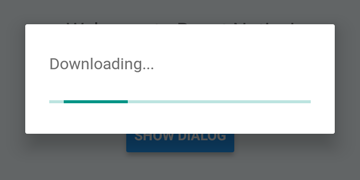
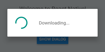
 DialogAndroid . showProgress ( 'Downloading...' , {
    style : DialogAndroid . progressHorizontal // omit this to get circular
} ) ;
setTimeout ( DialogAndroid . dismiss , 5000 ) ; 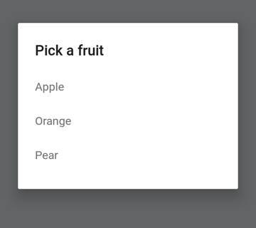
 const { selectedItem } = await DialogAndroid . showPicker ( 'Pick a fruit' , null , {
    items : [
        { label : 'Apple' , id : 'apple' } ,
        { label : 'Orange' , id : 'orange' } ,
        { label : 'Pear' , id : 'pear' }
    ]
} ) ;
if ( selectedItem ) {
    // when negative button is clicked, selectedItem is not present, so it doesn't get here
    console . log ( 'You selected item:' , selectedItem ) ;
} 
ตั้งค่า positiveText เป็น null สำหรับพฤติกรรมอัตโนมัติ dismiss เมื่อกดรายการปุ่มตัวเลือก
 const { selectedItem } = await DialogAndroid . showPicker ( 'Pick a fruit' , null , {
    // positiveText: null, // if positiveText is null, then on select of item, it dismisses dialog
    negativeText : 'Cancel' ,
    type : DialogAndroid . listRadio ,
    selectedId : 'apple' ,
    items : [
        { label : 'Apple' , id : 'apple' } ,
        { label : 'Orange' , id : 'orange' } ,
        { label : 'Pear' , id : 'pear' }
    ]
} ) ;
if ( selectedItem ) {
    // when negative button is clicked, selectedItem is not present, so it doesn't get here
    console . log ( 'You picked:' , selectedItem ) ;
} 
ที่นี่เราผ่านสตริงไปที่ positiveText สิ่งนี้จะช่วยป้องกันไม่ให้ Auto-Dismiss เลือกรายการวิทยุ
 const { selectedItem } = await DialogAndroid . showPicker ( 'Pick a fruit' , null , {
    positiveText : 'OK' , // this is what makes disables auto dismiss
    negativeText : 'Cancel' ,
    type : DialogAndroid . listRadio ,
    selectedId : 'apple' ,
    items : [
        { label : 'Apple' , id : 'apple' } ,
        { label : 'Orange' , id : 'orange' } ,
        { label : 'Pear' , id : 'pear' }
    ]
} ) ;
if ( selectedItem ) {
    // when negative button is clicked, selectedItem is not present, so it doesn't get here
    console . log ( 'You picked:' , selectedItem ) ;
} 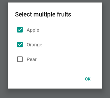
 const { selectedItems } = await DialogAndroid . showPicker ( 'Select multiple fruits' , null , {
    type : DialogAndroid . listCheckbox ,
    selectedIds : [ 'apple' , 'orange' ] ,
    items : [
        { label : 'Apple' , id : 'apple' } ,
        { label : 'Orange' , id : 'orange' } ,
        { label : 'Pear' , id : 'pear' }
    ]
} ) ;
if ( selectedItems ) {
    if ( ! selectedItems . length ) {
        console . log ( 'You selected no items.' ) ;
    } else {
        console . log ( 'You selected items:' , selectedItems ) ;
    }
} 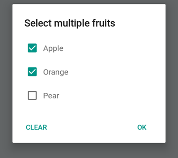
เราสามารถทำให้ปุ่มเป็นกลางเป็นปุ่มพิเศษ การกดมันจะล้างรายการและปิดกล่องโต้ตอบ หากคุณต้องการพฤติกรรมนี้ให้ตั้ง neutralIsClear เป็น true และตั้งค่า neutralText เป็นสตริง ต้องตั้งคุณสมบัติทั้งสองนี้
 const { selectedItems } = await DialogAndroid . showPicker ( 'Select multiple fruits' , null , {
    type : DialogAndroid . listCheckbox ,
    selectedIds : [ 'apple' , 'orange' ] ,
    neutralIsClear : true , /////// added this
    neutralText : 'Clear' , /////// added this
    items : [
        { label : 'Apple' , id : 'apple' } ,
        { label : 'Orange' , id : 'orange' } ,
        { label : 'Pear' , id : 'pear' }
    ]
} ) ;
if ( selectedItems ) {
    if ( ! selectedItems . length ) {
        console . log ( 'You selected no items.' ) ;
    } else {
        console . log ( 'You selected items:' , selectedItems ) ;
    }
} 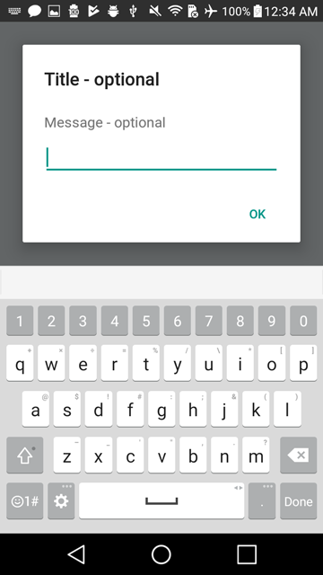
 const { action , text } = await DialogAndroid . prompt ( 'Title - optional' , 'Message - optional' ) ;
if ( action === DialogAndroid . actionPositive ) {
    console . log ( `You submitted: " ${ text } "` ) ;
} 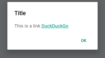
 DialogAndroid . alert ( 'Title' , `This is a link <a href="https://www.duckduckgo.com/">DuckDuckGo</a>` , {
    contentIsHtml : true
} ) ; คุณสามารถตั้งค่าเริ่มต้นบางอย่างเพื่อให้คุณไม่ต้องเปลี่ยนทุกครั้ง
 DialogAndroid . assignDefaults ( {
    title : 'Default Title' ,
    positiveText : null ,
    contentColor : 'rgba(0, 0, 0, 0.2)' ,
    widgetColor : 'blue'
} )
ตอนนี้เมื่อใดก็ตามที่คุณละเว้นหรือส่ง undefined ไปยัง contentColor , widgetColor หรือ title มันจะใช้ค่าเริ่มต้นที่เรากำหนดไว้ที่นี่
DialogAndroid . alert ( undefined , 'message here' ) นี่จะแสดงชื่อ "ชื่อเริ่มต้น" โดยไม่มีปุ่มบวกและสีของข้อความจะเป็นสีดำ 20% หากคุณ Dialog.showProgress ตัวบ่งชี้ความคืบหน้าจะเป็นสีน้ำเงิน เป็นต้น
ขอบคุณไปที่คนที่ยอดเยี่ยมเหล่านี้ (คีย์อีโมจิ):
Vojtech Novak - - | noitidart - | Alisson Carvalho | Anthony OU | แอชลีย์ไวท์ | ผึ้ง | ไบรอัน |
|---|---|---|---|---|---|---|
Byron Wang | Farzad Abdolhosseini | Geoffrey Goh - | Gustavo Fão Valvassori - | Henrik | Heydabop | หวางหยู |
Iragne | Janic Duplessis | Jeffchienzabinet | Jeremy Dagorn | jykun | Mattias Pfeiffer | Pureday |
Radek Czemerys | Ricardo Fuhrmann | หนู | Vinicius Zaramella |
โครงการนี้เป็นไปตามข้อกำหนดทั้งหมดของผู้เข้าร่วม การมีส่วนร่วมทุกชนิดยินดีต้อนรับ!


