react native dialogs
v1.1.2
Ein Android -Modul nur für Materialdesign -Dialoge. Dies ist ein Wrapper über Afollestad/Material-Dialogs. Dieses Modul ist für Android nur ohne Pläne zur Unterstützung von iOS konzipiert.
defaultsactionDismissactionNegativeactionNeutralactionPositivelistPlainlistRadiolistCheckboxprogressHorizontalalertassignDefaultsdismisspromptshowPickershowProgresstype ActionTypetype ListItemtype ListTypetype OptionsAlerttype OptionsCommontype OptionsProgresstype OptionsPickertype OptionsPrompttype ProgressStyleInstallieren:
npm install react-native-dialogs --saveyarn add react-native-dialogsLink:
react-native link react-native-dialogs Die Anwendung mit react-native run-android kompilieren
Befolgen Sie diese Schritte, wenn die automatische Verknüpfung ( react-native link ) fehlschlägt.
Fügen Sie in android/app/build.gradle die Abhängigkeit zu Ihrem App -Build hinzu:
 dependencies {
    ...
    compile project(':react-native-dialogs') // Add this
}
In android/build.gradle sollte es bereits vorhanden sein, fügen Sie jedoch für den Fall,
 allprojects {
    repositories {
        ...
        jcenter() // Add this if it is not already here
        ...
    }
}
In android/settings.gradle :
 rootProject.name = ...
...
include ':react-native-dialogs' // Add this
project(':react-native-dialogs').projectDir = new File(rootProject.projectDir, '../node_modules/react-native-dialogs/android') // Add this

...
include ':app'
Paket importieren und hinzufügen, in android/app/src/main/.../MainApplication.java :
...
import android . app . Application ;
...

import com . aakashns . reactnativedialogs . ReactNativeDialogsPackage ; // Add new import

...

public class MainApplication extends Application implements ReactApplication {
  ...
  @ Override
  protected List < ReactPackage > getPackages () {
    return Arrays .< ReactPackage > asList (
      new MainReactPackage (),
      ...
      new ReactNativeDialogsPackage () // Add the package here
    );
  }
}Importieren Sie es in Ihr JS:
import DialogAndroid from 'react-native-dialogs' ;API anrufen:
 class Blah extends Component {
    render ( ) {
        return < Button title = "Show DialogAndroid" onPress = { this . showDialogAndroid } />
    }

    showDialogAndroid = async ( ) => {
        const { action } = await DialogAndroid . alert ( 'Title' , 'Message' ) ;
        switch ( action ) {
            case DialogAndroid . actionPositive :
                console . log ( 'positive!' )
                break ;
            case DialogAndroid . actionNegative :
                console . log ( 'negative!' )
                break ;
            case DialogAndroid . actionNeutral :
                console . log ( 'neutral!' )
                break ;
            case DialogAndroid . actionDismiss :
                console . log ( 'dismissed!' )
                break ;
        }
    }
}defaults{positiveText: 'ok'}
Die Standardoptionen, die von allen Methoden verwendet werden sollen. Um dies zu ändern, manipulieren Sie entweder direkt mit DialogAndroid.defaults = { ... } assignDefaults verwenden
actionDismissstatic actiondismiss = "ActionDismiss"
actionNegativestatic actionNegative = "actionNegative"
actionNeutralstatic actionneutral = "ActionNeutral"
actionPositivestatic actionpositiv = "ActionPositiv"
listPlainstatic listplain = "listplain"
listRadiostatic listradio = "Listradio"
listCheckboxstatic ListCheckbox = "ListCheckbox"
progressHorizontalstatische progreshorizontal = "progreshorizontal"
alertstatic alert( title: Title, content: Content, options: OptionsAlert ): Promise< {| action: "actionDismiss" | "actionNegative" | "actionNeutral" | "actionPositive" |} | {| action: "actionDismiss" | "actionNegative" | "actionNeutral" | "actionPositive", checked: boolean |} >
Zeigt einen Dialog an.
| Parameter | Typ | Standard | Erforderlich | Beschreibung |
|---|---|---|---|---|
| Titel | string, null, void | Titel des Dialogs | ||
| Inhalt | string, null, void | Nachricht des Dialogs | ||
| Optionen | OptionsAlert | Siehe OptionsAlert |
assignDefaultsstatic assignDefaults({ [string]: value ): void
Stellen Sie beispielsweise Standardfarben fest, sodass Sie es nicht für jeden Methodenaufruf bereitstellen müssen.
{positiveText: 'ok'}
dismissstatic dismiss(): void
Verbirgt den derzeit angezeigten Dialog.
promptstatic prompt( title?: null | string, content?: null | string, options: OptionsPrompt ): Promise< {| action: "actionNegative" | "actionNeutral" | "actionDismiss" |} | {| action: "actionNegative" | "actionNeutral", checked: boolean |} | {| action: "actionPositive", text: string |} | {| action: "actionPositive", text: string, checked: boolean |} >
Zeigt einen Dialog mit einem Texteingangsfeld an.
| Parameter | Typ | Standard | Erforderlich | Beschreibung |
|---|---|---|---|---|
| Titel | string, null, void | Titel des Dialogs | ||
| Inhalt | string, null, void | Nachricht des Dialogs | ||
| Optionen | OptionsPrompt | Siehe OptionsPrompt |
showPickerstatic showPicker( title?: null | string, content?: null | string, options: OptionsPicker ): Promise< {| action: "actionNegative" | "actionNeutral" | "actionDismiss" |} | {| action: "actionNegative" | "actionNeutral" | "actionDismiss", checked: boolean |} | {| action: "actionSelect", selectedItem: ListItem |} | {| action: "actionSelect", selectedItem: ListItem, checked: boolean |} | {| action: "actionSelect", selectedItems: ListItem[] |} | {| action: "actionSelect", selectedItems: ListItem[], checked: boolean |} >
Zeigt eine regelmäßige Warnung an, aber auch mit Elementen, die ausgewählt werden können.
| Parameter | Typ | Standard | Erforderlich | Beschreibung |
|---|---|---|---|---|
| Titel | string, null, void | Titel des Dialogs | ||
| Inhalt | string, null, void | Nachricht des Dialogs | ||
| Optionen | OptionsPicker | Siehe OptionsPrompt |
showProgressstatic showProgress( content?: null | string, options: OptionsProgress ): Promise<{| action:"actionDismiss" |}>
Zeigt einen Fortschrittsdialog an. Standardmäßig werden keine Schaltflächen angezeigt, und die Hardware -Back -Taste schließt sie nicht. Sie müssen es mit DialogAndroid.dismiss() schließen.
| Parameter | Typ | Standard | Erforderlich | Beschreibung |
|---|---|---|---|---|
| Inhalt | string, null, void | Nachricht des Dialogs | ||
| Optionen | OptionsProgress | Siehe OptionsPrompt |
Der Fluss wird als Schreibsystem verwendet.
type ActionType"actionDismiss" | "actionNegative" | "actionNeutral" | "actionPositive" | "actionSelect"
type ListItem{ label:string } | { label:string, id:any } | {}
Notizen
label vorliegt, geben Sie an, welcher Schlüssel als Etikett mit labelKey -Eigenschaft von OptionsPicker verwendet werden soll.id ist nur erforderlich, wenn selectedId / selectedIds verwendet werden müssen.id -Schlüssel vorhanden ist, geben Sie an, welcher Schlüssel als ID mit idKey -Eigenschaft von OptionsPicker verwendet werden sollte. type ListType"listCheckbox" | "listPlain" | "listRadio"
type OptionsAlert{ ...OptionsCommon }
| Schlüssel | Typ | Standard | Erforderlich | Beschreibung |
|---|---|---|---|---|
| ... optionscommon | OptionsCommon | Siehe OptionsCommon |
type OptionsCommon{ cancelable?: boolean, checkboxDefaultValue?: boolean checkboxLabel?: string, content?: string, contentColor?: string, contentIsHtml?: boolean, forceStacking?: boolean, linkColor?: ColorValue, negativeColor?: ColorValue, negativeText?: string, neutralColor?: ColorValue, neutralText?: string, positiveColor?: ColorValue, positiveText?: string, // default "OK" backgroundColor?: ColorValue, title?: string, titleColor?: ColorValue, }
| Schlüssel | Typ | Standard | Erforderlich | Beschreibung |
|---|---|---|---|---|
| stornierbar | boolean | Wenn Sie außerhalb des Dialogfelds tippen oder die Hardware -zurück -Schaltfläche zurücklegen, sollte ein Dialog entlassen. | ||
| CheckBoxDefaultValue | boolean | false | Der Anfangszustand des Kontrollkasten. Tut nichts, wenn checkboxLabel nicht festgelegt ist. | |
| CheckBoxLabel | string | Wenn festgelegt, befindet sich unten im Dialogfeld ein Kontrollkästchen mit dieser Etikett | ||
| Inhalt | string | Dialognachricht | ||
| ContentColor | ColorValue | Farbe der Dialognachricht | ||
| Contentishtml | boolean | Wenn die Dialognachricht als HTML analysiert werden sollte. (Unterstützte Tags umfassen: <a> , <img> usw.) | ||
| Vorschlag | boolean | Wenn Sie mehrere Aktionsschaltflächen haben, die zusammen zu breit sind, um in eine Zeile zu passen, stapelt der Dialog die Tasten, um vertikal ausgerichtet zu sein. | ||
| linkColor | ColorValue | Wenn contentIsHtml wahr ist und content <a> Tags enthält, sind diese mit dieser Farbe gefärbt | ||
| NegativeColor | ColorValue | |||
| Negativetext | string | Wenn falsy, wird nicht angezeigt. | ||
| Neutralcolor | ColorValue | |||
| Neutraltext | string | Zeigt die Taste ganz links mit dieser Zeichenfolge als Etikett an. Wenn falsy, wird nicht angezeigt. | ||
| PositiveColor | ColorValue | |||
| Positivetext | string | Wenn falsy, wird nicht angezeigt. | ||
| Hintergrundkolor | ColorValue | |||
| Titel | string | Titel des Dialogs | ||
| Titlecolor | ColorValue | Farbe des Titels |
type OptionsProgress{ contentColor: $PropertyType<OptionsCommon, 'contentColor'>, contentIsHtml: $PropertyType<OptionsCommon, 'contentIsHtml'>, linkColor: $PropertyType<OptionsCommon, 'linkColor'>, style?: ProgressStyle, title: $PropertyType<OptionsCommon, 'title'>, titleColor: $PropertyType<OptionsCommon, 'titleColor'>', widgetColor: $PropertyType<OptionsCommon, 'widgetColor'> }
| Schlüssel | Typ | Standard | Erforderlich | Beschreibung |
|---|---|---|---|---|
| ContentColor | OptionsCommon#contentColor | Siehe OptionsCommon#contentColor | ||
| Contentishtml | OptionsCommon#contentIsHtml | Siehe OptionsCommon#contentIsHtml | ||
| linkColor | OptionsCommon#linkColor | Siehe OptionsCommon#linkColor | ||
| Stil | ProgressStyle | Siehe ProgressStyle | ||
| Titel | OptionsCommon#title | Siehe OptionsCommon#title | ||
| Titlecolor | OptionsCommon#titleColor | Siehe OptionsCommon#titleColor | ||
| WidgetColor | ColorValue | Farb des Fortschrittsindikators |
type OptionsPicker{| ... optionsCommon, Typ ?: Typeof listType.listplain, maxnumberofitems? {| ... optionsCommon, Typ ?: Typeof listType.listplain, maxnumberofitems? {| // Radio - kein vorgewähltes ... optioncommon, Typ: TypeOf listType.listradio, WidgetColor? {| // Radio - kein vorgewähltes ... options common, Typ: TypeOf listType.listradio, WidgetColor? {| // Radio - Vorausgewählt - ListItEMfull ... optionsCommon, Typ: TypeOf ListType.listradio, WidgetColor? {| // Radio - Vorausgewählter - ListItemjustLabel ... OptionsCommon, Typ: Typeof ListType.listradio, WidgetColor? {| // Radio - Vorausgewählt - ListItemjustID ... optionsCommon, Typ: TypeOf ListType.listradio, WidgetColor? {| // Radio - Vorausgewählter - ListItemBare ... OptionsCommon, Typ: Typeof ListType.listradio, WidgetColor? {| // Checkliste - Kein vorgewähltes - ListItemjustLabel ... Optionen, Typ: Typ: TypeOf ListType.ListCheckbox, neutralisclear ?: boolean, widgetColor? {| // Checkliste - Kein vorgewählter - ListItembare ... Optionen common, Typ: TypeOf ListType.ListCheckbox, Neutralisclear ?: Boolean, WidgetColor? {| // Checkliste - Vorausgewählter - ListItemfull ... options common, Typ: Typeof ListType.ListCheckbox, neutralisclear ?: boolean, widgetColor? {| // Checkliste - Vorausgewählter - ListItemjustLabel ... Optionen common, Typ: TypeOf ListType.ListCheckbox, neutralisclear ?: boolean, widgetColor? {| // Checkliste - Vorausgewählter - ListItemjustID ... Optionen common, Typ: TypeOf ListType.ListCheckbox, neutralisclear ?: boolean, widgetColor? {| // Checkliste - Vorausgewählter - ListItembare ... Optionen common, Typ: TypeOf ListType.ListCheckbox, neutralisclear ?: boolean, widgetColor?
| Schlüssel | Typ | Standard | Erforderlich | Beschreibung |
|---|---|---|---|---|
| Optionscommon | OptionsCommon | Siehe OptionsCommon | ||
| IDKY | string | "Ausweis" | ||
| Artikel | ListItem [] | Ja | Siehe ListItem | |
| Labelkey | string | "Etikett" | ||
| MaxNumberofitems | number | Wenn Sie eine maximale Anzahl sichtbarer Elemente in einer Liste festlegen möchten | ||
| neutralisclear | boolean | Durch das Drücken der neutralen Taste wird der Dialog geschlossen und selectedItems . Funktioniert nur, wenn auch neutralText geliefert wird. | ||
| ausgewählt | any | Das jeweilige Radio wird in der Dialogausstellung ausgewählt. Wenn keine solche ID gefunden wird, wird nichts ausgewählt. Nur dann anwendbar, wenn type DialogAndroid.listRadio ist. Erfordert, dass items[] von idKey beschriebene Schlüssel enthalten. | ||
| ausgewählt | any[] | Das jeweilige Kontrollkästchen wird in der Dialogstellung ausgewählt. Wenn keine solche ID gefunden wird, wird für diese ID nichts ausgewählt. Nur dann anwendbar, wenn type DialogAndroid.listCheckbox ist. Erfordert, dass items[] von idKey beschriebene Schlüssel enthalten. | ||
| Typ | ListType | DialogAndroid.listPlain | Siehe ListType | |
| WidgetColor | ColorValue | Farbe des Radios oder Checkbox |
type OptionsPrompt{ ...OptionsCommon, keyboardType?: | 'numeric' | 'number-pad' | 'numeric-password' | 'decimal-pad' | 'email-address' | 'password' | 'phone-pad' | 'url', defaultValue?: string, placeholder?: string, allowEmptyInput?: boolean, minLength?: number, maxLength?: number, widgetColor?: ColorValue }
| Schlüssel | Typ | Standard | Erforderlich | Beschreibung |
|---|---|---|---|---|
| Optionscommon | OptionsCommon | Siehe OptionsCommon | ||
| WidgetColor | ColorValue | Fachfarbe unterstreichen und Cursor |
type ProgressStyle"progressHorizontal"
Um die Beispiele mit checkboxLabel zu sehen
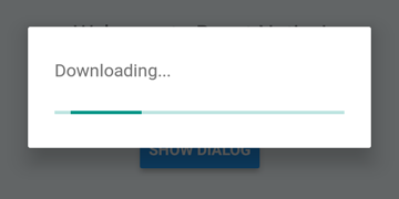
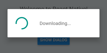
 DialogAndroid . showProgress ( 'Downloading...' , {
    style : DialogAndroid . progressHorizontal // omit this to get circular
} ) ;
setTimeout ( DialogAndroid . dismiss , 5000 ) ; 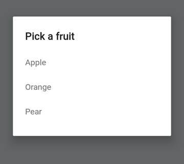
 const { selectedItem } = await DialogAndroid . showPicker ( 'Pick a fruit' , null , {
    items : [
        { label : 'Apple' , id : 'apple' } ,
        { label : 'Orange' , id : 'orange' } ,
        { label : 'Pear' , id : 'pear' }
    ]
} ) ;
if ( selectedItem ) {
    // when negative button is clicked, selectedItem is not present, so it doesn't get here
    console . log ( 'You selected item:' , selectedItem ) ;
} 
Setzen Sie positiveText auf null , um das automatische Verhalten eines Optionsknopfs zu verhalten.
 const { selectedItem } = await DialogAndroid . showPicker ( 'Pick a fruit' , null , {
    // positiveText: null, // if positiveText is null, then on select of item, it dismisses dialog
    negativeText : 'Cancel' ,
    type : DialogAndroid . listRadio ,
    selectedId : 'apple' ,
    items : [
        { label : 'Apple' , id : 'apple' } ,
        { label : 'Orange' , id : 'orange' } ,
        { label : 'Pear' , id : 'pear' }
    ]
} ) ;
if ( selectedItem ) {
    // when negative button is clicked, selectedItem is not present, so it doesn't get here
    console . log ( 'You picked:' , selectedItem ) ;
} 
Hier übergeben wir in einer Zeichenfolge an positiveText . Dies verhindert die Auto-Dismiss bei Auswahl eines Funkelements.
 const { selectedItem } = await DialogAndroid . showPicker ( 'Pick a fruit' , null , {
    positiveText : 'OK' , // this is what makes disables auto dismiss
    negativeText : 'Cancel' ,
    type : DialogAndroid . listRadio ,
    selectedId : 'apple' ,
    items : [
        { label : 'Apple' , id : 'apple' } ,
        { label : 'Orange' , id : 'orange' } ,
        { label : 'Pear' , id : 'pear' }
    ]
} ) ;
if ( selectedItem ) {
    // when negative button is clicked, selectedItem is not present, so it doesn't get here
    console . log ( 'You picked:' , selectedItem ) ;
} 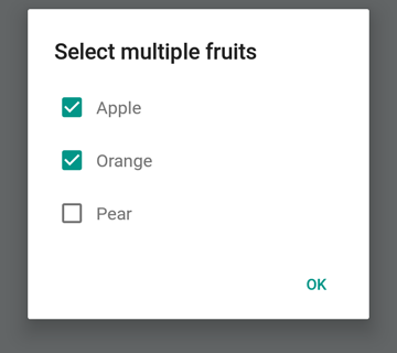
 const { selectedItems } = await DialogAndroid . showPicker ( 'Select multiple fruits' , null , {
    type : DialogAndroid . listCheckbox ,
    selectedIds : [ 'apple' , 'orange' ] ,
    items : [
        { label : 'Apple' , id : 'apple' } ,
        { label : 'Orange' , id : 'orange' } ,
        { label : 'Pear' , id : 'pear' }
    ]
} ) ;
if ( selectedItems ) {
    if ( ! selectedItems . length ) {
        console . log ( 'You selected no items.' ) ;
    } else {
        console . log ( 'You selected items:' , selectedItems ) ;
    }
} 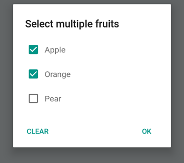
Wir können die neutrale Taste ein spezieller Taste sein. Wenn Sie darauf drücken, werden die Liste gelöscht und den Dialog schließen. Wenn Sie dieses Verhalten wünschen, setzen Sie neutralIsClear auf true und setzen Sie auch neutralText auf eine Zeichenfolge. Beide Eigenschaften müssen festgelegt werden.
 const { selectedItems } = await DialogAndroid . showPicker ( 'Select multiple fruits' , null , {
    type : DialogAndroid . listCheckbox ,
    selectedIds : [ 'apple' , 'orange' ] ,
    neutralIsClear : true , /////// added this
    neutralText : 'Clear' , /////// added this
    items : [
        { label : 'Apple' , id : 'apple' } ,
        { label : 'Orange' , id : 'orange' } ,
        { label : 'Pear' , id : 'pear' }
    ]
} ) ;
if ( selectedItems ) {
    if ( ! selectedItems . length ) {
        console . log ( 'You selected no items.' ) ;
    } else {
        console . log ( 'You selected items:' , selectedItems ) ;
    }
} 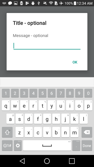
 const { action , text } = await DialogAndroid . prompt ( 'Title - optional' , 'Message - optional' ) ;
if ( action === DialogAndroid . actionPositive ) {
    console . log ( `You submitted: " ${ text } "` ) ;
} 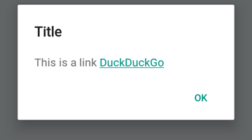
 DialogAndroid . alert ( 'Title' , `This is a link <a href="https://www.duckduckgo.com/">DuckDuckGo</a>` , {
    contentIsHtml : true
} ) ; Sie können einige Standardeinstellungen festlegen, damit Sie es nicht jedes Mal ändern müssen.
 DialogAndroid . assignDefaults ( {
    title : 'Default Title' ,
    positiveText : null ,
    contentColor : 'rgba(0, 0, 0, 0.2)' ,
    widgetColor : 'blue'
} )
Jedes Mal, wenn Sie undefined an contentColor , widgetColor oder title nicht definiert werden, wird die hier zugewiesenen Standardeinstellungen verwendet.
DialogAndroid . alert ( undefined , 'message here' ) Dadurch wird der Titel "Standardtitel" ohne positive Schaltfläche angezeigt, und die Farbe der Nachricht beträgt 20% schwarz. Wenn Sie Dialog.showProgress wären. usw.
Vielen Dank an diese wunderbaren Menschen (Emoji -Schlüssel):
Vojtech Novak ? ? | Noitidart ? | Alisson Carvalho | Anthony OU | Ashley White | Biene | Brianso |
|---|---|---|---|---|---|---|
Byron Wang | Farzad Abdolhosseini | Geoffrey Goh ? | Gustavo Fão Valvassori ? | Henrik | Heydabop | Huang Yu |
IRAGNE | Janic Duplessis | Jeffchienzabinet | Jeremy Dagorn | Jykun | Mattias Pfeiffer | Pureday |
Radek Czemerys | Ricardo Fuhrmann | Ross | Vinicius Zaramella |
Dieses Projekt folgt der All-Contributors-Spezifikation. Beiträge jeglicher Art willkommen!


