react native dialogs
v1.1.2
Un módulo de Android solo para diálogos de diseño de material. Este es un envoltorio sobre Afollestad/Material-Dialogs. Este módulo está diseñado para Android solo sin planes para admitir iOS.
defaultsactionDismissactionNegativeactionNeutralactionPositivelistPlainlistRadiolistCheckboxprogressHorizontalalertassignDefaultsdismisspromptshowPickershowProgresstype ActionTypetype ListItemtype ListTypetype OptionsAlerttype OptionsCommontype OptionsProgresstype OptionsPickertype OptionsPrompttype ProgressStyleInstalar:
npm install react-native-dialogs --saveyarn add react-native-dialogsEnlace:
react-native link react-native-dialogs Compilar la aplicación usando react-native run-android
Siga estos pasos si el enlace automático ( react-native link ) falló.
En android/app/build.gradle , agregue la dependencia a su aplicación Build:
 dependencies {
    ...
    compile project(':react-native-dialogs') // Add this
}
En android/build.gradle , ya debería estar allí, pero en caso de que no lo esté, agregue el repositorio de jitpack maven para descargar la biblioteca afollestad/material-dialogs:
 allprojects {
    repositories {
        ...
        jcenter() // Add this if it is not already here
        ...
    }
}
En android/settings.gradle :
 rootProject.name = ...
...
include ':react-native-dialogs' // Add this
project(':react-native-dialogs').projectDir = new File(rootProject.projectDir, '../node_modules/react-native-dialogs/android') // Add this

...
include ':app'
Importar y agregar paquete, en android/app/src/main/.../MainApplication.java :
...
import android . app . Application ;
...

import com . aakashns . reactnativedialogs . ReactNativeDialogsPackage ; // Add new import

...

public class MainApplication extends Application implements ReactApplication {
  ...
  @ Override
  protected List < ReactPackage > getPackages () {
    return Arrays .< ReactPackage > asList (
      new MainReactPackage (),
      ...
      new ReactNativeDialogsPackage () // Add the package here
    );
  }
}Importarlo en su js:
import DialogAndroid from 'react-native-dialogs' ;Llame a la API:
 class Blah extends Component {
    render ( ) {
        return < Button title = "Show DialogAndroid" onPress = { this . showDialogAndroid } />
    }

    showDialogAndroid = async ( ) => {
        const { action } = await DialogAndroid . alert ( 'Title' , 'Message' ) ;
        switch ( action ) {
            case DialogAndroid . actionPositive :
                console . log ( 'positive!' )
                break ;
            case DialogAndroid . actionNegative :
                console . log ( 'negative!' )
                break ;
            case DialogAndroid . actionNeutral :
                console . log ( 'neutral!' )
                break ;
            case DialogAndroid . actionDismiss :
                console . log ( 'dismissed!' )
                break ;
        }
    }
}defaults{positivEtext: 'ok'}
Las opciones predeterminadas para ser utilizadas por todos los métodos. Para modificar esto, manipule directamente con DialogAndroid.defaults = { ... } o use assignDefaults
actionDismissAction Dismiss = "ActionDismiss"
actionNegativestatic actionNegative = "ActionNegative"
actionNeutralActionSeutral estático = "ActionNeutral"
actionPositiveActionPositive estático = "acción positivo"
listPlainstatic listPlain = "listPlain"
listRadiostatic listradio = "listradio"
listCheckboxstatic listcheckbox = "listcheckbox"
progressHorizontalProgresshorizontal estático = "Progresshorizontal"
alertstatic alert( title: Title, content: Content, options: OptionsAlert ): Promise< {| action: "actionDismiss" | "actionNegative" | "actionNeutral" | "actionPositive" |} | {| action: "actionDismiss" | "actionNegative" | "actionNeutral" | "actionPositive", checked: boolean |} >
Muestra un diálogo.
| Parámetro | Tipo | Por defecto | Requerido | Descripción |
|---|---|---|---|---|
| título | string, null, void | Título de diálogo | ||
| contenido | string, null, void | Mensaje de diálogo | ||
| opción | OptionsAlert | Ver OptionsAlert |
assignDefaultsstatic assignDefaults({ [string]: value ): void
Establezca los colores predeterminados, por ejemplo, para que no tenga que proporcionarlo en cada llamada de método.
{positivEtext: 'ok'}
dismissstatic dismiss(): void
Oculta el diálogo que muestra actualmente.
promptstatic prompt( title?: null | string, content?: null | string, options: OptionsPrompt ): Promise< {| action: "actionNegative" | "actionNeutral" | "actionDismiss" |} | {| action: "actionNegative" | "actionNeutral", checked: boolean |} | {| action: "actionPositive", text: string |} | {| action: "actionPositive", text: string, checked: boolean |} >
Muestra un diálogo con un campo de entrada de texto.
| Parámetro | Tipo | Por defecto | Requerido | Descripción |
|---|---|---|---|---|
| título | string, null, void | Título de diálogo | ||
| contenido | string, null, void | Mensaje de diálogo | ||
| opción | OptionsPrompt | Ver OptionsPrompt |
showPickerstatic showPicker( title?: null | string, content?: null | string, options: OptionsPicker ): Promise< {| action: "actionNegative" | "actionNeutral" | "actionDismiss" |} | {| action: "actionNegative" | "actionNeutral" | "actionDismiss", checked: boolean |} | {| action: "actionSelect", selectedItem: ListItem |} | {| action: "actionSelect", selectedItem: ListItem, checked: boolean |} | {| action: "actionSelect", selectedItems: ListItem[] |} | {| action: "actionSelect", selectedItems: ListItem[], checked: boolean |} >
Muestra una alerta regular, pero también con elementos que se pueden seleccionar.
| Parámetro | Tipo | Por defecto | Requerido | Descripción |
|---|---|---|---|---|
| título | string, null, void | Título de diálogo | ||
| contenido | string, null, void | Mensaje de diálogo | ||
| opción | OptionsPicker | Ver OptionsPrompt |
showProgressstatic showProgress( content?: null | string, options: OptionsProgress ): Promise<{| action:"actionDismiss" |}>
Muestra un diálogo de progreso. Por defecto, no se muestran botones, y el botón de retroceso de hardware no lo cierra. Debe cerrarlo con DialogAndroid.dismiss() .
| Parámetro | Tipo | Por defecto | Requerido | Descripción |
|---|---|---|---|---|
| contenido | string, null, void | Mensaje de diálogo | ||
| opción | OptionsProgress | Ver OptionsPrompt |
El flujo se usa como sistema de tipificación.
type ActionType"actionDismiss" | "actionNegative" | "actionNeutral" | "actionPositive" | "actionSelect"
type ListItem{ label:string } | { label:string, id:any } | {}
Notas
label no existe, especifique qué tecla debe usarse como etiqueta con la propiedad labelKey de OptionsPicker .id solo se requiere si selectedId / selectedIds debe usarse.id no existe, especifique qué clave debe usarse como ID con propiedad idKey de OptionsPicker . type ListType"listCheckbox" | "listPlain" | "listRadio"
type OptionsAlert{ ...OptionsCommon }
| Llave | Tipo | Por defecto | Requerido | Descripción |
|---|---|---|---|---|
| ... Opciones Common | OptionsCommon | Ver OptionsCommon |
type OptionsCommon{ cancelable?: boolean, checkboxDefaultValue?: boolean checkboxLabel?: string, content?: string, contentColor?: string, contentIsHtml?: boolean, forceStacking?: boolean, linkColor?: ColorValue, negativeColor?: ColorValue, negativeText?: string, neutralColor?: ColorValue, neutralText?: string, positiveColor?: ColorValue, positiveText?: string, // default "OK" backgroundColor?: ColorValue, title?: string, titleColor?: ColorValue, }
| Llave | Tipo | Por defecto | Requerido | Descripción |
|---|---|---|---|---|
| cancelable | boolean | Si aprovecha el área de diálogo, o el botón de retroceso de hardware, debe descartar el diálogo. | ||
| checkboxDefaultValue | boolean | false | El estado inicial de la casilla de verificación. No hace nada si checkboxLabel no está configurado. | |
| checkboxLabel | string | Si se establece, entonces se muestra una casilla de verificación en la parte inferior del cuadro de diálogo con esta etiqueta | ||
| contenido | string | Mensaje de diálogo | ||
| ContentColor | ColorValue | Color del mensaje de diálogo | ||
| contentishtml | boolean | Si el mensaje de diálogo debe analizarse como HTML. (Las etiquetas compatibles incluyen: <a> , <img> , etc.) | ||
| fortuito | boolean | Si tiene múltiples botones de acción que juntos son demasiado anchos para caber en una línea, el diálogo apilará los botones para orientarse verticalmente. | ||
| linkcolor | ColorValue | Si contentIsHtml es verdadero, y content contiene <a> etiquetas, estas están coloreadas con este color | ||
| negativecolor | ColorValue | |||
| negativetext | string | Si falsifica, el botón no se muestra. | ||
| neutralcolor | ColorValue | |||
| neutralText | string | Muestra el botón en el extremo izquierdo con esta cadena como etiqueta. Si falsifica, el botón no se muestra. | ||
| positivecolor | ColorValue | |||
| positivetexto | string | Si falsifica, el botón no se muestra. | ||
| beckcolor | ColorValue | |||
| título | string | Título de diálogo | ||
| titlecolor | ColorValue | Color del título |
type OptionsProgress{ contentColor: $PropertyType<OptionsCommon, 'contentColor'>, contentIsHtml: $PropertyType<OptionsCommon, 'contentIsHtml'>, linkColor: $PropertyType<OptionsCommon, 'linkColor'>, style?: ProgressStyle, title: $PropertyType<OptionsCommon, 'title'>, titleColor: $PropertyType<OptionsCommon, 'titleColor'>', widgetColor: $PropertyType<OptionsCommon, 'widgetColor'> }
| Llave | Tipo | Por defecto | Requerido | Descripción |
|---|---|---|---|---|
| ContentColor | OptionsCommon#contentColor | Ver OptionsCommon#contentColor | ||
| contentishtml | OptionsCommon#contentIsHtml | Ver OptionsCommon#contentIsHtml | ||
| linkcolor | OptionsCommon#linkColor | Ver OptionsCommon#linkColor | ||
| estilo | ProgressStyle | Ver ProgressStyle | ||
| título | OptionsCommon#title | Ver OptionsCommon#title | ||
| titlecolor | OptionsCommon#titleColor | Ver OptionsCommon#titleColor | ||
| WidgetColor | ColorValue | Indicador de color de progreso |
type OptionsPicker{| ... OptionsCommon, Type?: TypeOf listType.listPlain, maxnumberOfItems?: Número, elementos: ListItemJustLabel [], |} | {| ... OptionsCommon, Type?: TypeOf listType.listPlain, maxnumberOfItems?: Número, elementos: ListitEmBare [], LabelKey: String |} | {| // Radio - Sin preselección ... Opciones Common, Tipo: TypeOf listType.listradio, WidgetColor?: ColorValue // Elementos de color de radio: listItemJustLabel [], |} | {| // Radio - No Preseleccionada ... Opciones Common, Tipo: TypeOf listType.listradio, WidgetColor?: ColorValue // Elementos de color de radio: listItEmBare [], Labelkey: String |} | {| // Radio - Preseleccionada - ListItemFull ... Opciones Common, Tipo: TypeOf listType.listradio, WidgetColor?: ColorValue // Radio Color Elementos: listitemfull [], selectedId: Any |} | {| // Radio - Preseleccionada - ListItemJustLabel ... Opciones Common, Tipo: typeof listype.listradio, widgetColor?: ColorValue // elementos de color de radio: listItemJustLabel [], idkey: string, selectedId: any |} | {| // Radio - Preseleccionada - ListitEmjustid ... Opciones Common, Tipo: typeof listType.listradio, widgetColor?: ColorValue // Radio Color Elements: ListitemJustid [], LabelKey: String, SelectedId: Any |} | {| // Radio - Preseleccionada - ListitImbare ... Opciones Common, Tipo: TypeOf listType.listradio, widgetColor?: ColorValue // Radio Color Elementos: listItembare [], idkey: string, etiqueta: string, selectedId: any |} | {| // Lista de verificación - No Preselected - ListItemJustLabel ... Opciones Common, Type: typeof listype.listcheckbox, neutralisClarear?: boolean, widgetcolor?: colorvalue, // elementos de color de casilla de verificación: listItemJustLabel [] |} | {| // Lista de verificación - No Preselected - ListItImbare ... Opciones Common, Type: typeOf listType.listcheckbox, neutralIsClarear?: boolean, widgetColor?: ColorValue, // Elementos de color de la casilla de verificación: ListItImbare [], LabelKey: String |} | {| // Lista de verificación - Preselectada - ListItemfull ... Opciones Common, Type: typeof listype.listcheckbox, neutralIsClarear?: boolean, widgetColor?: colorvalue, // elementos de color de casilla de verificación: listItemfull [], seleccionados: cualquier [] |} | {| // Lista de verificación - Preselectada - ListItemJustLabel ... Opciones Common, Type: typeOf listType.listcheckbox, neutralIsClarear?: boolean, widgetColor?: ColorValue, // Elementos de color de casilla de verificación: listItemJustLabel [], idkey: cadena, seleccionado: ONU |} | {| // Lista de verificación - Preselectada - ListitEmjustid ... Opciones Common, Type: typeof listype.listcheckbox, neutralisclar?: boolean, widgetColor?: ColorValue, // elementos de color de cuadros: listItEmjustid [], etiqueta: string, selectedids: cualquier |} | {| // Lista de verificación - Preselectada - ListItEmbare ... Opciones Common, Type: typeof listype.listcheckbox, neutralisclar?: boolean, widgetcolor?: colorvalue, // elementos de color de casilla de verificación: listitembare [], idkey: string, etiqueta Key: String, Selectids: Any |}
| Llave | Tipo | Por defecto | Requerido | Descripción |
|---|---|---|---|---|
| Opciones Common | OptionsCommon | Ver OptionsCommon | ||
| rehacer | string | "identificación" | ||
| elementos | ListItem [] | Sí | Ver ListItem | |
| keyleting | string | "etiqueta" | ||
| MaxNumberOfItems | number | Si desea establecer una cantidad máxima de elementos visibles en una lista | ||
| neutralicular | boolean | Al presionar el botón neutral, el cuadro de diálogo se cierre y selectedItems para ser una matriz vacía. Solo funciona si neutralText también se suministra. | ||
| Selectedid | any | La radio respectiva se seleccionará en el programa de diálogo. Si no se encuentra dicha identificación, entonces no se selecciona nada. Solo aplicable si type es DialogAndroid.listRadio . Requiere que items[] contengan la clave descrita por idKey . | ||
| SelectedIds | any[] | La casilla de verificación respectiva se seleccionará en el diálogo. Si no se encuentra dicha identificación, no se selecciona nada para esa identificación. Solo aplicable si type es DialogAndroid.listCheckbox . Requiere que items[] contengan la clave descrita por idKey . | ||
| tipo | ListType | DialogAndroid.listPlain | Ver ListType | |
| WidgetColor | ColorValue | Color de radio o casilla de verificación |
type OptionsPrompt{ ...OptionsCommon, keyboardType?: | 'numeric' | 'number-pad' | 'numeric-password' | 'decimal-pad' | 'email-address' | 'password' | 'phone-pad' | 'url', defaultValue?: string, placeholder?: string, allowEmptyInput?: boolean, minLength?: number, maxLength?: number, widgetColor?: ColorValue }
| Llave | Tipo | Por defecto | Requerido | Descripción |
|---|---|---|---|---|
| Opciones Common | OptionsCommon | Ver OptionsCommon | ||
| WidgetColor | ColorValue | Color de campo de campo y cursor |
type ProgressStyle"progressHorizontal"
Para ver los ejemplos rehacidos con checkboxLabel , vea este PR - GitHub :: Aakashns/React -Native -Dialogs - #86
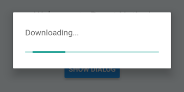
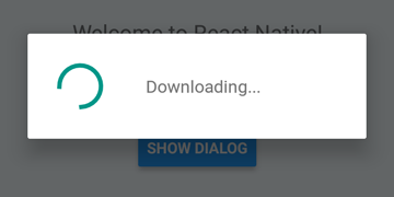
 DialogAndroid . showProgress ( 'Downloading...' , {
    style : DialogAndroid . progressHorizontal // omit this to get circular
} ) ;
setTimeout ( DialogAndroid . dismiss , 5000 ) ; 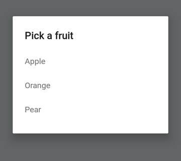
 const { selectedItem } = await DialogAndroid . showPicker ( 'Pick a fruit' , null , {
    items : [
        { label : 'Apple' , id : 'apple' } ,
        { label : 'Orange' , id : 'orange' } ,
        { label : 'Pear' , id : 'pear' }
    ]
} ) ;
if ( selectedItem ) {
    // when negative button is clicked, selectedItem is not present, so it doesn't get here
    console . log ( 'You selected item:' , selectedItem ) ;
} 
Establezca positiveText en null para el comportamiento de auto-discismo en presionar un elemento de botón de radio.
 const { selectedItem } = await DialogAndroid . showPicker ( 'Pick a fruit' , null , {
    // positiveText: null, // if positiveText is null, then on select of item, it dismisses dialog
    negativeText : 'Cancel' ,
    type : DialogAndroid . listRadio ,
    selectedId : 'apple' ,
    items : [
        { label : 'Apple' , id : 'apple' } ,
        { label : 'Orange' , id : 'orange' } ,
        { label : 'Pear' , id : 'pear' }
    ]
} ) ;
if ( selectedItem ) {
    // when negative button is clicked, selectedItem is not present, so it doesn't get here
    console . log ( 'You picked:' , selectedItem ) ;
} 
Aquí pasamos una cadena para positiveText , esto evita el auto-discismo en seleccionar un elemento de radio.
 const { selectedItem } = await DialogAndroid . showPicker ( 'Pick a fruit' , null , {
    positiveText : 'OK' , // this is what makes disables auto dismiss
    negativeText : 'Cancel' ,
    type : DialogAndroid . listRadio ,
    selectedId : 'apple' ,
    items : [
        { label : 'Apple' , id : 'apple' } ,
        { label : 'Orange' , id : 'orange' } ,
        { label : 'Pear' , id : 'pear' }
    ]
} ) ;
if ( selectedItem ) {
    // when negative button is clicked, selectedItem is not present, so it doesn't get here
    console . log ( 'You picked:' , selectedItem ) ;
} 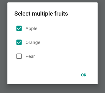
 const { selectedItems } = await DialogAndroid . showPicker ( 'Select multiple fruits' , null , {
    type : DialogAndroid . listCheckbox ,
    selectedIds : [ 'apple' , 'orange' ] ,
    items : [
        { label : 'Apple' , id : 'apple' } ,
        { label : 'Orange' , id : 'orange' } ,
        { label : 'Pear' , id : 'pear' }
    ]
} ) ;
if ( selectedItems ) {
    if ( ! selectedItems . length ) {
        console . log ( 'You selected no items.' ) ;
    } else {
        console . log ( 'You selected items:' , selectedItems ) ;
    }
} 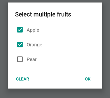
Podemos hacer que el botón neutral sea un botón especial. Al presionarlo, borrará la lista y cerrará el cuadro de diálogo. Si desea este comportamiento, establezca neutralIsClear en true y también establezca neutralText en una cadena. Ambas propiedades deben estar establecidas.
 const { selectedItems } = await DialogAndroid . showPicker ( 'Select multiple fruits' , null , {
    type : DialogAndroid . listCheckbox ,
    selectedIds : [ 'apple' , 'orange' ] ,
    neutralIsClear : true , /////// added this
    neutralText : 'Clear' , /////// added this
    items : [
        { label : 'Apple' , id : 'apple' } ,
        { label : 'Orange' , id : 'orange' } ,
        { label : 'Pear' , id : 'pear' }
    ]
} ) ;
if ( selectedItems ) {
    if ( ! selectedItems . length ) {
        console . log ( 'You selected no items.' ) ;
    } else {
        console . log ( 'You selected items:' , selectedItems ) ;
    }
} 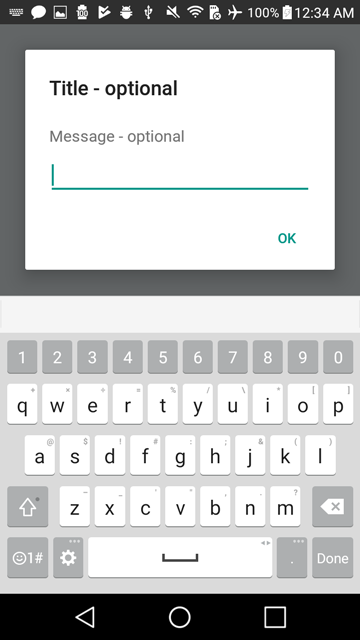
 const { action , text } = await DialogAndroid . prompt ( 'Title - optional' , 'Message - optional' ) ;
if ( action === DialogAndroid . actionPositive ) {
    console . log ( `You submitted: " ${ text } "` ) ;
} 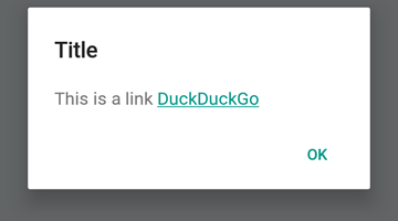
 DialogAndroid . alert ( 'Title' , `This is a link <a href="https://www.duckduckgo.com/">DuckDuckGo</a>` , {
    contentIsHtml : true
} ) ; Puede establecer algunos valores predeterminados para que no tenga que cambiarlo cada vez.
 DialogAndroid . assignDefaults ( {
    title : 'Default Title' ,
    positiveText : null ,
    contentColor : 'rgba(0, 0, 0, 0.2)' ,
    widgetColor : 'blue'
} )
Ahora, cada vez que omite o pase undefined a contentColor , widgetColor o title , usará los valores predeterminados que asignamos aquí.
DialogAndroid . alert ( undefined , 'message here' ) Esto mostrará el título "Título predeterminado", sin botón positivo, y el color del mensaje será 20% negro. Si hiciera Dialog.showProgress , el indicador de progreso sería azul. etc.
Gracias a estas maravillosas personas (Key Emoji):
Vojtech Novak ? ? | Noitidart ? | Alisson Carvalho | Anthony OU | Ashley White | Abeja | Brioso |
|---|---|---|---|---|---|---|
Byron Wang | Farzad Abdolhosseini | Geoffrey Goh ? | Gustavo Fão Valvassori ? | Henrik | Heydabop | Huang Yu |
Iragne | Duplessis janic | Jeffchienzabinet | Jeremy Dagorn | jykun | Mattias pfeiffer | Pureday |
Radek Czemerys | Ricardo Fuhrmann | Ross | Vinicius Zaramella |
Este proyecto sigue la especificación de todos los contribuyentes. ¡Contribuciones de cualquier tipo bienvenido!


