react native dialogs
v1.1.2
マテリアルデザインダイアログ用のAndroidのみのモジュール。これは、Afollestad/Material-Dialogsのラッパーです。このモジュールは、iOSをサポートする計画なしでのみAndroid用に設計されています。
defaultsactionDismissactionNegativeactionNeutralactionPositivelistPlainlistRadiolistCheckboxprogressHorizontalalertassignDefaultsdismisspromptshowPickershowProgresstype ActionTypetype ListItemtype ListTypetype OptionsAlerttype OptionsCommontype OptionsProgresstype OptionsPickertype OptionsPrompttype ProgressStyleインストール:
npm install react-native-dialogs --saveyarn add react-native-dialogsリンク:
react-native link react-native-dialogsreact-native run-androidを使用してアプリケーションをコンパイルします
自動リンク( react-native link )が失敗した場合、次の手順に従ってください。
android/app/build.gradleで、アプリビルドに依存関係を追加します。
 dependencies {
    ...
    compile project(':react-native-dialogs') // Add this
}
android/build.gradleでは、すでにそこにあるはずですが、そうでない場合は、Jitpack mavenリポジトリを追加して、ライブラリAfolleStad/Material-Dialogsをダウンロードします。
 allprojects {
    repositories {
        ...
        jcenter() // Add this if it is not already here
        ...
    }
}
android/settings.gradle :
 rootProject.name = ...
...
include ':react-native-dialogs' // Add this
project(':react-native-dialogs').projectDir = new File(rootProject.projectDir, '../node_modules/react-native-dialogs/android') // Add this

...
include ':app'
android/app/src/main/.../MainApplication.javaでパッケージをインポートして追加します:
...
import android . app . Application ;
...

import com . aakashns . reactnativedialogs . ReactNativeDialogsPackage ; // Add new import

...

public class MainApplication extends Application implements ReactApplication {
  ...
  @ Override
  protected List < ReactPackage > getPackages () {
    return Arrays .< ReactPackage > asList (
      new MainReactPackage (),
      ...
      new ReactNativeDialogsPackage () // Add the package here
    );
  }
}JSにインポートします:
import DialogAndroid from 'react-native-dialogs' ;APIに電話:
 class Blah extends Component {
    render ( ) {
        return < Button title = "Show DialogAndroid" onPress = { this . showDialogAndroid } />
    }

    showDialogAndroid = async ( ) => {
        const { action } = await DialogAndroid . alert ( 'Title' , 'Message' ) ;
        switch ( action ) {
            case DialogAndroid . actionPositive :
                console . log ( 'positive!' )
                break ;
            case DialogAndroid . actionNegative :
                console . log ( 'negative!' )
                break ;
            case DialogAndroid . actionNeutral :
                console . log ( 'neutral!' )
                break ;
            case DialogAndroid . actionDismiss :
                console . log ( 'dismissed!' )
                break ;
        }
    }
}defaults{positivetext: 'ok'}
すべての方法で使用されるデフォルトオプション。これを変更するには、 DialogAndroid.defaults = { ... }で直接操作するか、 assignDefaultsを使用します
actionDismissStatic ActionDismiss = "ActionDismiss"
actionNegativeStatic ActionNegative = "ActionNegive"
actionNeutralStatic ActionNeutral = "ActionNeutral"
actionPositivestatic ActionPositive = "ActionPositive"
listPlainstatic listplain = "listplain"
listRadio静的listradio = "listradio"
listCheckboxstatic listcheckbox = "listcheckbox"
progressHorizontalstatic progresshorizontal = "progresshorizontal"
alertstatic alert( title: Title, content: Content, options: OptionsAlert ): Promise< {| action: "actionDismiss" | "actionNegative" | "actionNeutral" | "actionPositive" |} | {| action: "actionDismiss" | "actionNegative" | "actionNeutral" | "actionPositive", checked: boolean |} >
ダイアログを表示します。
| パラメーター | タイプ | デフォルト | 必須 | 説明 |
|---|---|---|---|---|
| タイトル | string, null, void | ダイアログのタイトル | ||
| コンテンツ | string, null, void | ダイアログのメッセージ | ||
| オプション | OptionsAlert | OptionsAlertを参照してください |
assignDefaultsstatic assignDefaults({ [string]: value ): void
たとえば、デフォルトの色を設定するため、すべてのメソッド呼び出しでそれを提供する必要はありません。
{positivetext: 'ok'}
dismissstatic dismiss(): void
現在表示されているダイアログを隠します。
promptstatic prompt( title?: null | string, content?: null | string, options: OptionsPrompt ): Promise< {| action: "actionNegative" | "actionNeutral" | "actionDismiss" |} | {| action: "actionNegative" | "actionNeutral", checked: boolean |} | {| action: "actionPositive", text: string |} | {| action: "actionPositive", text: string, checked: boolean |} >
テキスト入力フィールドのダイアログを表示します。
| パラメーター | タイプ | デフォルト | 必須 | 説明 |
|---|---|---|---|---|
| タイトル | string, null, void | ダイアログのタイトル | ||
| コンテンツ | string, null, void | ダイアログのメッセージ | ||
| オプション | OptionsPrompt | OptionsPromptを参照してください |
showPickerstatic showPicker( title?: null | string, content?: null | string, options: OptionsPicker ): Promise< {| action: "actionNegative" | "actionNeutral" | "actionDismiss" |} | {| action: "actionNegative" | "actionNeutral" | "actionDismiss", checked: boolean |} | {| action: "actionSelect", selectedItem: ListItem |} | {| action: "actionSelect", selectedItem: ListItem, checked: boolean |} | {| action: "actionSelect", selectedItems: ListItem[] |} | {| action: "actionSelect", selectedItems: ListItem[], checked: boolean |} >
通常のアラートを示しますが、選択できるアイテムも表示されます。
| パラメーター | タイプ | デフォルト | 必須 | 説明 |
|---|---|---|---|---|
| タイトル | string, null, void | ダイアログのタイトル | ||
| コンテンツ | string, null, void | ダイアログのメッセージ | ||
| オプション | OptionsPicker | OptionsPromptを参照してください |
showProgressstatic showProgress( content?: null | string, options: OptionsProgress ): Promise<{| action:"actionDismiss" |}>
[進行状況]ダイアログを表示します。デフォルトでは、ボタンは表示されず、ハードウェアバックボタンは閉じません。 DialogAndroid.dismiss()で閉じる必要があります。
| パラメーター | タイプ | デフォルト | 必須 | 説明 |
|---|---|---|---|---|
| コンテンツ | string, null, void | ダイアログのメッセージ | ||
| オプション | OptionsProgress | OptionsPromptを参照してください |
フローはタイピングシステムとして使用されます。
type ActionType"actionDismiss" | "actionNegative" | "actionNeutral" | "actionPositive" | "actionSelect"
type ListItem{ label:string } | { label:string, id:any } | {}
メモ
labelキーが存在しない場合は、 OptionsPickerのlabelKeyプロパティを備えたラベルとして使用するキーを指定します。id 、 selectedId / selectedIds使用する必要がある場合にのみ必要です。idキーが存在しない場合は、 OptionsPickerのidKeyプロパティを持つIDとして使用するキーを指定します。 type ListType"listCheckbox" | "listPlain" | "listRadio"
type OptionsAlert{ ...OptionsCommon }
| 鍵 | タイプ | デフォルト | 必須 | 説明 |
|---|---|---|---|---|
| ... OptionsCommon | OptionsCommon | OptionsCommonを参照してください |
type OptionsCommon{ cancelable?: boolean, checkboxDefaultValue?: boolean checkboxLabel?: string, content?: string, contentColor?: string, contentIsHtml?: boolean, forceStacking?: boolean, linkColor?: ColorValue, negativeColor?: ColorValue, negativeText?: string, neutralColor?: ColorValue, neutralText?: string, positiveColor?: ColorValue, positiveText?: string, // default "OK" backgroundColor?: ColorValue, title?: string, titleColor?: ColorValue, }
| 鍵 | タイプ | デフォルト | 必須 | 説明 |
|---|---|---|---|---|
| キャンセル可能 | boolean | ダイアログエリアの外側、またはハードウェアバックボタンの外側をタップする場合は、ダイアログを却下する必要があります。 | ||
| CheckboxDefaultValue | boolean | false | チェックボックスの初期状態。 checkboxLabelが設定されていない場合、何もしません。 | |
| チェックボックスラベル | string | 設定した場合、このラベルを使用してダイアログの下部に表示されるチェックボックスがあります | ||
| コンテンツ | string | ダイアログメッセージ | ||
| ContentColor | ColorValue | ダイアログメッセージの色 | ||
| contentishtml | boolean | ダイアログメッセージをHTMLとして解析する必要がある場合。 (サポートされているタグには、 <a> 、 <img>などが含まれます) | ||
| 強制造影 | boolean | 一緒になって1つの行に合わない複数のアクションボタンがある場合、ダイアログは垂直方向のボタンを積み重ねます。 | ||
| LinkColor | ColorValue | contentIsHtmlが真で、 content <a>タグが含まれている場合、これらはこの色で色付けされています | ||
| ネガティブカラー | ColorValue | |||
| negativeText | string | Falsyの場合、ボタンは表示されません。 | ||
| ニュートラルカラー | ColorValue | |||
| NeutralText | string | この文字列をラベルとして、左端のボタンを表示します。 Falsyの場合、ボタンは表示されません。 | ||
| PositiveColor | ColorValue | |||
| positiveText | string | Falsyの場合、ボタンは表示されません。 | ||
| BackgroundColor | ColorValue | |||
| タイトル | string | ダイアログのタイトル | ||
| Titlecolor | ColorValue | タイトルの色 |
type OptionsProgress{ contentColor: $PropertyType<OptionsCommon, 'contentColor'>, contentIsHtml: $PropertyType<OptionsCommon, 'contentIsHtml'>, linkColor: $PropertyType<OptionsCommon, 'linkColor'>, style?: ProgressStyle, title: $PropertyType<OptionsCommon, 'title'>, titleColor: $PropertyType<OptionsCommon, 'titleColor'>', widgetColor: $PropertyType<OptionsCommon, 'widgetColor'> }
| 鍵 | タイプ | デフォルト | 必須 | 説明 |
|---|---|---|---|---|
| ContentColor | OptionsCommon#contentColor | OptionsCommon#contentColorを参照してください | ||
| contentishtml | OptionsCommon#contentIsHtml | OptionsCommon#contentIsHtml参照してください | ||
| LinkColor | OptionsCommon#linkColor | OptionsCommon#linkColorを参照してください | ||
| スタイル | ProgressStyle | ProgressStyleを参照してください | ||
| タイトル | OptionsCommon#title | OptionsCommon#titleを参照してください | ||
| Titlecolor | OptionsCommon#titleColor | OptionsCommon#titleColorを参照してください | ||
| ウィジェットコラー | ColorValue | Color of Progress Indicator |
type OptionsPicker{| ... optionscommon、type?:typeof listtype.listplain、maxnumberofitems?:number、item:listemjustlabel []、|} | {| ... optionscommon、type?:typeof listtype.listplain、maxnumberofitems?:number、items:listitembare []、labelkey:string |} | {| // Radio-事前に選択されていない... optionsCommon、type:typeof listType.Listradio、WidgetColor?:ColorValue //ラジオカラーアイテム:ListItemJustlabel []、|} | {| // Radio-事前選択なし... optionsCommon、type:typeof listType.Listradio、WidgetColor?:colorValue //ラジオカラーアイテム:listitembare []、labelkey:string |} | {| // RADIO- PRESELECTED -LISTITEMFULL ... OPTIONSCOMMON、TYPE:TYPEOF LISTTYPE.LISTRADIO、WIDGETCOLOR?:ColorValue // Radio Color Items:ListItemfull []、SelededId:any |} | {| // Radio-事前に選択される-listItemjustlabel ... optionscommon、type:typeof listtype.listradio、widgetcolor?:colorvalue //ラジオカラーアイテム:listitemjustlabel []、idkey:string、seleredid:|} | {| // Radio- Preselected -listItemjustid ... optionscommon、type:typeof listtype.listradio、widgetcolor?:colorvalue //ラジオカラーアイテム:listitemjustid []、labelkey:string、selectedid:any |} | {| // Radio- Preselected -listItembare ... optionscommon、type:typeof listtype.listradio、widgetcolor?:colorvalue //ラジオカラーアイテム:listitembare []、idkey:string、labelkey:string、seledid:|} | {| //チェックリスト - 事前選択なし-listItemjustlabel ... optionscommon、type:typeof listtype.listcheckbox、neutralisclear?:boolean、widgetcolor?:colorvalue、//チェックボックスカラーアイテム:listemjustlabel [] |} | {| // CheckList -No Priselected -ListItembare ... optionsCommon、type:typeof listType.listCheckbox、neutralisclear?:boolean、widgetcolor?:colorValue、//チェックボックスカラーアイテム:listitembare []、labelkey:string |} | {| // CheckList -Preselected -ListItemfull ... OptionsCommon、Type:Typeof ListType.ListCheckbox、Neutralisclear?:boolean、widgetColor?:colorValue、//チェックボックスカラーアイテム:listItemfull []、selectedids:any [] |} | {| // CheckList -Preselected -ListItemJustlabel ... optionsCommon、type:typeof listType.listCheckbox、neutralisclear?:boolean、widgetcolor?:colorValue、//チェックボックスカラーアイテム:listemjustlabel []、idkey:idkey:string、selededids:any |} | {| // CheckList -Preselected -ListItemjustid ... optionsCommon、type:typeof listType.listCheckbox、neutralisclear?:boolean、widgetcolor?:colorValue、//チェックボックスカラーアイテム:ListItemjustid []、LabelKey:文字列、SelededIds:|} | {| // CheckList -Preselected -listItembare ... optionsCommon、Type:Typeof listType.ListCheckbox、Neutralisclear?:boolean、widgetColor?:ColorValue、//チェックボックスカラーアイテム:ListItembare []、Idkey:文字列、ラベルキー:|}}}
| 鍵 | タイプ | デフォルト | 必須 | 説明 |
|---|---|---|---|---|
| OptionsCommon | OptionsCommon | OptionsCommonを参照してください | ||
| idkey | string | 「ID」 | ||
| アイテム | ListItem [] | はい | ListItemを参照してください | |
| ラベルキー | string | "ラベル" | ||
| MaxNumberOfitems | number | リストに最大量の可視アイテムを設定する場合 | ||
| Neutralisclear | boolean | ニュートラルボタンを押すと、ダイアログが閉じられ、 selectedItems空の配列になります。 neutralTextも提供されている場合にのみ機能します。 | ||
| seledededid | any | それぞれのラジオはダイアログショーで選択されます。そのようなIDが見つからない場合、何も選択されていません。 typeがDialogAndroid.listRadioである場合にのみ適用されます。 items[]には、 idKeyが記述するキーが含まれる必要があります。 | ||
| seledededids | any[] | それぞれのチェックボックスは、ダイアログショーで選択されます。そのようなIDが見つからない場合、そのIDに対して何も選択されていません。 typeがDialogAndroid.listCheckboxである場合にのみ適用されます。 items[]には、 idKeyが記述するキーが含まれる必要があります。 | ||
| タイプ | ListType | DialogAndroid.listPlain | ListTypeを参照してください | |
| ウィジェットコラー | ColorValue | ラジオまたはチェックボックスの色 |
type OptionsPrompt{ ...OptionsCommon, keyboardType?: | 'numeric' | 'number-pad' | 'numeric-password' | 'decimal-pad' | 'email-address' | 'password' | 'phone-pad' | 'url', defaultValue?: string, placeholder?: string, allowEmptyInput?: boolean, minLength?: number, maxLength?: number, widgetColor?: ColorValue }
| 鍵 | タイプ | デフォルト | 必須 | 説明 |
|---|---|---|---|---|
| OptionsCommon | OptionsCommon | OptionsCommonを参照してください | ||
| ウィジェットコラー | ColorValue | フィールドの下線とカーソルの色 |
type ProgressStyle"progressHorizontal"
checkboxLabelラベルでの例を確認するには、このpr -github :: aakashns/React -native -dialogs-#86を参照してください
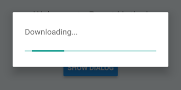
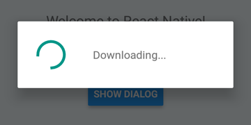
 DialogAndroid . showProgress ( 'Downloading...' , {
    style : DialogAndroid . progressHorizontal // omit this to get circular
} ) ;
setTimeout ( DialogAndroid . dismiss , 5000 ) ; 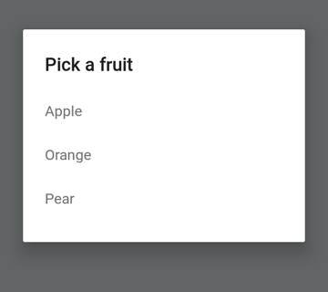
 const { selectedItem } = await DialogAndroid . showPicker ( 'Pick a fruit' , null , {
    items : [
        { label : 'Apple' , id : 'apple' } ,
        { label : 'Orange' , id : 'orange' } ,
        { label : 'Pear' , id : 'pear' }
    ]
} ) ;
if ( selectedItem ) {
    // when negative button is clicked, selectedItem is not present, so it doesn't get here
    console . log ( 'You selected item:' , selectedItem ) ;
} 
ラジオボタンアイテムを押すと、自動ジズムの動作のためにnullにpositiveTextを設定します。
 const { selectedItem } = await DialogAndroid . showPicker ( 'Pick a fruit' , null , {
    // positiveText: null, // if positiveText is null, then on select of item, it dismisses dialog
    negativeText : 'Cancel' ,
    type : DialogAndroid . listRadio ,
    selectedId : 'apple' ,
    items : [
        { label : 'Apple' , id : 'apple' } ,
        { label : 'Orange' , id : 'orange' } ,
        { label : 'Pear' , id : 'pear' }
    ]
} ) ;
if ( selectedItem ) {
    // when negative button is clicked, selectedItem is not present, so it doesn't get here
    console . log ( 'You picked:' , selectedItem ) ;
} 
ここでは、文字列を渡してpositiveTextに渡します。これにより、ラジオアイテムの選択時にAuto-dismissが防止されます。
 const { selectedItem } = await DialogAndroid . showPicker ( 'Pick a fruit' , null , {
    positiveText : 'OK' , // this is what makes disables auto dismiss
    negativeText : 'Cancel' ,
    type : DialogAndroid . listRadio ,
    selectedId : 'apple' ,
    items : [
        { label : 'Apple' , id : 'apple' } ,
        { label : 'Orange' , id : 'orange' } ,
        { label : 'Pear' , id : 'pear' }
    ]
} ) ;
if ( selectedItem ) {
    // when negative button is clicked, selectedItem is not present, so it doesn't get here
    console . log ( 'You picked:' , selectedItem ) ;
} 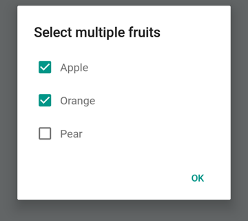
 const { selectedItems } = await DialogAndroid . showPicker ( 'Select multiple fruits' , null , {
    type : DialogAndroid . listCheckbox ,
    selectedIds : [ 'apple' , 'orange' ] ,
    items : [
        { label : 'Apple' , id : 'apple' } ,
        { label : 'Orange' , id : 'orange' } ,
        { label : 'Pear' , id : 'pear' }
    ]
} ) ;
if ( selectedItems ) {
    if ( ! selectedItems . length ) {
        console . log ( 'You selected no items.' ) ;
    } else {
        console . log ( 'You selected items:' , selectedItems ) ;
    }
} 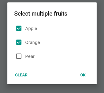
ニュートラルボタンを特別なボタンにすることができます。それを押すと、リストがクリアされ、ダイアログが閉じられます。この動作が必要な場合は、 neutralIsClear trueに設定し、 neutralText文字列に設定します。これらの両方のプロパティを設定する必要があります。
 const { selectedItems } = await DialogAndroid . showPicker ( 'Select multiple fruits' , null , {
    type : DialogAndroid . listCheckbox ,
    selectedIds : [ 'apple' , 'orange' ] ,
    neutralIsClear : true , /////// added this
    neutralText : 'Clear' , /////// added this
    items : [
        { label : 'Apple' , id : 'apple' } ,
        { label : 'Orange' , id : 'orange' } ,
        { label : 'Pear' , id : 'pear' }
    ]
} ) ;
if ( selectedItems ) {
    if ( ! selectedItems . length ) {
        console . log ( 'You selected no items.' ) ;
    } else {
        console . log ( 'You selected items:' , selectedItems ) ;
    }
} 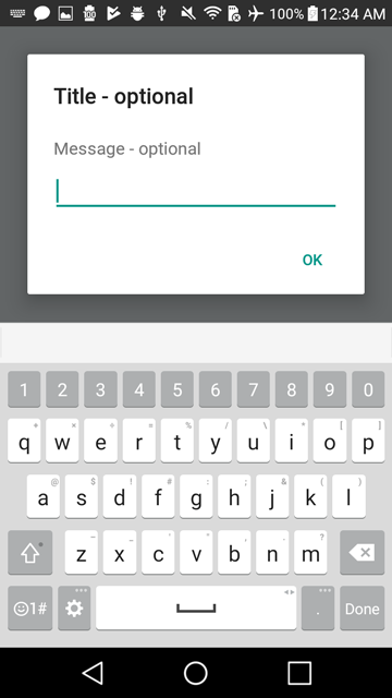
 const { action , text } = await DialogAndroid . prompt ( 'Title - optional' , 'Message - optional' ) ;
if ( action === DialogAndroid . actionPositive ) {
    console . log ( `You submitted: " ${ text } "` ) ;
} 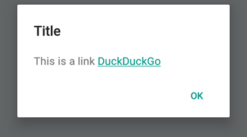
 DialogAndroid . alert ( 'Title' , `This is a link <a href="https://www.duckduckgo.com/">DuckDuckGo</a>` , {
    contentIsHtml : true
} ) ; デフォルトを設定できるように、毎回変更する必要がないようにすることができます。
 DialogAndroid . assignDefaults ( {
    title : 'Default Title' ,
    positiveText : null ,
    contentColor : 'rgba(0, 0, 0, 0.2)' ,
    widgetColor : 'blue'
} )
contentColor 、 widgetColor 、またはtitleにundefined省略または合格すると、ここで割り当てたデフォルトが使用されます。
DialogAndroid . alert ( undefined , 'message here' )これにより、[デフォルトタイトル]が表示され、正のボタンが表示されず、メッセージの色は20%ブラックになります。 Dialog.showProgressを行った場合、進行状況インジケーターは青色になります。等
これらの素晴らしい人々に感謝します(絵文字キー):
Vojtech Novak ? ? | noitidart ? | アリソン・カルヴァリョ | アンソニー・オウ | アシュリー・ホワイト | 蜂 | ブリアーソ |
|---|---|---|---|---|---|---|
バイロン・ワン | Farzad Abdolhosseini | ジェフリー・ゴー ? | GustavoFãoValvassori ? | ヘンリック | heydabop | Huang Yu |
イラクネ | Janic Duplessis | ジェフキエンツビネット | ジェレミー・ダゴーン | ジャクン | マティアス・ファイファー | ピュアデイ |
Radek Czemerys | リカルド・フルマン | ロス | Vinicius Zaramella |
このプロジェクトは、全委員会の仕様に従います。あらゆる種類の貢献を歓迎します!


