react native dialogs
v1.1.2
재료 설계 대화 상자를위한 안드로이드 전용 모듈. 이것은 Afollestad/Material-Dialogs의 래퍼입니다. 이 모듈은 iOS를 지원할 계획이없는 Android 용으로 만 설계되었습니다.
defaultsactionDismissactionNegativeactionNeutralactionPositivelistPlainlistRadiolistCheckboxprogressHorizontalalertassignDefaultsdismisspromptshowPickershowProgresstype ActionTypetype ListItemtype ListTypetype OptionsAlerttype OptionsCommontype OptionsProgresstype OptionsPickertype OptionsPrompttype ProgressStyle설치하다:
npm install react-native-dialogs --saveyarn add react-native-dialogs링크:
react-native link react-native-dialogs react-native run-android 사용하여 응용 프로그램을 컴파일하십시오
자동 링크 ( react-native link )가 실패한 경우 다음 단계를 따르십시오.
android/app/build.gradle 에서 앱 빌드에 종속성을 추가하십시오.
 dependencies {
    ...
    compile project(':react-native-dialogs') // Add this
}
android/build.gradle 에서는 이미 존재해야하지만 그렇지 않은 경우 Jitpack Maven 저장소를 추가하여 라이브러리 Afollestad/Material-Dialogs를 다운로드하십시오.
 allprojects {
    repositories {
        ...
        jcenter() // Add this if it is not already here
        ...
    }
}
android/settings.gradle :
 rootProject.name = ...
...
include ':react-native-dialogs' // Add this
project(':react-native-dialogs').projectDir = new File(rootProject.projectDir, '../node_modules/react-native-dialogs/android') // Add this

...
include ':app'
android/app/src/main/.../MainApplication.java 에서 패키지 가져 오기 및 추가 :
...
import android . app . Application ;
...

import com . aakashns . reactnativedialogs . ReactNativeDialogsPackage ; // Add new import

...

public class MainApplication extends Application implements ReactApplication {
  ...
  @ Override
  protected List < ReactPackage > getPackages () {
    return Arrays .< ReactPackage > asList (
      new MainReactPackage (),
      ...
      new ReactNativeDialogsPackage () // Add the package here
    );
  }
}JS에서 가져 오기 :
import DialogAndroid from 'react-native-dialogs' ;호출 API :
 class Blah extends Component {
    render ( ) {
        return < Button title = "Show DialogAndroid" onPress = { this . showDialogAndroid } />
    }

    showDialogAndroid = async ( ) => {
        const { action } = await DialogAndroid . alert ( 'Title' , 'Message' ) ;
        switch ( action ) {
            case DialogAndroid . actionPositive :
                console . log ( 'positive!' )
                break ;
            case DialogAndroid . actionNegative :
                console . log ( 'negative!' )
                break ;
            case DialogAndroid . actionNeutral :
                console . log ( 'neutral!' )
                break ;
            case DialogAndroid . actionDismiss :
                console . log ( 'dismissed!' )
                break ;
        }
    }
}defaults{POSITIVETEXT : 'OK'}
모든 방법에서 사용할 기본 옵션. 이를 수정하려면 DialogAndroid.defaults = { ... } 로 직접 조작하거나 assignDefaults 사용하십시오.
actionDismiss정적 ActionDismiss = "ActionDismiss"
actionNegative정적 ActionNegative = "ActionNegative"
actionNeutral정적 actureceetral = "ActionEtral"
actionPositive정적 actionpositive = "actionpositive"
listPlainstatic listplain = "listplain"
listRadio정적 Listradio = "Listradio"
listCheckboxstatic listcheckbox = "listcheckbox"
progressHorizontal정적 ProgressHorizOntal = "ProgressHorizontal"
alertstatic alert( title: Title, content: Content, options: OptionsAlert ): Promise< {| action: "actionDismiss" | "actionNegative" | "actionNeutral" | "actionPositive" |} | {| action: "actionDismiss" | "actionNegative" | "actionNeutral" | "actionPositive", checked: boolean |} >
대화 상자를 보여줍니다.
| 매개 변수 | 유형 | 기본 | 필수의 | 설명 |
|---|---|---|---|---|
| 제목 | string, null, void | 대화 제목 | ||
| 콘텐츠 | string, null, void | 대화의 메시지 | ||
| 옵션 | OptionsAlert | OptionsAlert 참조하십시오 |
assignDefaultsstatic assignDefaults({ [string]: value ): void
예를 들어 기본 색상을 설정하므로 모든 메소드 호출에서 제공 할 필요가 없습니다.
{POSITIVETEXT : 'OK'}
dismissstatic dismiss(): void
현재 보여주는 대화 상자를 숨 깁니다.
promptstatic prompt( title?: null | string, content?: null | string, options: OptionsPrompt ): Promise< {| action: "actionNegative" | "actionNeutral" | "actionDismiss" |} | {| action: "actionNegative" | "actionNeutral", checked: boolean |} | {| action: "actionPositive", text: string |} | {| action: "actionPositive", text: string, checked: boolean |} >
텍스트 입력 필드가있는 대화 상자가 표시됩니다.
| 매개 변수 | 유형 | 기본 | 필수의 | 설명 |
|---|---|---|---|---|
| 제목 | string, null, void | 대화 제목 | ||
| 콘텐츠 | string, null, void | 대화의 메시지 | ||
| 옵션 | OptionsPrompt | OptionsPrompt 참조하십시오 |
showPickerstatic showPicker( title?: null | string, content?: null | string, options: OptionsPicker ): Promise< {| action: "actionNegative" | "actionNeutral" | "actionDismiss" |} | {| action: "actionNegative" | "actionNeutral" | "actionDismiss", checked: boolean |} | {| action: "actionSelect", selectedItem: ListItem |} | {| action: "actionSelect", selectedItem: ListItem, checked: boolean |} | {| action: "actionSelect", selectedItems: ListItem[] |} | {| action: "actionSelect", selectedItems: ListItem[], checked: boolean |} >
정기적 인 경고와 선택할 수있는 항목도 표시됩니다.
| 매개 변수 | 유형 | 기본 | 필수의 | 설명 |
|---|---|---|---|---|
| 제목 | string, null, void | 대화 제목 | ||
| 콘텐츠 | string, null, void | 대화의 메시지 | ||
| 옵션 | OptionsPicker | OptionsPrompt 참조하십시오 |
showProgressstatic showProgress( content?: null | string, options: OptionsProgress ): Promise<{| action:"actionDismiss" |}>
진행 대화 상자를 보여줍니다. 기본적으로 버튼이 표시되지 않으며 하드웨어 뒤로 버튼이 닫히지 않습니다. DialogAndroid.dismiss() 로 닫아야합니다.
| 매개 변수 | 유형 | 기본 | 필수의 | 설명 |
|---|---|---|---|---|
| 콘텐츠 | string, null, void | 대화의 메시지 | ||
| 옵션 | OptionsProgress | OptionsPrompt 참조하십시오 |
흐름은 타이핑 시스템으로 사용됩니다.
type ActionType"actionDismiss" | "actionNegative" | "actionNeutral" | "actionPositive" | "actionSelect"
type ListItem{ label:string } | { label:string, id:any } | {}
메모
label 키가 존재하지 않는 경우 OptionsPicker 의 labelKey 속성이있는 레이블 키로 사용할 키로 사용할 키를 지정하십시오.selectedId / selectedIds 사용해야하는 경우에만 id 필요합니다.id 키가 존재하지 않는 경우 OptionsPicker 의 idKey 속성이있는 ID로 사용해야 할 키를 지정하십시오. type ListType"listCheckbox" | "listPlain" | "listRadio"
type OptionsAlert{ ...OptionsCommon }
| 열쇠 | 유형 | 기본 | 필수의 | 설명 |
|---|---|---|---|---|
| ... 옵션 공동체 | OptionsCommon | OptionsCommon 참조하십시오 |
type OptionsCommon{ cancelable?: boolean, checkboxDefaultValue?: boolean checkboxLabel?: string, content?: string, contentColor?: string, contentIsHtml?: boolean, forceStacking?: boolean, linkColor?: ColorValue, negativeColor?: ColorValue, negativeText?: string, neutralColor?: ColorValue, neutralText?: string, positiveColor?: ColorValue, positiveText?: string, // default "OK" backgroundColor?: ColorValue, title?: string, titleColor?: ColorValue, }
| 열쇠 | 유형 | 기본 | 필수의 | 설명 |
|---|---|---|---|---|
| 취소 가능 | boolean | 대화 상자 영역 또는 하드웨어 뒤로 버튼 외부를 탭하면 대화 상자가 무시해야합니다. | ||
| CheckBoxDefaultValue입니다 | boolean | false | 확인란의 초기 상태. checkboxLabel 설정되지 않은 경우 아무것도하지 않습니다. | |
| CheckBoxLabel | string | 설정된 경우이 레이블의 대화 상자 하단에 확인란이 표시됩니다. | ||
| 콘텐츠 | string | 대화 메시지 | ||
| ContentColor | ColorValue | 대화 상자 메시지의 색상 | ||
| contentishtml | boolean | 대화 상자 메시지를 HTML로 구문 분석 해야하는 경우. (지원되는 태그에는 다음이 포함됩니다 : <a> , <img> 등) | ||
| Forcestacking | boolean | 한 줄에 너무 넓어지는 여러 액션 버튼이있는 경우 대화 상자가 버튼을 수직 방향으로 쌓아 둡니다. | ||
| LinkColor | ColorValue | contentIsHtml 이 true이고 content 에 <a> 태그가 포함되어 있으면이 색상으로 채색됩니다. | ||
| 부정적인 색 | ColorValue | |||
| NegativeText | string | 허위, 버튼이 표시되지 않습니다. | ||
| 중성 콜러 | ColorValue | |||
| 중성 텍스트 | string | 이 문자열로 왼쪽에있는 버튼을 레이블로 표시합니다. 허위, 버튼이 표시되지 않습니다. | ||
| 양성 검색 | ColorValue | |||
| POITIVETEXT | string | 허위, 버튼이 표시되지 않습니다. | ||
| 배경 검색 | ColorValue | |||
| 제목 | string | 대화 제목 | ||
| titlecolor | ColorValue | 제목의 색상 |
type OptionsProgress{ contentColor: $PropertyType<OptionsCommon, 'contentColor'>, contentIsHtml: $PropertyType<OptionsCommon, 'contentIsHtml'>, linkColor: $PropertyType<OptionsCommon, 'linkColor'>, style?: ProgressStyle, title: $PropertyType<OptionsCommon, 'title'>, titleColor: $PropertyType<OptionsCommon, 'titleColor'>', widgetColor: $PropertyType<OptionsCommon, 'widgetColor'> }
| 열쇠 | 유형 | 기본 | 필수의 | 설명 |
|---|---|---|---|---|
| ContentColor | OptionsCommon#contentColor | OptionsCommon#contentColor 참조하십시오 | ||
| contentishtml | OptionsCommon#contentIsHtml | OptionsCommon#contentIsHtml 참조하십시오 | ||
| LinkColor | OptionsCommon#linkColor | OptionsCommon#linkColor 참조하십시오 | ||
| 스타일 | ProgressStyle | ProgressStyle 참조하십시오 | ||
| 제목 | OptionsCommon#title | OptionsCommon#title 참조하십시오 | ||
| titlecolor | OptionsCommon#titleColor | OptionsCommon#titleColor 참조하십시오 | ||
| 위젯 콜러 | ColorValue | 진행 지표의 색상 |
type OptionsPicker{| ... OptionsCommon, Type? : typeof listType.listPlain, maxNumberOfitems? : 숫자, 항목 : ListItemJustLabel [], |} | {| ... OptionsCommon, Type? : typeof listType.listPlain, maxNumberOfitems? : 숫자, 항목 : ListItemBare [], labelKey : String |} | {| // 라디오 - 미리 선택되지 않은 ... 옵션 교통, 유형 : typeof listtype.listradio, 위젯 콜러? : ColorValue // 라디오 색상 항목 : listitemjustlabel [], |} | {| // 라디오 - 미리 선택되지 않은 ... 옵션 교통, 유형 : typeof listtype.listradio, 위젯 콜러? : colorValue // 라디오 색상 항목 : ListItemBare [], labelKey : String |} | {| // Radio- 사전 선택 - ListItemfull ... OptionsCommon, 유형 : typeof listType.listradio, WidgetColor? : ColorValue // 라디오 색상 항목 : ListItemFull [], selectedId : Any |} | {| // 라디오 - 사전 선택 - ListItemJustLabel ... OptionsCommon, type : typeof listtype.listradio, WidgetColor? : colorValue // 라디오 색상 항목 : ListItemJustLabel [], idkey : string, selectedId : any |} | {| // 라디오 - 사전 선택 - ListItemJustId ... 옵션 교통, 유형 : typeof listType.listradio, WidgetColor? : colorValue // 라디오 색상 항목 : listItemJustid [], labelKey : string, selectedID : Any |} | {| // Radio- 사전 선택 - ListItemBare ... OptionsCommon, 유형 : typeof listType.listradio, WidgetColor? : ColorValue // 라디오 색상 항목 : ListItemBare [], Idkey : String, LabelKey : String, SelectedID : Any |} | {| // CheckList- 사전 선택 없음 -SLESTITEMJUSTLABEL ... OPSTRECOMMON, 유형 : typeof listType.listCheckbox, NeutralisClear? : boolean, WidgetColor? : ColorValue, // CheckBox Color 항목 : ListItemJustLabel [] |} | {| // CheckList -Preselected -ListItemBare ... OptionsCommon, 유형 : typeof listType.listCheckbox, NeutriciClear? : Boolean, WidgetColor? : ColorValue, // CheckBox Color 항목 : ListItemBare [], labelKey : String |} | {| // CheckList -Preselected -ListItemfull ... OptionsCommon, 유형 : typeof listType.listCheckBox, NeutriciSclear? : Boolean, WidgetColor? : ColorValue, // CheckBox Color 항목 : ListItemFull [], selectedIds : Any [] |} | {| // CheckList -Preselected -ListitemJustLabel ... OptionsCommon, type : type : listType.listCheckbox, NeutralISClear? : boolean, widgetColor? : colorValue, // checkbox color 항목 : listitemjustlabel [], idkey : string, selectedIds : Any |} | {| // CheckList -Preselected -ListItemJustid ... OptionsCommon, 유형 : typeof listType.listCheckbox, NeutralISClear? : boolean, WidgetColor? : ColorValue, // CheckBox Color 항목 : ListItemJustid [], labelKey : String, SelectedIds : Any |} | {| // CheckList -Preselected -ListItemBare ... OptionsCommon, 유형 : typeof listType.listCheckbox, NeutriciSclear? : Boolean, WidgetColor? : ColorValue, // CheckBox Color 항목 : ListItemBare [], idkey : String, LabelKey : String, SelectedIds : Any |}.
| 열쇠 | 유형 | 기본 | 필수의 | 설명 |
|---|---|---|---|---|
| OptionsCommon | OptionsCommon | OptionsCommon 참조하십시오 | ||
| Idkey | string | "ID" | ||
| 항목 | ListItem [] | 예 | ListItem 참조하십시오 | |
| 라벨키 | string | "상표" | ||
| maxnumberofitems | number | 목록에 가시 항목의 최대 금액을 설정하려면 | ||
| 중립적 인 클레어 | boolean | 중립 버튼을 누르면 대화 상자가 닫히고 selectedItems 빈 배열이됩니다. neutralText 도 제공되는 경우에만 작동합니다. | ||
| selectedId | any | 각각의 라디오는 대화 상자 쇼에서 선택됩니다. 그러한 ID가 발견되지 않으면 아무것도 선택되지 않습니다. type 이 DialogAndroid.listRadio 인 경우에만 해당됩니다. 해당 items[] idKey 가 설명한 키를 포함해야합니다. | ||
| selectedIds | any[] | 대화 상자는 대화 상자 쇼에서 선택됩니다. 그러한 ID가 발견되지 않으면 해당 ID에 대해 아무것도 선택되지 않습니다. type 이 DialogAndroid.listCheckbox 인 경우에만 해당됩니다. 해당 items[] idKey 가 설명한 키를 포함해야합니다. | ||
| 유형 | ListType | DialogAndroid.listPlain | ListType 참조하십시오 | |
| 위젯 콜러 | ColorValue | 라디오 또는 확인란의 색상 |
type OptionsPrompt{ ...OptionsCommon, keyboardType?: | 'numeric' | 'number-pad' | 'numeric-password' | 'decimal-pad' | 'email-address' | 'password' | 'phone-pad' | 'url', defaultValue?: string, placeholder?: string, allowEmptyInput?: boolean, minLength?: number, maxLength?: number, widgetColor?: ColorValue }
| 열쇠 | 유형 | 기본 | 필수의 | 설명 |
|---|---|---|---|---|
| OptionsCommon | OptionsCommon | OptionsCommon 참조하십시오 | ||
| 위젯 콜러 | ColorValue | 필드 밑줄과 커서의 색 |
type ProgressStyle"progressHorizontal"
checkboxLabel 로 다시 작성하는 예를 보려면이 pr -github :: aakashns/reft -native -dialogs - #86을 참조하십시오.
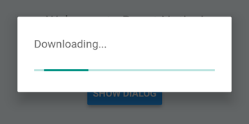
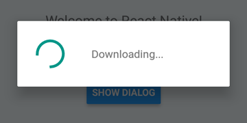
 DialogAndroid . showProgress ( 'Downloading...' , {
    style : DialogAndroid . progressHorizontal // omit this to get circular
} ) ;
setTimeout ( DialogAndroid . dismiss , 5000 ) ; 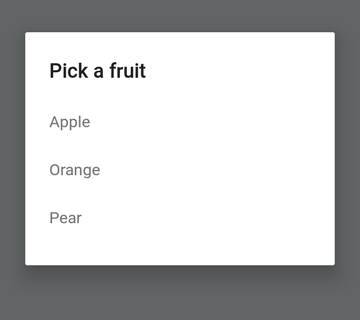
 const { selectedItem } = await DialogAndroid . showPicker ( 'Pick a fruit' , null , {
    items : [
        { label : 'Apple' , id : 'apple' } ,
        { label : 'Orange' , id : 'orange' } ,
        { label : 'Pear' , id : 'pear' }
    ]
} ) ;
if ( selectedItem ) {
    // when negative button is clicked, selectedItem is not present, so it doesn't get here
    console . log ( 'You selected item:' , selectedItem ) ;
} 
라디오 버튼 항목을 누르는 경우 자동 디스 미스 동작을 위해 널로 positiveText null 로 설정하십시오.
 const { selectedItem } = await DialogAndroid . showPicker ( 'Pick a fruit' , null , {
    // positiveText: null, // if positiveText is null, then on select of item, it dismisses dialog
    negativeText : 'Cancel' ,
    type : DialogAndroid . listRadio ,
    selectedId : 'apple' ,
    items : [
        { label : 'Apple' , id : 'apple' } ,
        { label : 'Orange' , id : 'orange' } ,
        { label : 'Pear' , id : 'pear' }
    ]
} ) ;
if ( selectedItem ) {
    // when negative button is clicked, selectedItem is not present, so it doesn't get here
    console . log ( 'You picked:' , selectedItem ) ;
} 
여기서 우리는 문자열을 positiveText 로 전달합니다. 이것은 무선 항목을 선택할 때 자동 디스 미스를 방지합니다.
 const { selectedItem } = await DialogAndroid . showPicker ( 'Pick a fruit' , null , {
    positiveText : 'OK' , // this is what makes disables auto dismiss
    negativeText : 'Cancel' ,
    type : DialogAndroid . listRadio ,
    selectedId : 'apple' ,
    items : [
        { label : 'Apple' , id : 'apple' } ,
        { label : 'Orange' , id : 'orange' } ,
        { label : 'Pear' , id : 'pear' }
    ]
} ) ;
if ( selectedItem ) {
    // when negative button is clicked, selectedItem is not present, so it doesn't get here
    console . log ( 'You picked:' , selectedItem ) ;
} 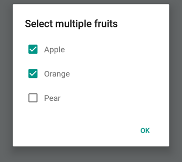
 const { selectedItems } = await DialogAndroid . showPicker ( 'Select multiple fruits' , null , {
    type : DialogAndroid . listCheckbox ,
    selectedIds : [ 'apple' , 'orange' ] ,
    items : [
        { label : 'Apple' , id : 'apple' } ,
        { label : 'Orange' , id : 'orange' } ,
        { label : 'Pear' , id : 'pear' }
    ]
} ) ;
if ( selectedItems ) {
    if ( ! selectedItems . length ) {
        console . log ( 'You selected no items.' ) ;
    } else {
        console . log ( 'You selected items:' , selectedItems ) ;
    }
} 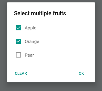
중립 버튼을 특별한 버튼으로 만들 수 있습니다. 그것을 누르면 목록이 지워지고 대화 상자를 닫습니다. 이 동작을 원한다면 neutralIsClear true 로 설정하고 문자열로 neutralText 설정하십시오. 이 두 속성을 모두 설정해야합니다.
 const { selectedItems } = await DialogAndroid . showPicker ( 'Select multiple fruits' , null , {
    type : DialogAndroid . listCheckbox ,
    selectedIds : [ 'apple' , 'orange' ] ,
    neutralIsClear : true , /////// added this
    neutralText : 'Clear' , /////// added this
    items : [
        { label : 'Apple' , id : 'apple' } ,
        { label : 'Orange' , id : 'orange' } ,
        { label : 'Pear' , id : 'pear' }
    ]
} ) ;
if ( selectedItems ) {
    if ( ! selectedItems . length ) {
        console . log ( 'You selected no items.' ) ;
    } else {
        console . log ( 'You selected items:' , selectedItems ) ;
    }
} 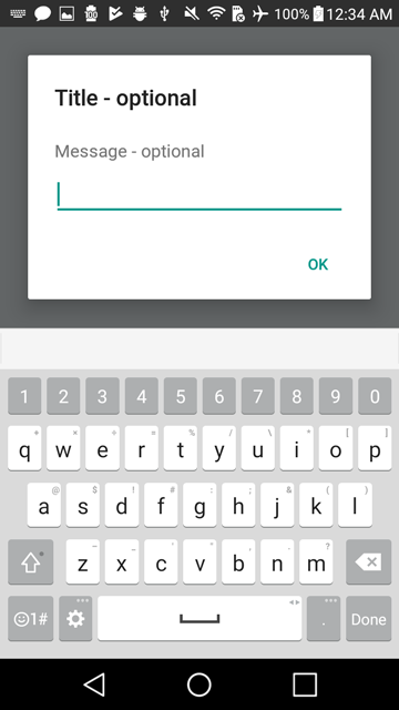
 const { action , text } = await DialogAndroid . prompt ( 'Title - optional' , 'Message - optional' ) ;
if ( action === DialogAndroid . actionPositive ) {
    console . log ( `You submitted: " ${ text } "` ) ;
} 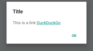
 DialogAndroid . alert ( 'Title' , `This is a link <a href="https://www.duckduckgo.com/">DuckDuckGo</a>` , {
    contentIsHtml : true
} ) ; 기본값을 설정하여 매번 변경할 필요가 없습니다.
 DialogAndroid . assignDefaults ( {
    title : 'Default Title' ,
    positiveText : null ,
    contentColor : 'rgba(0, 0, 0, 0.2)' ,
    widgetColor : 'blue'
} )
이제 undefined contentColor , widgetColor 또는 title 에 정의되지 않은 것을 생략하거나 전달할 때마다 여기에 할당 한 기본값을 사용합니다.
DialogAndroid . alert ( undefined , 'message here' ) 여기에는 긍정적 인 버튼이없는 제목 "기본 제목"이 표시되며 메시지 색상은 20% 검은 색입니다. Dialog.showProgress 한 경우 ShowProgress는 진행 표시기가 파란색입니다. 등.
이 멋진 사람들에게 감사합니다 (이모티콘 키) :
Vojtech Novak ? ? | noitidart ? | Alisson Carvalho | Anthony OU | 애슐리 화이트 | 벌 | Brianso |
|---|---|---|---|---|---|---|
바이런 왕 | Farzad Abdolhosseini | Geoffrey Goh ? | Gustavo Fão Valvassori ? | 헨릭 | Heydabop | 황유 |
Iragne | Janic Duplessis | Jeffchienzabinet | 제레미 다고른 | Jykun | Mattias Pfeiffer | PUREDAY |
Radek Czemerys | Ricardo Fuhrmann | 로스 | Vinicius Zaramella |
이 프로젝트는 All-Contritors 사양을 따릅니다. 모든 종류의 공헌을 환영합니다!


