timeline_list
1.0.0
一个高度可定制的绘制小部件,用于显示具有自定义标记,图标和灵活定位选项的垂直时间表。
警告
?该文档是使用LLMS创建的。如果您注意到任何错误或错别字,请提交拉动请求或创建问题。
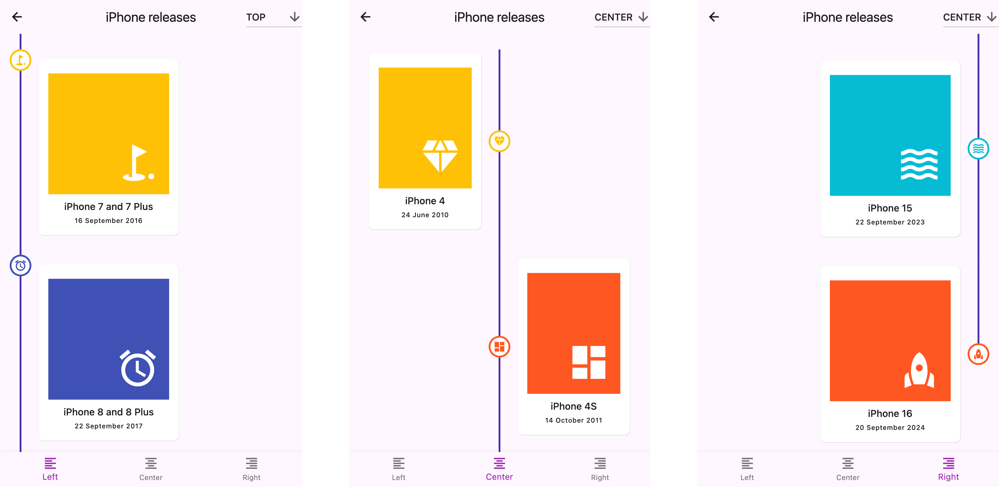
start (左), center或end (右)top , center或标记bottom将其添加到包装的pubspec.yaml文件中:
 dependencies :
timeline_list : ^0.1.0 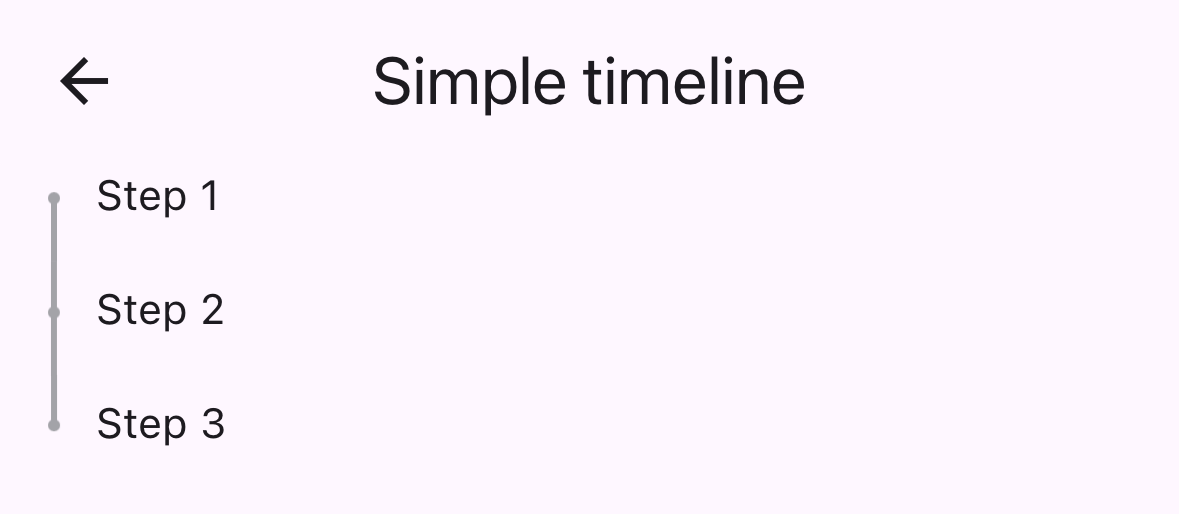
 import 'package:timeline_list/timeline_list.dart' ;

Timeline (
  children : [
    Marker (child : Text ( "Step 1" )),
    Marker (child : Text ( "Step 2" )),
    Marker (child : Text ( "Step 3" ))
  ],
)这是一个更高级的示例,显示具有自定义图标的入职时间轴:
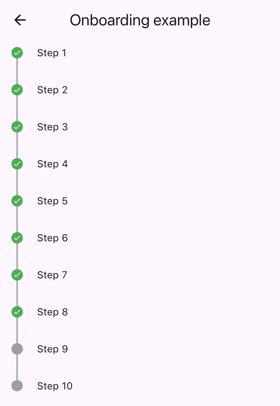
 var checkIcon = Container (
    width : 16 ,
    height : 16 ,
    decoration : BoxDecoration (shape : BoxShape .circle, color : Colors .green),
    child : Icon ( Icons .check, color : Colors .white, size : 12 ));
var emptyIcon = Container (
    width : 16 ,
    height : 16 ,
    decoration : BoxDecoration (shape : BoxShape .circle, color : Colors .grey));
return Scaffold (
    appBar : AppBar (title : const Text ( "Onboarding example" )),
    body : Column (children : [
      Timeline . builder (
        context : context,
        markerCount : 10 ,
        properties : TimelineProperties (
            iconAlignment : MarkerIconAlignment .center,
            iconSize : 16 ,
            timelinePosition : TimelinePosition .start),
        markerBuilder : (context, index) => Marker (
          child : Padding (
            padding : const EdgeInsets . all ( 8.0 ),
            child : Text ( "Step ${ index + 1 }" ),
          ),
          icon : index >= 8 ? emptyIcon : checkIcon,
          position : MarkerPosition .left,
        ),
      ),
]));timelinePosition :控制整个时间轴位置( start , center , end )iconAlignment :将图标对准相对于标记内容iconSize :定义标记图标的大小lineWidth :设置连接线的宽度lineColor :自定义连接线的颜色itemGap :控制标记之间的间距iconGap :设置图标和标记内容之间的差距child :标记的主要内容小部件icon :可选的自定义图标小部件position :集中时间表的标记位置( left , right )onTap :标记点击事件的可选回调maxWidth :标记内容的最大宽度约束查看example/文件夹以获取完整的示例应用程序,包括:
此存储库正在寻找维护者。欢迎捐款!请随时提交拉动请求。
谢谢您的所有贡献者!
赞助人:


