xu_ui
1.0.0
xui是筆者開發的基於react的輕量級組件庫,目前不依賴任何第三方ui組件庫,支持按需導入,可定制。官網地址website: xui——基於react的輕量級UI組件庫
如果覺得官網地址訪問太慢,可以直接移步github地址:xui——基於react的輕量級UI組件庫
目前已開發完成如下ui組件:
正在開發的組件:
後續會開發出更多優質輕量組件,敬請關注。
該組件庫基於一下技術版本開發:
npm install @ alex_xu / xui或者用yarn安裝
yarn add @ alex_xu / xui import {
Button ,
Skeleton ,
Empty ,
Progress ,
Tag ,
Switch ,
Drawer ,
Badge ,
Alert
} from '@alex_xu/xui'
import { useState } from 'react'
import styles from './index.css'
export default function ( ) {
const [ visible , setVisible ] = useState ( false )
let show = ( ) => { setVisible ( true ) }
let close = ( ) => { setVisible ( false ) }
return (
< div className = { styles . normal } >
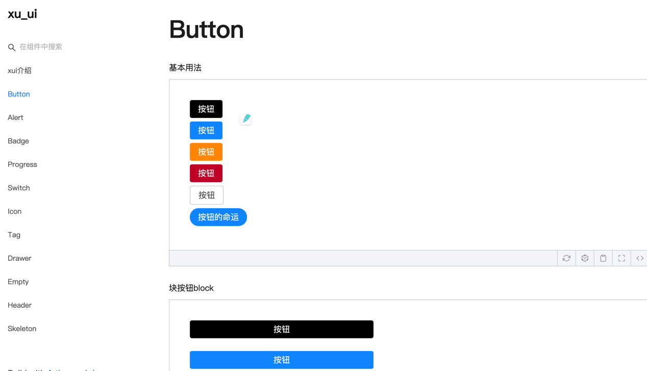
< Button className = { styles . btn } > default </ Button >
< Button className = { styles . btn } type = "warning" > warning </ Button >
< Button className = { styles . btn } type = "primary" > primary </ Button >
< Button className = { styles . btn } type = "info" > info </ Button >
< Button className = { styles . btn } type = "pure" > pure </ Button >
< Button className = { styles . btn } type = "primary" shape = "circle" > circle </ Button >
< Button className = { styles . mb16 } type = "primary" block > primary & block </ Button >
< Button type = "warning" shape = "circle" block onClick = { show } > circle & block </ Button >
{ /* <Skeleton /> */ }
< Progress
percent = { 10 }
/>
< Progress
percent = { 50 }
themeColor = "#009933"
/>
< Progress
percent = { 50 }
width = { 240 }
/>
< Progress
percent = { 30 }
width = { 240 }
textColor = "#fff"
/>
< Progress
percent = { 50 }
width = { 200 }
themeColor = "#FF6666"
hiddenText
/>
< Progress
percent = { 10 }
themeColor = "#6699FF"
statusScope = { [ [ 18 , 'red' ] , [ 40 , 'orange' ] ] }
/>
< Progress
percent = { 20 }
themeColor = "#6699FF"
statusScope = { [ [ 18 , 'red' ] , [ 40 , 'orange' ] ] }
/>
< div className = { styles . mb16 } > </ div >
< Tag > Html </ Tag >
< Tag closable > react </ Tag >
< Tag color = "#FF99CC" > Css3 </ Tag >
< Tag color = "#06c" closable > react </ Tag >
< Tag color = "rgb(135, 208, 104)" > Node </ Tag >
< div className = { styles . mb16 } > </ div >
< Switch onText = "on" offText = "off" size = "small" />
< Badge text = "ddd" status = "warning" > 6666ngd </ Badge >
< div className = { styles . mb16 } > </ div >
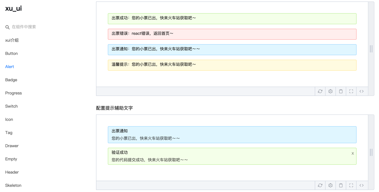
< Alert message = "success tip" />
< Alert message = "success tip" type = "success" />
< Alert message = "success tip" type = "error" />
< Alert message = "success tip" type = "info" />
< Alert message = "success tip" type = "info" closable />
< Alert message = "success tip" description = "skfjdsalajdfjadkfjaldfhjaskdn你好,欢迎光临" closable type = "success" />
< Empty />
< Drawer visible = { visible } onClose = { close } destroyOnClose >
< h3 >我是标题</ h3 >
< br />
< input type = "text" />
< br />
< textarea />
</ Drawer >
</ div >
)
}正在搭建中,具體使用方式可參考:
微信(wechat):qunqiujinkou
歡迎提出更多issue以便讓組件庫更健壯


