xu_ui
1.0.0
Xui는 저자가 개발 한 반응을 기반으로 한 경량 구성 요소 라이브러리입니다. 현재 타사 UI 구성 요소 라이브러리에 의존하지 않습니다. 주문형 가져 오기를 지원하며 사용자 정의 할 수 있습니다. 공식 웹 사이트 주소 웹 사이트 : XUI—— 반응 기반 경량 UI 구성 요소 라이브러리
공식 웹 사이트 주소에 대한 액세스가 너무 느리다고 생각되면 GitHub 주소로 직접 이동할 수 있습니다. XUI- REACT를 기반으로 한 가벼운 UI 구성 요소 라이브러리
다음 UI 구성 요소가 개발되었습니다.
개발중인 구성 요소 :
향후 고품질 및 경량 구성 요소가 개발 될 것이므로 계속 지켜봐 주시기 바랍니다.
이 구성 요소 라이브러리는 다음 기술 버전을 기반으로 개발되었습니다.
npm install @ alex_xu / xui또는 원사로 설치하십시오
yarn add @ alex_xu / xui import {
Button ,
Skeleton ,
Empty ,
Progress ,
Tag ,
Switch ,
Drawer ,
Badge ,
Alert
} from '@alex_xu/xui'
import { useState } from 'react'
import styles from './index.css'
export default function ( ) {
const [ visible , setVisible ] = useState ( false )
let show = ( ) => { setVisible ( true ) }
let close = ( ) => { setVisible ( false ) }
return (
< div className = { styles . normal } >
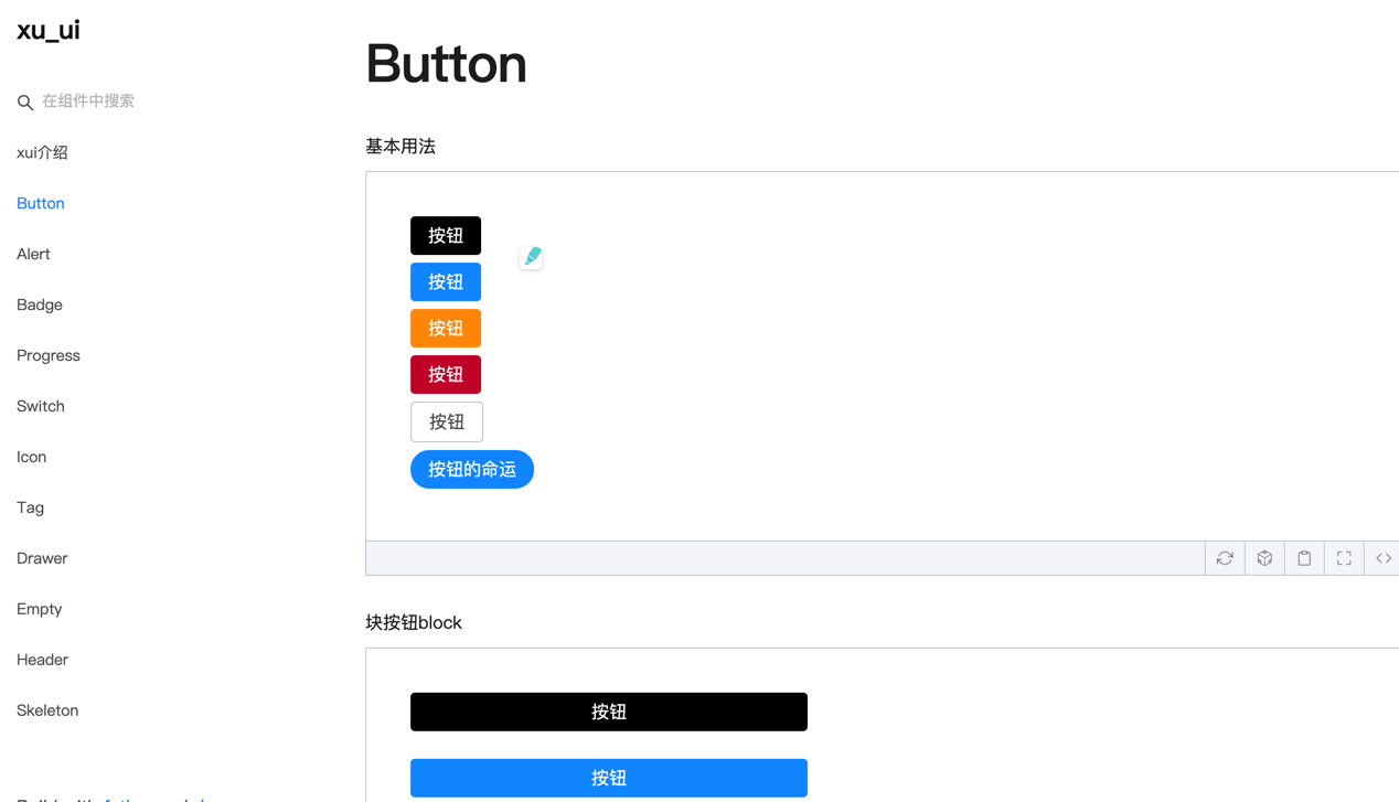
< Button className = { styles . btn } > default </ Button >
< Button className = { styles . btn } type = "warning" > warning </ Button >
< Button className = { styles . btn } type = "primary" > primary </ Button >
< Button className = { styles . btn } type = "info" > info </ Button >
< Button className = { styles . btn } type = "pure" > pure </ Button >
< Button className = { styles . btn } type = "primary" shape = "circle" > circle </ Button >
< Button className = { styles . mb16 } type = "primary" block > primary & block </ Button >
< Button type = "warning" shape = "circle" block onClick = { show } > circle & block </ Button >
{ /* <Skeleton /> */ }
< Progress
percent = { 10 }
/>
< Progress
percent = { 50 }
themeColor = "#009933"
/>
< Progress
percent = { 50 }
width = { 240 }
/>
< Progress
percent = { 30 }
width = { 240 }
textColor = "#fff"
/>
< Progress
percent = { 50 }
width = { 200 }
themeColor = "#FF6666"
hiddenText
/>
< Progress
percent = { 10 }
themeColor = "#6699FF"
statusScope = { [ [ 18 , 'red' ] , [ 40 , 'orange' ] ] }
/>
< Progress
percent = { 20 }
themeColor = "#6699FF"
statusScope = { [ [ 18 , 'red' ] , [ 40 , 'orange' ] ] }
/>
< div className = { styles . mb16 } > </ div >
< Tag > Html </ Tag >
< Tag closable > react </ Tag >
< Tag color = "#FF99CC" > Css3 </ Tag >
< Tag color = "#06c" closable > react </ Tag >
< Tag color = "rgb(135, 208, 104)" > Node </ Tag >
< div className = { styles . mb16 } > </ div >
< Switch onText = "on" offText = "off" size = "small" />
< Badge text = "ddd" status = "warning" > 6666ngd </ Badge >
< div className = { styles . mb16 } > </ div >
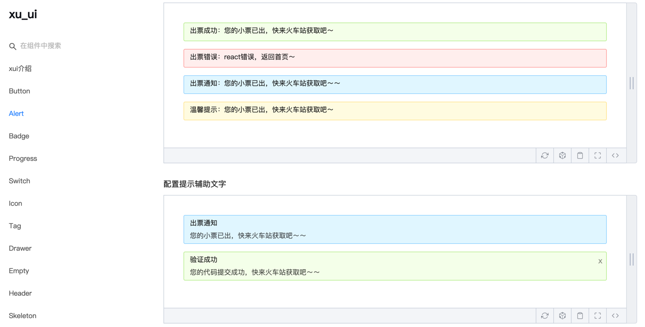
< Alert message = "success tip" />
< Alert message = "success tip" type = "success" />
< Alert message = "success tip" type = "error" />
< Alert message = "success tip" type = "info" />
< Alert message = "success tip" type = "info" closable />
< Alert message = "success tip" description = "skfjdsalajdfjadkfjaldfhjaskdn你好,欢迎光临" closable type = "success" />
< Empty />
< Drawer visible = { visible } onClose = { close } destroyOnClose >
< h3 >我是标题</ h3 >
< br />
< input type = "text" />
< br />
< textarea />
</ Drawer >
</ div >
)
}시공은 특정 사용법을 참조하십시오.
Wechat : Qunqiujinkou
컴포넌트 라이브러리를보다 강력하게 만들기 위해 더 많은 문제를 제안하는 데 오신 것을 환영합니다.


