xu_ui
1.0.0
XUIは、著者によって開発されたReactに基づいた軽量コンポーネントライブラリです。現在、サードパーティのUIコンポーネントライブラリに依存していません。オンデマンドのインポートをサポートし、カスタマイズできます。公式ウェブサイトアドレスウェブサイト:XUI——反応ベースの軽量UIコンポーネントライブラリ
公式のウェブサイトの住所へのアクセスが遅すぎると思われる場合は、githubアドレスに直接移動できます:xui-反応に基づく軽量UIコンポーネントライブラリ
次のUIコンポーネントが開発されました。
開発中のコンポーネント:
将来、より高品質で軽量コンポーネントが開発されるため、ご期待ください。
このコンポーネントライブラリは、次の技術バージョンに基づいて開発されています。
npm install @ alex_xu / xuiまたは糸でインストールします
yarn add @ alex_xu / xui import {
Button ,
Skeleton ,
Empty ,
Progress ,
Tag ,
Switch ,
Drawer ,
Badge ,
Alert
} from '@alex_xu/xui'
import { useState } from 'react'
import styles from './index.css'
export default function ( ) {
const [ visible , setVisible ] = useState ( false )
let show = ( ) => { setVisible ( true ) }
let close = ( ) => { setVisible ( false ) }
return (
< div className = { styles . normal } >
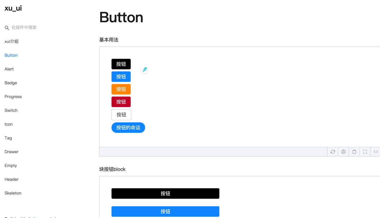
< Button className = { styles . btn } > default </ Button >
< Button className = { styles . btn } type = "warning" > warning </ Button >
< Button className = { styles . btn } type = "primary" > primary </ Button >
< Button className = { styles . btn } type = "info" > info </ Button >
< Button className = { styles . btn } type = "pure" > pure </ Button >
< Button className = { styles . btn } type = "primary" shape = "circle" > circle </ Button >
< Button className = { styles . mb16 } type = "primary" block > primary & block </ Button >
< Button type = "warning" shape = "circle" block onClick = { show } > circle & block </ Button >
{ /* <Skeleton /> */ }
< Progress
percent = { 10 }
/>
< Progress
percent = { 50 }
themeColor = "#009933"
/>
< Progress
percent = { 50 }
width = { 240 }
/>
< Progress
percent = { 30 }
width = { 240 }
textColor = "#fff"
/>
< Progress
percent = { 50 }
width = { 200 }
themeColor = "#FF6666"
hiddenText
/>
< Progress
percent = { 10 }
themeColor = "#6699FF"
statusScope = { [ [ 18 , 'red' ] , [ 40 , 'orange' ] ] }
/>
< Progress
percent = { 20 }
themeColor = "#6699FF"
statusScope = { [ [ 18 , 'red' ] , [ 40 , 'orange' ] ] }
/>
< div className = { styles . mb16 } > </ div >
< Tag > Html </ Tag >
< Tag closable > react </ Tag >
< Tag color = "#FF99CC" > Css3 </ Tag >
< Tag color = "#06c" closable > react </ Tag >
< Tag color = "rgb(135, 208, 104)" > Node </ Tag >
< div className = { styles . mb16 } > </ div >
< Switch onText = "on" offText = "off" size = "small" />
< Badge text = "ddd" status = "warning" > 6666ngd </ Badge >
< div className = { styles . mb16 } > </ div >
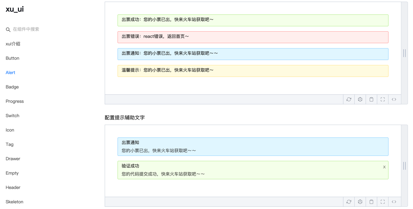
< Alert message = "success tip" />
< Alert message = "success tip" type = "success" />
< Alert message = "success tip" type = "error" />
< Alert message = "success tip" type = "info" />
< Alert message = "success tip" type = "info" closable />
< Alert message = "success tip" description = "skfjdsalajdfjadkfjaldfhjaskdn你好,欢迎光临" closable type = "success" />
< Empty />
< Drawer visible = { visible } onClose = { close } destroyOnClose >
< h3 >我是标题</ h3 >
< br />
< input type = "text" />
< br />
< textarea />
</ Drawer >
</ div >
)
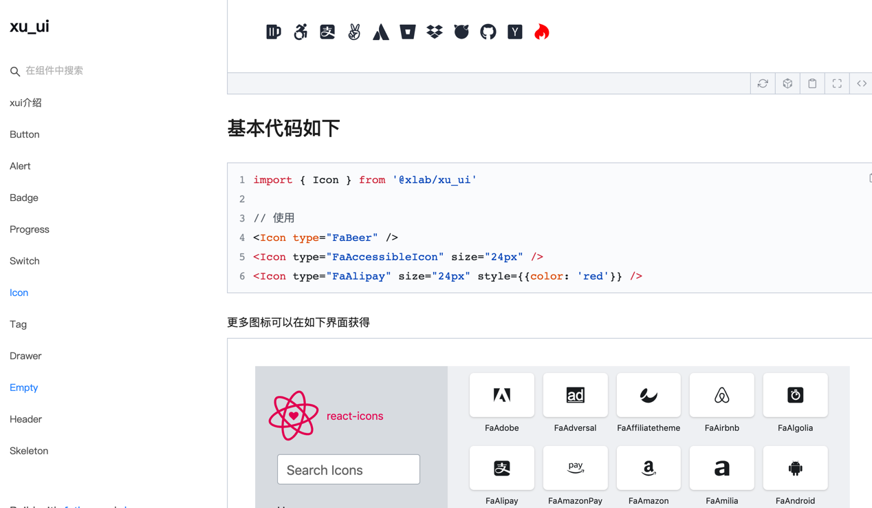
}構造については、特定の使用方法を参照してください。
wechat:qunqiujinkou
コンポーネントライブラリをより堅牢にするために、より多くの問題を提案することへようこそ


