xu_ui
1.0.0
Xui ist eine leichte Komponentenbibliothek, die auf dem vom Autor entwickelten React basiert. Derzeit beruht es nicht auf eine UI-Komponentenbibliothek von Drittanbietern. Es unterstützt On-Demand-Import und kann angepasst werden. Offizielle Website-Adress-Website: XUI--basierte leichte UI-Komponentenbibliothek
Wenn Sie der Meinung sind, dass der Zugriff auf die offizielle Website -Adresse zu langsam ist, können Sie direkt zur GitHub -Adresse wechseln: xui - eine leichte UI -Komponentenbibliothek basierend auf React
Die folgenden UI -Komponenten wurden entwickelt:
Komponenten in der Entwicklung:
In Zukunft werden mehr hochwertige und leichte Komponenten entwickelt. Bleiben Sie also auf dem Laufenden.
Diese Komponentenbibliothek wird basierend auf der folgenden technischen Version entwickelt:
npm install @ alex_xu / xuiOder installieren Sie es mit Garn
yarn add @ alex_xu / xui import {
Button ,
Skeleton ,
Empty ,
Progress ,
Tag ,
Switch ,
Drawer ,
Badge ,
Alert
} from '@alex_xu/xui'
import { useState } from 'react'
import styles from './index.css'
export default function ( ) {
const [ visible , setVisible ] = useState ( false )
let show = ( ) => { setVisible ( true ) }
let close = ( ) => { setVisible ( false ) }
return (
< div className = { styles . normal } >
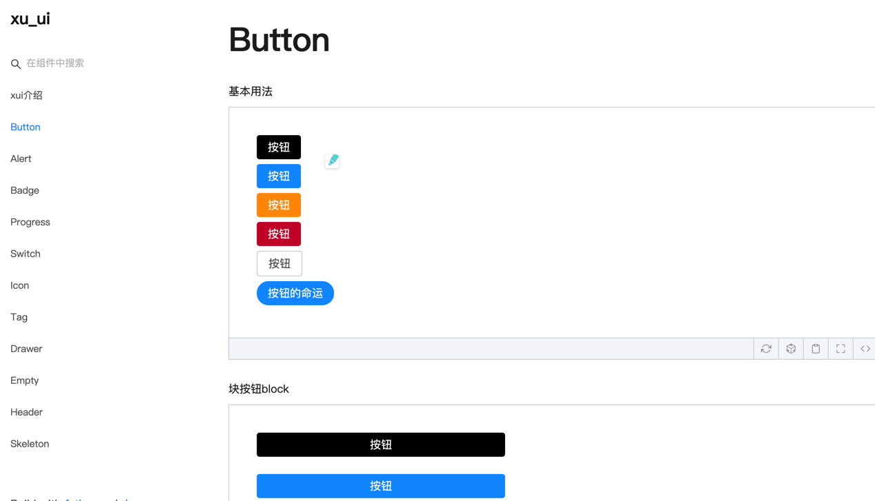
< Button className = { styles . btn } > default </ Button >
< Button className = { styles . btn } type = "warning" > warning </ Button >
< Button className = { styles . btn } type = "primary" > primary </ Button >
< Button className = { styles . btn } type = "info" > info </ Button >
< Button className = { styles . btn } type = "pure" > pure </ Button >
< Button className = { styles . btn } type = "primary" shape = "circle" > circle </ Button >
< Button className = { styles . mb16 } type = "primary" block > primary & block </ Button >
< Button type = "warning" shape = "circle" block onClick = { show } > circle & block </ Button >
{ /* <Skeleton /> */ }
< Progress
percent = { 10 }
/>
< Progress
percent = { 50 }
themeColor = "#009933"
/>
< Progress
percent = { 50 }
width = { 240 }
/>
< Progress
percent = { 30 }
width = { 240 }
textColor = "#fff"
/>
< Progress
percent = { 50 }
width = { 200 }
themeColor = "#FF6666"
hiddenText
/>
< Progress
percent = { 10 }
themeColor = "#6699FF"
statusScope = { [ [ 18 , 'red' ] , [ 40 , 'orange' ] ] }
/>
< Progress
percent = { 20 }
themeColor = "#6699FF"
statusScope = { [ [ 18 , 'red' ] , [ 40 , 'orange' ] ] }
/>
< div className = { styles . mb16 } > </ div >
< Tag > Html </ Tag >
< Tag closable > react </ Tag >
< Tag color = "#FF99CC" > Css3 </ Tag >
< Tag color = "#06c" closable > react </ Tag >
< Tag color = "rgb(135, 208, 104)" > Node </ Tag >
< div className = { styles . mb16 } > </ div >
< Switch onText = "on" offText = "off" size = "small" />
< Badge text = "ddd" status = "warning" > 6666ngd </ Badge >
< div className = { styles . mb16 } > </ div >
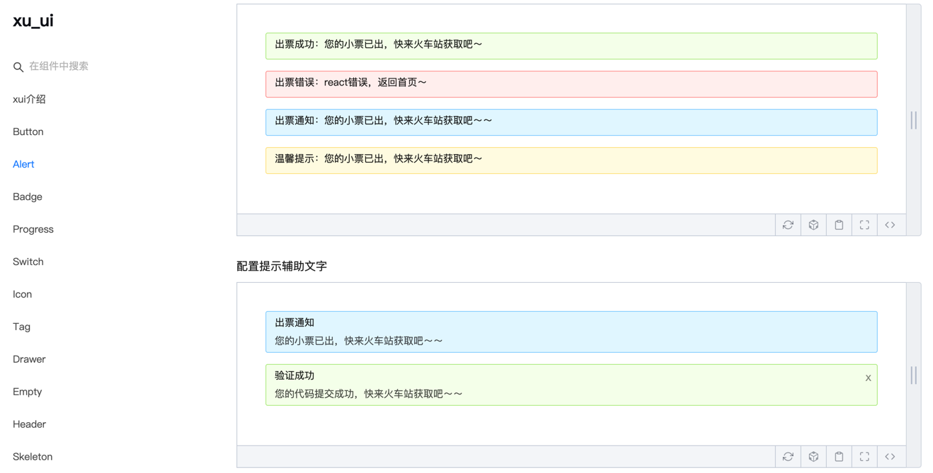
< Alert message = "success tip" />
< Alert message = "success tip" type = "success" />
< Alert message = "success tip" type = "error" />
< Alert message = "success tip" type = "info" />
< Alert message = "success tip" type = "info" closable />
< Alert message = "success tip" description = "skfjdsalajdfjadkfjaldfhjaskdn你好,欢迎光临" closable type = "success" />
< Empty />
< Drawer visible = { visible } onClose = { close } destroyOnClose >
< h3 >我是标题</ h3 >
< br />
< input type = "text" />
< br />
< textarea />
</ Drawer >
</ div >
)
}Für die Konstruktion finden Sie auf der spezifischen Verwendungsmethode:
Wechat: Qunqiujinkou
Willkommen, weitere Probleme vorzuschlagen, um die Komponentenbibliothek robuster zu machen


