xu_ui
1.0.0
Xui هي مكتبة مكون خفيفة الوزن تعتمد على رد الفعل الذي طوره المؤلف. لا يعتمد حاليًا على أي مكتبة مكونات لجهة خارجية لجهة خارجية. وهو يدعم الاستيراد عند الطلب ويمكن تخصيصه. موقع عنوان الموقع الرسمي: XUI--مكتبة مكونات واجهة المستخدم الخفيفة الوزن المستندة إلى التفاح
إذا كنت تعتقد أن الوصول إلى عنوان الموقع الرسمي بطيء للغاية ، فيمكنك الانتقال مباشرة إلى عنوان GitHub: XUI - مكتبة مكونات واجهة المستخدم خفيفة الوزن استنادًا إلى React
تم تطوير مكونات واجهة المستخدم التالية:
المكونات قيد التطوير:
سيتم تطوير مزيد من الجودة عالية الجودة وخفيفة الوزن في المستقبل ، لذا يرجى ترقبنا.
تم تطوير مكتبة المكون هذه بناءً على الإصدار الفني التالي:
npm install @ alex_xu / xuiأو تثبيته مع الغزل
yarn add @ alex_xu / xui import {
Button ,
Skeleton ,
Empty ,
Progress ,
Tag ,
Switch ,
Drawer ,
Badge ,
Alert
} from '@alex_xu/xui'
import { useState } from 'react'
import styles from './index.css'
export default function ( ) {
const [ visible , setVisible ] = useState ( false )
let show = ( ) => { setVisible ( true ) }
let close = ( ) => { setVisible ( false ) }
return (
< div className = { styles . normal } >
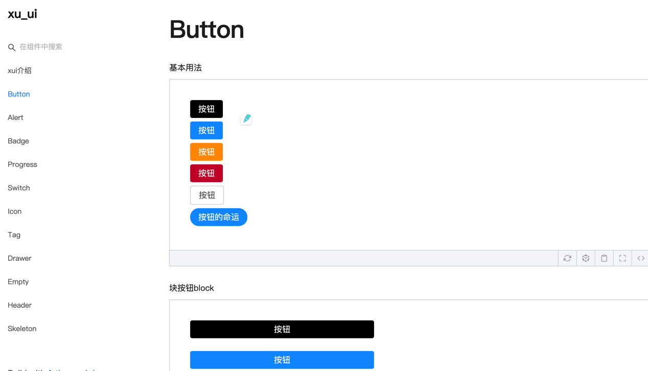
< Button className = { styles . btn } > default </ Button >
< Button className = { styles . btn } type = "warning" > warning </ Button >
< Button className = { styles . btn } type = "primary" > primary </ Button >
< Button className = { styles . btn } type = "info" > info </ Button >
< Button className = { styles . btn } type = "pure" > pure </ Button >
< Button className = { styles . btn } type = "primary" shape = "circle" > circle </ Button >
< Button className = { styles . mb16 } type = "primary" block > primary & block </ Button >
< Button type = "warning" shape = "circle" block onClick = { show } > circle & block </ Button >
{ /* <Skeleton /> */ }
< Progress
percent = { 10 }
/>
< Progress
percent = { 50 }
themeColor = "#009933"
/>
< Progress
percent = { 50 }
width = { 240 }
/>
< Progress
percent = { 30 }
width = { 240 }
textColor = "#fff"
/>
< Progress
percent = { 50 }
width = { 200 }
themeColor = "#FF6666"
hiddenText
/>
< Progress
percent = { 10 }
themeColor = "#6699FF"
statusScope = { [ [ 18 , 'red' ] , [ 40 , 'orange' ] ] }
/>
< Progress
percent = { 20 }
themeColor = "#6699FF"
statusScope = { [ [ 18 , 'red' ] , [ 40 , 'orange' ] ] }
/>
< div className = { styles . mb16 } > </ div >
< Tag > Html </ Tag >
< Tag closable > react </ Tag >
< Tag color = "#FF99CC" > Css3 </ Tag >
< Tag color = "#06c" closable > react </ Tag >
< Tag color = "rgb(135, 208, 104)" > Node </ Tag >
< div className = { styles . mb16 } > </ div >
< Switch onText = "on" offText = "off" size = "small" />
< Badge text = "ddd" status = "warning" > 6666ngd </ Badge >
< div className = { styles . mb16 } > </ div >
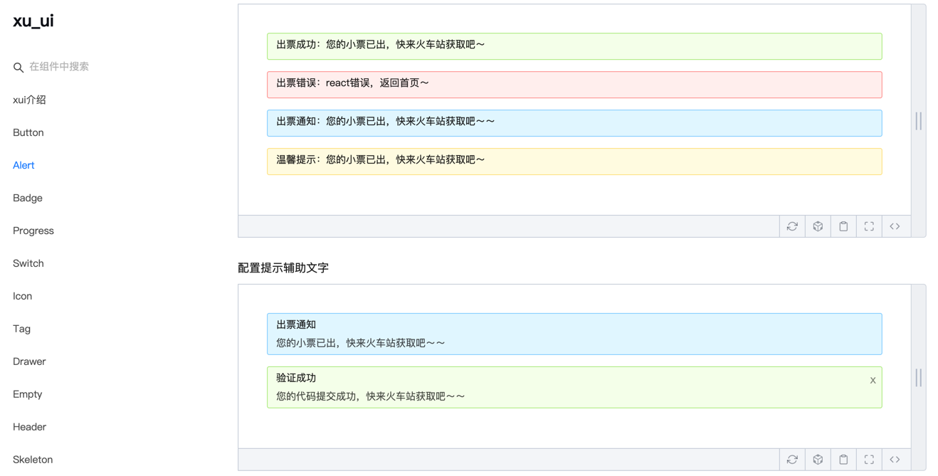
< Alert message = "success tip" />
< Alert message = "success tip" type = "success" />
< Alert message = "success tip" type = "error" />
< Alert message = "success tip" type = "info" />
< Alert message = "success tip" type = "info" closable />
< Alert message = "success tip" description = "skfjdsalajdfjadkfjaldfhjaskdn你好,欢迎光临" closable type = "success" />
< Empty />
< Drawer visible = { visible } onClose = { close } destroyOnClose >
< h3 >我是标题</ h3 >
< br />
< input type = "text" />
< br />
< textarea />
</ Drawer >
</ div >
)
}للبناء ، يرجى الرجوع إلى طريقة الاستخدام المحددة:
WeChat: Qunqiujinkou
مرحبًا بك في اقتراح المزيد من المشكلات لجعل مكتبة المكون أكثر قوة


