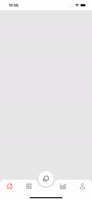
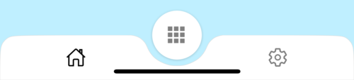
react native curved bottom bar
Release 3.4.0
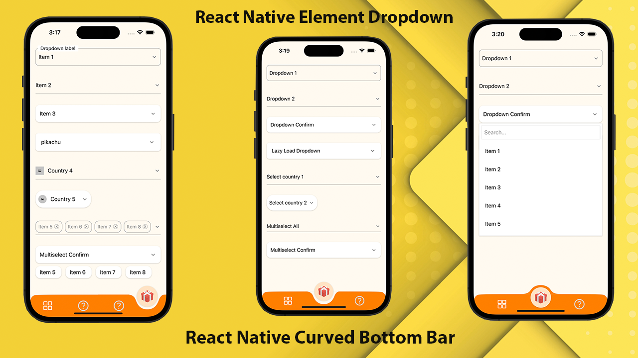
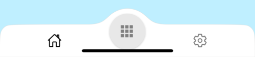
高性能,美麗且完全可定制的曲面導航桿,用於React Native。使用React-Native-SVG和 @React-Navigation/Boty-Tabs實施。
If you love this library , give us a star , you will be a ray of sunshine in our lives : )用美麗的UI反應本地模板。
npm install react - native - curved - bottom - bar -- save或者
yarn add react - native - curved - bottom - bar現在,我們需要安裝React-Native-SVG和 @React-Navigation/bottom-tabs。
| 道具 | 參數 | Isrequire | 描述 |
|---|---|---|---|
| 類型 | “下降”或“向上” | 是的 | 中心標籤項目的類型,向下曲線或向上曲線 |
| 圓形 | “中心”或“左”或“右” | 不 | 圓按鈕的位置 |
| InitialRoutEname | 細繩 | 是的 | 在導航器的首次負載上渲染路線的名稱 |
| 塔巴爾 | ({routename,SelectedTab,navigate})=> jsx.element | 是的 | 返回React元素以顯示為選項卡欄的函數 |
| rendercircle | ({routename,SelectedTab,navigate})=> jsx.element | 是的 | 返回React元素以顯示為“中心”選項卡項目的函數 |
| 圓寬 | 數字 | 不 | 自定義中心標籤項目的寬度。最低為50px,最大為60px |
| 風格 | ViewStyle | 不 | 容器視圖的造型 |
| 陰影風格 | ViewStyle | 不 | 陰影視圖的樣式。 |
| 寬度 | 數字 | 不 | 自定義容器視圖的寬度 |
| 高度 | 數字 | 不 | 自定義容器視圖的高度,最小值為50px,最大為90px |
| BorderTopleFright | 布爾 | 不 | 邊界半徑左上和頂部的容器視圖 |
| 邊界色 | 細繩 | 不 | 邊框顏色 |
| 邊界開關 | 數字 | 不 | 邊界寬度 |
| bgcolor | 細繩 | 不 | 容器視圖的背景顏色 |
| 道具 | 參數 | Isrequire | 描述 |
|---|---|---|---|
| 姓名 | 細繩 | 是的 | 跳到路線的名稱 |
| 位置 | “左”或“右”或“圓” | 是的 | 將塔巴爾圖標的位置設置在圓按鈕的左側或右側。僅當要圓按鈕是tabview時才使用類型“圓” |
| 成分 | (props)=> jsx.element | 是的 | 屏幕參數合併到目標路線 |
| 功能 | 參數 | 描述 |
|---|---|---|
| 可見 | 布爾 | 用於隱藏/顯示標籤欄。例如:ref.current.setvisible(false) |
 import React from 'react' ;
import {
  Alert ,
  Animated ,
  StyleSheet ,
  TouchableOpacity ,
  View ,
} from 'react-native' ;
import { CurvedBottomBarExpo } from 'react-native-curved-bottom-bar' ;
import Ionicons from '@expo/vector-icons/Ionicons' ;
import { NavigationContainer } from '@react-navigation/native' ;

const Screen1 = ( ) => {
  return < View style = { styles . screen1 } /> ;
} ;

const Screen2 = ( ) => {
  return < View style = { styles . screen2 } /> ;
} ;

export default function App ( ) {
  const _renderIcon = ( routeName , selectedTab ) => {
    let icon = '' ;

    switch ( routeName ) {
      case 'title1' :
        icon = 'ios-home-outline' ;
        break ;
      case 'title2' :
        icon = 'settings-outline' ;
        break ;
    }

    return (
      < Ionicons
        name = { icon }
        size = { 25 }
        color = { routeName === selectedTab ? 'black' : 'gray' }
      />
    ) ;
  } ;
  const renderTabBar = ( { routeName , selectedTab , navigate } ) => {
    return (
      < TouchableOpacity
        onPress = { ( ) => navigate ( routeName ) }
        style = { styles . tabbarItem }
      >
        { _renderIcon ( routeName , selectedTab ) }
      </ TouchableOpacity >
    ) ;
  } ;

  return (
    < NavigationContainer >
      < CurvedBottomBarExpo . Navigator
        type = "DOWN"
        style = { styles . bottomBar }
        shadowStyle = { styles . shawdow }
        height = { 55 }
        circleWidth = { 50 }
        bgColor = "white"
        initialRouteName = "title1"
        borderTopLeftRight
        renderCircle = { ( { selectedTab , navigate } ) => (
          < Animated . View style = { styles . btnCircleUp } >
            < TouchableOpacity
              style = { styles . button }
              onPress = { ( ) => Alert . alert ( 'Click Action' ) }
            >
              < Ionicons name = { 'apps-sharp' } color = "gray" size = { 25 } />
            </ TouchableOpacity >
          </ Animated . View >
        ) }
        tabBar = { renderTabBar }
      >
        < CurvedBottomBarExpo . Screen
          name = "title1"
          position = "LEFT"
          component = { ( ) => < Screen1 /> }
        />
        < CurvedBottomBarExpo . Screen
          name = "title2"
          component = { ( ) => < Screen2 /> }
          position = "RIGHT"
        />
      </ CurvedBottomBarExpo . Navigator >
    </ NavigationContainer >
  ) ;
}

export const styles = StyleSheet . create ( {
  container : {
    flex : 1 ,
    padding : 20 ,
  } ,
  shawdow : {
    shadowColor : '#DDDDDD' ,
    shadowOffset : {
      width : 0 ,
      height : 0 ,
    } ,
    shadowOpacity : 1 ,
    shadowRadius : 5 ,
  } ,
  button : {
    flex : 1 ,
    justifyContent : 'center' ,
  } ,
  bottomBar : { } ,
  btnCircleUp : {
    width : 60 ,
    height : 60 ,
    borderRadius : 30 ,
    alignItems : 'center' ,
    justifyContent : 'center' ,
    backgroundColor : '#E8E8E8' ,
    bottom : 30 ,
    shadowColor : '#000' ,
    shadowOffset : {
      width : 0 ,
      height : 1 ,
    } ,
    shadowOpacity : 0.2 ,
    shadowRadius : 1.41 ,
    elevation : 1 ,
  } ,
  imgCircle : {
    width : 30 ,
    height : 30 ,
    tintColor : 'gray' ,
  } ,
  tabbarItem : {
    flex : 1 ,
    alignItems : 'center' ,
    justifyContent : 'center' ,
  } ,
  img : {
    width : 30 ,
    height : 30 ,
  } ,
  screen1 : {
    flex : 1 ,
    backgroundColor : '#BFEFFF' ,
  } ,
  screen2 : {
    flex : 1 ,
    backgroundColor : '#FFEBCD' ,
  } ,
} ) ;
 import React from 'react' ;
import {
  Alert ,
  Animated ,
  StyleSheet ,
  TouchableOpacity ,
  View ,
} from 'react-native' ;
import { CurvedBottomBar } from 'react-native-curved-bottom-bar' ;
import Ionicons from 'react-native-vector-icons/Ionicons' ;
import { NavigationContainer } from '@react-navigation/native' ;

const Screen1 = ( ) => {
  return < View style = { styles . screen1 } /> ;
} ;

const Screen2 = ( ) => {
  return < View style = { styles . screen2 } /> ;
} ;

export default function App ( ) {
  const _renderIcon = ( routeName , selectedTab ) => {
    let icon = '' ;

    switch ( routeName ) {
      case 'title1' :
        icon = 'ios-home-outline' ;
        break ;
      case 'title2' :
        icon = 'settings-outline' ;
        break ;
    }

    return (
      < Ionicons
        name = { icon }
        size = { 25 }
        color = { routeName === selectedTab ? 'black' : 'gray' }
      />
    ) ;
  } ;
  const renderTabBar = ( { routeName , selectedTab , navigate } ) => {
    return (
      < TouchableOpacity
        onPress = { ( ) => navigate ( routeName ) }
        style = { styles . tabbarItem }
      >
        { _renderIcon ( routeName , selectedTab ) }
      </ TouchableOpacity >
    ) ;
  } ;

  return (
    < NavigationContainer >
      < CurvedBottomBar . Navigator
        type = "UP"
        style = { styles . bottomBar }
        shadowStyle = { styles . shawdow }
        height = { 55 }
        circleWidth = { 50 }
        bgColor = "white"
        initialRouteName = "title1"
        borderTopLeftRight
        renderCircle = { ( { selectedTab , navigate } ) => (
          < Animated . View style = { styles . btnCircleUp } >
            < TouchableOpacity
              style = { styles . button }
              onPress = { ( ) => Alert . alert ( 'Click Action' ) }
            >
              < Ionicons name = { 'apps-sharp' } color = "gray" size = { 25 } />
            </ TouchableOpacity >
          </ Animated . View >
        ) }
        tabBar = { renderTabBar }
      >
        < CurvedBottomBar . Screen
          name = "title1"
          position = "LEFT"
          component = { ( ) => < Screen1 /> }
        />
        < CurvedBottomBar . Screen
          name = "title2"
          component = { ( ) => < Screen2 /> }
          position = "RIGHT"
        />
      </ CurvedBottomBar . Navigator >
    </ NavigationContainer >
  ) ;
}

export const styles = StyleSheet . create ( {
  container : {
    flex : 1 ,
    padding : 20 ,
  } ,
  shawdow : {
    shadowColor : '#DDDDDD' ,
    shadowOffset : {
      width : 0 ,
      height : 0 ,
    } ,
    shadowOpacity : 1 ,
    shadowRadius : 5 ,
  } ,
  button : {
    flex : 1 ,
    justifyContent : 'center' ,
  } ,
  bottomBar : { } ,
  btnCircleUp : {
    width : 60 ,
    height : 60 ,
    borderRadius : 30 ,
    alignItems : 'center' ,
    justifyContent : 'center' ,
    backgroundColor : '#E8E8E8' ,
    bottom : 18 ,
    shadowColor : '#000' ,
    shadowOffset : {
      width : 0 ,
      height : 1 ,
    } ,
    shadowOpacity : 0.2 ,
    shadowRadius : 1.41 ,
    elevation : 1 ,
  } ,
  imgCircle : {
    width : 30 ,
    height : 30 ,
    tintColor : 'gray' ,
  } ,
  tabbarItem : {
    flex : 1 ,
    alignItems : 'center' ,
    justifyContent : 'center' ,
  } ,
  img : {
    width : 30 ,
    height : 30 ,
  } ,
  screen1 : {
    flex : 1 ,
    backgroundColor : '#BFEFFF' ,
  } ,
  screen2 : {
    flex : 1 ,
    backgroundColor : '#FFEBCD' ,
  } ,
} ) ; 


