react native curved bottom bar
Release 3.4.0
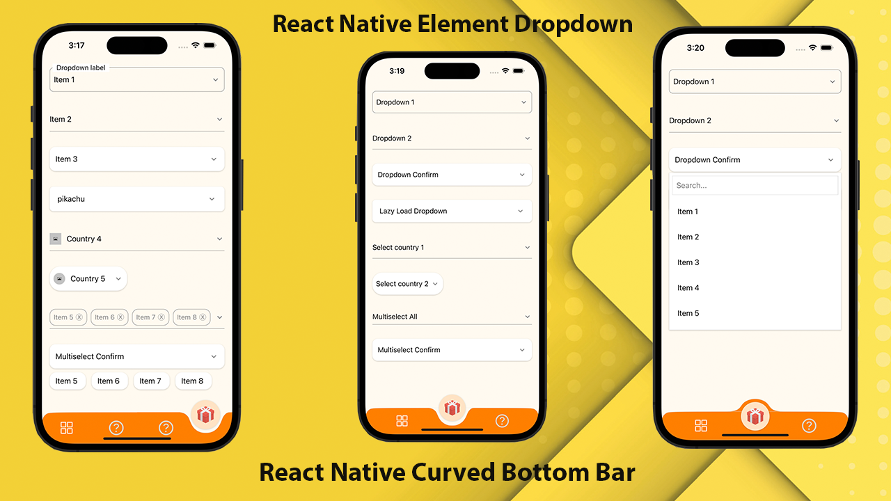
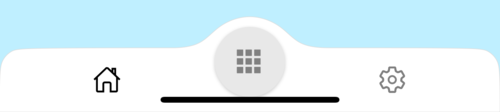
Eine hohe Leistung, eine schöne und vollständig anpassbare, gekrümmte Bodennavigationsleiste für React Native. Implementiert mit React-Native-SVG und @React-Navigation/Bottababs.
If you love this library , give us a star , you will be a ray of sunshine in our lives : )Reagieren Sie die native Vorlage mit einer schönen Benutzeroberfläche.
npm install react - native - curved - bottom - bar -- saveoder
yarn add react - native - curved - bottom - barJetzt müssen wir React-Native-SVG und @React-Navigation/Bottababs installieren.
| Requisiten | Parameter | IsRequire | Beschreibung |
|---|---|---|---|
| Typ | 'Down' oder 'Up' | Ja | Typ des Registerkartenelements, Abwärtskurve oder Aufwärtskurve |
| Kreislager | 'Mitte' oder 'links' oder 'rechts' | NEIN | Taste der Kreisposition |
| initialRoutename | Saite | Ja | Der Name der Route, um die erste Last des Navigators zu rendern |
| TABBAR | ({RoutName, SelectedTab, navigieren}) => jsx.element | Ja | Funktion, die ein React -Element zurückgibt, das als Registerkarte Balk angezeigt wird |
| Rendercircle | ({RoutName, SelectedTab, navigieren}) => jsx.element | Ja | Funktion, die ein React -Element zurückgibt, das als Zentrum -Registerkarte angezeigt wird |
| Kreisbreite | Nummer | NEIN | Passen Sie die Breite des Registerkartenelements an. Das Minimum beträgt 50px und maximal 60px |
| Stil | ViewStyle | NEIN | Styling für Containeransicht |
| Schattenstil | ViewStyle | NEIN | Styling für Schattenansicht. |
| Breite | Nummer | NEIN | Passen Sie die Breite für die Containeransicht an |
| Höhe | Nummer | NEIN | Die Höhe für die Containeransicht anpassen, das Minimum beträgt 50px und maximal 90px |
| Bordertopleftright | Boolean | NEIN | Grenze Radius oben links und oben rechts in der Containeransicht |
| BorderColor | Saite | NEIN | Grenzfarbe |
| Grenzbreite | Nummer | NEIN | Grenzbreite |
| BGColor | Saite | NEIN | Hintergrundfarbe der Containeransicht |
| Requisiten | Parameter | IsRequire | Beschreibung |
|---|---|---|---|
| Name | Saite | Ja | Name des Weges zum Springen |
| Position | 'Links' oder 'rechts' oder 'Kreis' | Ja | Stellen Sie die Position des Tabbar -Symbols nach links oder rechts in der Kreisschaltfläche fest. Verwenden Sie den Typ "Kreis" nur dann, wenn Sie möchten, dass die Schaltfläche Kreis ein Tabview ist |
| Komponente | (Requisiten) => jsx.element | Ja | Bildschirmparameter, um sich in die Zielroute zu verschmelzen |
| Funktion | Parameter | Beschreibung |
|---|---|---|
| setvisible | Boolean | Wird verwendet, um die Registerkartenleiste auszublenden/anzuzeigen. Ex: Ref.Current.setVisible (Falsch) |
 import React from 'react' ;
import {
  Alert ,
  Animated ,
  StyleSheet ,
  TouchableOpacity ,
  View ,
} from 'react-native' ;
import { CurvedBottomBarExpo } from 'react-native-curved-bottom-bar' ;
import Ionicons from '@expo/vector-icons/Ionicons' ;
import { NavigationContainer } from '@react-navigation/native' ;

const Screen1 = ( ) => {
  return < View style = { styles . screen1 } /> ;
} ;

const Screen2 = ( ) => {
  return < View style = { styles . screen2 } /> ;
} ;

export default function App ( ) {
  const _renderIcon = ( routeName , selectedTab ) => {
    let icon = '' ;

    switch ( routeName ) {
      case 'title1' :
        icon = 'ios-home-outline' ;
        break ;
      case 'title2' :
        icon = 'settings-outline' ;
        break ;
    }

    return (
      < Ionicons
        name = { icon }
        size = { 25 }
        color = { routeName === selectedTab ? 'black' : 'gray' }
      />
    ) ;
  } ;
  const renderTabBar = ( { routeName , selectedTab , navigate } ) => {
    return (
      < TouchableOpacity
        onPress = { ( ) => navigate ( routeName ) }
        style = { styles . tabbarItem }
      >
        { _renderIcon ( routeName , selectedTab ) }
      </ TouchableOpacity >
    ) ;
  } ;

  return (
    < NavigationContainer >
      < CurvedBottomBarExpo . Navigator
        type = "DOWN"
        style = { styles . bottomBar }
        shadowStyle = { styles . shawdow }
        height = { 55 }
        circleWidth = { 50 }
        bgColor = "white"
        initialRouteName = "title1"
        borderTopLeftRight
        renderCircle = { ( { selectedTab , navigate } ) => (
          < Animated . View style = { styles . btnCircleUp } >
            < TouchableOpacity
              style = { styles . button }
              onPress = { ( ) => Alert . alert ( 'Click Action' ) }
            >
              < Ionicons name = { 'apps-sharp' } color = "gray" size = { 25 } />
            </ TouchableOpacity >
          </ Animated . View >
        ) }
        tabBar = { renderTabBar }
      >
        < CurvedBottomBarExpo . Screen
          name = "title1"
          position = "LEFT"
          component = { ( ) => < Screen1 /> }
        />
        < CurvedBottomBarExpo . Screen
          name = "title2"
          component = { ( ) => < Screen2 /> }
          position = "RIGHT"
        />
      </ CurvedBottomBarExpo . Navigator >
    </ NavigationContainer >
  ) ;
}

export const styles = StyleSheet . create ( {
  container : {
    flex : 1 ,
    padding : 20 ,
  } ,
  shawdow : {
    shadowColor : '#DDDDDD' ,
    shadowOffset : {
      width : 0 ,
      height : 0 ,
    } ,
    shadowOpacity : 1 ,
    shadowRadius : 5 ,
  } ,
  button : {
    flex : 1 ,
    justifyContent : 'center' ,
  } ,
  bottomBar : { } ,
  btnCircleUp : {
    width : 60 ,
    height : 60 ,
    borderRadius : 30 ,
    alignItems : 'center' ,
    justifyContent : 'center' ,
    backgroundColor : '#E8E8E8' ,
    bottom : 30 ,
    shadowColor : '#000' ,
    shadowOffset : {
      width : 0 ,
      height : 1 ,
    } ,
    shadowOpacity : 0.2 ,
    shadowRadius : 1.41 ,
    elevation : 1 ,
  } ,
  imgCircle : {
    width : 30 ,
    height : 30 ,
    tintColor : 'gray' ,
  } ,
  tabbarItem : {
    flex : 1 ,
    alignItems : 'center' ,
    justifyContent : 'center' ,
  } ,
  img : {
    width : 30 ,
    height : 30 ,
  } ,
  screen1 : {
    flex : 1 ,
    backgroundColor : '#BFEFFF' ,
  } ,
  screen2 : {
    flex : 1 ,
    backgroundColor : '#FFEBCD' ,
  } ,
} ) ;
 import React from 'react' ;
import {
  Alert ,
  Animated ,
  StyleSheet ,
  TouchableOpacity ,
  View ,
} from 'react-native' ;
import { CurvedBottomBar } from 'react-native-curved-bottom-bar' ;
import Ionicons from 'react-native-vector-icons/Ionicons' ;
import { NavigationContainer } from '@react-navigation/native' ;

const Screen1 = ( ) => {
  return < View style = { styles . screen1 } /> ;
} ;

const Screen2 = ( ) => {
  return < View style = { styles . screen2 } /> ;
} ;

export default function App ( ) {
  const _renderIcon = ( routeName , selectedTab ) => {
    let icon = '' ;

    switch ( routeName ) {
      case 'title1' :
        icon = 'ios-home-outline' ;
        break ;
      case 'title2' :
        icon = 'settings-outline' ;
        break ;
    }

    return (
      < Ionicons
        name = { icon }
        size = { 25 }
        color = { routeName === selectedTab ? 'black' : 'gray' }
      />
    ) ;
  } ;
  const renderTabBar = ( { routeName , selectedTab , navigate } ) => {
    return (
      < TouchableOpacity
        onPress = { ( ) => navigate ( routeName ) }
        style = { styles . tabbarItem }
      >
        { _renderIcon ( routeName , selectedTab ) }
      </ TouchableOpacity >
    ) ;
  } ;

  return (
    < NavigationContainer >
      < CurvedBottomBar . Navigator
        type = "UP"
        style = { styles . bottomBar }
        shadowStyle = { styles . shawdow }
        height = { 55 }
        circleWidth = { 50 }
        bgColor = "white"
        initialRouteName = "title1"
        borderTopLeftRight
        renderCircle = { ( { selectedTab , navigate } ) => (
          < Animated . View style = { styles . btnCircleUp } >
            < TouchableOpacity
              style = { styles . button }
              onPress = { ( ) => Alert . alert ( 'Click Action' ) }
            >
              < Ionicons name = { 'apps-sharp' } color = "gray" size = { 25 } />
            </ TouchableOpacity >
          </ Animated . View >
        ) }
        tabBar = { renderTabBar }
      >
        < CurvedBottomBar . Screen
          name = "title1"
          position = "LEFT"
          component = { ( ) => < Screen1 /> }
        />
        < CurvedBottomBar . Screen
          name = "title2"
          component = { ( ) => < Screen2 /> }
          position = "RIGHT"
        />
      </ CurvedBottomBar . Navigator >
    </ NavigationContainer >
  ) ;
}

export const styles = StyleSheet . create ( {
  container : {
    flex : 1 ,
    padding : 20 ,
  } ,
  shawdow : {
    shadowColor : '#DDDDDD' ,
    shadowOffset : {
      width : 0 ,
      height : 0 ,
    } ,
    shadowOpacity : 1 ,
    shadowRadius : 5 ,
  } ,
  button : {
    flex : 1 ,
    justifyContent : 'center' ,
  } ,
  bottomBar : { } ,
  btnCircleUp : {
    width : 60 ,
    height : 60 ,
    borderRadius : 30 ,
    alignItems : 'center' ,
    justifyContent : 'center' ,
    backgroundColor : '#E8E8E8' ,
    bottom : 18 ,
    shadowColor : '#000' ,
    shadowOffset : {
      width : 0 ,
      height : 1 ,
    } ,
    shadowOpacity : 0.2 ,
    shadowRadius : 1.41 ,
    elevation : 1 ,
  } ,
  imgCircle : {
    width : 30 ,
    height : 30 ,
    tintColor : 'gray' ,
  } ,
  tabbarItem : {
    flex : 1 ,
    alignItems : 'center' ,
    justifyContent : 'center' ,
  } ,
  img : {
    width : 30 ,
    height : 30 ,
  } ,
  screen1 : {
    flex : 1 ,
    backgroundColor : '#BFEFFF' ,
  } ,
  screen2 : {
    flex : 1 ,
    backgroundColor : '#FFEBCD' ,
  } ,
} ) ; 


