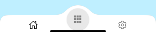
react native curved bottom bar
Release 3.4.0
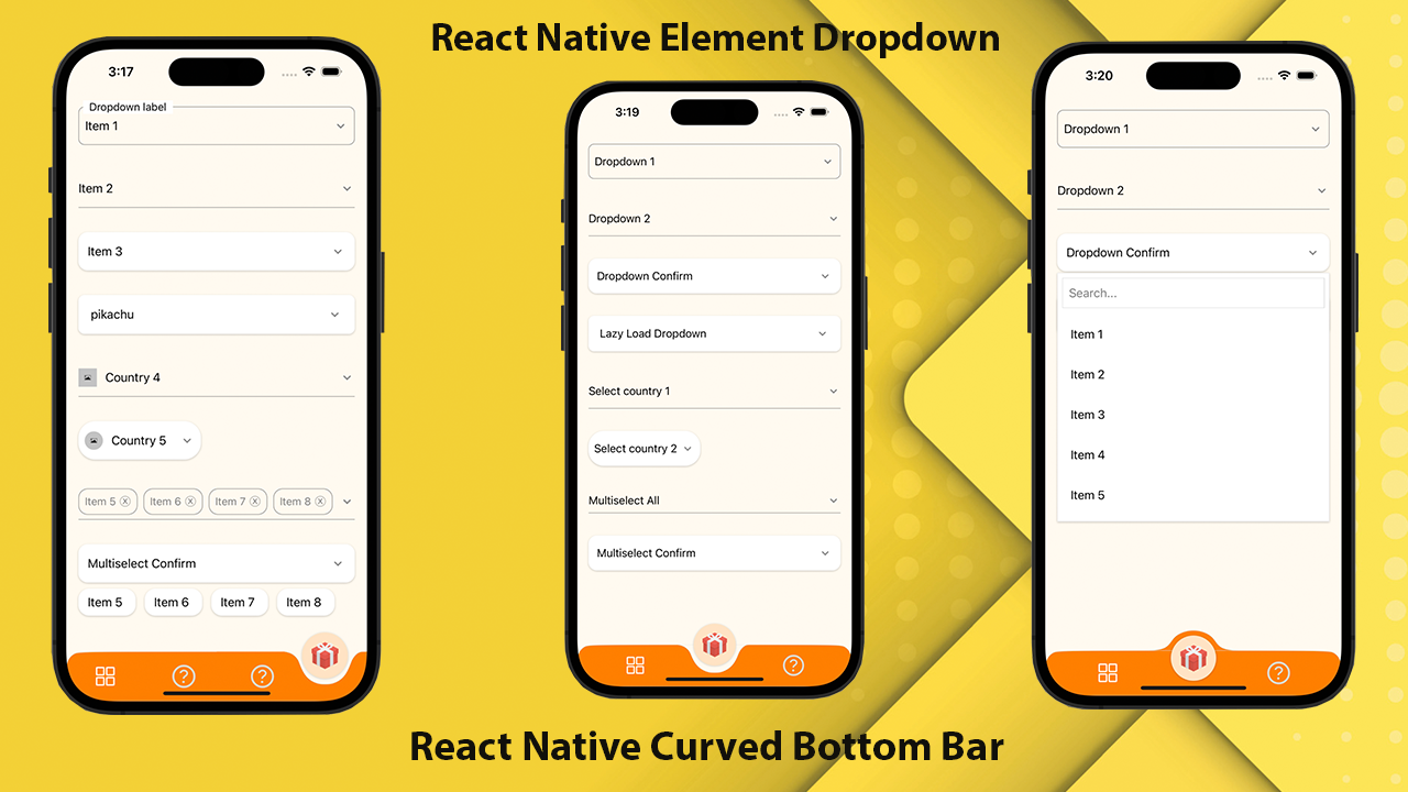
أداء عالي الأداء وجميل وقابل للتخصيص بالكامل من أجل React Native. تم تنفيذها باستخدام React-Native-SVG و @React-Navigation/TABS.
If you love this library , give us a star , you will be a ray of sunshine in our lives : )رد فعل القالب الأصلي مع واجهة مستخدم جميلة.
npm install react - native - curved - bottom - bar -- saveأو
yarn add react - native - curved - bottom - barالآن نحتاج إلى تثبيت React-Native-SVG و @React-Navigation/TABS.
| الدعائم | params | Isrequire | وصف |
|---|---|---|---|
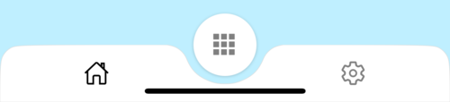
| يكتب | "أسفل" أو "UP" | نعم | نوع عنصر علامة التبويب المركزية ، منحنى أسفل أو منحنى أعلى |
| دائرة | "المركز" أو "اليسار" أو "يمين" | لا | موقف زر الدائرة |
| initialRoutename | خيط | نعم | اسم المسار لتقديمه على الحمل الأول من المستكشف |
| Tabbar | (} | نعم | الوظيفة التي تُرجع عنصر React لعرضه كقارة علامات التبويب |
| RenderCircle | (} | نعم | الوظيفة التي تُرجع عنصر React لعرضه كعنصر علامة التبويب المركزية |
| Circlewidth | رقم | لا | تخصيص عرض عنصر علامة التبويب المركزية. الحد الأدنى هو 50 بكسل والحد الأقصى هو 60 بكسل |
| أسلوب | ViewStyle | لا | التصميم لعرض الحاوية |
| Shadowstyle | ViewStyle | لا | التصميم لعرض الظل. |
| عرض | رقم | لا | تخصيص عرض لعرض الحاوية |
| ارتفاع | رقم | لا | تخصيص ارتفاع لعرض الحاوية ، الحد الأدنى هو 50 بكسل والحد الأقصى هو 90 بكسل |
| الحدود | منطقية | لا | قطر الحدود أعلى اليسار والأعلى يمينًا من عرض الحاوية |
| الحدود | خيط | لا | لون الحدود |
| عرض الحدود | رقم | لا | عرض الحدود |
| bgcolor | خيط | لا | لون خلفية عرض الحاوية |
| الدعائم | params | Isrequire | وصف |
|---|---|---|---|
| اسم | خيط | نعم | اسم الطريق للقفز إلى |
| موضع | "يسار" أو "يمين" أو "دائرة" | نعم | قم بتعيين موضع رمز Tabbar إلى يسار أو يمين زر الدائرة. استخدم اكتب "دائرة" فقط عندما تريد أن يكون زر الدائرة هو tabview |
| عنصر | (الدعائم) => jsx.element | نعم | params الشاشة للاندماج في مسار الوجهة |
| وظيفة | params | وصف |
|---|---|---|
| setVisible | منطقية | تستخدم لإخفاء/إظهار شريط علامة التبويب. على سبيل المثال: Ref.Current.setVisible (خطأ) |
import React from 'react' ;
import {
Alert ,
Animated ,
StyleSheet ,
TouchableOpacity ,
View ,
} from 'react-native' ;
import { CurvedBottomBarExpo } from 'react-native-curved-bottom-bar' ;
import Ionicons from '@expo/vector-icons/Ionicons' ;
import { NavigationContainer } from '@react-navigation/native' ;
const Screen1 = ( ) => {
return < View style = { styles . screen1 } /> ;
} ;
const Screen2 = ( ) => {
return < View style = { styles . screen2 } /> ;
} ;
export default function App ( ) {
const _renderIcon = ( routeName , selectedTab ) => {
let icon = '' ;
switch ( routeName ) {
case 'title1' :
icon = 'ios-home-outline' ;
break ;
case 'title2' :
icon = 'settings-outline' ;
break ;
}
return (
< Ionicons
name = { icon }
size = { 25 }
color = { routeName === selectedTab ? 'black' : 'gray' }
/>
) ;
} ;
const renderTabBar = ( { routeName , selectedTab , navigate } ) => {
return (
< TouchableOpacity
onPress = { ( ) => navigate ( routeName ) }
style = { styles . tabbarItem }
>
{ _renderIcon ( routeName , selectedTab ) }
</ TouchableOpacity >
) ;
} ;
return (
< NavigationContainer >
< CurvedBottomBarExpo . Navigator
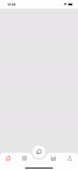
type = "DOWN"
style = { styles . bottomBar }
shadowStyle = { styles . shawdow }
height = { 55 }
circleWidth = { 50 }
bgColor = "white"
initialRouteName = "title1"
borderTopLeftRight
renderCircle = { ( { selectedTab , navigate } ) => (
< Animated . View style = { styles . btnCircleUp } >
< TouchableOpacity
style = { styles . button }
onPress = { ( ) => Alert . alert ( 'Click Action' ) }
>
< Ionicons name = { 'apps-sharp' } color = "gray" size = { 25 } />
</ TouchableOpacity >
</ Animated . View >
) }
tabBar = { renderTabBar }
>
< CurvedBottomBarExpo . Screen
name = "title1"
position = "LEFT"
component = { ( ) => < Screen1 /> }
/>
< CurvedBottomBarExpo . Screen
name = "title2"
component = { ( ) => < Screen2 /> }
position = "RIGHT"
/>
</ CurvedBottomBarExpo . Navigator >
</ NavigationContainer >
) ;
}
export const styles = StyleSheet . create ( {
container : {
flex : 1 ,
padding : 20 ,
} ,
shawdow : {
shadowColor : '#DDDDDD' ,
shadowOffset : {
width : 0 ,
height : 0 ,
} ,
shadowOpacity : 1 ,
shadowRadius : 5 ,
} ,
button : {
flex : 1 ,
justifyContent : 'center' ,
} ,
bottomBar : { } ,
btnCircleUp : {
width : 60 ,
height : 60 ,
borderRadius : 30 ,
alignItems : 'center' ,
justifyContent : 'center' ,
backgroundColor : '#E8E8E8' ,
bottom : 30 ,
shadowColor : '#000' ,
shadowOffset : {
width : 0 ,
height : 1 ,
} ,
shadowOpacity : 0.2 ,
shadowRadius : 1.41 ,
elevation : 1 ,
} ,
imgCircle : {
width : 30 ,
height : 30 ,
tintColor : 'gray' ,
} ,
tabbarItem : {
flex : 1 ,
alignItems : 'center' ,
justifyContent : 'center' ,
} ,
img : {
width : 30 ,
height : 30 ,
} ,
screen1 : {
flex : 1 ,
backgroundColor : '#BFEFFF' ,
} ,
screen2 : {
flex : 1 ,
backgroundColor : '#FFEBCD' ,
} ,
} ) ;
 import React from 'react' ;
import {
  Alert ,
  Animated ,
  StyleSheet ,
  TouchableOpacity ,
  View ,
} from 'react-native' ;
import { CurvedBottomBar } from 'react-native-curved-bottom-bar' ;
import Ionicons from 'react-native-vector-icons/Ionicons' ;
import { NavigationContainer } from '@react-navigation/native' ;

const Screen1 = ( ) => {
  return < View style = { styles . screen1 } /> ;
} ;

const Screen2 = ( ) => {
  return < View style = { styles . screen2 } /> ;
} ;

export default function App ( ) {
  const _renderIcon = ( routeName , selectedTab ) => {
    let icon = '' ;

    switch ( routeName ) {
      case 'title1' :
        icon = 'ios-home-outline' ;
        break ;
      case 'title2' :
        icon = 'settings-outline' ;
        break ;
    }

    return (
      < Ionicons
        name = { icon }
        size = { 25 }
        color = { routeName === selectedTab ? 'black' : 'gray' }
      />
    ) ;
  } ;
  const renderTabBar = ( { routeName , selectedTab , navigate } ) => {
    return (
      < TouchableOpacity
        onPress = { ( ) => navigate ( routeName ) }
        style = { styles . tabbarItem }
      >
        { _renderIcon ( routeName , selectedTab ) }
      </ TouchableOpacity >
    ) ;
  } ;

  return (
    < NavigationContainer >
      < CurvedBottomBar . Navigator
        type = "UP"
        style = { styles . bottomBar }
        shadowStyle = { styles . shawdow }
        height = { 55 }
        circleWidth = { 50 }
        bgColor = "white"
        initialRouteName = "title1"
        borderTopLeftRight
        renderCircle = { ( { selectedTab , navigate } ) => (
          < Animated . View style = { styles . btnCircleUp } >
            < TouchableOpacity
              style = { styles . button }
              onPress = { ( ) => Alert . alert ( 'Click Action' ) }
            >
              < Ionicons name = { 'apps-sharp' } color = "gray" size = { 25 } />
            </ TouchableOpacity >
          </ Animated . View >
        ) }
        tabBar = { renderTabBar }
      >
        < CurvedBottomBar . Screen
          name = "title1"
          position = "LEFT"
          component = { ( ) => < Screen1 /> }
        />
        < CurvedBottomBar . Screen
          name = "title2"
          component = { ( ) => < Screen2 /> }
          position = "RIGHT"
        />
      </ CurvedBottomBar . Navigator >
    </ NavigationContainer >
  ) ;
}

export const styles = StyleSheet . create ( {
  container : {
    flex : 1 ,
    padding : 20 ,
  } ,
  shawdow : {
    shadowColor : '#DDDDDD' ,
    shadowOffset : {
      width : 0 ,
      height : 0 ,
    } ,
    shadowOpacity : 1 ,
    shadowRadius : 5 ,
  } ,
  button : {
    flex : 1 ,
    justifyContent : 'center' ,
  } ,
  bottomBar : { } ,
  btnCircleUp : {
    width : 60 ,
    height : 60 ,
    borderRadius : 30 ,
    alignItems : 'center' ,
    justifyContent : 'center' ,
    backgroundColor : '#E8E8E8' ,
    bottom : 18 ,
    shadowColor : '#000' ,
    shadowOffset : {
      width : 0 ,
      height : 1 ,
    } ,
    shadowOpacity : 0.2 ,
    shadowRadius : 1.41 ,
    elevation : 1 ,
  } ,
  imgCircle : {
    width : 30 ,
    height : 30 ,
    tintColor : 'gray' ,
  } ,
  tabbarItem : {
    flex : 1 ,
    alignItems : 'center' ,
    justifyContent : 'center' ,
  } ,
  img : {
    width : 30 ,
    height : 30 ,
  } ,
  screen1 : {
    flex : 1 ,
    backgroundColor : '#BFEFFF' ,
  } ,
  screen2 : {
    flex : 1 ,
    backgroundColor : '#FFEBCD' ,
  } ,
} ) ; 


