react native curved bottom bar
Release 3.4.0
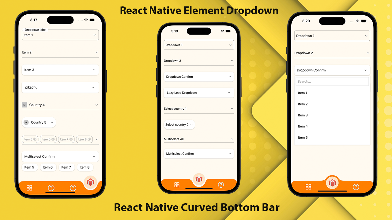
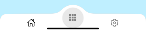
Bilah navigasi dasar melengkung berkinerja tinggi, indah dan sepenuhnya dapat disesuaikan untuk React Native. Diimplementasikan menggunakan react-native-SVG dan @react-navigation/bottom-tabs.
If you love this library , give us a star , you will be a ray of sunshine in our lives : )Bereaksi template asli dengan UI yang indah.
npm install react - native - curved - bottom - bar -- saveatau
yarn add react - native - curved - bottom - barSekarang kita perlu menginstal react-native-SVG dan @react-navigation/bottom-tab.
| Alat peraga | Params | Isrequire | Keterangan |
|---|---|---|---|
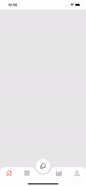
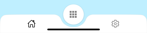
| jenis | 'Turun' atau 'naik' | Ya | Jenis item tab tengah, kurva ke bawah atau kurva ke atas |
| CirclePosition | 'Tengah' atau 'kiri' atau 'kanan' | TIDAK | Posisi tombol lingkaran |
| InitialRoutename | Rangkaian | Ya | Nama rute untuk merender pada beban pertama navigator |
| tabbar | ({routename, selectedtab, navigasi}) => jsx.element | Ya | Fungsi yang mengembalikan elemen bereaksi untuk ditampilkan sebagai bilah tab |
| RenderCircle | ({routename, selectedtab, navigasi}) => jsx.element | Ya | Fungsi yang mengembalikan elemen bereaksi untuk ditampilkan sebagai item tab tengah |
| CircleWidth | Nomor | TIDAK | Kustomisasi Lebar Item Tab Pusat. Minimum 50px dan maksimum 60px |
| gaya | View style | TIDAK | Styling for Container View |
| Shadowstyle | View style | TIDAK | Styling for Shadow View. |
| lebar | Nomor | TIDAK | Kustomisasi lebar untuk tampilan kontainer |
| tinggi | Nomor | TIDAK | Kustomisasi tinggi untuk tampilan kontainer, minimum 50px dan maksimum 90px |
| BorderToplefTright | Boolean | TIDAK | Radius perbatasan kiri atas dan kanan atas tampilan kontainer |
| BorderColor | Rangkaian | TIDAK | Warna perbatasan |
| Borderwidth | Nomor | TIDAK | Lebar perbatasan |
| bgcolor | Rangkaian | TIDAK | Warna latar belakang tampilan kontainer |
| Alat peraga | Params | Isrequire | Keterangan |
|---|---|---|---|
| nama | Rangkaian | Ya | Nama rute untuk melompat ke |
| posisi | 'Kiri' atau 'kanan' atau 'lingkaran' | Ya | Atur posisi ikon Tabbar ke kiri atau kanan tombol lingkaran. Gunakan tipe "lingkaran" hanya saat Anda ingin tombol lingkaran adalah tabview |
| komponen | (alat peraga) => jsx.element | Ya | Layar Params untuk bergabung ke rute tujuan |
| Fungsi | Params | Keterangan |
|---|---|---|
| setVisible | Boolean | Digunakan untuk menyembunyikan/menampilkan bilah tab. Contoh: Ref.Current.SetVisible (false) |
 import React from 'react' ;
import {
  Alert ,
  Animated ,
  StyleSheet ,
  TouchableOpacity ,
  View ,
} from 'react-native' ;
import { CurvedBottomBarExpo } from 'react-native-curved-bottom-bar' ;
import Ionicons from '@expo/vector-icons/Ionicons' ;
import { NavigationContainer } from '@react-navigation/native' ;

const Screen1 = ( ) => {
  return < View style = { styles . screen1 } /> ;
} ;

const Screen2 = ( ) => {
  return < View style = { styles . screen2 } /> ;
} ;

export default function App ( ) {
  const _renderIcon = ( routeName , selectedTab ) => {
    let icon = '' ;

    switch ( routeName ) {
      case 'title1' :
        icon = 'ios-home-outline' ;
        break ;
      case 'title2' :
        icon = 'settings-outline' ;
        break ;
    }

    return (
      < Ionicons
        name = { icon }
        size = { 25 }
        color = { routeName === selectedTab ? 'black' : 'gray' }
      />
    ) ;
  } ;
  const renderTabBar = ( { routeName , selectedTab , navigate } ) => {
    return (
      < TouchableOpacity
        onPress = { ( ) => navigate ( routeName ) }
        style = { styles . tabbarItem }
      >
        { _renderIcon ( routeName , selectedTab ) }
      </ TouchableOpacity >
    ) ;
  } ;

  return (
    < NavigationContainer >
      < CurvedBottomBarExpo . Navigator
        type = "DOWN"
        style = { styles . bottomBar }
        shadowStyle = { styles . shawdow }
        height = { 55 }
        circleWidth = { 50 }
        bgColor = "white"
        initialRouteName = "title1"
        borderTopLeftRight
        renderCircle = { ( { selectedTab , navigate } ) => (
          < Animated . View style = { styles . btnCircleUp } >
            < TouchableOpacity
              style = { styles . button }
              onPress = { ( ) => Alert . alert ( 'Click Action' ) }
            >
              < Ionicons name = { 'apps-sharp' } color = "gray" size = { 25 } />
            </ TouchableOpacity >
          </ Animated . View >
        ) }
        tabBar = { renderTabBar }
      >
        < CurvedBottomBarExpo . Screen
          name = "title1"
          position = "LEFT"
          component = { ( ) => < Screen1 /> }
        />
        < CurvedBottomBarExpo . Screen
          name = "title2"
          component = { ( ) => < Screen2 /> }
          position = "RIGHT"
        />
      </ CurvedBottomBarExpo . Navigator >
    </ NavigationContainer >
  ) ;
}

export const styles = StyleSheet . create ( {
  container : {
    flex : 1 ,
    padding : 20 ,
  } ,
  shawdow : {
    shadowColor : '#DDDDDD' ,
    shadowOffset : {
      width : 0 ,
      height : 0 ,
    } ,
    shadowOpacity : 1 ,
    shadowRadius : 5 ,
  } ,
  button : {
    flex : 1 ,
    justifyContent : 'center' ,
  } ,
  bottomBar : { } ,
  btnCircleUp : {
    width : 60 ,
    height : 60 ,
    borderRadius : 30 ,
    alignItems : 'center' ,
    justifyContent : 'center' ,
    backgroundColor : '#E8E8E8' ,
    bottom : 30 ,
    shadowColor : '#000' ,
    shadowOffset : {
      width : 0 ,
      height : 1 ,
    } ,
    shadowOpacity : 0.2 ,
    shadowRadius : 1.41 ,
    elevation : 1 ,
  } ,
  imgCircle : {
    width : 30 ,
    height : 30 ,
    tintColor : 'gray' ,
  } ,
  tabbarItem : {
    flex : 1 ,
    alignItems : 'center' ,
    justifyContent : 'center' ,
  } ,
  img : {
    width : 30 ,
    height : 30 ,
  } ,
  screen1 : {
    flex : 1 ,
    backgroundColor : '#BFEFFF' ,
  } ,
  screen2 : {
    flex : 1 ,
    backgroundColor : '#FFEBCD' ,
  } ,
} ) ;
 import React from 'react' ;
import {
  Alert ,
  Animated ,
  StyleSheet ,
  TouchableOpacity ,
  View ,
} from 'react-native' ;
import { CurvedBottomBar } from 'react-native-curved-bottom-bar' ;
import Ionicons from 'react-native-vector-icons/Ionicons' ;
import { NavigationContainer } from '@react-navigation/native' ;

const Screen1 = ( ) => {
  return < View style = { styles . screen1 } /> ;
} ;

const Screen2 = ( ) => {
  return < View style = { styles . screen2 } /> ;
} ;

export default function App ( ) {
  const _renderIcon = ( routeName , selectedTab ) => {
    let icon = '' ;

    switch ( routeName ) {
      case 'title1' :
        icon = 'ios-home-outline' ;
        break ;
      case 'title2' :
        icon = 'settings-outline' ;
        break ;
    }

    return (
      < Ionicons
        name = { icon }
        size = { 25 }
        color = { routeName === selectedTab ? 'black' : 'gray' }
      />
    ) ;
  } ;
  const renderTabBar = ( { routeName , selectedTab , navigate } ) => {
    return (
      < TouchableOpacity
        onPress = { ( ) => navigate ( routeName ) }
        style = { styles . tabbarItem }
      >
        { _renderIcon ( routeName , selectedTab ) }
      </ TouchableOpacity >
    ) ;
  } ;

  return (
    < NavigationContainer >
      < CurvedBottomBar . Navigator
        type = "UP"
        style = { styles . bottomBar }
        shadowStyle = { styles . shawdow }
        height = { 55 }
        circleWidth = { 50 }
        bgColor = "white"
        initialRouteName = "title1"
        borderTopLeftRight
        renderCircle = { ( { selectedTab , navigate } ) => (
          < Animated . View style = { styles . btnCircleUp } >
            < TouchableOpacity
              style = { styles . button }
              onPress = { ( ) => Alert . alert ( 'Click Action' ) }
            >
              < Ionicons name = { 'apps-sharp' } color = "gray" size = { 25 } />
            </ TouchableOpacity >
          </ Animated . View >
        ) }
        tabBar = { renderTabBar }
      >
        < CurvedBottomBar . Screen
          name = "title1"
          position = "LEFT"
          component = { ( ) => < Screen1 /> }
        />
        < CurvedBottomBar . Screen
          name = "title2"
          component = { ( ) => < Screen2 /> }
          position = "RIGHT"
        />
      </ CurvedBottomBar . Navigator >
    </ NavigationContainer >
  ) ;
}

export const styles = StyleSheet . create ( {
  container : {
    flex : 1 ,
    padding : 20 ,
  } ,
  shawdow : {
    shadowColor : '#DDDDDD' ,
    shadowOffset : {
      width : 0 ,
      height : 0 ,
    } ,
    shadowOpacity : 1 ,
    shadowRadius : 5 ,
  } ,
  button : {
    flex : 1 ,
    justifyContent : 'center' ,
  } ,
  bottomBar : { } ,
  btnCircleUp : {
    width : 60 ,
    height : 60 ,
    borderRadius : 30 ,
    alignItems : 'center' ,
    justifyContent : 'center' ,
    backgroundColor : '#E8E8E8' ,
    bottom : 18 ,
    shadowColor : '#000' ,
    shadowOffset : {
      width : 0 ,
      height : 1 ,
    } ,
    shadowOpacity : 0.2 ,
    shadowRadius : 1.41 ,
    elevation : 1 ,
  } ,
  imgCircle : {
    width : 30 ,
    height : 30 ,
    tintColor : 'gray' ,
  } ,
  tabbarItem : {
    flex : 1 ,
    alignItems : 'center' ,
    justifyContent : 'center' ,
  } ,
  img : {
    width : 30 ,
    height : 30 ,
  } ,
  screen1 : {
    flex : 1 ,
    backgroundColor : '#BFEFFF' ,
  } ,
  screen2 : {
    flex : 1 ,
    backgroundColor : '#FFEBCD' ,
  } ,
} ) ; 


