react native curved bottom bar
Release 3.4.0
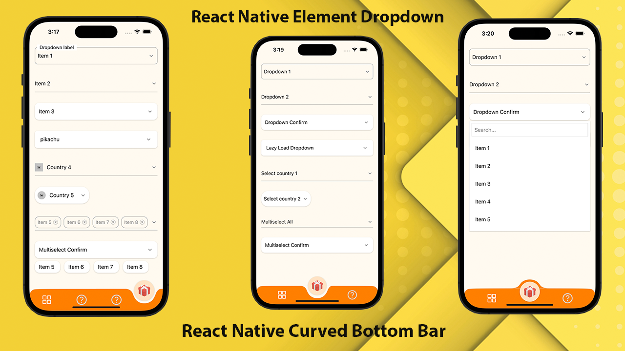
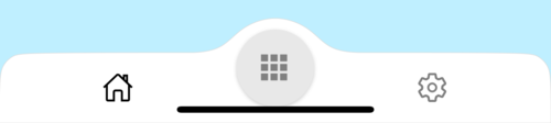
Una barra de navegación inferior curva de alto rendimiento, hermosa y totalmente personalizable para React Native. Implementado utilizando React-Native-SVG y @React-Navegación/Tabas inferiores.
If you love this library , give us a star , you will be a ray of sunshine in our lives : )Reaccione la plantilla nativa con una hermosa interfaz de usuario.
npm install react - native - curved - bottom - bar -- saveo
yarn add react - native - curved - bottom - barAhora necesitamos instalar React-Native-SVG y @React-Navigation/Tablero inferior.
| Accesorios | Parámetros | Isrequire | Descripción |
|---|---|---|---|
| tipo | 'Abajo' o 'arriba' | Sí | Tipo de elemento de pestaña central, curva hacia abajo o curva ascendente |
| posición círculo | 'Center' o 'izquierda' o 'derecha' | No | Posición del botón Círculo |
| nombre inicial | Cadena | Sí | El nombre de la ruta para renderizar la primera carga del navegador |
| pestaña | ({rutename, selectedTab, navegate}) => jsx.element | Sí | Función que devuelve un elemento react para mostrar como la barra de pestaña |
| rendercir | ({rutename, selectedTab, navegate}) => jsx.element | Sí | Función que devuelve un elemento react para mostrar como elemento de pestaña central |
| ancho del círculo | Número | No | Personalizar el ancho del elemento de la pestaña central. El mínimo es 50px y el máximo es 60px |
| estilo | Vista de estilo | No | Estilo para la vista del contenedor |
| Estilo de sombra | Vista de estilo | No | Estilo para la vista de la sombra. |
| ancho | Número | No | Personalizar el ancho para la vista del contenedor |
| altura | Número | No | Altura de personalización para la vista del contenedor, el mínimo es 50px y el máximo es 90px |
| borderTopleftright | Booleano | No | Radio de borde superior a la izquierda y superior a la derecha de la vista del contenedor |
| bordercolor | Cadena | No | Color de borde |
| ancho de la frontera | Número | No | Ancho fronterizo |
| bgcolor | Cadena | No | Color de fondo de la vista del contenedor |
| Accesorios | Parámetros | Isrequire | Descripción |
|---|---|---|---|
| nombre | Cadena | Sí | Nombre de la ruta para saltar a |
| posición | 'Izquierda' o 'derecha' o 'círculo' | Sí | Establezca la posición del icono TabBar a la izquierda o derecha del botón Círculo. Use el tipo de "círculo" solo cuando desee, el botón Circle es un TabView |
| componente | (Props) => JSX.Element | Sí | Parámetros de pantalla para fusionarse en la ruta de destino |
| Función | Parámetros | Descripción |
|---|---|---|
| setvisible | Booleano | Se usa para ocultar/mostrar la barra de pestaña. Ej: ref.current.setVisible (falso) |
 import React from 'react' ;
import {
  Alert ,
  Animated ,
  StyleSheet ,
  TouchableOpacity ,
  View ,
} from 'react-native' ;
import { CurvedBottomBarExpo } from 'react-native-curved-bottom-bar' ;
import Ionicons from '@expo/vector-icons/Ionicons' ;
import { NavigationContainer } from '@react-navigation/native' ;

const Screen1 = ( ) => {
  return < View style = { styles . screen1 } /> ;
} ;

const Screen2 = ( ) => {
  return < View style = { styles . screen2 } /> ;
} ;

export default function App ( ) {
  const _renderIcon = ( routeName , selectedTab ) => {
    let icon = '' ;

    switch ( routeName ) {
      case 'title1' :
        icon = 'ios-home-outline' ;
        break ;
      case 'title2' :
        icon = 'settings-outline' ;
        break ;
    }

    return (
      < Ionicons
        name = { icon }
        size = { 25 }
        color = { routeName === selectedTab ? 'black' : 'gray' }
      />
    ) ;
  } ;
  const renderTabBar = ( { routeName , selectedTab , navigate } ) => {
    return (
      < TouchableOpacity
        onPress = { ( ) => navigate ( routeName ) }
        style = { styles . tabbarItem }
      >
        { _renderIcon ( routeName , selectedTab ) }
      </ TouchableOpacity >
    ) ;
  } ;

  return (
    < NavigationContainer >
      < CurvedBottomBarExpo . Navigator
        type = "DOWN"
        style = { styles . bottomBar }
        shadowStyle = { styles . shawdow }
        height = { 55 }
        circleWidth = { 50 }
        bgColor = "white"
        initialRouteName = "title1"
        borderTopLeftRight
        renderCircle = { ( { selectedTab , navigate } ) => (
          < Animated . View style = { styles . btnCircleUp } >
            < TouchableOpacity
              style = { styles . button }
              onPress = { ( ) => Alert . alert ( 'Click Action' ) }
            >
              < Ionicons name = { 'apps-sharp' } color = "gray" size = { 25 } />
            </ TouchableOpacity >
          </ Animated . View >
        ) }
        tabBar = { renderTabBar }
      >
        < CurvedBottomBarExpo . Screen
          name = "title1"
          position = "LEFT"
          component = { ( ) => < Screen1 /> }
        />
        < CurvedBottomBarExpo . Screen
          name = "title2"
          component = { ( ) => < Screen2 /> }
          position = "RIGHT"
        />
      </ CurvedBottomBarExpo . Navigator >
    </ NavigationContainer >
  ) ;
}

export const styles = StyleSheet . create ( {
  container : {
    flex : 1 ,
    padding : 20 ,
  } ,
  shawdow : {
    shadowColor : '#DDDDDD' ,
    shadowOffset : {
      width : 0 ,
      height : 0 ,
    } ,
    shadowOpacity : 1 ,
    shadowRadius : 5 ,
  } ,
  button : {
    flex : 1 ,
    justifyContent : 'center' ,
  } ,
  bottomBar : { } ,
  btnCircleUp : {
    width : 60 ,
    height : 60 ,
    borderRadius : 30 ,
    alignItems : 'center' ,
    justifyContent : 'center' ,
    backgroundColor : '#E8E8E8' ,
    bottom : 30 ,
    shadowColor : '#000' ,
    shadowOffset : {
      width : 0 ,
      height : 1 ,
    } ,
    shadowOpacity : 0.2 ,
    shadowRadius : 1.41 ,
    elevation : 1 ,
  } ,
  imgCircle : {
    width : 30 ,
    height : 30 ,
    tintColor : 'gray' ,
  } ,
  tabbarItem : {
    flex : 1 ,
    alignItems : 'center' ,
    justifyContent : 'center' ,
  } ,
  img : {
    width : 30 ,
    height : 30 ,
  } ,
  screen1 : {
    flex : 1 ,
    backgroundColor : '#BFEFFF' ,
  } ,
  screen2 : {
    flex : 1 ,
    backgroundColor : '#FFEBCD' ,
  } ,
} ) ;
 import React from 'react' ;
import {
  Alert ,
  Animated ,
  StyleSheet ,
  TouchableOpacity ,
  View ,
} from 'react-native' ;
import { CurvedBottomBar } from 'react-native-curved-bottom-bar' ;
import Ionicons from 'react-native-vector-icons/Ionicons' ;
import { NavigationContainer } from '@react-navigation/native' ;

const Screen1 = ( ) => {
  return < View style = { styles . screen1 } /> ;
} ;

const Screen2 = ( ) => {
  return < View style = { styles . screen2 } /> ;
} ;

export default function App ( ) {
  const _renderIcon = ( routeName , selectedTab ) => {
    let icon = '' ;

    switch ( routeName ) {
      case 'title1' :
        icon = 'ios-home-outline' ;
        break ;
      case 'title2' :
        icon = 'settings-outline' ;
        break ;
    }

    return (
      < Ionicons
        name = { icon }
        size = { 25 }
        color = { routeName === selectedTab ? 'black' : 'gray' }
      />
    ) ;
  } ;
  const renderTabBar = ( { routeName , selectedTab , navigate } ) => {
    return (
      < TouchableOpacity
        onPress = { ( ) => navigate ( routeName ) }
        style = { styles . tabbarItem }
      >
        { _renderIcon ( routeName , selectedTab ) }
      </ TouchableOpacity >
    ) ;
  } ;

  return (
    < NavigationContainer >
      < CurvedBottomBar . Navigator
        type = "UP"
        style = { styles . bottomBar }
        shadowStyle = { styles . shawdow }
        height = { 55 }
        circleWidth = { 50 }
        bgColor = "white"
        initialRouteName = "title1"
        borderTopLeftRight
        renderCircle = { ( { selectedTab , navigate } ) => (
          < Animated . View style = { styles . btnCircleUp } >
            < TouchableOpacity
              style = { styles . button }
              onPress = { ( ) => Alert . alert ( 'Click Action' ) }
            >
              < Ionicons name = { 'apps-sharp' } color = "gray" size = { 25 } />
            </ TouchableOpacity >
          </ Animated . View >
        ) }
        tabBar = { renderTabBar }
      >
        < CurvedBottomBar . Screen
          name = "title1"
          position = "LEFT"
          component = { ( ) => < Screen1 /> }
        />
        < CurvedBottomBar . Screen
          name = "title2"
          component = { ( ) => < Screen2 /> }
          position = "RIGHT"
        />
      </ CurvedBottomBar . Navigator >
    </ NavigationContainer >
  ) ;
}

export const styles = StyleSheet . create ( {
  container : {
    flex : 1 ,
    padding : 20 ,
  } ,
  shawdow : {
    shadowColor : '#DDDDDD' ,
    shadowOffset : {
      width : 0 ,
      height : 0 ,
    } ,
    shadowOpacity : 1 ,
    shadowRadius : 5 ,
  } ,
  button : {
    flex : 1 ,
    justifyContent : 'center' ,
  } ,
  bottomBar : { } ,
  btnCircleUp : {
    width : 60 ,
    height : 60 ,
    borderRadius : 30 ,
    alignItems : 'center' ,
    justifyContent : 'center' ,
    backgroundColor : '#E8E8E8' ,
    bottom : 18 ,
    shadowColor : '#000' ,
    shadowOffset : {
      width : 0 ,
      height : 1 ,
    } ,
    shadowOpacity : 0.2 ,
    shadowRadius : 1.41 ,
    elevation : 1 ,
  } ,
  imgCircle : {
    width : 30 ,
    height : 30 ,
    tintColor : 'gray' ,
  } ,
  tabbarItem : {
    flex : 1 ,
    alignItems : 'center' ,
    justifyContent : 'center' ,
  } ,
  img : {
    width : 30 ,
    height : 30 ,
  } ,
  screen1 : {
    flex : 1 ,
    backgroundColor : '#BFEFFF' ,
  } ,
  screen2 : {
    flex : 1 ,
    backgroundColor : '#FFEBCD' ,
  } ,
} ) ; 


