SwiftUICharts
v2.10.3
Swiftui的图表 /绘图库。在MACOS,iOS,WatchOS和TVOS上工作,并具有内置的可访问性和本地化功能。
演示项目
文档
在API上使用更快的感觉进行版本3。
线图
填充的线图
多线图
范围的线图
条形图
远程条形图
分组的条形图
堆叠的条形图
饼图
甜甜圈图
使用LineChartData数据模型。
LineChart ( chartData : LineChartData ) 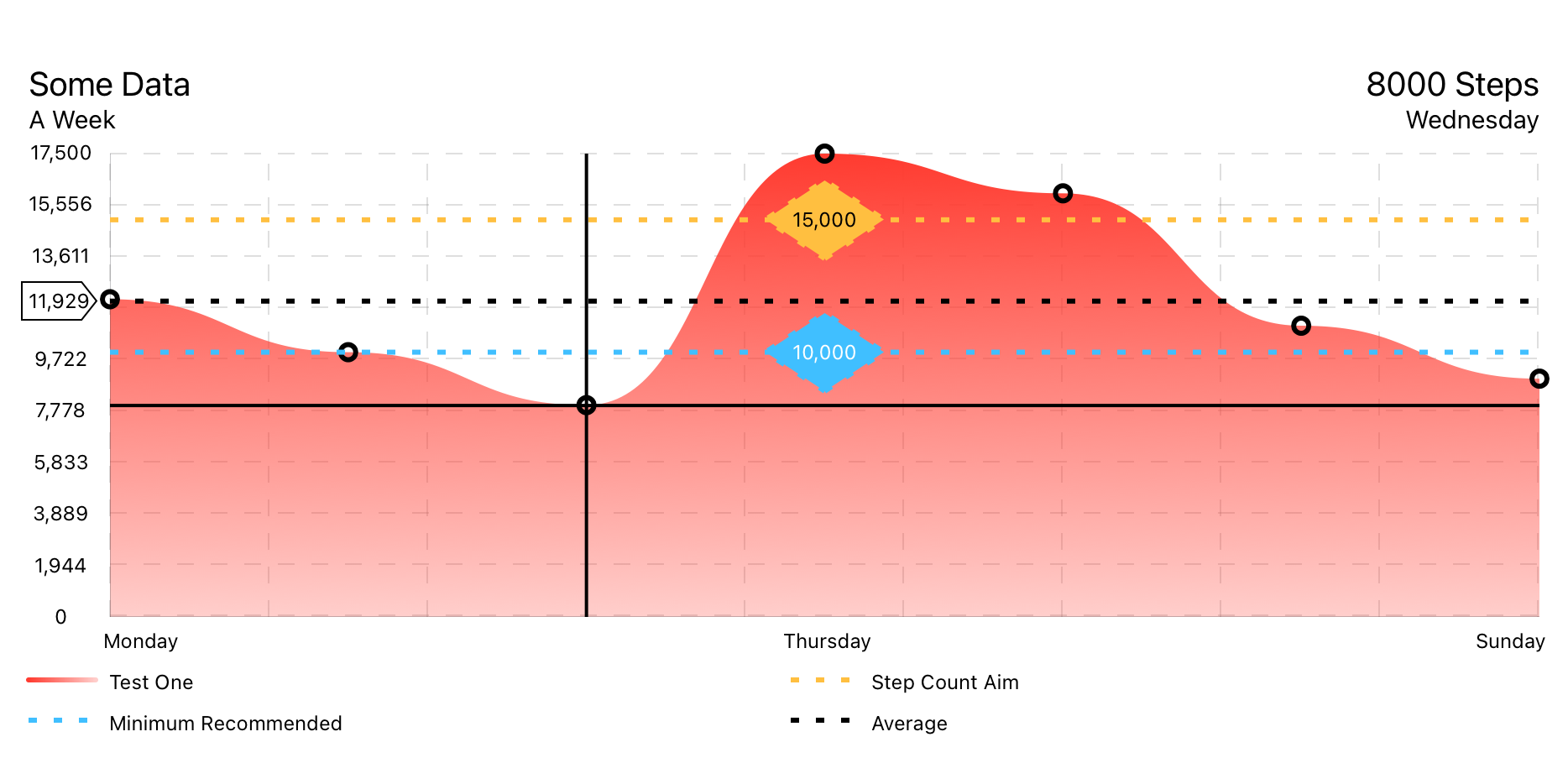
使用LineChartData数据模型。
FilledLineChart ( chartData : LineChartData ) 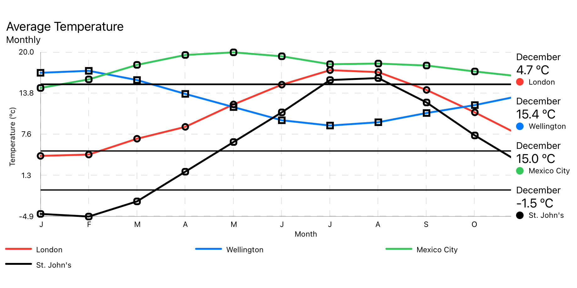
使用MultiLineChartData数据模型。
MultiLineChart ( chartData : MultiLineChartData ) 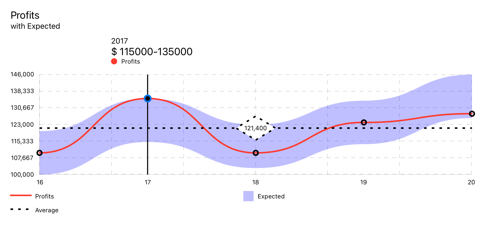
使用RangedLineChart数据模型。
RangedLineChart ( chartData : RangedLineChartData )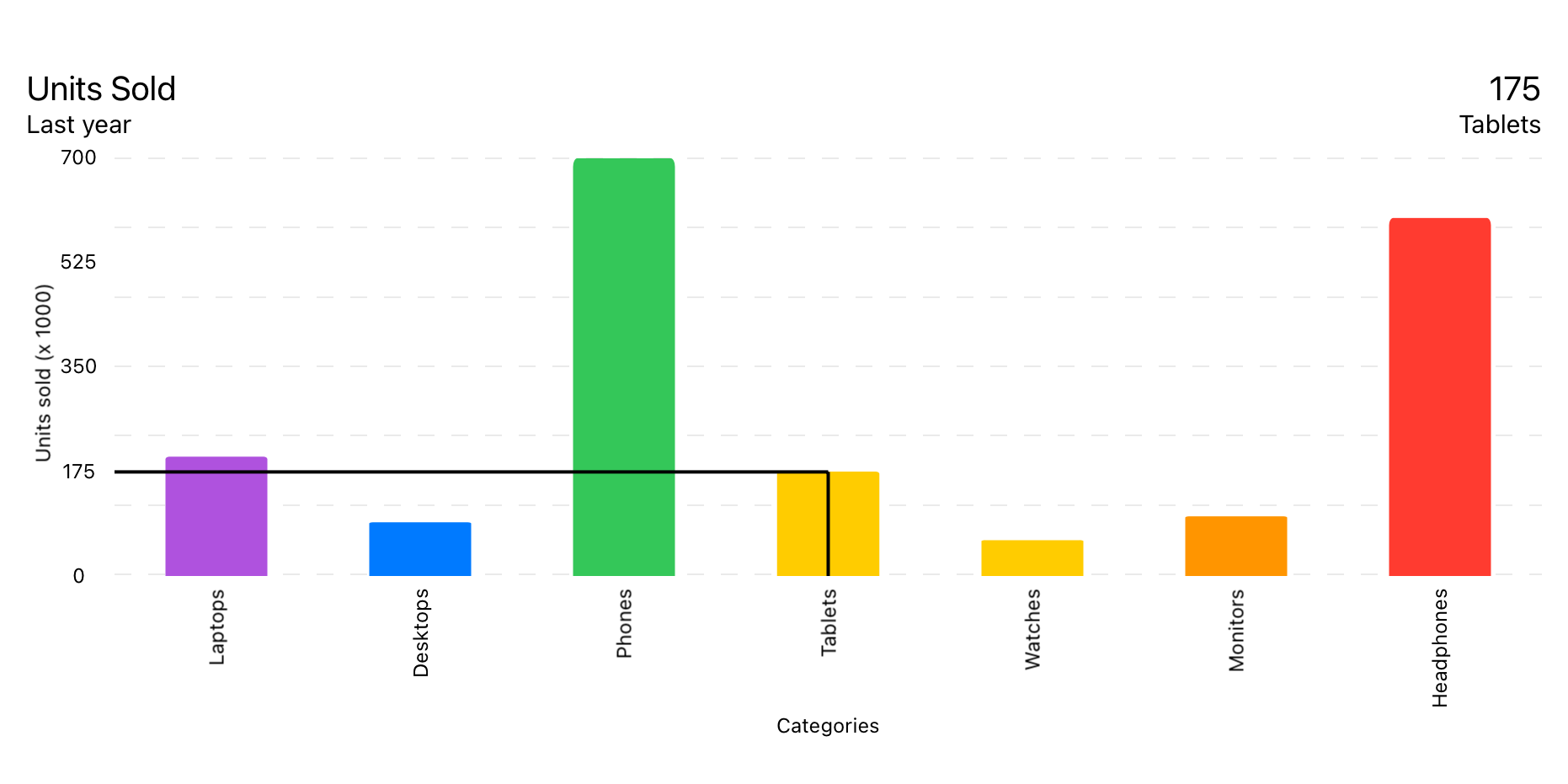
使用BarChartData数据模型。
BarChart ( chartData : BarChartData ) 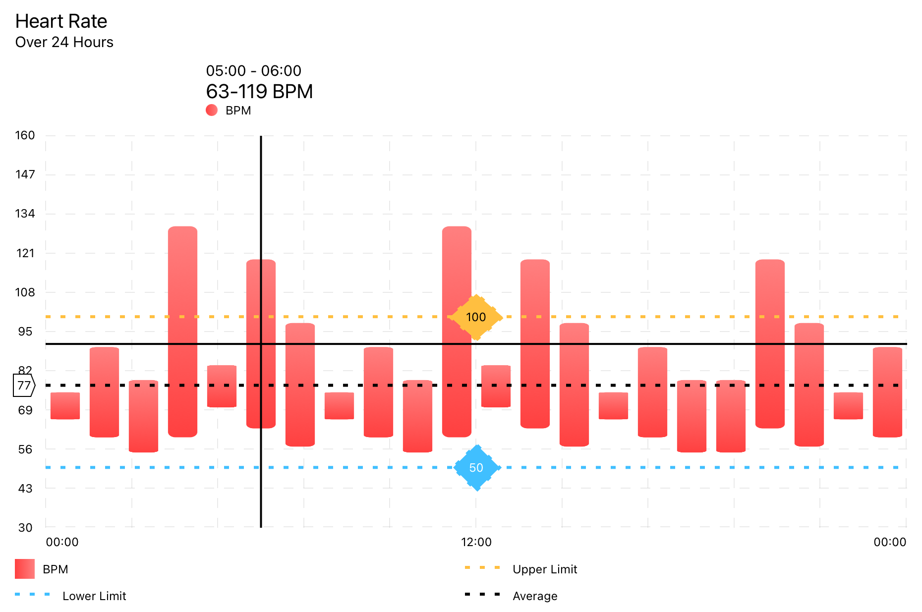
使用RangedBarChartData数据模型。
RangedBarChart ( chartData : RangedBarChartData ) 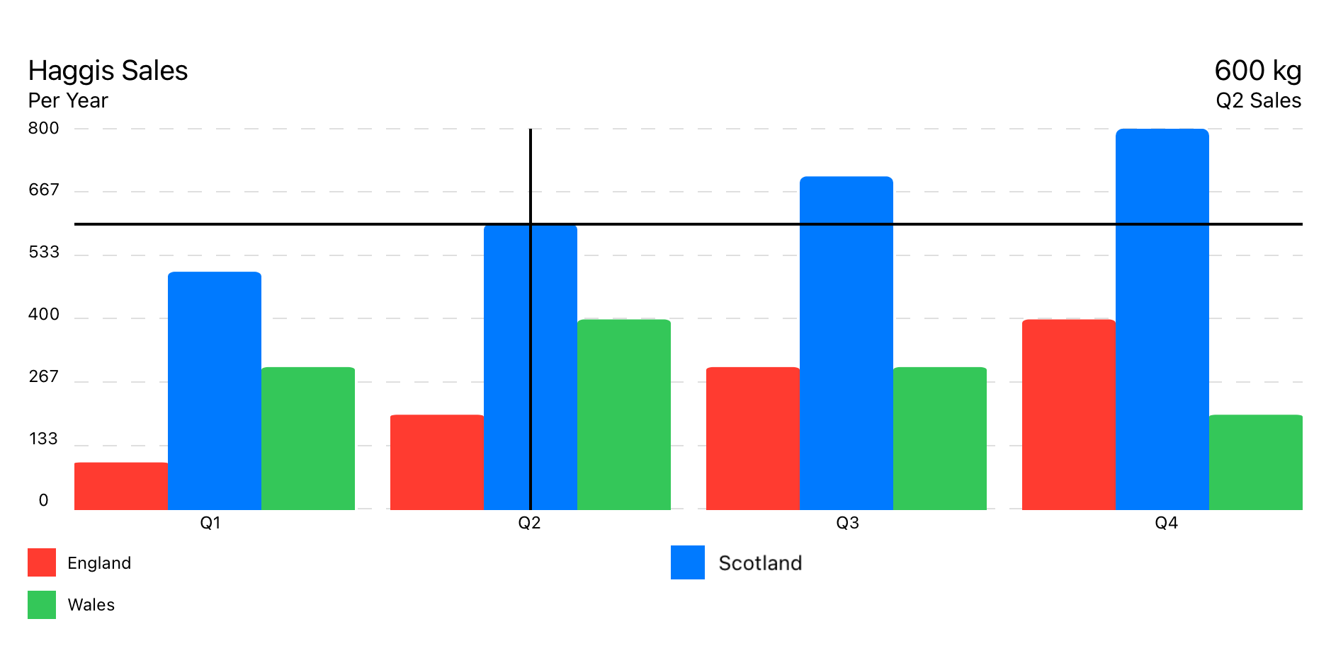
使用GroupedBarChartData数据模型。
GroupedBarChart ( chartData : GroupedBarChartData ) 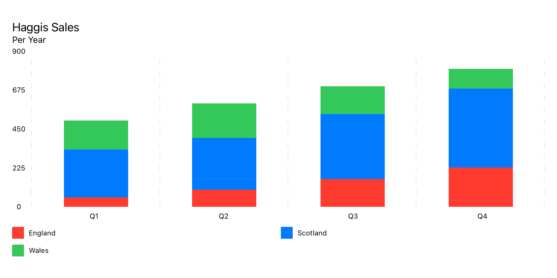
使用StackedBarChartData数据模型。
StackedBarChart ( chartData : StackedBarChartData )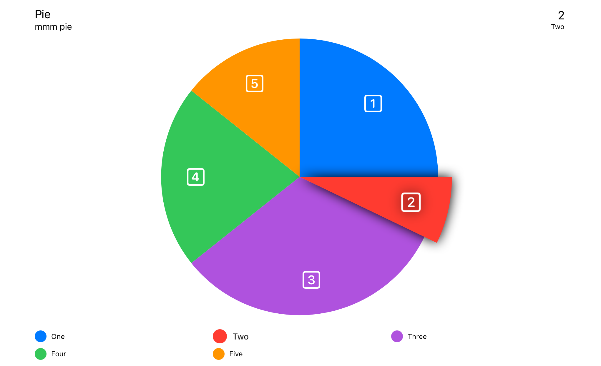
使用PieChartData数据模型。
PieChart ( chartData : PieChartData ) 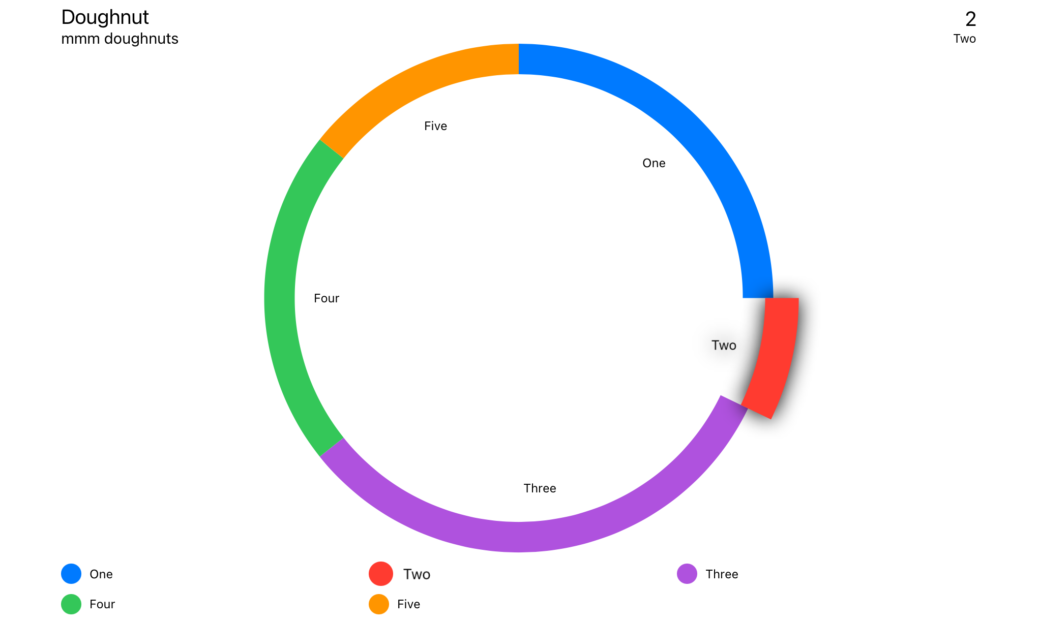
使用DoughnutChartData数据模型。
DoughnutChart ( chartData : DoughnutChartData ) Swift软件包管理器
File > Swift Packages > Add Package Dependency...
import SwiftUICharts如果您在视图无法正确更新时遇到麻烦,请在视图中添加.id() 。
 LineChart ( chartData : LineChartData )
. id ( LineChartData . id ) 触摸覆盖
信息框
浮动信息框
标题盒
传奇
平均线
y轴的兴趣点
X轴网格
y轴网格
X轴标签
Y轴标签
线性趋势线
点标记
视图修饰符的顺序是重要的,因为修饰符是围绕先前视图的各种类型的堆栈。
从指针触摸中检测输入。找到最近的数据点并在指定的情况下显示相关信息。
信息框的位置设置在ChartStyle -> infoBoxPlacement中。
. touchOverlay ( chartData : CTChartData , specifier : String , unit : TouchUnit )图表数据中的设置 - >图表样式
如果将InfoBoxPlacement设置为.infoBox ,则显示触摸覆盖的信息。
信息框的位置设置在ChartStyle -> infoBoxPlacement中。
. infoBox ( chartData : CTChartData )如果将InfoBoxPlacement设置为.floating则显示触摸覆盖的信息。
信息框的位置设置在ChartStyle -> infoBoxPlacement中。
. floatingInfoBox ( chartData : CTChartData )显示有关图表的元数据,在Chart Data -> ChartMetadata
如果将InfoBoxPlacement设置为.header ,则显示触摸覆盖的信息。
信息框的位置设置在ChartStyle -> infoBoxPlacement中。
. headerBox ( chartData : CTChartData ) 显示传奇。
. legends ( )在每个数据点上列出标记。
在所有数据点的平均值上显示标记线。
 . averageLine ( chartData : CTLineBarChartDataProtocol ,
             markerName : " Average " ,
             labelPosition : . yAxis ( specifier : " %.0f " ) ,
             lineColour : . primary ,
strokeStyle : StrokeStyle ( lineWidth : 3 , dash : [ 5 , 10 ] ) )可配置的兴趣点
 . yAxisPOI ( chartData : CTLineBarChartDataProtocol ,
          markerName : " Marker " ,
          markerValue : 123 ,
          labelPosition : . center ( specifier : " %.0f " ) ,
          labelColour : Color . black ,
          labelBackground : Color . orange ,
          lineColour : Color . orange ,
strokeStyle : StrokeStyle ( lineWidth : 3 , dash : [ 5 , 10 ] ) )沿X轴添加垂直线。
. xAxisGrid ( chartData : CTLineBarChartDataProtocol ) ChartData -> ChartStyle 。
沿Y轴添加水平线。
. yAxisGrid ( chartData : CTLineBarChartDataProtocol ) ChartData -> ChartStyle 。
X轴的标签。
. xAxisLabels ( chartData : CTLineBarChartDataProtocol ) ChartData -> ChartStyle 。
自动生成Y轴的标签
. yAxisLabels ( chartData : CTLineBarChartDataProtocol , specifier : " %.0f " ) ChartData -> ChartStyle 。
yaxislabeltype:
case numeric // Auto generated, numeric labels.
case custom // Custom labels array自定义是从ChartData -> yAxisLabels设置的
图表上的一条线以显示数据的趋势。
 . linearTrendLine ( chartData : CTLineBarChartDataProtocol ,
                 firstValue : Double ,
                 lastValue : Double ,
                 lineColour : ColourStyle ,
strokeStyle : StrokeStyle )在每个数据点上列出标记。
. pointMarkers ( chartData : CTLineChartDataProtocol ) Data Set -> PointStyle中的设置。
在Filllinechart的顶部添加了一条独立的行。
 . filledTopLine ( chartData : LineChartData ,
               lineColour : ColourStyle ,
               strokeStyle : StrokeStyle )
允许使用半透明填充的数据点上的硬线。
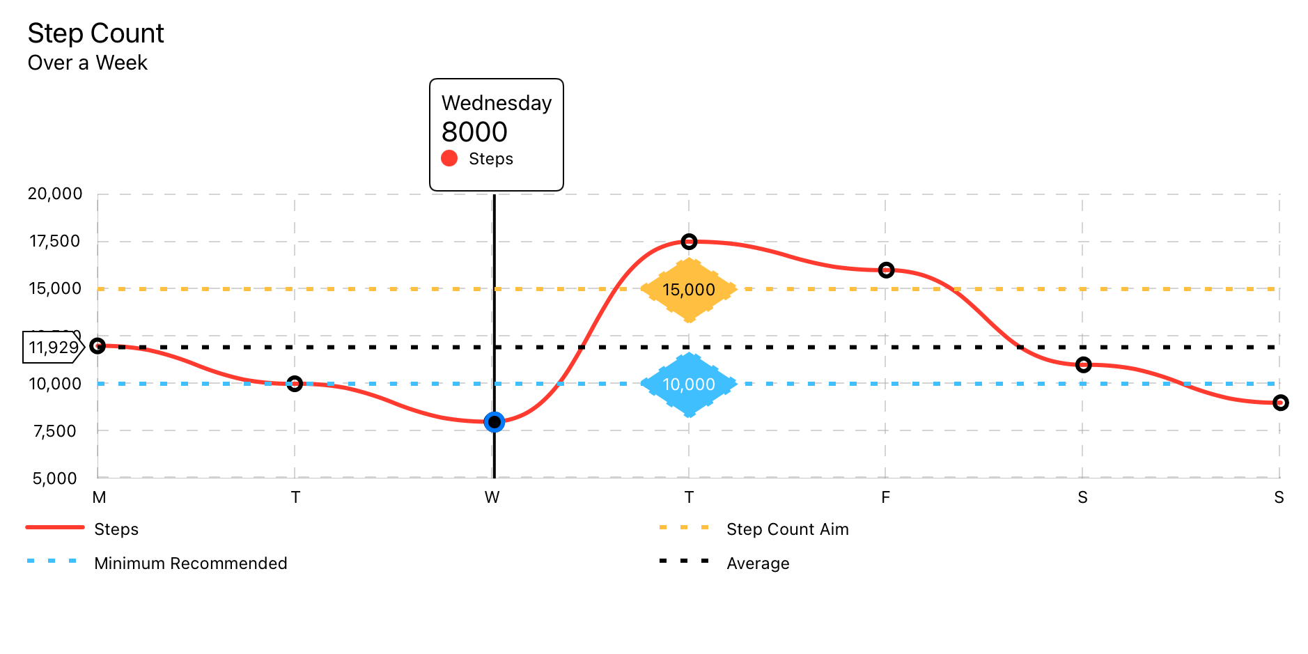
 struct LineChartDemoView : View {

    let data : LineChartData = weekOfData ( )

    var body : some View {
        VStack {
            LineChart ( chartData : data )
                . pointMarkers ( chartData : data )
                . touchOverlay ( chartData : data , specifier : " %.0f " )
                . yAxisPOI ( chartData : data ,
                          markerName : " Step Count Aim " ,
                          markerValue : 15_000 ,
                          labelPosition : . center ( specifier : " %.0f " ) ,
                          labelColour : Color . black ,
                          labelBackground : Color ( red : 1.0 , green : 0.75 , blue : 0.25 ) ,
                          lineColour : Color ( red : 1.0 , green : 0.75 , blue : 0.25 ) ,
                          strokeStyle : StrokeStyle ( lineWidth : 3 , dash : [ 5 , 10 ] ) )
                . yAxisPOI ( chartData : data ,
                          markerName : " Minimum Recommended " ,
                          markerValue : 10_000 ,
                          labelPosition : . center ( specifier : " %.0f " ) ,
                          labelColour : Color . white ,
                          labelBackground : Color ( red : 0.25 , green : 0.75 , blue : 1.0 ) ,
                          lineColour : Color ( red : 0.25 , green : 0.75 , blue : 1.0 ) ,
                          strokeStyle : StrokeStyle ( lineWidth : 3 , dash : [ 5 , 10 ] ) )
                . averageLine ( chartData : data ,
                             strokeStyle : StrokeStyle ( lineWidth : 3 , dash : [ 5 , 10 ] ) )
                . xAxisGrid ( chartData : data )
                . yAxisGrid ( chartData : data )
                . xAxisLabels ( chartData : data )
                . yAxisLabels ( chartData : data )
                . infoBox ( chartData : data )
                . headerBox ( chartData : data )
                . legends ( chartData : data , columns : [ GridItem ( . flexible ( ) ) , GridItem ( . flexible ( ) ) ] )
                . id ( data . id )
                . frame ( minWidth : 150 , maxWidth : 900 , minHeight : 150 , idealHeight : 250 , maxHeight : 400 , alignment : . center )
        }
        . navigationTitle ( " Week of Data " )
    }

    static func weekOfData ( ) -> LineChartData {
        let data = LineDataSet ( dataPoints : [
            LineChartDataPoint ( value : 12000 , xAxisLabel : " M " , description : " Monday " ) ,
            LineChartDataPoint ( value : 10000 , xAxisLabel : " T " , description : " Tuesday " ) ,
            LineChartDataPoint ( value : 8000 ,  xAxisLabel : " W " , description : " Wednesday " ) ,
            LineChartDataPoint ( value : 17500 , xAxisLabel : " T " , description : " Thursday " ) ,
            LineChartDataPoint ( value : 16000 , xAxisLabel : " F " , description : " Friday " ) ,
            LineChartDataPoint ( value : 11000 , xAxisLabel : " S " , description : " Saturday " ) ,
            LineChartDataPoint ( value : 9000 ,  xAxisLabel : " S " , description : " Sunday " )
        ] ,
        legendTitle : " Steps " ,
        pointStyle : PointStyle ( ) ,
        style : LineStyle ( lineColour : ColourStyle ( colour : . red ) , lineType : . curvedLine ) )

        let metadata   = ChartMetadata ( title : " Step Count " , subtitle : " Over a Week " )

        let gridStyle  = GridStyle ( numberOfLines : 7 ,
                                   lineColour   : Color ( . lightGray ) . opacity ( 0.5 ) ,
                                   lineWidth    : 1 ,
                                   dash         : [ 8 ] ,
                                   dashPhase    : 0 )

        let chartStyle = LineChartStyle ( infoBoxPlacement    : . infoBox ( isStatic : false ) ,
                                        infoBoxBorderColour : Color . primary ,
                                        infoBoxBorderStyle  : StrokeStyle ( lineWidth : 1 ) ,

                                        markerType          : . vertical ( attachment : . line ( dot : . style ( DotStyle ( ) ) ) ) ,

                                        xAxisGridStyle      : gridStyle ,
                                        xAxisLabelPosition  : . bottom ,
                                        xAxisLabelColour    : Color . primary ,
                                        xAxisLabelsFrom     : . dataPoint ( rotation : . degrees ( 0 ) ) ,

                                        yAxisGridStyle      : gridStyle ,
                                        yAxisLabelPosition  : . leading ,
                                        yAxisLabelColour    : Color . primary ,
                                        yAxisNumberOfLabels : 7 ,

                                        baseline            : . minimumWithMaximum ( of : 5000 ) ,
                                        topLine             : . maximum ( of : 20000 ) ,

                                        globalAnimation     : . easeOut ( duration : 1 ) )

        return LineChartData ( dataSets       : data ,
                             metadata       : metadata ,
                             chartStyle     : chartStyle )

    }
}内部某些元素是其他标签,以帮助描述配音图表。
查看可访问性的本地化
所有标签都支持本地化。但是,有一些隐藏的标签可以支持配音。查看可访问性的本地化
请参阅演示项目中的本地化演示。
当用户触摸最接近数据点的区域时,语音对数据点的描述。配音将说<chart title>, <data point value>, <data point description> 。
" %@ <local_description_of_a_data_point> " = " %@, <Description of a data point> " ;在poiMarker之前读出。配音会说<poi marker>, <marker legend title>, <marker value> 。
 " P-O-I-Marker " = " P O I Marker " ;
" Average " = " Average " ;声音超过了对poiMarker的描述。配音会说<POI-Marker>, <marker legend title>, <marker value> 。
" <local_marker_legend_title> %@ " = " local_marker_legend_title, %@ " ;在axisLabel之前读出。画外音会说<axisLabel>, <marker value> 。
 "X-Axis-Label" = "X Axis Label";
"Y-Axis-Label" = "Y Axis Label";
在legend之前读出。配音会说<chart type legend>, <legend title> 。
 " Line-Chart-Legend " = " Line Chart Legend " ;
" P-O-I-Marker-Legend " = " P O I Marker Legend " ;
" Bar-Chart-Legend " = " Bar Chart Legend " ;
" P-O-I-Marker-Legend " = " P O I Marker Legend " ;
" Pie-Chart-Legend " = " Pie Chart Legend " ;
" P-O-I-Marker-Legend " = " P O I Marker Legend " ;

