LWGUI
1.21.0
中文 | ภาษาอังกฤษ
ระบบ GUI ที่ มีน้ำหนักเบายืดหยุ่นและทรงพลัง
ได้รับการตรวจสอบผ่านโครงการเชิงพาณิชย์ขนาดใหญ่จำนวนมากการใช้ไวยากรณ์ของลิ้นชักอสังหาริมทรัพย์ในวัสดุที่กระชับช่วยให้การรับรู้ของ Shader GUIs ที่ทรงพลังลดเวลาในการพัฒนาอย่างมีนัยสำคัญส่งเสริมการใช้งานง่ายและยืดหยุ่นและยกระดับประสบการณ์ผู้ใช้สำหรับศิลปินได้อย่างมีประสิทธิภาพ

 |  |
|---|---|
| ใหม่: ตัวแก้ไขการไล่ระดับสีที่ทรงพลังกว่า UE พร้อมรองรับทั้ง Shader และ C# | ใหม่: แทรกภาพลงใน Shadergui โดยตรงเพื่อรองรับการแสดงเอกสารที่ซับซ้อนโดยไม่ต้องข้ามไปที่เบราว์เซอร์ |
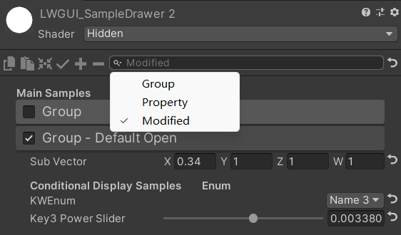 | 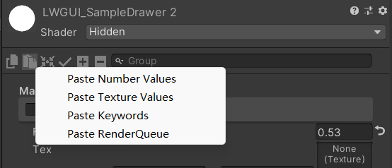 |
| แถบค้นหายังสามารถกรองคุณสมบัติที่ได้รับการแก้ไข | คลิกขวาที่จะวางค่าแอตทริบิวต์ตามประเภท |
| ด้วยการสนับสนุนของคุณฉันจะอัปเดตอย่างแข็งขันมากขึ้น | 有你的赞助我会更加积极地更新 |
|---|---|
| paypal.me/jasonma0012 |  |
ตรวจสอบให้แน่ใจว่าสภาพแวดล้อมของคุณเข้ากันได้กับ lwgui
lwgui <1.17: Unity 2017.4+
lwgui> = 1.17: Unity 2021.3+
เปิดโครงการของคุณ
Window > Package Manager > Add > Add package from git URL , Enter: https://github.com/JasonMa0012/LWGUI.git
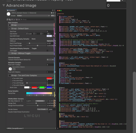
Package Manager > Add package from diskCustomEditor "LWGUI.LWGUI" /// Create a Folding Group
/// group: group name (Default: Property Name)
/// keyword: keyword used for toggle, "_" = ignore, none or "__" = Property Name + "_ON", always Upper (Default: none)
/// default Folding State: "on" or "off" (Default: off)
/// default Toggle Displayed: "on" or "off" (Default: on)
/// Target Property Type: FLoat, express Toggle value
public MainDrawer ( ) : this ( String . Empty ) { }
public MainDrawer ( string group ) : this ( group , String . Empty ) { }
public MainDrawer ( string group , string keyword ) : this ( group , keyword , "off" ) { }
public MainDrawer ( string group , string keyword , string defaultFoldingState ) : this ( group , keyword , defaultFoldingState , "on" ) { }
public MainDrawer ( string group , string keyword , string defaultFoldingState , string defaultToggleDisplayed ) /// Draw a property with default style in the folding group
/// group: father group name, support suffix keyword for conditional display (Default: none)
/// Target Property Type: Any
public SubDrawer ( ) { }
public SubDrawer ( string group )ตัวอย่าง:
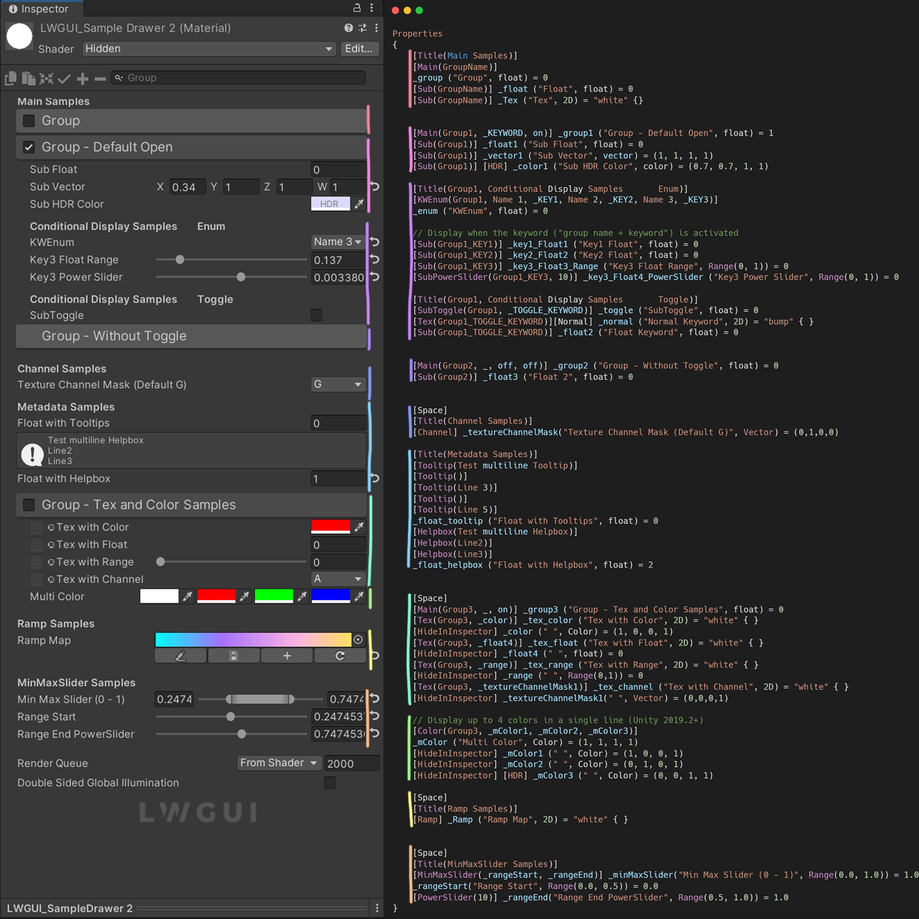
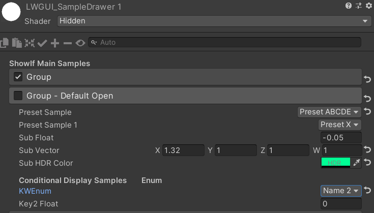
[ Title ( Main Samples ) ]
[ Main ( GroupName ) ]
_group ( "Group" , float ) = 0
[ Sub ( GroupName ) ] _float ( "Float" , float ) = 0
[ Main ( Group1 , _KEYWORD , on ) ] _group1 ( "Group - Default Open" , float ) = 1
[ Sub ( Group1 ) ] _float1 ( "Sub Float" , float ) = 0
[ Sub ( Group1 ) ] _vector1 ( "Sub Vector" , vector ) = ( 1 , 1 , 1 , 1 )
[ Sub ( Group1 ) ] [ HDR ] _color1 ( "Sub HDR Color" , color ) = ( 0.7 , 0.7 , 1 , 1 )
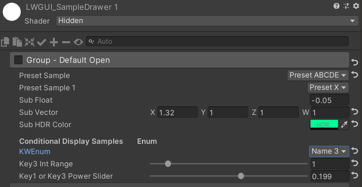
[ Title ( Group1 , Conditional Display Samples Enum ) ]
[ KWEnum ( Group1 , Name 1 , _KEY1 , Name 2 , _KEY2 , Name 3 , _KEY3 ) ]
_enum ( "KWEnum" , float ) = 0
// Display when the keyword ("group name + keyword") is activated
[ Sub ( Group1_KEY1 ) ] _key1_Float1 ( "Key1 Float" , float ) = 0
[ Sub ( Group1_KEY2 ) ] _key2_Float2 ( "Key2 Float" , float ) = 0
[ Sub ( Group1_KEY3 ) ] _key3_Float3_Range ( "Key3 Float Range" , Range ( 0 , 1 ) ) = 0
[ SubPowerSlider ( Group1_KEY3 , 10 ) ] _key3_Float4_PowerSlider ( "Key3 Power Slider" , Range ( 0 , 1 ) ) = 0
[ Title ( Group1 , Conditional Display Samples Toggle ) ]
[ SubToggle ( Group1 , _TOGGLE_KEYWORD ) ] _toggle ( "SubToggle" , float ) = 0
[ Tex ( Group1_TOGGLE_KEYWORD ) ] [ Normal ] _normal ( "Normal Keyword" , 2D ) = "bump" { }
[ Sub ( Group1_TOGGLE_KEYWORD ) ] _float2 ( "Float Keyword" , float ) = 0
[ Main ( Group2 , _ , off , off ) ] _group2 ( "Group - Without Toggle" , float ) = 0
[ Sub ( Group2 ) ] _float3 ( "Float 2" , float ) = 0ผลลัพธ์เริ่มต้น:
จากนั้นเปลี่ยนค่า:
 /// Similar to builtin Toggle()
/// group: father group name, support suffix keyword for conditional display (Default: none)
/// keyword: keyword used for toggle, "_" = ignore, none or "__" = Property Name +  "_ON", always Upper (Default: none)
/// Target Property Type: FLoat
public SubToggleDrawer ( ) { }
public SubToggleDrawer ( string group ) : this ( group , String . Empty ) { }
public SubToggleDrawer ( string group , string keyWord ) /// Similar to builtin PowerSlider()
/// group: father group name, support suffix keyword for conditional display (Default: none)
/// power: power of slider (Default: 1)
/// Target Property Type: Range
public SubPowerSliderDrawer ( float power ) : this ( "_" , power ) { }
public SubPowerSliderDrawer ( string group , float power ) /// Similar to builtin IntRange()
/// group: father group name, support suffix keyword for conditional display (Default: none)
/// Target Property Type: Range
public SubIntRangeDrawer ( string group ) /// Draw a min max slider
/// group: father group name, support suffix keyword for conditional display (Default: none)
/// minPropName: Output Min Property Name
/// maxPropName: Output Max Property Name
/// Target Property Type: Range, range limits express the MinMaxSlider value range
/// Output Min/Max Property Type: Range, it's value is limited by it's range
public MinMaxSliderDrawer ( string minPropName , string maxPropName ) : this ( "_" , minPropName , maxPropName ) { }
public MinMaxSliderDrawer ( string group , string minPropName , string maxPropName )ตัวอย่าง:
 [ Title ( MinMaxSlider Samples ) ]
[ MinMaxSlider ( _rangeStart , _rangeEnd ) ] _minMaxSlider ( "Min Max Slider (0 - 1)" , Range ( 0.0 , 1.0 ) ) = 1.0
/*[HideInInspector]*/ _rangeStart ( "Range Start" , Range ( 0.0 , 0.5 ) ) = 0.0
/*[HideInInspector]*/ [ PowerSlider ( 10 ) ] _rangeEnd ( "Range End PowerSlider" , Range ( 0.5 , 1.0 ) ) = 1.0
ผลลัพธ์:
 /// <summary>
/// Similar to builtin Enum() / KeywordEnum()
/// group: father group name, support suffix keyword for conditional display (Default: none)
/// n(s): display name
/// k(s): keyword
/// v(s): value
/// Target Property Type: FLoat, express current keyword index
/// </summary>
public KWEnumDrawer ( string n1 , string k1 )
public KWEnumDrawer ( string n1 , string k1 , string n2 , string k2 )
public KWEnumDrawer ( string n1 , string k1 , string n2 , string k2 , string n3 , string k3 )
public KWEnumDrawer ( string n1 , string k1 , string n2 , string k2 , string n3 , string k3 , string n4 , string k4 )
public KWEnumDrawer ( string n1 , string k1 , string n2 , string k2 , string n3 , string k3 , string n4 , string k4 , string n5 , string k5 )

public KWEnumDrawer ( string group , string n1 , string k1 )
public KWEnumDrawer ( string group , string n1 , string k1 , string n2 , string k2 )
public KWEnumDrawer ( string group , string n1 , string k1 , string n2 , string k2 , string n3 , string k3 )
public KWEnumDrawer ( string group , string n1 , string k1 , string n2 , string k2 , string n3 , string k3 , string n4 , string k4 )
public KWEnumDrawer ( string group , string n1 , string k1 , string n2 , string k2 , string n3 , string k3 , string n4 , string k4 , string n5 , string k5 ) // enumName: like "UnityEngine.Rendering.BlendMode"
public SubEnumDrawer ( string group , string enumName ) : base ( group , enumName )
public SubEnumDrawer ( string group , string n1 , float v1 , string n2 , float v2 )
public SubEnumDrawer ( string group , string n1 , float v1 , string n2 , float v2 , string n3 , float v3 )
public SubEnumDrawer ( string group , string n1 , float v1 , string n2 , float v2 , string n3 , float v3 , string n4 , float v4 )
public SubEnumDrawer ( string group , string n1 , float v1 , string n2 , float v2 , string n3 , float v3 , string n4 , float v4 , string n5 , float v5 )
public SubEnumDrawer ( string group , string n1 , float v1 , string n2 , float v2 , string n3 , float v3 , string n4 , float v4 , string n5 , float v5 , string n6 , float v6 )
public SubEnumDrawer ( string group , string n1 , float v1 , string n2 , float v2 , string n3 , float v3 , string n4 , float v4 , string n5 , float v5 , string n6 , float v6 , string n7 , float v7 )
public SubKeywordEnumDrawer ( string group , string kw1 , string kw2 )
public SubKeywordEnumDrawer ( string group , string kw1 , string kw2 , string kw3 )
public SubKeywordEnumDrawer ( string group , string kw1 , string kw2 , string kw3 , string kw4 )
public SubKeywordEnumDrawer ( string group , string kw1 , string kw2 , string kw3 , string kw4 , string kw5 )
public SubKeywordEnumDrawer ( string group , string kw1 , string kw2 , string kw3 , string kw4 , string kw5 , string kw6 )
public SubKeywordEnumDrawer ( string group , string kw1 , string kw2 , string kw3 , string kw4 , string kw5 , string kw6 , string kw7 )
public SubKeywordEnumDrawer ( string group , string kw1 , string kw2 , string kw3 , string kw4 , string kw5 , string kw6 , string kw7 , string kw8 )
public SubKeywordEnumDrawer ( string group , string kw1 , string kw2 , string kw3 , string kw4 , string kw5 , string kw6 , string kw7 , string kw8 , string kw9 ) /// Draw a Texture property in single line with a extra property
/// group: father group name, support suffix keyword for conditional display (Default: none)
/// extraPropName: extra property name (Default: none)
/// Target Property Type: Texture
/// Extra Property Type: Color, Vector
public TexDrawer ( ) { }
public TexDrawer ( string group ) : this ( group , String . Empty ) { }
public TexDrawer ( string group , string extraPropName ) /// Display up to 4 colors in a single line
/// group: father group name, support suffix keyword for conditional display (Default: none)
/// color2-4: extra color property name
/// Target Property Type: Color
public ColorDrawer ( string group , string color2 ) : this ( group , color2 , String . Empty , String . Empty ) { }
public ColorDrawer ( string group , string color2 , string color3 ) : this ( group , color2 , color3 , String . Empty ) { }
public ColorDrawer ( string group , string color2 , string color3 , string color4 )ตัวอย่าง:
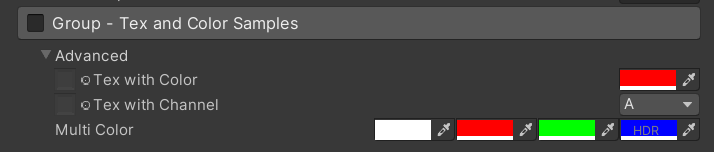
 [ Main ( Group3 , _ , on ) ] _group3 ( "Group - Tex and Color Samples" , float ) = 0
[ Advanced ] [ Tex ( Group3 , _color ) ] _tex_color ( "Tex with Color" , 2D ) = "white" { }
[ Advanced ] [ HideInInspector ] _color ( " ", Color) = (1, 0, 0, 1)
[ Advanced ] [ Tex ( Group3 , _textureChannelMask1 ) ] _tex_channel ( "Tex with Channel" , 2D ) = "white" { }
[ Advanced ] [ HideInInspector ] _textureChannelMask1 ( " ", Vector) = (0, 0, 0, 1)

[ Advanced ] [ Color ( Group3 , _mColor1 , _mColor2 , _mColor3 ) ] _mColor ( "Multi Color" , Color ) = ( 1 , 1 , 1 , 1 )
[ Advanced ] [ HideInInspector ] _mColor1 ( " " , Color ) = ( 1 , 0 , 0 , 1 )
[ Advanced ] [ HideInInspector ] _mColor2 ( " " , Color ) = ( 0 , 1 , 0 , 1 )
[ Advanced ] [ HideInInspector ] [ HDR ] _mColor3 ( " " , Color ) = ( 0 , 0 , 1 , 1 )
ผลลัพธ์:
 /// Draw an image preview.
/// display name: The path of the image file relative to the Unity project, such as: "Assets/test.png", "Doc/test.png", "../test.png"
/// group: father group name, support suffix keyword for conditional display (Default: none)
public ImageDrawer ( ) { }
public ImageDrawer ( string group )
ผลลัพธ์:
 /// Draw a R/G/B/A drop menu:
/// 	R = (1, 0, 0, 0)
/// 	G = (0, 1, 0, 0)
/// 	B = (0, 0, 1, 0)
/// 	A = (0, 0, 0, 1)
/// 	RGB Average = (1f / 3f, 1f / 3f, 1f / 3f, 0)
/// 	RGB Luminance = (0.2126f, 0.7152f, 0.0722f, 0)
///		None = (0, 0, 0, 0)
/// group: father group name, support suffix keyword for conditional display (Default: none)
/// Target Property Type: Vector, used to dot() with Texture Sample Value
public ChannelDrawer ( ) { }
public ChannelDrawer ( string group )
ตัวอย่าง:
 [ Title ( _ , Channel Samples ) ]
[ Channel ( _ ) ] _textureChannelMask ( "Texture Channel Mask (Default G)" , Vector ) = ( 0 , 1 , 0 , 0 )

......

float selectedChannelValue = dot ( tex2D ( _Tex , uv ) , _textureChannelMask ) ; 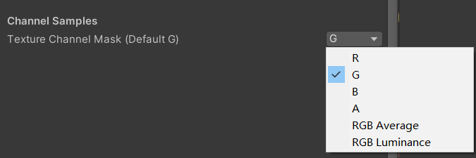
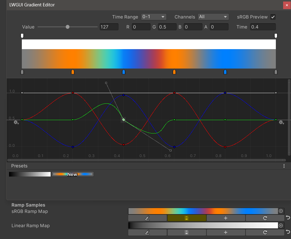
 /// Draw an unreal style Ramp Map Editor (Default Ramp Map Resolution: 512 * 2)
/// NEW: The new LwguiGradient type has both the Gradient and Curve editors, and can be used in C# scripts and runtime, and is intended to replace UnityEngine.Gradient
/// group: father group name, support suffix keyword for conditional display (Default: none)
/// defaultFileName: default Ramp Map file name when create a new one (Default: RampMap)
/// rootPath: the path where ramp is stored, replace '/' with '.' (for example: Assets.Art.Ramps). when selecting ramp, it will also be filtered according to the path (Default: Assets)
/// colorSpace: switch sRGB / Linear in ramp texture import setting (Default: sRGB)
/// defaultWidth: default Ramp Width (Default: 512)
/// viewChannelMask: editable channels. (Default: RGBA)
/// timeRange: the abscissa display range (1/24/2400), is used to optimize the editing experience when the abscissa is time of day. (Default: 1)
/// Target Property Type: Texture2D
public RampDrawer ( ) : this ( String . Empty ) { }
public RampDrawer ( string group ) : this ( group , "RampMap" ) { }
public RampDrawer ( string group , string defaultFileName ) : this ( group , defaultFileName , DefaultRootPath , 512 ) { }
public RampDrawer ( string group , string defaultFileName , float defaultWidth ) : this ( group , defaultFileName , DefaultRootPath , defaultWidth ) { }
public RampDrawer ( string group , string defaultFileName , string rootPath , float defaultWidth ) : this ( group , defaultFileName , rootPath , "sRGB" , defaultWidth ) { }
public RampDrawer ( string group , string defaultFileName , string rootPath , string colorSpace , float defaultWidth ) : this ( group , defaultFileName , rootPath , colorSpace , defaultWidth , "RGBA" ) { }
public RampDrawer ( string group , string defaultFileName , string rootPath , string colorSpace , float defaultWidth , string viewChannelMask ) : this ( group , defaultFileName , rootPath , colorSpace , defaultWidth , viewChannelMask , 1 ) { }
public RampDrawer ( string group , string defaultFileName , string rootPath , string colorSpace , float defaultWidth , string viewChannelMask , float timeRange )
ตัวอย่าง:
[ Ramp ( _ , RampMap , Assets . Art , 512 ) ] _Ramp ( "Ramp Map" , 2D ) = "white" { }ผลลัพธ์:
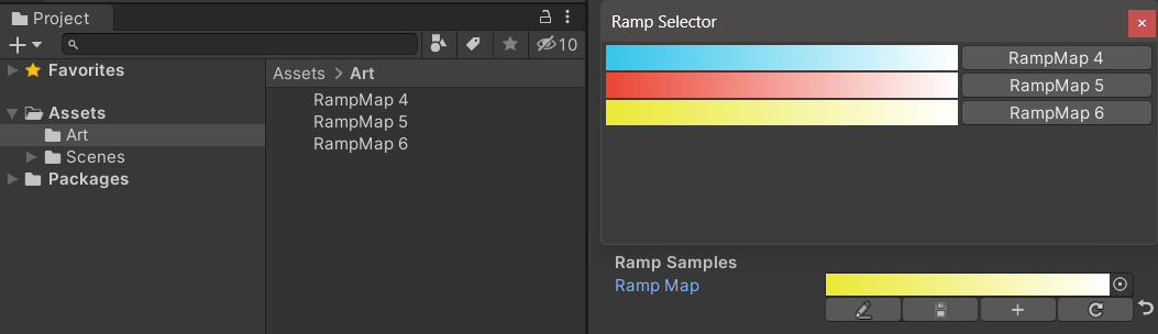
คุณ ต้องบันทึกผลลัพธ์การแก้ไขด้วยตนเอง หากมีการเปลี่ยนแปลงที่ไม่ได้บันทึกปุ่มบันทึกจะแสดงสีเหลือง
เมื่อคุณย้ายหรือคัดลอกแผนที่ทางลาดอย่าลืมย้ายไปพร้อมกับไฟล์. meta มิฉะนั้นคุณจะไม่สามารถแก้ไขได้อีกครั้ง!
ตัวอย่าง:
 public class Test : MonoBehaviour
{
    public LwguiGradient lwguiGradientSrgb = new LwguiGradient ( ) ;

    [ LwguiGradientUsage ( ColorSpace . Linear , LwguiGradient . ChannelMask . RGB , LwguiGradient . GradientTimeRange . TwentyFourHundred ) ]
    public LwguiGradient lwguiGradientLinear = new LwguiGradient ( ) ;
}
ผลลัพธ์:
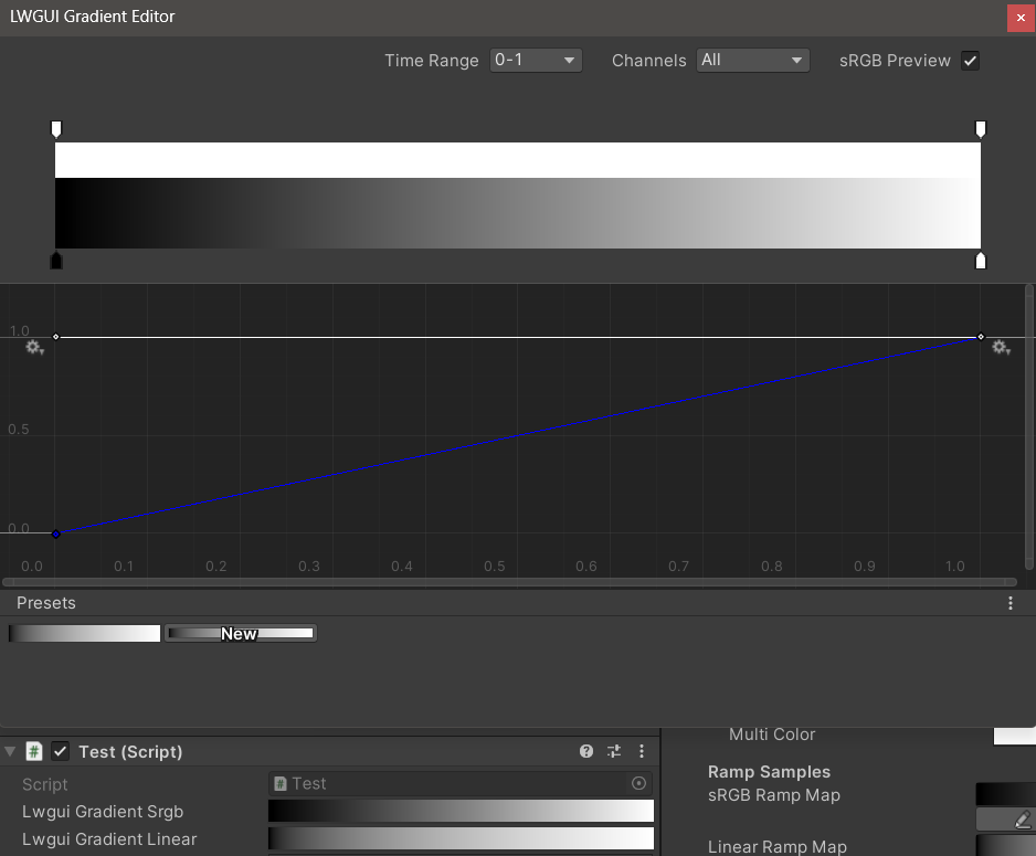
การตั้งค่าการแสดงผลเริ่มต้นสามารถตั้งค่าได้โดยใช้แอตทริบิวต์ lwguigradientusage ()
ตัวแก้ไขการไล่ระดับสี LWGUI ใหม่รวมเข้ากับตัวแก้ไขการไล่ระดับสีและตัวแก้ไขการไล่ระดับสีในตัวของ Unity ซึ่งช่วยให้มีคุณสมบัติที่ทรงพลังมากกว่าตัวแก้ไขการไล่ระดับสีของ UE
| บรรณาธิการ | คำอธิบาย |
|---|---|
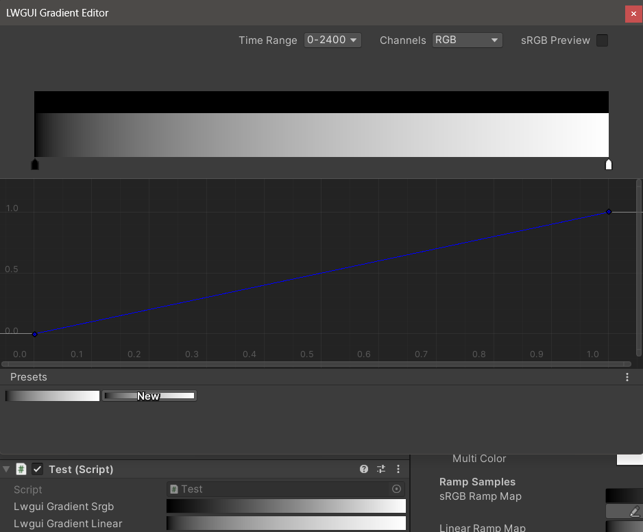
| ช่วงเวลา | ช่วงการแสดงผลของแกนแนวนอนที่เลือกได้จาก 0-1 / 0-24 / 0-2400 นั้นมีประโยชน์มากเมื่อแกนแนวนอนเป็นเวลา โปรดทราบว่ามีเพียงจอแสดงผลเท่านั้นที่ได้รับผลกระทบค่าจริงที่เก็บไว้ในแกนแนวนอนคือ 0-1 เสมอ |
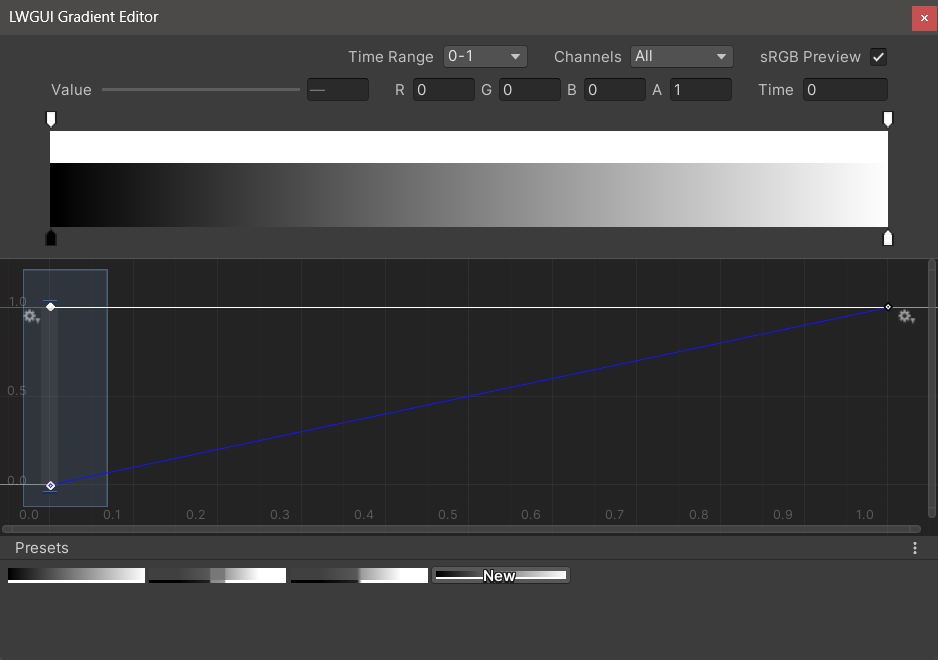
| ช่อง | ช่องแสดง สามารถแสดงเป็นรายบุคคล |
| ตัวอย่าง SRGB | ควรตรวจสอบเมื่อค่าของการไล่ระดับสีเป็นสีเพื่อดูตัวอย่างสีที่ถูกต้องมิฉะนั้นไม่จำเป็นต้องตรวจสอบ มีผลต่อการแสดงผลแผนที่การไล่ระดับสีและทางลาดจะถูกจัดเก็บเป็นเส้นตรงเสมอ |
| ค่า / r / g / b / a | ใช้ในการแก้ไขค่าของคีย์ที่เลือกคุณสามารถแก้ไขค่าของหลายปุ่มในเวลาเดียวกัน |
| เวลา | ใช้ในการแก้ไขเวลาของคีย์ที่เลือกคุณสามารถแก้ไขเวลาของหลายปุ่มในเวลาเดียวกัน หากคุณป้อนตัวเลขด้วยตนเองคุณต้อง กด ENTER เพื่อสิ้นสุดการแก้ไข |
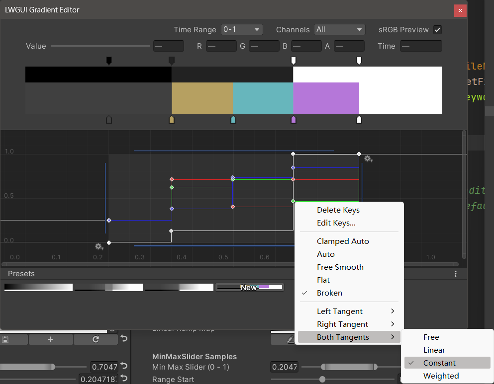
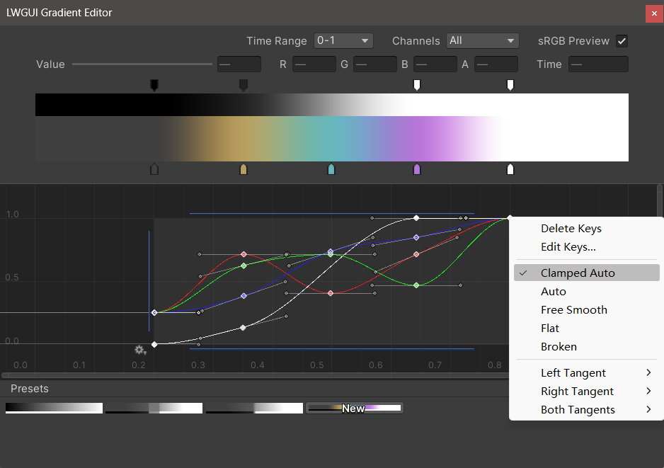
| บรรณาธิการไล่ระดับสี | สิ่งนี้คล้ายกับตัวแก้ไขการไล่ระดับสีในตัวของ Unity แต่ช่องอัลฟ่าถูกแยกออกเป็นขาวดำ โปรดทราบว่า การเพิ่มคีย์จากตัวแก้ไขการไล่ระดับสีนั้น จำกัด อยู่ที่สูงสุด 8 ปุ่ม การเพิ่มคีย์จากตัวแก้ไขเส้นโค้งนั้น ไม่ จำกัด เกินขีด จำกัด คีย์จะไม่ส่งผลกระทบต่อตัวอย่างหรือการใช้งาน |
| ตัวแก้ไขโค้ง | คล้ายกับตัวแก้ไขเส้นโค้งในตัวของ Unity มันจะแสดงช่วง XY 0-1 ตามค่าเริ่มต้นและคุณสามารถใช้ล้อเลื่อนเพื่อซูมหรือย้ายช่วงการแสดงผล อย่างที่คุณเห็นในภาพด้านล่างเมนูบริบทมีฟังก์ชั่นจำนวนมากสำหรับการควบคุมรูปร่างของเส้นโค้งและคุณสามารถปรึกษาเอกสาร Unity เพื่อให้ได้ประโยชน์สูงสุดจากฟังก์ชั่นเหล่านี้ |
| การตั้งค่าล่วงหน้า | คุณสามารถบันทึกการไล่ระดับสี LWGUI ปัจจุบันเป็นที่ตั้งไว้ล่วงหน้าและใช้งานได้ตลอดเวลา ค่าที่ตั้งไว้ล่วงหน้าเหล่านี้เป็นเรื่องธรรมดาระหว่างเครื่องยนต์ที่แตกต่างกันในคอมพิวเตอร์ท้องถิ่น แต่ไม่ได้บันทึกไว้ในโครงการ |
ปัญหาที่รู้จัก:
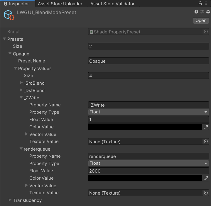
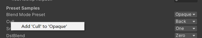
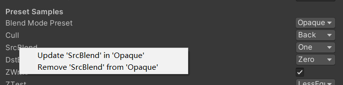
/// Popping a menu, you can select the Shader Property Preset, the Preset values will replaces the default values
/// group: father group name, support suffix keyword for conditional display (Default: none)
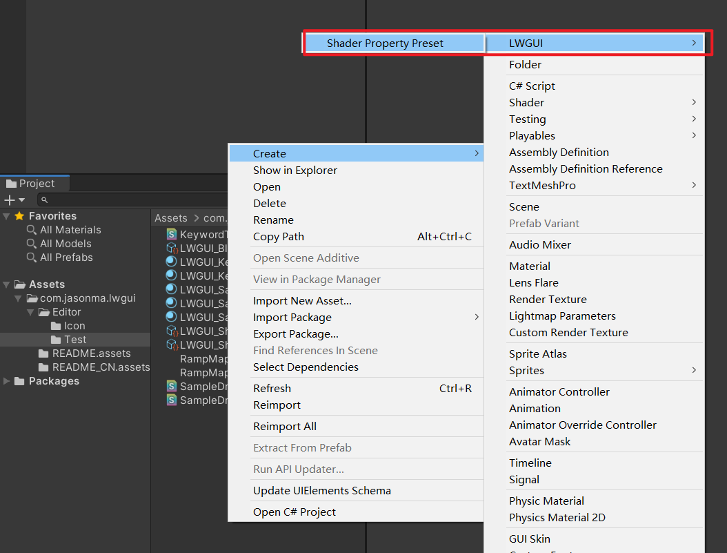
/// presetFileName: "Shader Property Preset" asset name, you can create new Preset by
/// "Right Click > Create > LWGUI > Shader Property Preset" in Project window,
/// *any Preset in the entire project cannot have the same name*
public PresetDrawer ( string presetFileName ) : this ( "_" , presetFileName ) { }
public PresetDrawer ( string group , string presetFileName )ตัวอย่าง:
[ Title ( Preset Samples ) ]
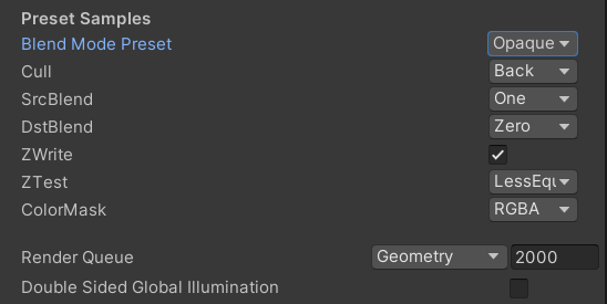
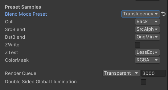
[ Preset ( LWGUI_BlendModePreset ) ] _BlendMode ( "Blend Mode Preset" , float ) = 0
[ Enum ( UnityEngine . Rendering . CullMode ) ] _Cull ( "Cull" , Float ) = 2
[ Enum ( UnityEngine . Rendering . BlendMode ) ] _SrcBlend ( "SrcBlend" , Float ) = 1
[ Enum ( UnityEngine . Rendering . BlendMode ) ] _DstBlend ( "DstBlend" , Float ) = 0
[ Toggle ( _ ) ] _ZWrite ( "ZWrite " , Float ) = 1
[ Enum ( UnityEngine . Rendering . CompareFunction ) ] _ZTest ( "ZTest" , Float ) = 4 // 4 is LEqual
[ Enum ( RGBA , 15 , RGB , 14 ) ] _ColorMask ( "ColorMask" , Float ) = 15 // 15 is RGBA (binary 1111)
``````
Cull [ _Cull ]
ZWrite [ _ZWrite ]
Blend [ _SrcBlend ] [ _DstBlend ]
ColorMask [ _ColorMask ]ผลลัพธ์:
ค่าคุณสมบัติในที่ตั้งไว้ล่วงหน้าที่เลือกจะเป็นค่าเริ่มต้น
RenderQueue เป็นชื่อคุณสมบัติที่ใช้รหัสยากคุณต้องเพิ่มด้วยตนเองในที่ตั้งไว้ด้วยตนเอง
 /// Draw one or more Buttons within the same row, using the Display Name to control the appearance and behavior of the buttons
///
/// Declaring a set of Button Name and Button Command in Display Name generates a Button, separated by '@':
/// ButtonName0@ButtonCommand0@ButtonName1@ButtonCommand1
///
/// Button Name can be any other string, the format of Button Command is:
/// TYPE:Argument
///
/// The following TYPEs are currently supported:
/// - URL: Open the URL, Argument is the URL
/// - C#: Call the public static C# function, Argument is NameSpace.Class.Method(arg0, arg1, ...),
///		for target function signatures, see: LWGUI.ButtonDrawer.TestMethod().
///
/// The full example:
/// [Button(_)] _button0 ("URL Button@URL:https://github.com/JasonMa0012/LWGUI@C#:LWGUI.ButtonDrawer.TestMethod(1234, abcd)", Float) = 0
///
/// group: father group name, support suffix keyword for conditional display (Default: none)
public ButtonDrawer ( ) { }
public ButtonDrawer ( string group )
ตัวอย่าง:
 [ Title ( Button Samples ) ]
[ Button ( _ ) ] _button0 ( "URL Button@URL:https://github.com/JasonMa0012/LWGUI@C# Button@C#:LWGUI.ButtonDrawer.TestMethod(1234, abcd)" , Float ) = 0 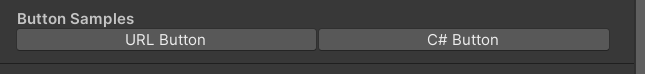
 /// Similar to Header()
/// group: father group name, support suffix keyword for conditional display (Default: none)
/// header: string to display, "SpaceLine" or "_" = none (Default: none)
/// height: line height (Default: 22)
public TitleDecorator ( string header ) : this ( "_" , header , DefaultHeight ) { }
public TitleDecorator ( string header , float  height ) : this ( "_" , header , height ) { }
public TitleDecorator ( string group ,  string header ) : this ( group , header , DefaultHeight ) { }
public TitleDecorator ( string group , string header , float height )


/// Similar to Title()
/// group: father group name, support suffix keyword for conditional display (Default: none)
/// header: string to display, "SpaceLine" or "_" = none (Default: none)
/// height: line height (Default: 22)
public SubTitleDecorator ( string group ,  string header ) : base ( group , header , DefaultHeight ) { }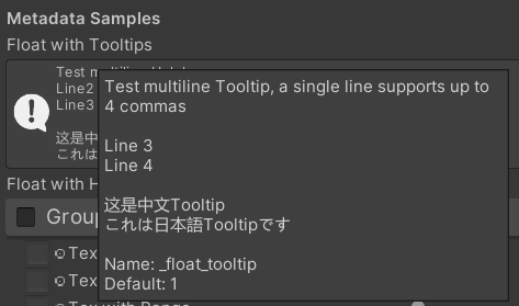
public SubTitleDecorator ( string group , string header , float height ) : base ( group , header , height ) { } /// Tooltip, describes the details of the property. (Default: property.name and property default value)
/// You can also use "#Text" in DisplayName to add Tooltip that supports Multi-Language.
/// tooltip: a single-line string to display, support up to 4 ','. (Default: Newline)
public TooltipDecorator ( ) : this ( string . Empty ) { }
public TooltipDecorator ( string tooltip ) { this . _tooltip = tooltip ; }
public TooltipDecorator ( string s1 , string s2 ) : this ( s1 + ", " + s2 ) { }
public TooltipDecorator ( string s1 , string s2 , string s3 ) : this ( s1 + ", " + s2 + ", " + s3 ) { }
public TooltipDecorator ( string s1 , string s2 , string s3 , string s4 ) : this ( s1 + ", " + s2 + ", " + s3 + ", " + s4 ) { }
public TooltipDecorator ( string s1 , string s2 , string s3 , string s4 , string s5 ) : this ( s1 + ", " + s2 + ", " + s3 + ", " + s4 + ", " + s5 ) { }
 /// Display a Helpbox on the property
/// You can also use "%Text" in DisplayName to add Helpbox that supports Multi-Language.
/// message: a single-line string to display, support up to 4 ','. (Default: Newline)
public HelpboxDecorator ( ) : this ( string . Empty ) { }
public HelpboxDecorator ( string message ) { this . _message = message ; }
public HelpboxDecorator ( string s1 , string s2 ) : this ( s1 + ", " + s2 ) { }
public HelpboxDecorator ( string s1 , string s2 , string s3 ) : this ( s1 + ", " + s2 + ", " + s3 ) { }
public HelpboxDecorator ( string s1 , string s2 , string s3 , string s4 ) : this ( s1 + ", " + s2 + ", " + s3 + ", " + s4 ) { }
public HelpboxDecorator ( string s1 , string s2 , string s3 , string s4 , string s5 ) : this ( s1 + ", " + s2 + ", " + s3 + ", " + s4 + ", " + s5 ) { }
ตัวอย่าง:
 [ Title ( Metadata Samples ) ]
[ Tooltip ( Test multiline Tooltip , a single line supports up to 4 commas ) ]
[ Tooltip ( ) ]
[ Tooltip ( Line 3 ) ]
[ Tooltip ( Line 4 ) ]
_float_tooltip ( "Float with Tooltips#这是中文Tooltip#これは日本語Tooltipです" , float ) = 1
[ Helpbox ( Test multiline Helpbox ) ]
[ Helpbox ( Line2 ) ]
[ Helpbox ( Line3 ) ]
_float_helpbox ( "Float with Helpbox%这是中文Helpbox%これは日本語Helpboxです" , float ) = 1 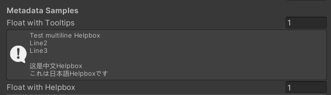
เคล็ดลับ:
 /// Cooperate with Toggle to switch certain Passes
/// lightModeName(s): Light Mode in Shader Pass (https://docs.unity3d.com/2017.4/Documentation/Manual/SL-PassTags.html)
public PassSwitchDecorator ( string   lightModeName1 )
public PassSwitchDecorator ( string   lightModeName1 , string lightModeName2 )
public PassSwitchDecorator ( string   lightModeName1 , string lightModeName2 , string lightModeName3 )
public PassSwitchDecorator ( string   lightModeName1 , string lightModeName2 , string lightModeName3 , string lightModeName4 )
public PassSwitchDecorator ( string   lightModeName1 , string lightModeName2 , string lightModeName3 , string lightModeName4 , string lightModeName5 )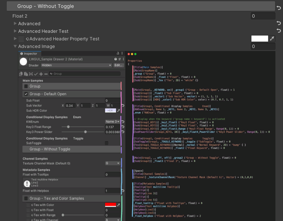
public PassSwitchDecorator ( string lightModeName1 , string lightModeName2 , string lightModeName3 , string lightModeName4 , string lightModeName5 , string lightModeName6 ) /// Collapse the current Property into an Advanced Block. Specify the Header String to create a new Advanced Block. All Properties using Advanced() will be collapsed into the nearest Advanced Block.
/// headerString: The title of the Advanced Block. Default: "Advanced"
public AdvancedDecorator ( ) : this ( string . Empty ) { }
public AdvancedDecorator ( string headerString ) /// Create an Advanced Block using the current Property as the Header
public AdvancedHeaderPropertyDecorator ( )ตัวอย่าง:
 [ Main ( Group2 , _ , off , off ) ] _group2 ( "Group - Without Toggle" , float ) = 0
[ Sub ( Group2 ) ] _float3 ( "Float 2 " , float ) = 0
[ Advanced ] [ Sub ( Group2 ) ] _Advancedfloat0 ( "Advanced Float 0 " , float ) = 0
[ Advanced ] [ Sub ( Group2 ) ] _Advancedfloat1 ( "Advanced Float 1" , float ) = 0
[ Advanced ( Advanced Header Test ) ] [ Sub ( Group2 ) ] _Advancedfloat3 ( "Advanced Float 3" , float ) = 0
[ Advanced ] [ Sub ( Group2 ) ] _Advancedfloat4 ( "Advanced Float 4" , float ) = 0
[ AdvancedHeaderProperty ] [ Tex ( Group2 , _Advancedfloat7 ) ] _AdvancedTex0 ( "Advanced Header Property Test" , 2D ) = "white" { }
[ Advanced ] [ HideInInspector ] _Advancedfloat7 ( "Advanced Float 7" , float ) = 0
[ Advanced ] [ Tex ( Group2 , _AdvancedRange0 ) ] _AdvancedTex1 ( "Advanced Tex 1" , 2D ) = "white" { }
[ Advanced ] [ HideInInspector ] _AdvancedRange0 ( "Advanced Range 0" , Range ( 0 , 1 ) ) = 0 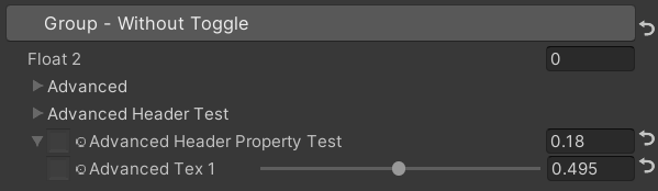
เคล็ดลับ:
 /// Similar to HideInInspector(), the difference is that Hidden() can be unhidden through the Display Mode button.
public HiddenDecorator ( ) /// Set the property to read-only.
public ReadOnlyDecorator ( ) /// Control the show or hide of a single or a group of properties based on multiple conditions.
/// logicalOperator: And | Or (Default: And).
/// propName: Target Property Name used for comparison.
/// compareFunction: Less (L) | Equal (E) | LessEqual (LEqual / LE) | Greater (G) | NotEqual (NEqual / NE) | GreaterEqual (GEqual / GE).
/// value: Target Property Value used for comparison.
public ShowIfDecorator ( string propName , string comparisonMethod , float value ) : this ( "And" , propName , comparisonMethod , value ) { }
public ShowIfDecorator ( string logicalOperator , string propName , string compareFunction , float value )ตัวอย่าง:
 [ ShowIf ( _enum , Equal , 1 ) ]
[ Title ( ShowIf Main Samples ) ]
[ Main ( GroupName ) ] _group ( "Group" , float ) = 0
[ Sub ( GroupName ) ] _float ( "Float" , float ) = 0
[ Sub ( GroupName ) ] _Tex ( "Tex" , 2D ) = "white" { }

.. .

[ SubTitle ( Group1 , Conditional Display Samples       Enum ) ]
[ KWEnum ( Group1 , Name 1 , _KEY1 , Name 2 , _KEY2 , Name 3 , _KEY3 ) ] _enum ( "KWEnum" , float ) = 0
[ Sub ( Group1 ) ] [ ShowIf ( _enum , Equal , 0 ) ] _key1_Float1 ( "Key1 Float" , float ) = 0
[ Sub ( Group1 ) ] [ ShowIf ( _enum , Equal , 1 ) ] _key2_Float2 ( "Key2 Float" , float ) = 0
[ SubIntRange ( Group1 ) ] [ ShowIf ( _enum , Equal , 2 ) ] _key3_Int_Range ( "Key3 Int Range" , Range ( 0 , 10 ) ) = 0
[ ShowIf ( _enum , Equal , 0 ) ] [ ShowIf ( Or , _enum , Equal , 2 ) ]
[ SubPowerSlider ( Group1 , 3 ) ] _key13_PowerSlider ( "Key1 or Key3 Power Slider" , Range ( 0 , 1 ) ) = 0 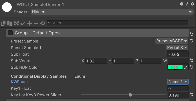
MaterialSpaceDecorator ( float height ) MaterialHeaderDecorator ( string header ) MaterialEnumDrawer ( string n1 , float v1 , string n2 , float v2 , string n3 , float v3 , string n4 , float v4 , string n5 , float v5 , string n6 , float v6 , string n7 , float v7 ) MaterialIntRangeDrawer ( ) MaterialKeywordEnumDrawer ( string kw1 , string kw2 , string kw3 , string kw4 , string kw5 , string kw6 , string kw7 , string kw8 , string kw9 ) MaterialPowerSliderDrawer ( float power ) MaterialToggleUIDrawer ( string keyword ) 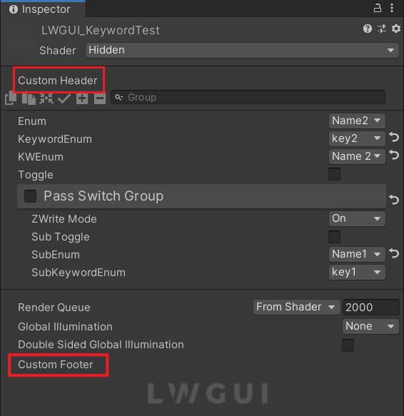
ส่วนหัวและส่วนท้ายที่กำหนดเองช่วยให้คุณสามารถรวมโมดูล bespoke ที่ด้านบนหรือด้านล่างของ Shadergui โดยไม่ต้องเปลี่ยนรหัสปลั๊กอิน LWGUI
ขึ้นอยู่กับตำแหน่งที่ต้องการสำหรับ GUI ที่กำหนดเองทำซ้ำสคริปต์ต่อไปนี้ลงในโฟลเดอร์ Editor ภายในโครงการของคุณ:
แก้ไขชื่อไฟล์และชื่อคลาสตามนั้น
ใช้รหัส GUI ที่กำหนดเองของคุณภายในฟังก์ชั่น docustomheader () / docustomfooter ()
ขอแนะนำให้ตรวจสอบคำจำกัดความของวัตถุ LWGUI เพื่อรับข้อมูลที่จำเป็นใด ๆ
สิ่งที่ต้องทำ
Subdrawer ใน shadeerdrawer.cs เพื่อเริ่มพัฒนาลิ้นชักที่กำหนดเองของคุณ

