LWGUI
1.21.0
中文 | Anglais
Un système GUI Unity Shader léger, flexible et puissant.
Ayant été validé par de nombreux projets commerciaux à grande échelle, l'emploi d'une syntaxe succincte de tiroir de propriété matériaux permet de réaliser de puissantes GUIS de shader, réduisant considérablement le temps de développement, favorisant efficacement la facilité d'utilisation et l'extensibilité, et élevant efficacement l'expérience utilisateur pour les artistes.

 |  |
|---|---|
| Nouveau: un éditeur de dégradé plus puissant que UE, avec le support pour Shader et C # | Nouveau: insérez des images directement dans le shadergui pour soutenir l'affichage de documents complexes sans avoir à sauter au navigateur |
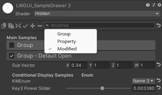 | 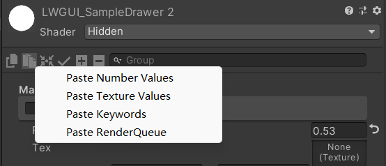 |
| La barre de recherche peut également filtrer les propriétés qui ont été modifiées | Cliquez avec le bouton droit pour coller la valeur d'attribut par type |
| Avec votre parrainage, je mettrai à jour plus activement. | 有你的赞助我会更加积极地更新 |
|---|---|
| paypal.me/jasonma0012 |  |
Assurez-vous que votre environnement est compatible avec LWGUI
LWGUI <1,17: Unity 2017.4+
LwGui> = 1.17: Unity 2021.3+
Ouvrez votre projet
Window > Package Manager > Add > Add package from git URL , entrez: https://github.com/JasonMa0012/LWGUI.git
Package Manager > Add package from diskCustomEditor "LWGUI.LWGUI" /// Create a Folding Group
/// group: group name (Default: Property Name)
/// keyword: keyword used for toggle, "_" = ignore, none or "__" = Property Name + "_ON", always Upper (Default: none)
/// default Folding State: "on" or "off" (Default: off)
/// default Toggle Displayed: "on" or "off" (Default: on)
/// Target Property Type: FLoat, express Toggle value
public MainDrawer ( ) : this ( String . Empty ) { }
public MainDrawer ( string group ) : this ( group , String . Empty ) { }
public MainDrawer ( string group , string keyword ) : this ( group , keyword , "off" ) { }
public MainDrawer ( string group , string keyword , string defaultFoldingState ) : this ( group , keyword , defaultFoldingState , "on" ) { }
public MainDrawer ( string group , string keyword , string defaultFoldingState , string defaultToggleDisplayed ) /// Draw a property with default style in the folding group
/// group: father group name, support suffix keyword for conditional display (Default: none)
/// Target Property Type: Any
public SubDrawer ( ) { }
public SubDrawer ( string group )Exemple:
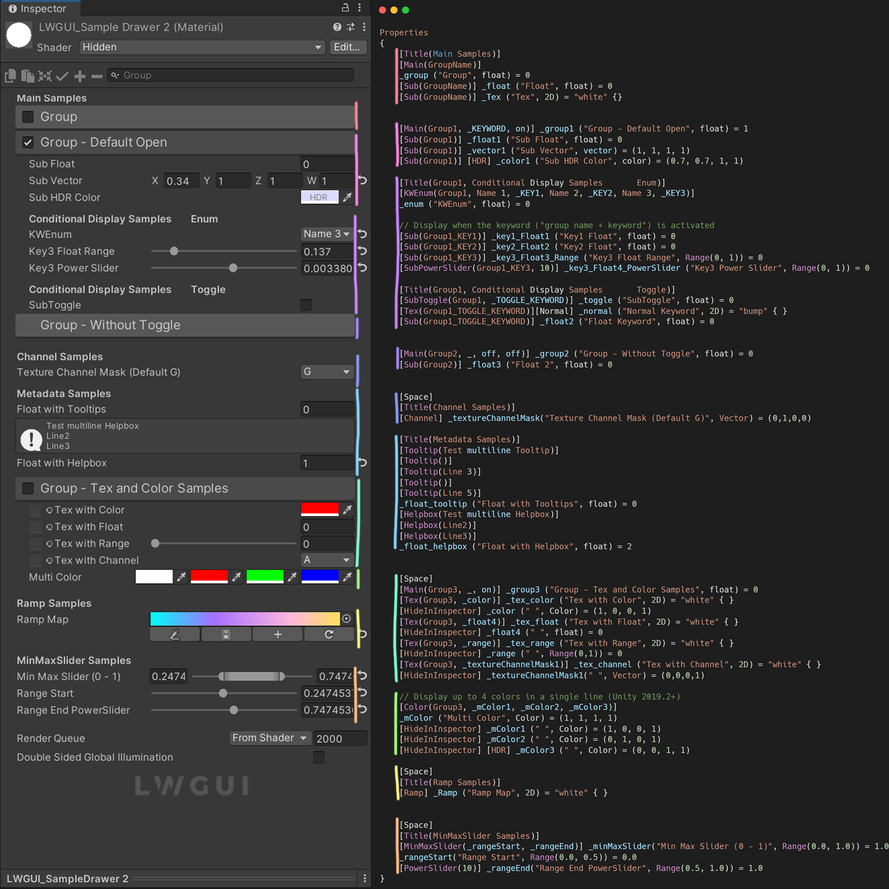
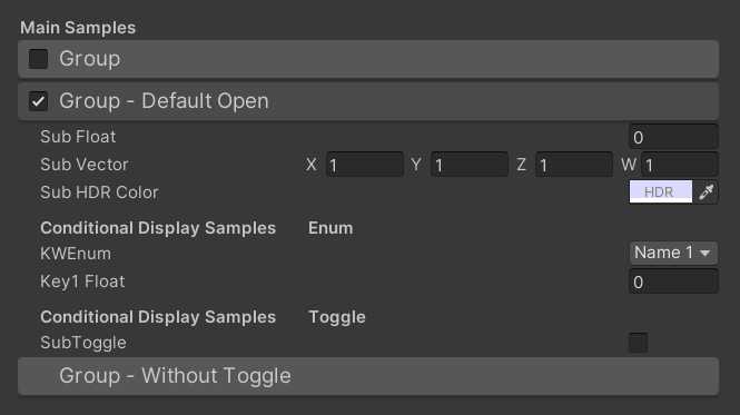
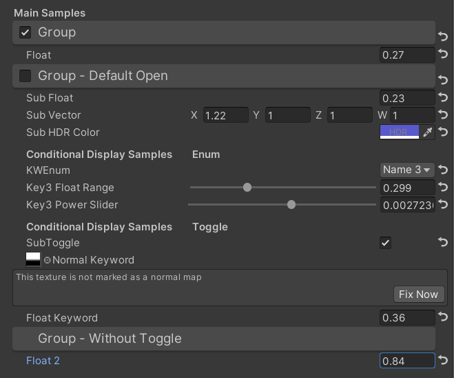
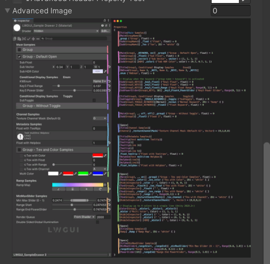
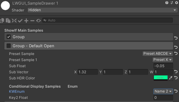
[ Title ( Main Samples ) ]
[ Main ( GroupName ) ]
_group ( "Group" , float ) = 0
[ Sub ( GroupName ) ] _float ( "Float" , float ) = 0
[ Main ( Group1 , _KEYWORD , on ) ] _group1 ( "Group - Default Open" , float ) = 1
[ Sub ( Group1 ) ] _float1 ( "Sub Float" , float ) = 0
[ Sub ( Group1 ) ] _vector1 ( "Sub Vector" , vector ) = ( 1 , 1 , 1 , 1 )
[ Sub ( Group1 ) ] [ HDR ] _color1 ( "Sub HDR Color" , color ) = ( 0.7 , 0.7 , 1 , 1 )
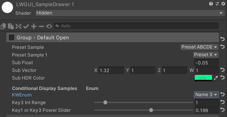
[ Title ( Group1 , Conditional Display Samples Enum ) ]
[ KWEnum ( Group1 , Name 1 , _KEY1 , Name 2 , _KEY2 , Name 3 , _KEY3 ) ]
_enum ( "KWEnum" , float ) = 0
// Display when the keyword ("group name + keyword") is activated
[ Sub ( Group1_KEY1 ) ] _key1_Float1 ( "Key1 Float" , float ) = 0
[ Sub ( Group1_KEY2 ) ] _key2_Float2 ( "Key2 Float" , float ) = 0
[ Sub ( Group1_KEY3 ) ] _key3_Float3_Range ( "Key3 Float Range" , Range ( 0 , 1 ) ) = 0
[ SubPowerSlider ( Group1_KEY3 , 10 ) ] _key3_Float4_PowerSlider ( "Key3 Power Slider" , Range ( 0 , 1 ) ) = 0
[ Title ( Group1 , Conditional Display Samples Toggle ) ]
[ SubToggle ( Group1 , _TOGGLE_KEYWORD ) ] _toggle ( "SubToggle" , float ) = 0
[ Tex ( Group1_TOGGLE_KEYWORD ) ] [ Normal ] _normal ( "Normal Keyword" , 2D ) = "bump" { }
[ Sub ( Group1_TOGGLE_KEYWORD ) ] _float2 ( "Float Keyword" , float ) = 0
[ Main ( Group2 , _ , off , off ) ] _group2 ( "Group - Without Toggle" , float ) = 0
[ Sub ( Group2 ) ] _float3 ( "Float 2" , float ) = 0Résultat par défaut:
Puis modifie les valeurs:
 /// Similar to builtin Toggle()
/// group: father group name, support suffix keyword for conditional display (Default: none)
/// keyword: keyword used for toggle, "_" = ignore, none or "__" = Property Name +  "_ON", always Upper (Default: none)
/// Target Property Type: FLoat
public SubToggleDrawer ( ) { }
public SubToggleDrawer ( string group ) : this ( group , String . Empty ) { }
public SubToggleDrawer ( string group , string keyWord ) /// Similar to builtin PowerSlider()
/// group: father group name, support suffix keyword for conditional display (Default: none)
/// power: power of slider (Default: 1)
/// Target Property Type: Range
public SubPowerSliderDrawer ( float power ) : this ( "_" , power ) { }
public SubPowerSliderDrawer ( string group , float power ) /// Similar to builtin IntRange()
/// group: father group name, support suffix keyword for conditional display (Default: none)
/// Target Property Type: Range
public SubIntRangeDrawer ( string group ) /// Draw a min max slider
/// group: father group name, support suffix keyword for conditional display (Default: none)
/// minPropName: Output Min Property Name
/// maxPropName: Output Max Property Name
/// Target Property Type: Range, range limits express the MinMaxSlider value range
/// Output Min/Max Property Type: Range, it's value is limited by it's range
public MinMaxSliderDrawer ( string minPropName , string maxPropName ) : this ( "_" , minPropName , maxPropName ) { }
public MinMaxSliderDrawer ( string group , string minPropName , string maxPropName )Exemple:
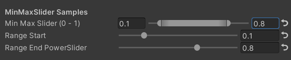
 [ Title ( MinMaxSlider Samples ) ]
[ MinMaxSlider ( _rangeStart , _rangeEnd ) ] _minMaxSlider ( "Min Max Slider (0 - 1)" , Range ( 0.0 , 1.0 ) ) = 1.0
/*[HideInInspector]*/ _rangeStart ( "Range Start" , Range ( 0.0 , 0.5 ) ) = 0.0
/*[HideInInspector]*/ [ PowerSlider ( 10 ) ] _rangeEnd ( "Range End PowerSlider" , Range ( 0.5 , 1.0 ) ) = 1.0
Résultat:
 /// <summary>
/// Similar to builtin Enum() / KeywordEnum()
/// group: father group name, support suffix keyword for conditional display (Default: none)
/// n(s): display name
/// k(s): keyword
/// v(s): value
/// Target Property Type: FLoat, express current keyword index
/// </summary>
public KWEnumDrawer ( string n1 , string k1 )
public KWEnumDrawer ( string n1 , string k1 , string n2 , string k2 )
public KWEnumDrawer ( string n1 , string k1 , string n2 , string k2 , string n3 , string k3 )
public KWEnumDrawer ( string n1 , string k1 , string n2 , string k2 , string n3 , string k3 , string n4 , string k4 )
public KWEnumDrawer ( string n1 , string k1 , string n2 , string k2 , string n3 , string k3 , string n4 , string k4 , string n5 , string k5 )

public KWEnumDrawer ( string group , string n1 , string k1 )
public KWEnumDrawer ( string group , string n1 , string k1 , string n2 , string k2 )
public KWEnumDrawer ( string group , string n1 , string k1 , string n2 , string k2 , string n3 , string k3 )
public KWEnumDrawer ( string group , string n1 , string k1 , string n2 , string k2 , string n3 , string k3 , string n4 , string k4 )
public KWEnumDrawer ( string group , string n1 , string k1 , string n2 , string k2 , string n3 , string k3 , string n4 , string k4 , string n5 , string k5 ) // enumName: like "UnityEngine.Rendering.BlendMode"
public SubEnumDrawer ( string group , string enumName ) : base ( group , enumName )
public SubEnumDrawer ( string group , string n1 , float v1 , string n2 , float v2 )
public SubEnumDrawer ( string group , string n1 , float v1 , string n2 , float v2 , string n3 , float v3 )
public SubEnumDrawer ( string group , string n1 , float v1 , string n2 , float v2 , string n3 , float v3 , string n4 , float v4 )
public SubEnumDrawer ( string group , string n1 , float v1 , string n2 , float v2 , string n3 , float v3 , string n4 , float v4 , string n5 , float v5 )
public SubEnumDrawer ( string group , string n1 , float v1 , string n2 , float v2 , string n3 , float v3 , string n4 , float v4 , string n5 , float v5 , string n6 , float v6 )
public SubEnumDrawer ( string group , string n1 , float v1 , string n2 , float v2 , string n3 , float v3 , string n4 , float v4 , string n5 , float v5 , string n6 , float v6 , string n7 , float v7 )
public SubKeywordEnumDrawer ( string group , string kw1 , string kw2 )
public SubKeywordEnumDrawer ( string group , string kw1 , string kw2 , string kw3 )
public SubKeywordEnumDrawer ( string group , string kw1 , string kw2 , string kw3 , string kw4 )
public SubKeywordEnumDrawer ( string group , string kw1 , string kw2 , string kw3 , string kw4 , string kw5 )
public SubKeywordEnumDrawer ( string group , string kw1 , string kw2 , string kw3 , string kw4 , string kw5 , string kw6 )
public SubKeywordEnumDrawer ( string group , string kw1 , string kw2 , string kw3 , string kw4 , string kw5 , string kw6 , string kw7 )
public SubKeywordEnumDrawer ( string group , string kw1 , string kw2 , string kw3 , string kw4 , string kw5 , string kw6 , string kw7 , string kw8 )
public SubKeywordEnumDrawer ( string group , string kw1 , string kw2 , string kw3 , string kw4 , string kw5 , string kw6 , string kw7 , string kw8 , string kw9 ) /// Draw a Texture property in single line with a extra property
/// group: father group name, support suffix keyword for conditional display (Default: none)
/// extraPropName: extra property name (Default: none)
/// Target Property Type: Texture
/// Extra Property Type: Color, Vector
public TexDrawer ( ) { }
public TexDrawer ( string group ) : this ( group , String . Empty ) { }
public TexDrawer ( string group , string extraPropName ) /// Display up to 4 colors in a single line
/// group: father group name, support suffix keyword for conditional display (Default: none)
/// color2-4: extra color property name
/// Target Property Type: Color
public ColorDrawer ( string group , string color2 ) : this ( group , color2 , String . Empty , String . Empty ) { }
public ColorDrawer ( string group , string color2 , string color3 ) : this ( group , color2 , color3 , String . Empty ) { }
public ColorDrawer ( string group , string color2 , string color3 , string color4 )Exemple:
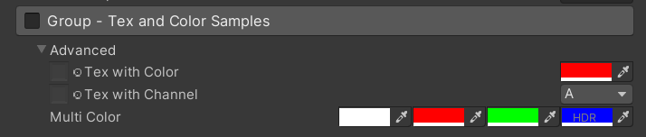
 [ Main ( Group3 , _ , on ) ] _group3 ( "Group - Tex and Color Samples" , float ) = 0
[ Advanced ] [ Tex ( Group3 , _color ) ] _tex_color ( "Tex with Color" , 2D ) = "white" { }
[ Advanced ] [ HideInInspector ] _color ( " ", Color) = (1, 0, 0, 1)
[ Advanced ] [ Tex ( Group3 , _textureChannelMask1 ) ] _tex_channel ( "Tex with Channel" , 2D ) = "white" { }
[ Advanced ] [ HideInInspector ] _textureChannelMask1 ( " ", Vector) = (0, 0, 0, 1)

[ Advanced ] [ Color ( Group3 , _mColor1 , _mColor2 , _mColor3 ) ] _mColor ( "Multi Color" , Color ) = ( 1 , 1 , 1 , 1 )
[ Advanced ] [ HideInInspector ] _mColor1 ( " " , Color ) = ( 1 , 0 , 0 , 1 )
[ Advanced ] [ HideInInspector ] _mColor2 ( " " , Color ) = ( 0 , 1 , 0 , 1 )
[ Advanced ] [ HideInInspector ] [ HDR ] _mColor3 ( " " , Color ) = ( 0 , 0 , 1 , 1 )
Résultat:
 /// Draw an image preview.
/// display name: The path of the image file relative to the Unity project, such as: "Assets/test.png", "Doc/test.png", "../test.png"
/// group: father group name, support suffix keyword for conditional display (Default: none)
public ImageDrawer ( ) { }
public ImageDrawer ( string group )
Résultat:
 /// Draw a R/G/B/A drop menu:
/// 	R = (1, 0, 0, 0)
/// 	G = (0, 1, 0, 0)
/// 	B = (0, 0, 1, 0)
/// 	A = (0, 0, 0, 1)
/// 	RGB Average = (1f / 3f, 1f / 3f, 1f / 3f, 0)
/// 	RGB Luminance = (0.2126f, 0.7152f, 0.0722f, 0)
///		None = (0, 0, 0, 0)
/// group: father group name, support suffix keyword for conditional display (Default: none)
/// Target Property Type: Vector, used to dot() with Texture Sample Value
public ChannelDrawer ( ) { }
public ChannelDrawer ( string group )
Exemple:
 [ Title ( _ , Channel Samples ) ]
[ Channel ( _ ) ] _textureChannelMask ( "Texture Channel Mask (Default G)" , Vector ) = ( 0 , 1 , 0 , 0 )

......

float selectedChannelValue = dot ( tex2D ( _Tex , uv ) , _textureChannelMask ) ; 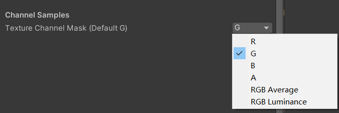
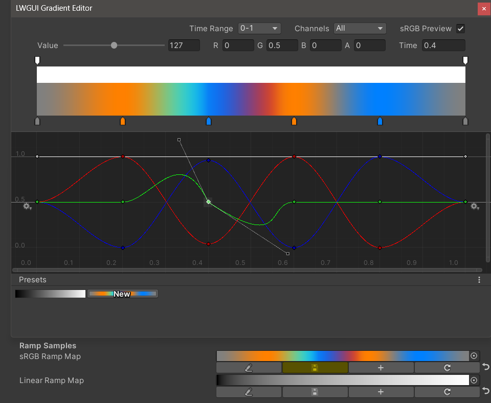
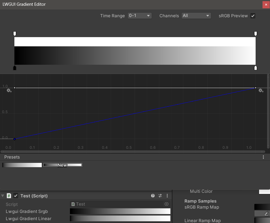
/// Draw an unreal style Ramp Map Editor (Default Ramp Map Resolution: 512 * 2)
/// NEW: The new LwguiGradient type has both the Gradient and Curve editors, and can be used in C# scripts and runtime, and is intended to replace UnityEngine.Gradient
/// group: father group name, support suffix keyword for conditional display (Default: none)
/// defaultFileName: default Ramp Map file name when create a new one (Default: RampMap)
/// rootPath: the path where ramp is stored, replace '/' with '.' (for example: Assets.Art.Ramps). when selecting ramp, it will also be filtered according to the path (Default: Assets)
/// colorSpace: switch sRGB / Linear in ramp texture import setting (Default: sRGB)
/// defaultWidth: default Ramp Width (Default: 512)
/// viewChannelMask: editable channels. (Default: RGBA)
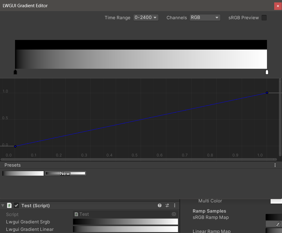
/// timeRange: the abscissa display range (1/24/2400), is used to optimize the editing experience when the abscissa is time of day. (Default: 1)
/// Target Property Type: Texture2D
public RampDrawer ( ) : this ( String . Empty ) { }
public RampDrawer ( string group ) : this ( group , "RampMap" ) { }
public RampDrawer ( string group , string defaultFileName ) : this ( group , defaultFileName , DefaultRootPath , 512 ) { }
public RampDrawer ( string group , string defaultFileName , float defaultWidth ) : this ( group , defaultFileName , DefaultRootPath , defaultWidth ) { }
public RampDrawer ( string group , string defaultFileName , string rootPath , float defaultWidth ) : this ( group , defaultFileName , rootPath , "sRGB" , defaultWidth ) { }
public RampDrawer ( string group , string defaultFileName , string rootPath , string colorSpace , float defaultWidth ) : this ( group , defaultFileName , rootPath , colorSpace , defaultWidth , "RGBA" ) { }
public RampDrawer ( string group , string defaultFileName , string rootPath , string colorSpace , float defaultWidth , string viewChannelMask ) : this ( group , defaultFileName , rootPath , colorSpace , defaultWidth , viewChannelMask , 1 ) { }
public RampDrawer ( string group , string defaultFileName , string rootPath , string colorSpace , float defaultWidth , string viewChannelMask , float timeRange )Exemple:
[ Ramp ( _ , RampMap , Assets . Art , 512 ) ] _Ramp ( "Ramp Map" , 2D ) = "white" { }Résultat:
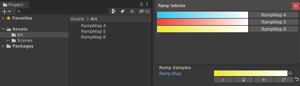
Vous devez enregistrer manuellement les résultats d'édition , s'il y a des modifications non enregistrées, le bouton de sauvegarde s'affichera jaune.
Lorsque vous déplacez ou copiez la carte de rampe, n'oubliez pas de vous déplacer avec le fichier .Meta, sinon vous ne pourrez plus le modifier!
Exemple:
 public class Test : MonoBehaviour
{
    public LwguiGradient lwguiGradientSrgb = new LwguiGradient ( ) ;

    [ LwguiGradientUsage ( ColorSpace . Linear , LwguiGradient . ChannelMask . RGB , LwguiGradient . GradientTimeRange . TwentyFourHundred ) ]
    public LwguiGradient lwguiGradientLinear = new LwguiGradient ( ) ;
}
Résultat:
Les paramètres d'affichage par défaut peuvent être définis à l'aide de l'attribut LWGuigradientUsage ().
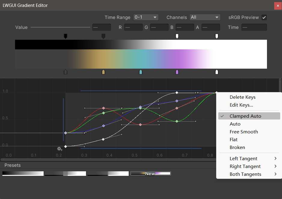
Le nouvel éditeur de dégradé LWGUI s'intègre à l'éditeur de dégradés intégré d'Unity et à l'éditeur de courbe, permettant des fonctionnalités plus puissantes que l'éditeur de dégradé d'UE.
| Éditeur | Description |
|---|---|
| Plage de temps | La plage d'affichage de l'axe horizontal, sélectionnable à partir de 0-1 / 0-24 / 0-2400, est très utile lorsque l'axe horizontal est le temps. Notez que seul l'affichage est affecté, la valeur réelle stockée dans l'axe horizontal est toujours 0-1. |
| Canaux | Les canaux affichés. Peut être affiché individuellement. |
| Aperçu SRGB | Il doit être vérifié lorsque la valeur du gradient est une couleur pour prévisualiser la bonne couleur, sinon il n'a pas besoin d'être vérifié. Affecte uniquement l'affichage, le gradient et la carte de rampe sont toujours stockés comme linéaires. |
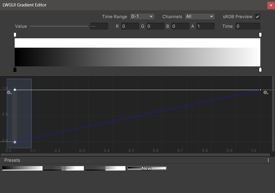
| Valeur / r / g / b / a | Utilisé pour modifier la valeur de la clé sélectionnée, vous pouvez modifier la valeur de plusieurs clés en même temps. |
| Temps | Utilisé pour modifier l'heure de la touche sélectionnée, vous pouvez modifier le temps de plusieurs clés en même temps. Si vous entrez manuellement un numéro, vous devez appuyer sur Entrée pour mettre fin à l'édition. |
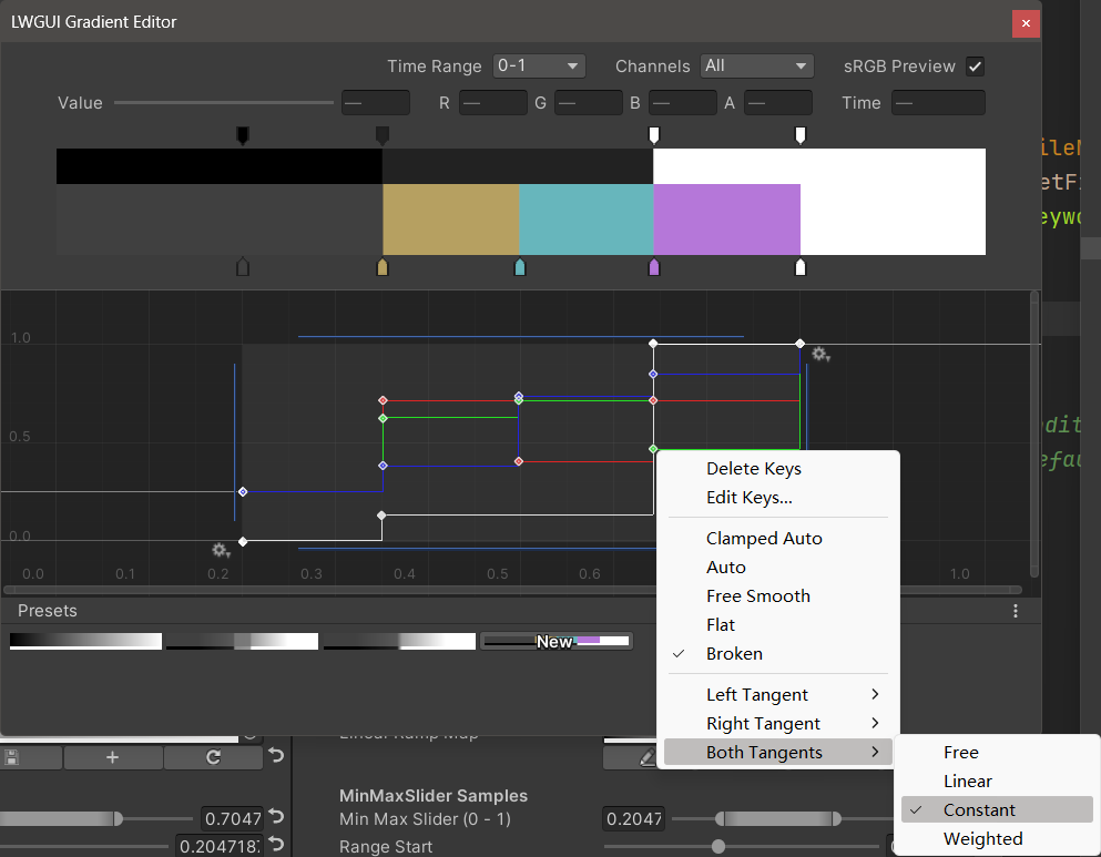
| Éditeur de dégradé | Ceci est similaire à l'éditeur de dégradé intégré d'Unity, mais les canaux alpha sont séparés en noir et blanc. Notez que l'ajout de clés de l'éditeur de dégradé est limité à un maximum de 8 clés , l'ajout de clés de l'éditeur de courbe est illimité . Le dépassement de la limite de clé n'affectera pas l'aperçu ou l'utilisation. |
| Éditeur de courbe | Semblable à l'éditeur de courbe intégré d'Unity, il affiche la plage XY 0-1 par défaut, et vous pouvez utiliser la roue de défilement pour zoomer ou déplacer la plage d'affichage. Comme vous pouvez le voir dans l'image ci-dessous, le menu contextuel dispose d'un certain nombre de fonctions pour contrôler la forme de la courbe, et vous pouvez consulter la documentation Unity pour tirer le meilleur parti de ces fonctions. |
| Préréglages | Vous pouvez enregistrer le gradient LWGUI actuel en tant que préréglage et l'appliquer à tout moment. Ces préréglages sont communs entre différentes versions de moteur sur l'ordinateur local, mais ne sont pas enregistrées dans le projet. |
Problèmes connus:
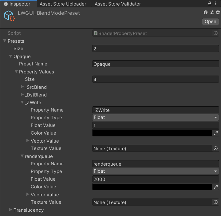
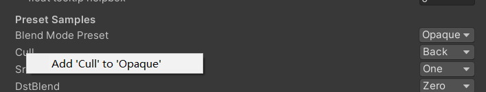
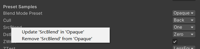
/// Popping a menu, you can select the Shader Property Preset, the Preset values will replaces the default values
/// group: father group name, support suffix keyword for conditional display (Default: none)
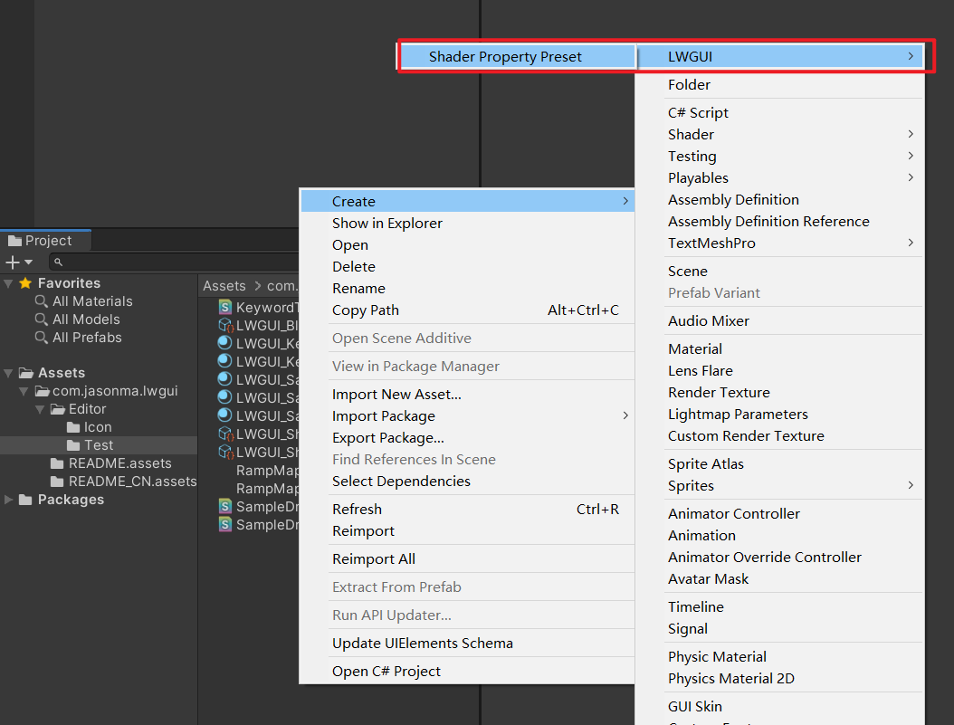
/// presetFileName: "Shader Property Preset" asset name, you can create new Preset by
/// "Right Click > Create > LWGUI > Shader Property Preset" in Project window,
/// *any Preset in the entire project cannot have the same name*
public PresetDrawer ( string presetFileName ) : this ( "_" , presetFileName ) { }
public PresetDrawer ( string group , string presetFileName )Exemple:
[ Title ( Preset Samples ) ]
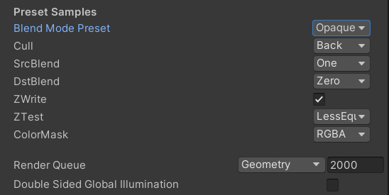
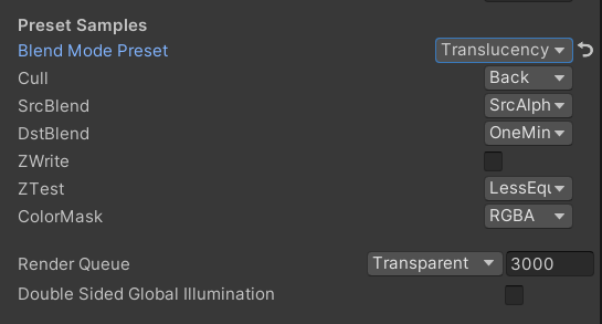
[ Preset ( LWGUI_BlendModePreset ) ] _BlendMode ( "Blend Mode Preset" , float ) = 0
[ Enum ( UnityEngine . Rendering . CullMode ) ] _Cull ( "Cull" , Float ) = 2
[ Enum ( UnityEngine . Rendering . BlendMode ) ] _SrcBlend ( "SrcBlend" , Float ) = 1
[ Enum ( UnityEngine . Rendering . BlendMode ) ] _DstBlend ( "DstBlend" , Float ) = 0
[ Toggle ( _ ) ] _ZWrite ( "ZWrite " , Float ) = 1
[ Enum ( UnityEngine . Rendering . CompareFunction ) ] _ZTest ( "ZTest" , Float ) = 4 // 4 is LEqual
[ Enum ( RGBA , 15 , RGB , 14 ) ] _ColorMask ( "ColorMask" , Float ) = 15 // 15 is RGBA (binary 1111)
``````
Cull [ _Cull ]
ZWrite [ _ZWrite ]
Blend [ _SrcBlend ] [ _DstBlend ]
ColorMask [ _ColorMask ]Résultat:
La valeur de la propriété dans le préréglage sélectionné sera la valeur par défaut
RenderQueue est un nom de propriété à code dur, vous devez l'ajouter manuellement au préréglé
 /// Draw one or more Buttons within the same row, using the Display Name to control the appearance and behavior of the buttons
///
/// Declaring a set of Button Name and Button Command in Display Name generates a Button, separated by '@':
/// ButtonName0@ButtonCommand0@ButtonName1@ButtonCommand1
///
/// Button Name can be any other string, the format of Button Command is:
/// TYPE:Argument
///
/// The following TYPEs are currently supported:
/// - URL: Open the URL, Argument is the URL
/// - C#: Call the public static C# function, Argument is NameSpace.Class.Method(arg0, arg1, ...),
///		for target function signatures, see: LWGUI.ButtonDrawer.TestMethod().
///
/// The full example:
/// [Button(_)] _button0 ("URL Button@URL:https://github.com/JasonMa0012/LWGUI@C#:LWGUI.ButtonDrawer.TestMethod(1234, abcd)", Float) = 0
///
/// group: father group name, support suffix keyword for conditional display (Default: none)
public ButtonDrawer ( ) { }
public ButtonDrawer ( string group )
Exemple:
 [ Title ( Button Samples ) ]
[ Button ( _ ) ] _button0 ( "URL Button@URL:https://github.com/JasonMa0012/LWGUI@C# Button@C#:LWGUI.ButtonDrawer.TestMethod(1234, abcd)" , Float ) = 0 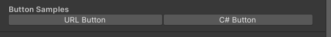
 /// Similar to Header()
/// group: father group name, support suffix keyword for conditional display (Default: none)
/// header: string to display, "SpaceLine" or "_" = none (Default: none)
/// height: line height (Default: 22)
public TitleDecorator ( string header ) : this ( "_" , header , DefaultHeight ) { }
public TitleDecorator ( string header , float  height ) : this ( "_" , header , height ) { }
public TitleDecorator ( string group ,  string header ) : this ( group , header , DefaultHeight ) { }
public TitleDecorator ( string group , string header , float height )


/// Similar to Title()
/// group: father group name, support suffix keyword for conditional display (Default: none)
/// header: string to display, "SpaceLine" or "_" = none (Default: none)
/// height: line height (Default: 22)
public SubTitleDecorator ( string group ,  string header ) : base ( group , header , DefaultHeight ) { }
public SubTitleDecorator ( string group , string header , float height ) : base ( group , header , height ) { } /// Tooltip, describes the details of the property. (Default: property.name and property default value)
/// You can also use "#Text" in DisplayName to add Tooltip that supports Multi-Language.
/// tooltip: a single-line string to display, support up to 4 ','. (Default: Newline)
public TooltipDecorator ( ) : this ( string . Empty ) { }
public TooltipDecorator ( string tooltip ) { this . _tooltip = tooltip ; }
public TooltipDecorator ( string s1 , string s2 ) : this ( s1 + ", " + s2 ) { }
public TooltipDecorator ( string s1 , string s2 , string s3 ) : this ( s1 + ", " + s2 + ", " + s3 ) { }
public TooltipDecorator ( string s1 , string s2 , string s3 , string s4 ) : this ( s1 + ", " + s2 + ", " + s3 + ", " + s4 ) { }
public TooltipDecorator ( string s1 , string s2 , string s3 , string s4 , string s5 ) : this ( s1 + ", " + s2 + ", " + s3 + ", " + s4 + ", " + s5 ) { }
 /// Display a Helpbox on the property
/// You can also use "%Text" in DisplayName to add Helpbox that supports Multi-Language.
/// message: a single-line string to display, support up to 4 ','. (Default: Newline)
public HelpboxDecorator ( ) : this ( string . Empty ) { }
public HelpboxDecorator ( string message ) { this . _message = message ; }
public HelpboxDecorator ( string s1 , string s2 ) : this ( s1 + ", " + s2 ) { }
public HelpboxDecorator ( string s1 , string s2 , string s3 ) : this ( s1 + ", " + s2 + ", " + s3 ) { }
public HelpboxDecorator ( string s1 , string s2 , string s3 , string s4 ) : this ( s1 + ", " + s2 + ", " + s3 + ", " + s4 ) { }
public HelpboxDecorator ( string s1 , string s2 , string s3 , string s4 , string s5 ) : this ( s1 + ", " + s2 + ", " + s3 + ", " + s4 + ", " + s5 ) { }
Exemple:
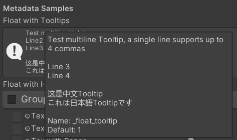
 [ Title ( Metadata Samples ) ]
[ Tooltip ( Test multiline Tooltip , a single line supports up to 4 commas ) ]
[ Tooltip ( ) ]
[ Tooltip ( Line 3 ) ]
[ Tooltip ( Line 4 ) ]
_float_tooltip ( "Float with Tooltips#这是中文Tooltip#これは日本語Tooltipです" , float ) = 1
[ Helpbox ( Test multiline Helpbox ) ]
[ Helpbox ( Line2 ) ]
[ Helpbox ( Line3 ) ]
_float_helpbox ( "Float with Helpbox%这是中文Helpbox%これは日本語Helpboxです" , float ) = 1 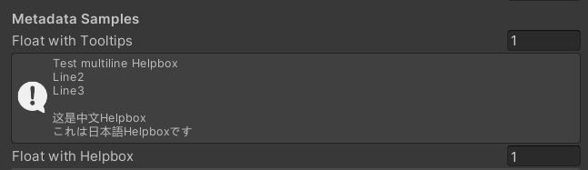
Conseils:
 /// Cooperate with Toggle to switch certain Passes
/// lightModeName(s): Light Mode in Shader Pass (https://docs.unity3d.com/2017.4/Documentation/Manual/SL-PassTags.html)
public PassSwitchDecorator ( string   lightModeName1 )
public PassSwitchDecorator ( string   lightModeName1 , string lightModeName2 )
public PassSwitchDecorator ( string   lightModeName1 , string lightModeName2 , string lightModeName3 )
public PassSwitchDecorator ( string   lightModeName1 , string lightModeName2 , string lightModeName3 , string lightModeName4 )
public PassSwitchDecorator ( string   lightModeName1 , string lightModeName2 , string lightModeName3 , string lightModeName4 , string lightModeName5 )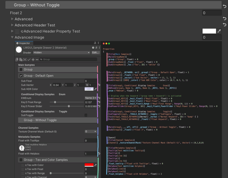
public PassSwitchDecorator ( string lightModeName1 , string lightModeName2 , string lightModeName3 , string lightModeName4 , string lightModeName5 , string lightModeName6 ) /// Collapse the current Property into an Advanced Block. Specify the Header String to create a new Advanced Block. All Properties using Advanced() will be collapsed into the nearest Advanced Block.
/// headerString: The title of the Advanced Block. Default: "Advanced"
public AdvancedDecorator ( ) : this ( string . Empty ) { }
public AdvancedDecorator ( string headerString ) /// Create an Advanced Block using the current Property as the Header
public AdvancedHeaderPropertyDecorator ( )Exemple:
 [ Main ( Group2 , _ , off , off ) ] _group2 ( "Group - Without Toggle" , float ) = 0
[ Sub ( Group2 ) ] _float3 ( "Float 2 " , float ) = 0
[ Advanced ] [ Sub ( Group2 ) ] _Advancedfloat0 ( "Advanced Float 0 " , float ) = 0
[ Advanced ] [ Sub ( Group2 ) ] _Advancedfloat1 ( "Advanced Float 1" , float ) = 0
[ Advanced ( Advanced Header Test ) ] [ Sub ( Group2 ) ] _Advancedfloat3 ( "Advanced Float 3" , float ) = 0
[ Advanced ] [ Sub ( Group2 ) ] _Advancedfloat4 ( "Advanced Float 4" , float ) = 0
[ AdvancedHeaderProperty ] [ Tex ( Group2 , _Advancedfloat7 ) ] _AdvancedTex0 ( "Advanced Header Property Test" , 2D ) = "white" { }
[ Advanced ] [ HideInInspector ] _Advancedfloat7 ( "Advanced Float 7" , float ) = 0
[ Advanced ] [ Tex ( Group2 , _AdvancedRange0 ) ] _AdvancedTex1 ( "Advanced Tex 1" , 2D ) = "white" { }
[ Advanced ] [ HideInInspector ] _AdvancedRange0 ( "Advanced Range 0" , Range ( 0 , 1 ) ) = 0 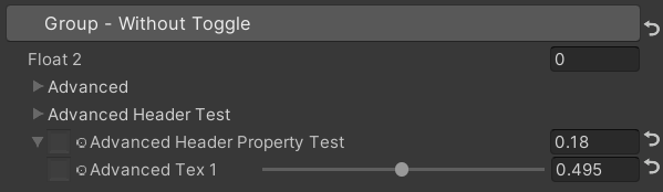
Conseils:
 /// Similar to HideInInspector(), the difference is that Hidden() can be unhidden through the Display Mode button.
public HiddenDecorator ( ) /// Set the property to read-only.
public ReadOnlyDecorator ( ) /// Control the show or hide of a single or a group of properties based on multiple conditions.
/// logicalOperator: And | Or (Default: And).
/// propName: Target Property Name used for comparison.
/// compareFunction: Less (L) | Equal (E) | LessEqual (LEqual / LE) | Greater (G) | NotEqual (NEqual / NE) | GreaterEqual (GEqual / GE).
/// value: Target Property Value used for comparison.
public ShowIfDecorator ( string propName , string comparisonMethod , float value ) : this ( "And" , propName , comparisonMethod , value ) { }
public ShowIfDecorator ( string logicalOperator , string propName , string compareFunction , float value )Exemple:
 [ ShowIf ( _enum , Equal , 1 ) ]
[ Title ( ShowIf Main Samples ) ]
[ Main ( GroupName ) ] _group ( "Group" , float ) = 0
[ Sub ( GroupName ) ] _float ( "Float" , float ) = 0
[ Sub ( GroupName ) ] _Tex ( "Tex" , 2D ) = "white" { }

.. .

[ SubTitle ( Group1 , Conditional Display Samples       Enum ) ]
[ KWEnum ( Group1 , Name 1 , _KEY1 , Name 2 , _KEY2 , Name 3 , _KEY3 ) ] _enum ( "KWEnum" , float ) = 0
[ Sub ( Group1 ) ] [ ShowIf ( _enum , Equal , 0 ) ] _key1_Float1 ( "Key1 Float" , float ) = 0
[ Sub ( Group1 ) ] [ ShowIf ( _enum , Equal , 1 ) ] _key2_Float2 ( "Key2 Float" , float ) = 0
[ SubIntRange ( Group1 ) ] [ ShowIf ( _enum , Equal , 2 ) ] _key3_Int_Range ( "Key3 Int Range" , Range ( 0 , 10 ) ) = 0
[ ShowIf ( _enum , Equal , 0 ) ] [ ShowIf ( Or , _enum , Equal , 2 ) ]
[ SubPowerSlider ( Group1 , 3 ) ] _key13_PowerSlider ( "Key1 or Key3 Power Slider" , Range ( 0 , 1 ) ) = 0 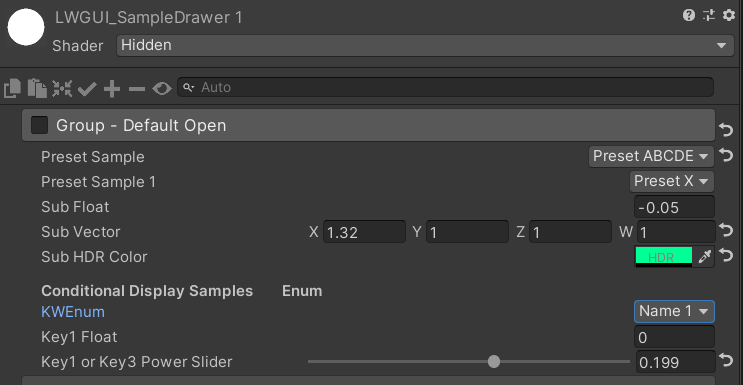
MaterialSpaceDecorator ( float height ) MaterialHeaderDecorator ( string header ) MaterialEnumDrawer ( string n1 , float v1 , string n2 , float v2 , string n3 , float v3 , string n4 , float v4 , string n5 , float v5 , string n6 , float v6 , string n7 , float v7 ) MaterialIntRangeDrawer ( ) MaterialKeywordEnumDrawer ( string kw1 , string kw2 , string kw3 , string kw4 , string kw5 , string kw6 , string kw7 , string kw8 , string kw9 ) MaterialPowerSliderDrawer ( float power ) MaterialToggleUIDrawer ( string keyword ) 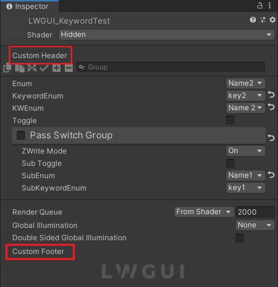
Les en-têtes et pieds de page personnalisés vous permettent d'intégrer des modules sur mesure en haut ou en bas du Shadergui sans modifier le code du plugin LWGUI.
Selon l'emplacement souhaité pour l'interface graphique personnalisée, dupliquez le script suivant dans un dossier d'éditeur dans votre projet:
Modifiez le nom de fichier et le nom de classe en conséquence.
Implémentez votre code GUI personnalisé dans les fonctions DocustomHeader () / DocustomFooter ().
Il est conseillé d'examiner la définition de l'objet LWGUI pour obtenir des données requises.
FAIRE
Subdrawer dans shadeerdrawer.cs pour commencer à développer votre tiroir personnalisé

