LWGUI
1.21.0
中文|英語
軽量で柔軟な、強力な統一シェーダーGUIシステム。
多くの大規模な商業プロジェクトを通じて検証され、簡潔な材料プロパティドロワーの構文を採用することで、強力なシェーダーGUIを実現し、開発時間を大幅に短縮し、使いやすさと拡張性を促進し、アーティストのユーザーエクスペリエンスを効果的に高めることができます。

 |  |
|---|---|
| 新規:ShaderとC#の両方をサポートして、UEよりも強力なグラデーションエディター | 新規:ブラウザにジャンプすることなく複雑なドキュメントの表示をサポートするために、Shaderguiに画像を直接挿入します |
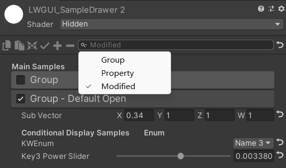 | 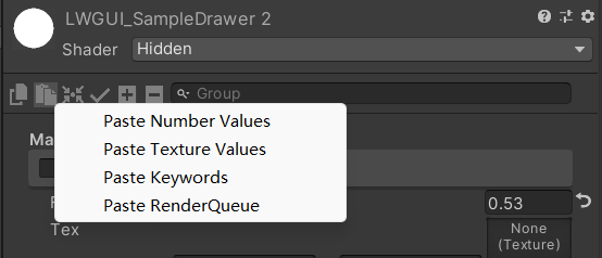 |
| 検索バーは、変更されたプロパティをフィルタリングすることもできます | 右クリックして、タイプごとに属性値を貼り付けます |
| あなたのスポンサーシップで、私はより積極的に更新します。 | 有你的赞助我会更加积极地更新 |
|---|---|
| paypal.me/jasonma0012 |  |
環境がLwguiと互換性があることを確認してください
LWGUI <1.17: Unity 2017.4+
lwgui> = 1.17: unity 2021.3+
プロジェクトを開きます
Window > Package Manager > Add > Add package from git URL 、 https://github.com/JasonMa0012/LWGUI.gitを入力します
Package Manager > Add package from disk手動でダウンロードすることもできます。CustomEditor "LWGUI.LWGUI" /// Create a Folding Group
/// group: group name (Default: Property Name)
/// keyword: keyword used for toggle, "_" = ignore, none or "__" = Property Name + "_ON", always Upper (Default: none)
/// default Folding State: "on" or "off" (Default: off)
/// default Toggle Displayed: "on" or "off" (Default: on)
/// Target Property Type: FLoat, express Toggle value
public MainDrawer ( ) : this ( String . Empty ) { }
public MainDrawer ( string group ) : this ( group , String . Empty ) { }
public MainDrawer ( string group , string keyword ) : this ( group , keyword , "off" ) { }
public MainDrawer ( string group , string keyword , string defaultFoldingState ) : this ( group , keyword , defaultFoldingState , "on" ) { }
public MainDrawer ( string group , string keyword , string defaultFoldingState , string defaultToggleDisplayed ) /// Draw a property with default style in the folding group
/// group: father group name, support suffix keyword for conditional display (Default: none)
/// Target Property Type: Any
public SubDrawer ( ) { }
public SubDrawer ( string group )例:
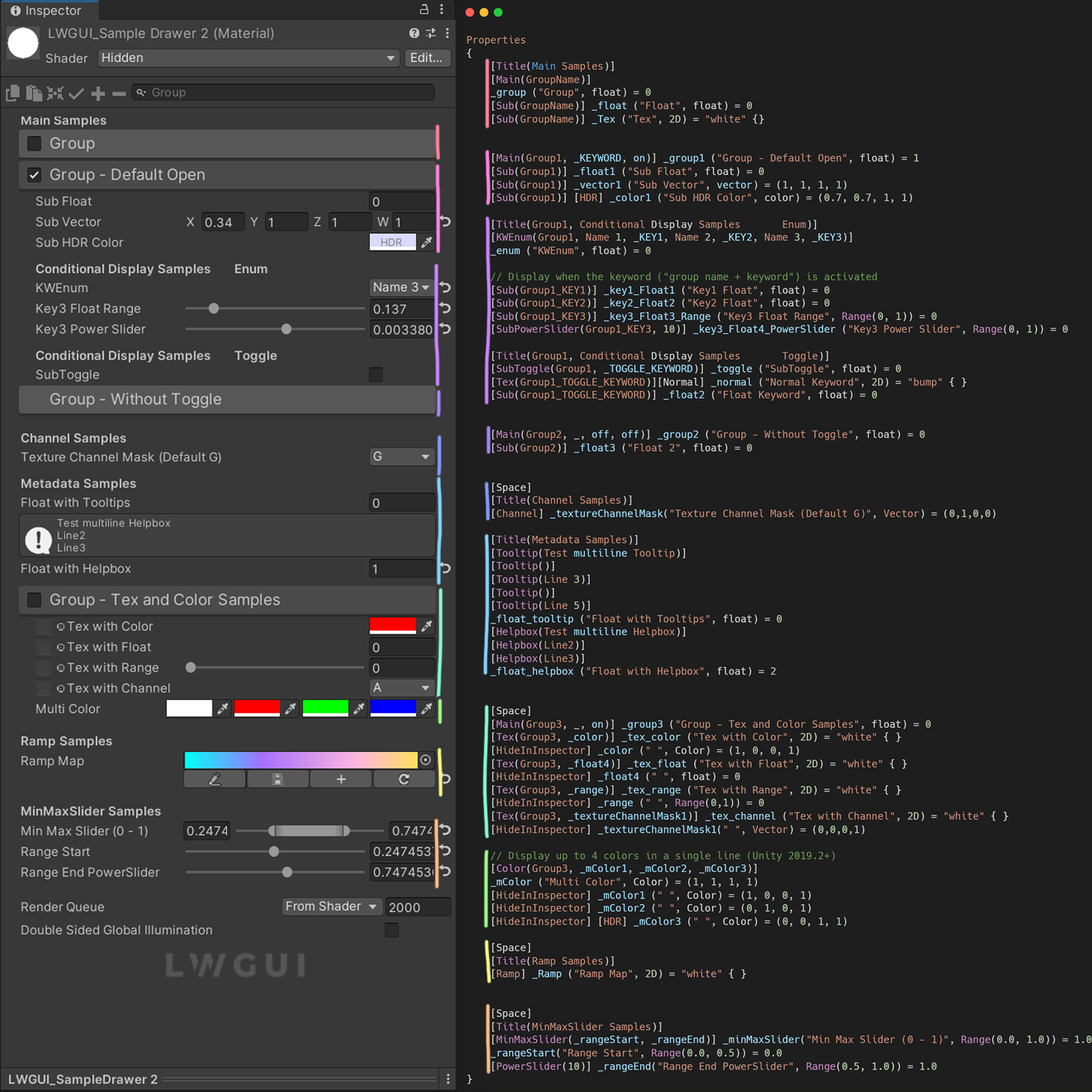
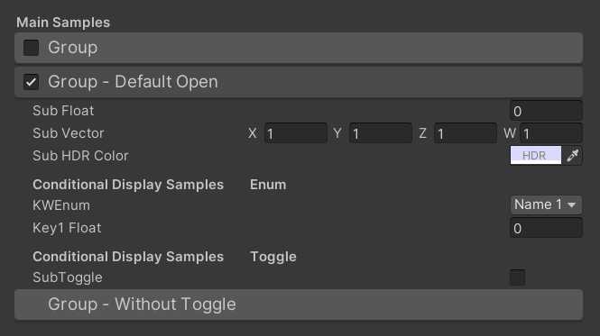
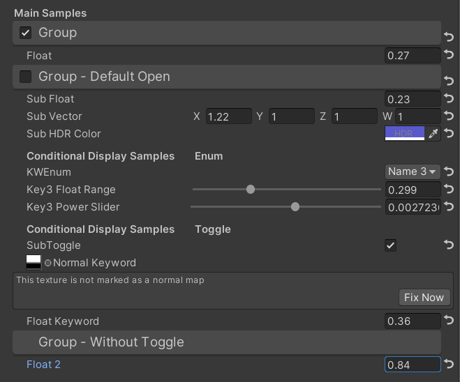
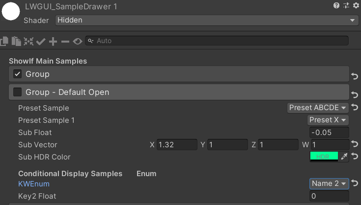
[ Title ( Main Samples ) ]
[ Main ( GroupName ) ]
_group ( "Group" , float ) = 0
[ Sub ( GroupName ) ] _float ( "Float" , float ) = 0
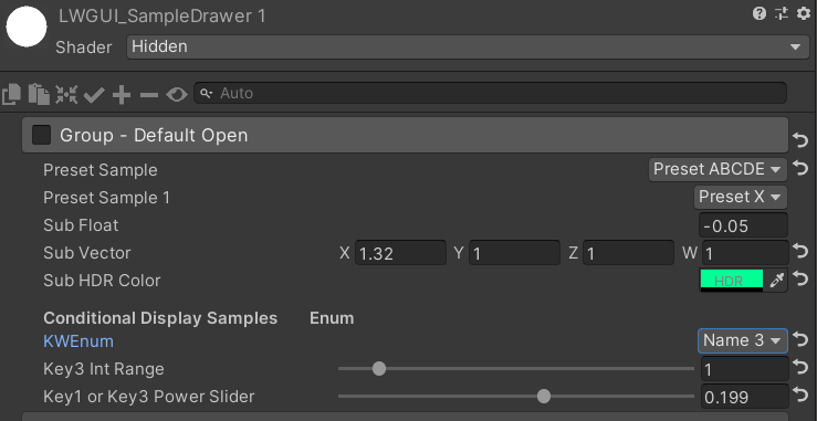
[ Main ( Group1 , _KEYWORD , on ) ] _group1 ( "Group - Default Open" , float ) = 1
[ Sub ( Group1 ) ] _float1 ( "Sub Float" , float ) = 0
[ Sub ( Group1 ) ] _vector1 ( "Sub Vector" , vector ) = ( 1 , 1 , 1 , 1 )
[ Sub ( Group1 ) ] [ HDR ] _color1 ( "Sub HDR Color" , color ) = ( 0.7 , 0.7 , 1 , 1 )
[ Title ( Group1 , Conditional Display Samples Enum ) ]
[ KWEnum ( Group1 , Name 1 , _KEY1 , Name 2 , _KEY2 , Name 3 , _KEY3 ) ]
_enum ( "KWEnum" , float ) = 0
// Display when the keyword ("group name + keyword") is activated
[ Sub ( Group1_KEY1 ) ] _key1_Float1 ( "Key1 Float" , float ) = 0
[ Sub ( Group1_KEY2 ) ] _key2_Float2 ( "Key2 Float" , float ) = 0
[ Sub ( Group1_KEY3 ) ] _key3_Float3_Range ( "Key3 Float Range" , Range ( 0 , 1 ) ) = 0
[ SubPowerSlider ( Group1_KEY3 , 10 ) ] _key3_Float4_PowerSlider ( "Key3 Power Slider" , Range ( 0 , 1 ) ) = 0
[ Title ( Group1 , Conditional Display Samples Toggle ) ]
[ SubToggle ( Group1 , _TOGGLE_KEYWORD ) ] _toggle ( "SubToggle" , float ) = 0
[ Tex ( Group1_TOGGLE_KEYWORD ) ] [ Normal ] _normal ( "Normal Keyword" , 2D ) = "bump" { }
[ Sub ( Group1_TOGGLE_KEYWORD ) ] _float2 ( "Float Keyword" , float ) = 0
[ Main ( Group2 , _ , off , off ) ] _group2 ( "Group - Without Toggle" , float ) = 0
[ Sub ( Group2 ) ] _float3 ( "Float 2" , float ) = 0デフォルトの結果:
次に、値を変更します。
 /// Similar to builtin Toggle()
/// group: father group name, support suffix keyword for conditional display (Default: none)
/// keyword: keyword used for toggle, "_" = ignore, none or "__" = Property Name +  "_ON", always Upper (Default: none)
/// Target Property Type: FLoat
public SubToggleDrawer ( ) { }
public SubToggleDrawer ( string group ) : this ( group , String . Empty ) { }
public SubToggleDrawer ( string group , string keyWord ) /// Similar to builtin PowerSlider()
/// group: father group name, support suffix keyword for conditional display (Default: none)
/// power: power of slider (Default: 1)
/// Target Property Type: Range
public SubPowerSliderDrawer ( float power ) : this ( "_" , power ) { }
public SubPowerSliderDrawer ( string group , float power ) /// Similar to builtin IntRange()
/// group: father group name, support suffix keyword for conditional display (Default: none)
/// Target Property Type: Range
public SubIntRangeDrawer ( string group ) /// Draw a min max slider
/// group: father group name, support suffix keyword for conditional display (Default: none)
/// minPropName: Output Min Property Name
/// maxPropName: Output Max Property Name
/// Target Property Type: Range, range limits express the MinMaxSlider value range
/// Output Min/Max Property Type: Range, it's value is limited by it's range
public MinMaxSliderDrawer ( string minPropName , string maxPropName ) : this ( "_" , minPropName , maxPropName ) { }
public MinMaxSliderDrawer ( string group , string minPropName , string maxPropName )例:
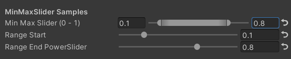
 [ Title ( MinMaxSlider Samples ) ]
[ MinMaxSlider ( _rangeStart , _rangeEnd ) ] _minMaxSlider ( "Min Max Slider (0 - 1)" , Range ( 0.0 , 1.0 ) ) = 1.0
/*[HideInInspector]*/ _rangeStart ( "Range Start" , Range ( 0.0 , 0.5 ) ) = 0.0
/*[HideInInspector]*/ [ PowerSlider ( 10 ) ] _rangeEnd ( "Range End PowerSlider" , Range ( 0.5 , 1.0 ) ) = 1.0
結果:
 /// <summary>
/// Similar to builtin Enum() / KeywordEnum()
/// group: father group name, support suffix keyword for conditional display (Default: none)
/// n(s): display name
/// k(s): keyword
/// v(s): value
/// Target Property Type: FLoat, express current keyword index
/// </summary>
public KWEnumDrawer ( string n1 , string k1 )
public KWEnumDrawer ( string n1 , string k1 , string n2 , string k2 )
public KWEnumDrawer ( string n1 , string k1 , string n2 , string k2 , string n3 , string k3 )
public KWEnumDrawer ( string n1 , string k1 , string n2 , string k2 , string n3 , string k3 , string n4 , string k4 )
public KWEnumDrawer ( string n1 , string k1 , string n2 , string k2 , string n3 , string k3 , string n4 , string k4 , string n5 , string k5 )

public KWEnumDrawer ( string group , string n1 , string k1 )
public KWEnumDrawer ( string group , string n1 , string k1 , string n2 , string k2 )
public KWEnumDrawer ( string group , string n1 , string k1 , string n2 , string k2 , string n3 , string k3 )
public KWEnumDrawer ( string group , string n1 , string k1 , string n2 , string k2 , string n3 , string k3 , string n4 , string k4 )
public KWEnumDrawer ( string group , string n1 , string k1 , string n2 , string k2 , string n3 , string k3 , string n4 , string k4 , string n5 , string k5 ) // enumName: like "UnityEngine.Rendering.BlendMode"
public SubEnumDrawer ( string group , string enumName ) : base ( group , enumName )
public SubEnumDrawer ( string group , string n1 , float v1 , string n2 , float v2 )
public SubEnumDrawer ( string group , string n1 , float v1 , string n2 , float v2 , string n3 , float v3 )
public SubEnumDrawer ( string group , string n1 , float v1 , string n2 , float v2 , string n3 , float v3 , string n4 , float v4 )
public SubEnumDrawer ( string group , string n1 , float v1 , string n2 , float v2 , string n3 , float v3 , string n4 , float v4 , string n5 , float v5 )
public SubEnumDrawer ( string group , string n1 , float v1 , string n2 , float v2 , string n3 , float v3 , string n4 , float v4 , string n5 , float v5 , string n6 , float v6 )
public SubEnumDrawer ( string group , string n1 , float v1 , string n2 , float v2 , string n3 , float v3 , string n4 , float v4 , string n5 , float v5 , string n6 , float v6 , string n7 , float v7 )
public SubKeywordEnumDrawer ( string group , string kw1 , string kw2 )
public SubKeywordEnumDrawer ( string group , string kw1 , string kw2 , string kw3 )
public SubKeywordEnumDrawer ( string group , string kw1 , string kw2 , string kw3 , string kw4 )
public SubKeywordEnumDrawer ( string group , string kw1 , string kw2 , string kw3 , string kw4 , string kw5 )
public SubKeywordEnumDrawer ( string group , string kw1 , string kw2 , string kw3 , string kw4 , string kw5 , string kw6 )
public SubKeywordEnumDrawer ( string group , string kw1 , string kw2 , string kw3 , string kw4 , string kw5 , string kw6 , string kw7 )
public SubKeywordEnumDrawer ( string group , string kw1 , string kw2 , string kw3 , string kw4 , string kw5 , string kw6 , string kw7 , string kw8 )
public SubKeywordEnumDrawer ( string group , string kw1 , string kw2 , string kw3 , string kw4 , string kw5 , string kw6 , string kw7 , string kw8 , string kw9 ) /// Draw a Texture property in single line with a extra property
/// group: father group name, support suffix keyword for conditional display (Default: none)
/// extraPropName: extra property name (Default: none)
/// Target Property Type: Texture
/// Extra Property Type: Color, Vector
public TexDrawer ( ) { }
public TexDrawer ( string group ) : this ( group , String . Empty ) { }
public TexDrawer ( string group , string extraPropName ) /// Display up to 4 colors in a single line
/// group: father group name, support suffix keyword for conditional display (Default: none)
/// color2-4: extra color property name
/// Target Property Type: Color
public ColorDrawer ( string group , string color2 ) : this ( group , color2 , String . Empty , String . Empty ) { }
public ColorDrawer ( string group , string color2 , string color3 ) : this ( group , color2 , color3 , String . Empty ) { }
public ColorDrawer ( string group , string color2 , string color3 , string color4 )例:
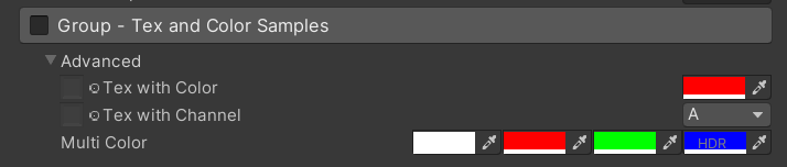
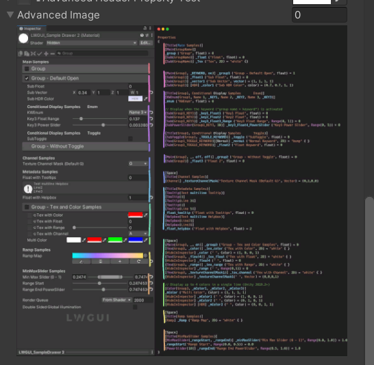
 [ Main ( Group3 , _ , on ) ] _group3 ( "Group - Tex and Color Samples" , float ) = 0
[ Advanced ] [ Tex ( Group3 , _color ) ] _tex_color ( "Tex with Color" , 2D ) = "white" { }
[ Advanced ] [ HideInInspector ] _color ( " ", Color) = (1, 0, 0, 1)
[ Advanced ] [ Tex ( Group3 , _textureChannelMask1 ) ] _tex_channel ( "Tex with Channel" , 2D ) = "white" { }
[ Advanced ] [ HideInInspector ] _textureChannelMask1 ( " ", Vector) = (0, 0, 0, 1)

[ Advanced ] [ Color ( Group3 , _mColor1 , _mColor2 , _mColor3 ) ] _mColor ( "Multi Color" , Color ) = ( 1 , 1 , 1 , 1 )
[ Advanced ] [ HideInInspector ] _mColor1 ( " " , Color ) = ( 1 , 0 , 0 , 1 )
[ Advanced ] [ HideInInspector ] _mColor2 ( " " , Color ) = ( 0 , 1 , 0 , 1 )
[ Advanced ] [ HideInInspector ] [ HDR ] _mColor3 ( " " , Color ) = ( 0 , 0 , 1 , 1 )
結果:
 /// Draw an image preview.
/// display name: The path of the image file relative to the Unity project, such as: "Assets/test.png", "Doc/test.png", "../test.png"
/// group: father group name, support suffix keyword for conditional display (Default: none)
public ImageDrawer ( ) { }
public ImageDrawer ( string group )
結果:
 /// Draw a R/G/B/A drop menu:
/// 	R = (1, 0, 0, 0)
/// 	G = (0, 1, 0, 0)
/// 	B = (0, 0, 1, 0)
/// 	A = (0, 0, 0, 1)
/// 	RGB Average = (1f / 3f, 1f / 3f, 1f / 3f, 0)
/// 	RGB Luminance = (0.2126f, 0.7152f, 0.0722f, 0)
///		None = (0, 0, 0, 0)
/// group: father group name, support suffix keyword for conditional display (Default: none)
/// Target Property Type: Vector, used to dot() with Texture Sample Value
public ChannelDrawer ( ) { }
public ChannelDrawer ( string group )
例:
 [ Title ( _ , Channel Samples ) ]
[ Channel ( _ ) ] _textureChannelMask ( "Texture Channel Mask (Default G)" , Vector ) = ( 0 , 1 , 0 , 0 )

......

float selectedChannelValue = dot ( tex2D ( _Tex , uv ) , _textureChannelMask ) ; 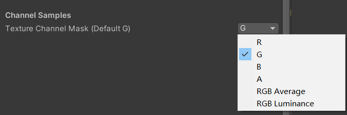
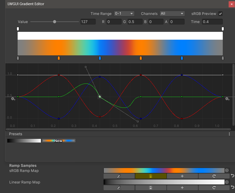
 /// Draw an unreal style Ramp Map Editor (Default Ramp Map Resolution: 512 * 2)
/// NEW: The new LwguiGradient type has both the Gradient and Curve editors, and can be used in C# scripts and runtime, and is intended to replace UnityEngine.Gradient
/// group: father group name, support suffix keyword for conditional display (Default: none)
/// defaultFileName: default Ramp Map file name when create a new one (Default: RampMap)
/// rootPath: the path where ramp is stored, replace '/' with '.' (for example: Assets.Art.Ramps). when selecting ramp, it will also be filtered according to the path (Default: Assets)
/// colorSpace: switch sRGB / Linear in ramp texture import setting (Default: sRGB)
/// defaultWidth: default Ramp Width (Default: 512)
/// viewChannelMask: editable channels. (Default: RGBA)
/// timeRange: the abscissa display range (1/24/2400), is used to optimize the editing experience when the abscissa is time of day. (Default: 1)
/// Target Property Type: Texture2D
public RampDrawer ( ) : this ( String . Empty ) { }
public RampDrawer ( string group ) : this ( group , "RampMap" ) { }
public RampDrawer ( string group , string defaultFileName ) : this ( group , defaultFileName , DefaultRootPath , 512 ) { }
public RampDrawer ( string group , string defaultFileName , float defaultWidth ) : this ( group , defaultFileName , DefaultRootPath , defaultWidth ) { }
public RampDrawer ( string group , string defaultFileName , string rootPath , float defaultWidth ) : this ( group , defaultFileName , rootPath , "sRGB" , defaultWidth ) { }
public RampDrawer ( string group , string defaultFileName , string rootPath , string colorSpace , float defaultWidth ) : this ( group , defaultFileName , rootPath , colorSpace , defaultWidth , "RGBA" ) { }
public RampDrawer ( string group , string defaultFileName , string rootPath , string colorSpace , float defaultWidth , string viewChannelMask ) : this ( group , defaultFileName , rootPath , colorSpace , defaultWidth , viewChannelMask , 1 ) { }
public RampDrawer ( string group , string defaultFileName , string rootPath , string colorSpace , float defaultWidth , string viewChannelMask , float timeRange )
例:
[ Ramp ( _ , RampMap , Assets . Art , 512 ) ] _Ramp ( "Ramp Map" , 2D ) = "white" { }結果:
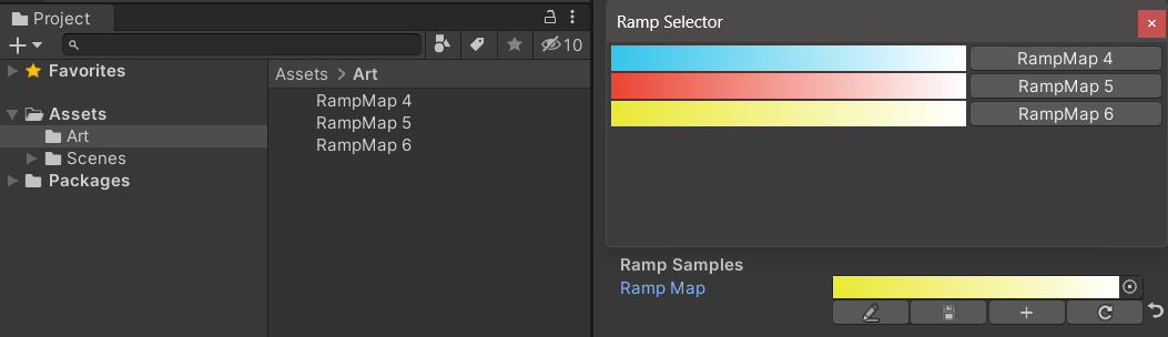
編集結果を手動で保存する必要があります。救済されていない変更がある場合、保存ボタンは黄色に表示されます。
ランプマップを移動またはコピーするときは、.metaファイルと一緒に移動することを忘れないでください。そうしないと、再度編集できません。
例:
 public class Test : MonoBehaviour
{
    public LwguiGradient lwguiGradientSrgb = new LwguiGradient ( ) ;

    [ LwguiGradientUsage ( ColorSpace . Linear , LwguiGradient . ChannelMask . RGB , LwguiGradient . GradientTimeRange . TwentyFourHundred ) ]
    public LwguiGradient lwguiGradientLinear = new LwguiGradient ( ) ;
}
結果:
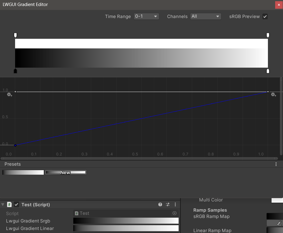
lwguigradientusage()属性を使用して、デフォルトの表示設定を設定できます。
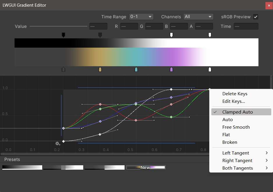
新しいLWGUI Gradient Editorは、Unityの組み込みグラデーションエディターおよび曲線エディターと統合され、UEのGradientエディターよりも強力な機能を可能にします。
| エディタ | 説明 |
|---|---|
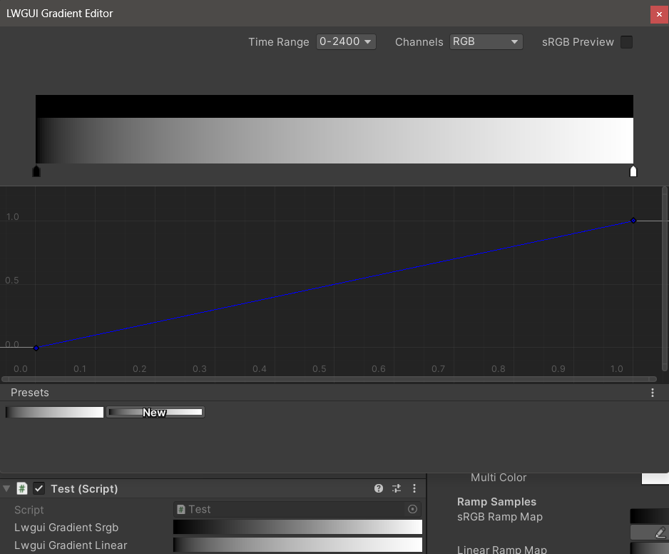
| 時間範囲 | 0-1 / 0-24 / 0-2400で選択可能な水平軸の表示範囲は、水平軸が時間である場合に非常に役立ちます。ディスプレイのみが影響を受けることに注意してください。水平軸に保存されている実際の値は常に0-1です。 |
| チャネル | 表示されたチャネル。個別に表示できます。 |
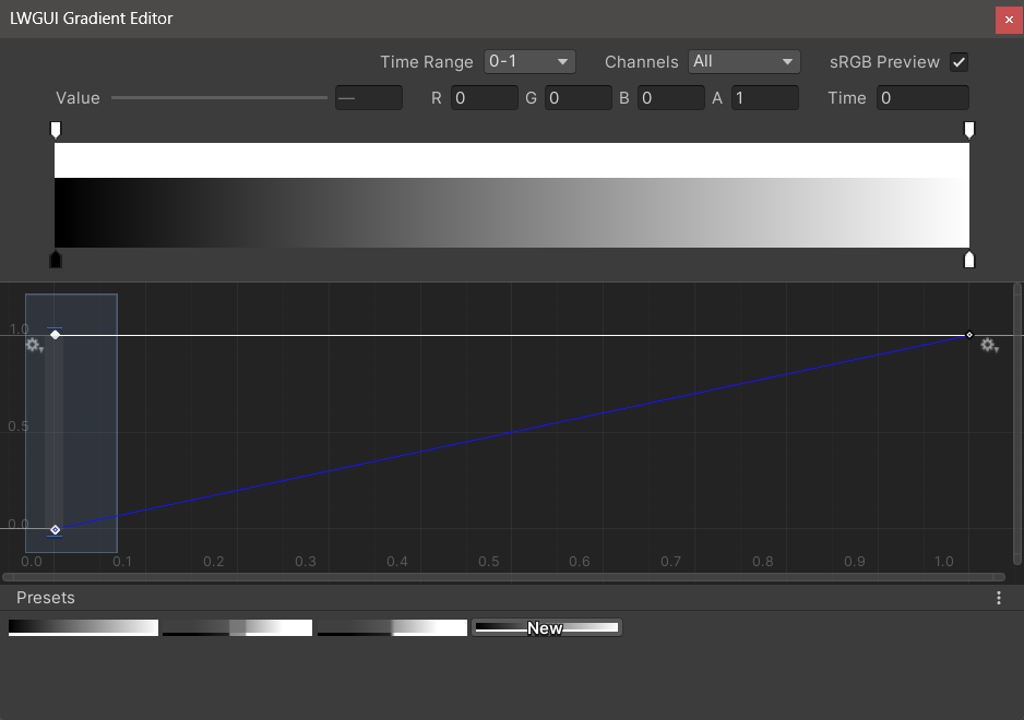
| SRGBプレビュー | グラデーションの値が正しい色をプレビューする色である場合、チェックする必要があります。そうしないと、チェックする必要はありません。ディスプレイ、グラデーション、ランプマップは常に線形として保存されます。 |
| 値 / r / g / b / a | 選択したキーの値の編集に使用すると、複数のキーの値を同時に編集できます。 |
| 時間 | 選択したキーの時間を編集するために使用すると、複数のキーの時間を同時に編集できます。数字を手動で入力する場合は、 Enterを押して編集を終了する必要があります。 |
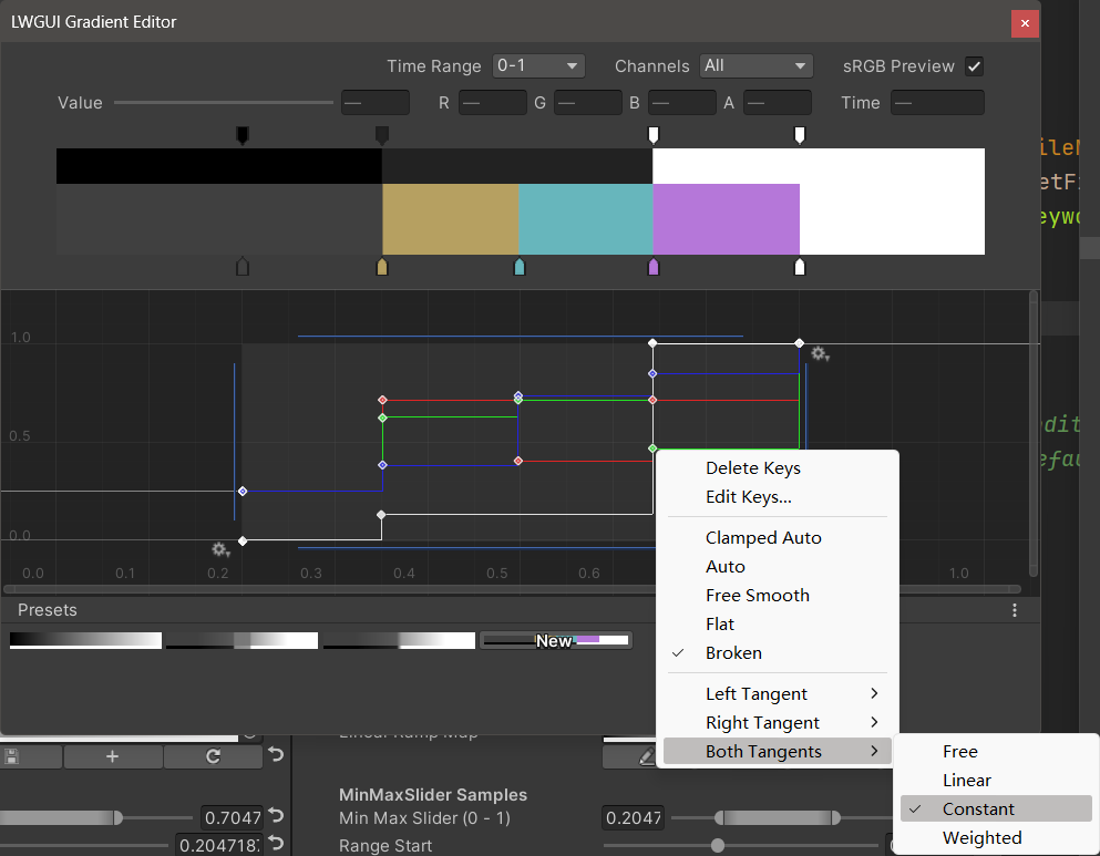
| グラデーションエディター | これは、Unityの組み込みグラデーションエディターに似ていますが、アルファチャネルは白黒に分離されています。 グラデーションエディターからキーを追加すると、最大8キーに制限されているため、曲線エディターからキーを追加することは無制限であることに注意してください。主要な制限を超えると、プレビューや使用には影響しません。 |
| 曲線エディター | Unityのビルトインカーブエディターと同様に、デフォルトでXY 0-1範囲を表示し、スクロールホイールを使用してディスプレイ範囲をズームまたは移動できます。 以下の画像で見ることができるように、コンテキストメニューには、曲線の形状を制御するための多くの機能があり、Unityドキュメントを参照してこれらの機能を最大限に活用できます。 |
| プリセット | 現在のLwGUIグラデーションをプリセットとして保存して、いつでも適用できます。これらのプリセットは、ローカルコンピューター上の異なるエンジンバージョン間で一般的ですが、プロジェクトに保存されません。 |
既知の問題:
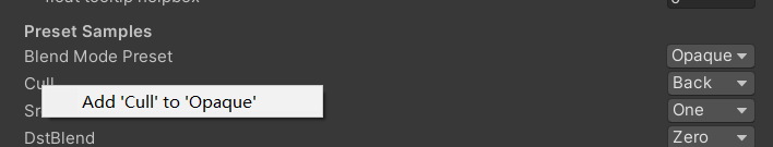
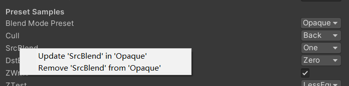
/// Popping a menu, you can select the Shader Property Preset, the Preset values will replaces the default values
/// group: father group name, support suffix keyword for conditional display (Default: none)
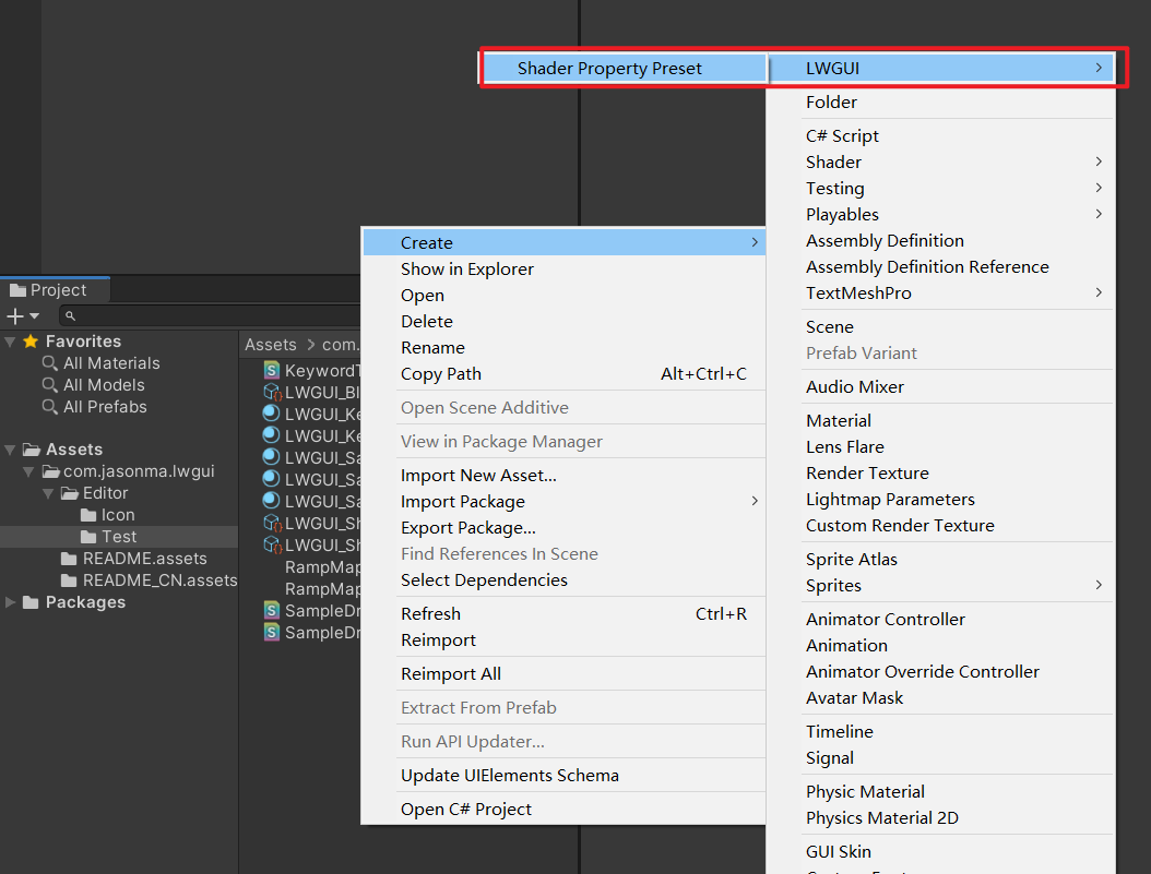
/// presetFileName: "Shader Property Preset" asset name, you can create new Preset by
/// "Right Click > Create > LWGUI > Shader Property Preset" in Project window,
/// *any Preset in the entire project cannot have the same name*
public PresetDrawer ( string presetFileName ) : this ( "_" , presetFileName ) { }
public PresetDrawer ( string group , string presetFileName )例:
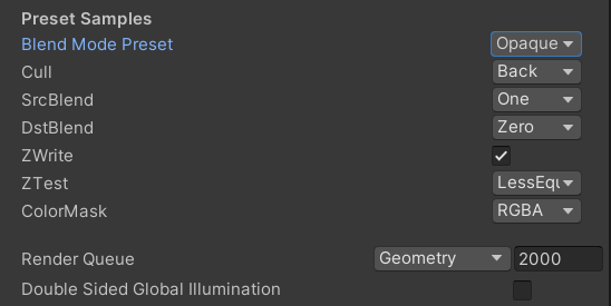
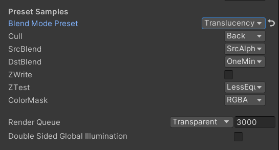
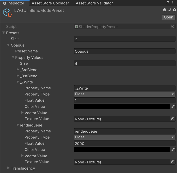
 [ Title ( Preset Samples ) ]
[ Preset ( LWGUI_BlendModePreset ) ] _BlendMode ( "Blend Mode Preset" , float ) = 0
[ Enum ( UnityEngine . Rendering . CullMode ) ] _Cull ( "Cull" , Float ) = 2
[ Enum ( UnityEngine . Rendering . BlendMode ) ] _SrcBlend ( "SrcBlend" , Float ) = 1
[ Enum ( UnityEngine . Rendering . BlendMode ) ] _DstBlend ( "DstBlend" , Float ) = 0
[ Toggle ( _ ) ] _ZWrite ( "ZWrite " , Float ) = 1
[ Enum ( UnityEngine . Rendering . CompareFunction ) ] _ZTest ( "ZTest" , Float ) = 4 // 4 is LEqual
[ Enum ( RGBA , 15 , RGB , 14 ) ] _ColorMask ( "ColorMask" , Float ) = 15 // 15 is RGBA (binary 1111)

``````

Cull [ _Cull ]
ZWrite [ _ZWrite ]
Blend [ _SrcBlend ] [ _DstBlend ]
ColorMask [ _ColorMask ]
結果:
選択したプリセットのプロパティ値はデフォルト値になります
renderqueueはハードコーディングされたプロパティ名です。プリセットに手動で追加する必要があります
 /// Draw one or more Buttons within the same row, using the Display Name to control the appearance and behavior of the buttons
///
/// Declaring a set of Button Name and Button Command in Display Name generates a Button, separated by '@':
/// ButtonName0@ButtonCommand0@ButtonName1@ButtonCommand1
///
/// Button Name can be any other string, the format of Button Command is:
/// TYPE:Argument
///
/// The following TYPEs are currently supported:
/// - URL: Open the URL, Argument is the URL
/// - C#: Call the public static C# function, Argument is NameSpace.Class.Method(arg0, arg1, ...),
///		for target function signatures, see: LWGUI.ButtonDrawer.TestMethod().
///
/// The full example:
/// [Button(_)] _button0 ("URL Button@URL:https://github.com/JasonMa0012/LWGUI@C#:LWGUI.ButtonDrawer.TestMethod(1234, abcd)", Float) = 0
///
/// group: father group name, support suffix keyword for conditional display (Default: none)
public ButtonDrawer ( ) { }
public ButtonDrawer ( string group )
例:
 [ Title ( Button Samples ) ]
[ Button ( _ ) ] _button0 ( "URL Button@URL:https://github.com/JasonMa0012/LWGUI@C# Button@C#:LWGUI.ButtonDrawer.TestMethod(1234, abcd)" , Float ) = 0 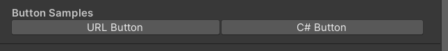
 /// Similar to Header()
/// group: father group name, support suffix keyword for conditional display (Default: none)
/// header: string to display, "SpaceLine" or "_" = none (Default: none)
/// height: line height (Default: 22)
public TitleDecorator ( string header ) : this ( "_" , header , DefaultHeight ) { }
public TitleDecorator ( string header , float  height ) : this ( "_" , header , height ) { }
public TitleDecorator ( string group ,  string header ) : this ( group , header , DefaultHeight ) { }
public TitleDecorator ( string group , string header , float height )


/// Similar to Title()
/// group: father group name, support suffix keyword for conditional display (Default: none)
/// header: string to display, "SpaceLine" or "_" = none (Default: none)
/// height: line height (Default: 22)
public SubTitleDecorator ( string group ,  string header ) : base ( group , header , DefaultHeight ) { }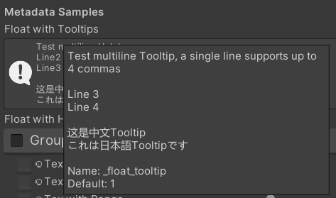
public SubTitleDecorator ( string group , string header , float height ) : base ( group , header , height ) { } /// Tooltip, describes the details of the property. (Default: property.name and property default value)
/// You can also use "#Text" in DisplayName to add Tooltip that supports Multi-Language.
/// tooltip: a single-line string to display, support up to 4 ','. (Default: Newline)
public TooltipDecorator ( ) : this ( string . Empty ) { }
public TooltipDecorator ( string tooltip ) { this . _tooltip = tooltip ; }
public TooltipDecorator ( string s1 , string s2 ) : this ( s1 + ", " + s2 ) { }
public TooltipDecorator ( string s1 , string s2 , string s3 ) : this ( s1 + ", " + s2 + ", " + s3 ) { }
public TooltipDecorator ( string s1 , string s2 , string s3 , string s4 ) : this ( s1 + ", " + s2 + ", " + s3 + ", " + s4 ) { }
public TooltipDecorator ( string s1 , string s2 , string s3 , string s4 , string s5 ) : this ( s1 + ", " + s2 + ", " + s3 + ", " + s4 + ", " + s5 ) { }
 /// Display a Helpbox on the property
/// You can also use "%Text" in DisplayName to add Helpbox that supports Multi-Language.
/// message: a single-line string to display, support up to 4 ','. (Default: Newline)
public HelpboxDecorator ( ) : this ( string . Empty ) { }
public HelpboxDecorator ( string message ) { this . _message = message ; }
public HelpboxDecorator ( string s1 , string s2 ) : this ( s1 + ", " + s2 ) { }
public HelpboxDecorator ( string s1 , string s2 , string s3 ) : this ( s1 + ", " + s2 + ", " + s3 ) { }
public HelpboxDecorator ( string s1 , string s2 , string s3 , string s4 ) : this ( s1 + ", " + s2 + ", " + s3 + ", " + s4 ) { }
public HelpboxDecorator ( string s1 , string s2 , string s3 , string s4 , string s5 ) : this ( s1 + ", " + s2 + ", " + s3 + ", " + s4 + ", " + s5 ) { }
例:
 [ Title ( Metadata Samples ) ]
[ Tooltip ( Test multiline Tooltip , a single line supports up to 4 commas ) ]
[ Tooltip ( ) ]
[ Tooltip ( Line 3 ) ]
[ Tooltip ( Line 4 ) ]
_float_tooltip ( "Float with Tooltips#这是中文Tooltip#これは日本語Tooltipです" , float ) = 1
[ Helpbox ( Test multiline Helpbox ) ]
[ Helpbox ( Line2 ) ]
[ Helpbox ( Line3 ) ]
_float_helpbox ( "Float with Helpbox%这是中文Helpbox%これは日本語Helpboxです" , float ) = 1 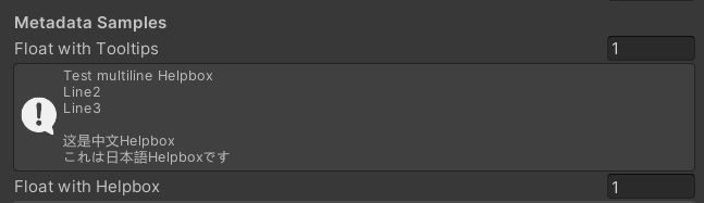
ヒント:
 /// Cooperate with Toggle to switch certain Passes
/// lightModeName(s): Light Mode in Shader Pass (https://docs.unity3d.com/2017.4/Documentation/Manual/SL-PassTags.html)
public PassSwitchDecorator ( string   lightModeName1 )
public PassSwitchDecorator ( string   lightModeName1 , string lightModeName2 )
public PassSwitchDecorator ( string   lightModeName1 , string lightModeName2 , string lightModeName3 )
public PassSwitchDecorator ( string   lightModeName1 , string lightModeName2 , string lightModeName3 , string lightModeName4 )
public PassSwitchDecorator ( string   lightModeName1 , string lightModeName2 , string lightModeName3 , string lightModeName4 , string lightModeName5 )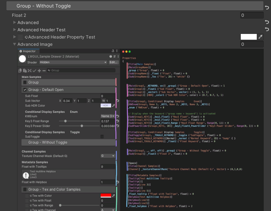
public PassSwitchDecorator ( string lightModeName1 , string lightModeName2 , string lightModeName3 , string lightModeName4 , string lightModeName5 , string lightModeName6 ) /// Collapse the current Property into an Advanced Block. Specify the Header String to create a new Advanced Block. All Properties using Advanced() will be collapsed into the nearest Advanced Block.
/// headerString: The title of the Advanced Block. Default: "Advanced"
public AdvancedDecorator ( ) : this ( string . Empty ) { }
public AdvancedDecorator ( string headerString ) /// Create an Advanced Block using the current Property as the Header
public AdvancedHeaderPropertyDecorator ( )例:
 [ Main ( Group2 , _ , off , off ) ] _group2 ( "Group - Without Toggle" , float ) = 0
[ Sub ( Group2 ) ] _float3 ( "Float 2 " , float ) = 0
[ Advanced ] [ Sub ( Group2 ) ] _Advancedfloat0 ( "Advanced Float 0 " , float ) = 0
[ Advanced ] [ Sub ( Group2 ) ] _Advancedfloat1 ( "Advanced Float 1" , float ) = 0
[ Advanced ( Advanced Header Test ) ] [ Sub ( Group2 ) ] _Advancedfloat3 ( "Advanced Float 3" , float ) = 0
[ Advanced ] [ Sub ( Group2 ) ] _Advancedfloat4 ( "Advanced Float 4" , float ) = 0
[ AdvancedHeaderProperty ] [ Tex ( Group2 , _Advancedfloat7 ) ] _AdvancedTex0 ( "Advanced Header Property Test" , 2D ) = "white" { }
[ Advanced ] [ HideInInspector ] _Advancedfloat7 ( "Advanced Float 7" , float ) = 0
[ Advanced ] [ Tex ( Group2 , _AdvancedRange0 ) ] _AdvancedTex1 ( "Advanced Tex 1" , 2D ) = "white" { }
[ Advanced ] [ HideInInspector ] _AdvancedRange0 ( "Advanced Range 0" , Range ( 0 , 1 ) ) = 0 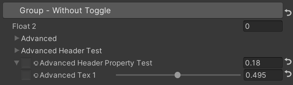
ヒント:
 /// Similar to HideInInspector(), the difference is that Hidden() can be unhidden through the Display Mode button.
public HiddenDecorator ( ) /// Set the property to read-only.
public ReadOnlyDecorator ( ) /// Control the show or hide of a single or a group of properties based on multiple conditions.
/// logicalOperator: And | Or (Default: And).
/// propName: Target Property Name used for comparison.
/// compareFunction: Less (L) | Equal (E) | LessEqual (LEqual / LE) | Greater (G) | NotEqual (NEqual / NE) | GreaterEqual (GEqual / GE).
/// value: Target Property Value used for comparison.
public ShowIfDecorator ( string propName , string comparisonMethod , float value ) : this ( "And" , propName , comparisonMethod , value ) { }
public ShowIfDecorator ( string logicalOperator , string propName , string compareFunction , float value )例:
 [ ShowIf ( _enum , Equal , 1 ) ]
[ Title ( ShowIf Main Samples ) ]
[ Main ( GroupName ) ] _group ( "Group" , float ) = 0
[ Sub ( GroupName ) ] _float ( "Float" , float ) = 0
[ Sub ( GroupName ) ] _Tex ( "Tex" , 2D ) = "white" { }

.. .

[ SubTitle ( Group1 , Conditional Display Samples       Enum ) ]
[ KWEnum ( Group1 , Name 1 , _KEY1 , Name 2 , _KEY2 , Name 3 , _KEY3 ) ] _enum ( "KWEnum" , float ) = 0
[ Sub ( Group1 ) ] [ ShowIf ( _enum , Equal , 0 ) ] _key1_Float1 ( "Key1 Float" , float ) = 0
[ Sub ( Group1 ) ] [ ShowIf ( _enum , Equal , 1 ) ] _key2_Float2 ( "Key2 Float" , float ) = 0
[ SubIntRange ( Group1 ) ] [ ShowIf ( _enum , Equal , 2 ) ] _key3_Int_Range ( "Key3 Int Range" , Range ( 0 , 10 ) ) = 0
[ ShowIf ( _enum , Equal , 0 ) ] [ ShowIf ( Or , _enum , Equal , 2 ) ]
[ SubPowerSlider ( Group1 , 3 ) ] _key13_PowerSlider ( "Key1 or Key3 Power Slider" , Range ( 0 , 1 ) ) = 0 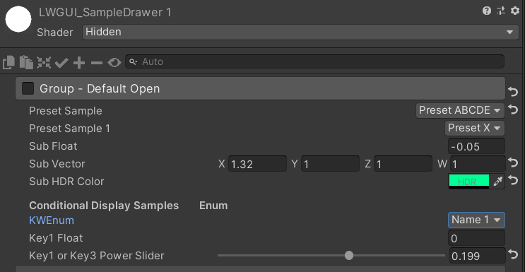
MaterialSpaceDecorator ( float height ) MaterialHeaderDecorator ( string header ) MaterialEnumDrawer ( string n1 , float v1 , string n2 , float v2 , string n3 , float v3 , string n4 , float v4 , string n5 , float v5 , string n6 , float v6 , string n7 , float v7 ) MaterialIntRangeDrawer ( ) MaterialKeywordEnumDrawer ( string kw1 , string kw2 , string kw3 , string kw4 , string kw5 , string kw6 , string kw7 , string kw8 , string kw9 ) MaterialPowerSliderDrawer ( float power ) MaterialToggleUIDrawer ( string keyword ) 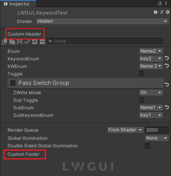
カスタムヘッダーとフッターを使用すると、LWGUIプラグインコードを変更せずに、Shaderguiの上部または下部にオーダーメイドモジュールを統合できます。
カスタムGUIの目的の場所に応じて、次のスクリプトをプロジェクト内のエディターフォルダーに複製します。
それに応じてファイル名とクラス名を変更します。
docustomheader() / docustomfooter()関数内にカスタムGUIコードを実装します。
LWGUIオブジェクト定義を調べて、必要なデータを取得することをお勧めします。
トト
shadeerdrawer.csのSubdrawerを継承して、カスタムドロワーの開発を開始します

