LWGUI
1.21.0
中文 | Englisch
Ein leichtes, flexibles, leistungsstarke GUI -System der Einheit Shader .
Nach zahlreichen groß angelegten kommerziellen Projekten validiert wurde, ermöglicht die Verwendung einer prägnanten materiellen Immobilienschubladensyntax die Realisierung leistungsstarker Shader-GUIs, die Entwicklung der Entwicklungszeit, die Förderung der Benutzerfreundlichkeit und der Erweiterbarkeit und die Erhöhung der Benutzererfahrung für Künstler effektiv.

 |  |
|---|---|
| Neu: Ein leistungsstärkerer Gradientenredakteur als UE, mit Unterstützung für Shader und C# | Neu: Fügen Sie Bilder direkt in den Shadergui ein, um die Anzeige komplexer Dokumente zu unterstützen, ohne zum Browser springen zu müssen |
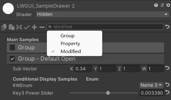 | 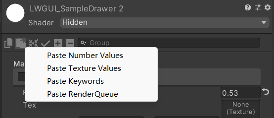 |
| Die Suchleiste kann auch für geänderte Eigenschaften filtern | Klicken Sie mit der rechten Maustaste, um den Attributwert nach Typ einzufügen |
| Mit Ihrem Sponsoring werde ich aktiver aktualisieren. | 有你的赞助我会更加积极地更新 |
|---|---|
| paypal.me/jasonma0012 |  |
Stellen Sie sicher, dass Ihre Umgebung mit LWGui kompatibel ist
Lwgui <1,17: Einheit 2017.4+
Lwgui> = 1.17: Einheit 2021.3+
Öffnen Sie Ihr Projekt
Window > Package Manager > Add > Add package from git URL , geben Sie ein: https://github.com/JasonMa0012/LWGUI.git
Package Manager > Add package from disk von Github herunterladen.CustomEditor "LWGUI.LWGUI" /// Create a Folding Group
/// group: group name (Default: Property Name)
/// keyword: keyword used for toggle, "_" = ignore, none or "__" = Property Name + "_ON", always Upper (Default: none)
/// default Folding State: "on" or "off" (Default: off)
/// default Toggle Displayed: "on" or "off" (Default: on)
/// Target Property Type: FLoat, express Toggle value
public MainDrawer ( ) : this ( String . Empty ) { }
public MainDrawer ( string group ) : this ( group , String . Empty ) { }
public MainDrawer ( string group , string keyword ) : this ( group , keyword , "off" ) { }
public MainDrawer ( string group , string keyword , string defaultFoldingState ) : this ( group , keyword , defaultFoldingState , "on" ) { }
public MainDrawer ( string group , string keyword , string defaultFoldingState , string defaultToggleDisplayed ) /// Draw a property with default style in the folding group
/// group: father group name, support suffix keyword for conditional display (Default: none)
/// Target Property Type: Any
public SubDrawer ( ) { }
public SubDrawer ( string group )Beispiel:
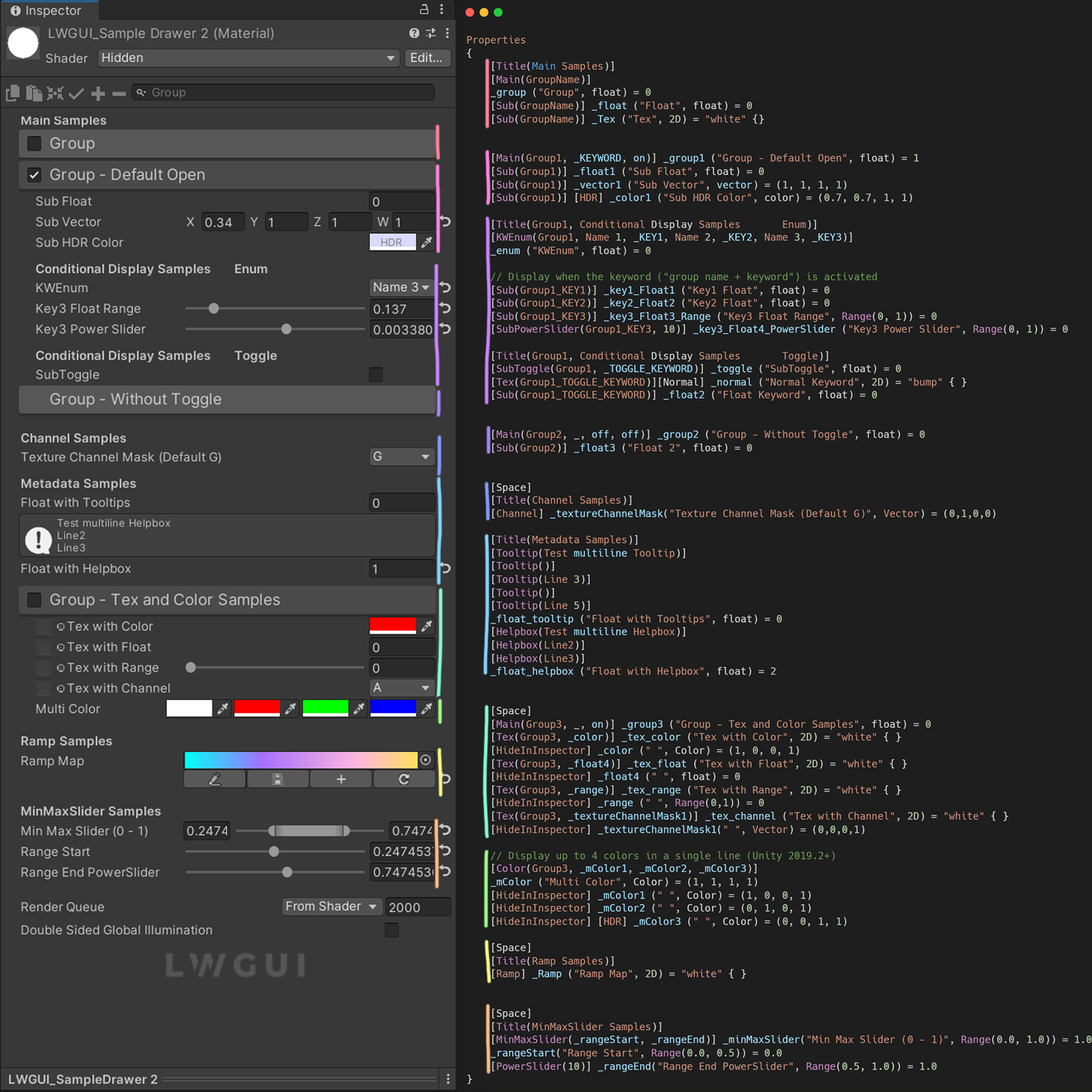
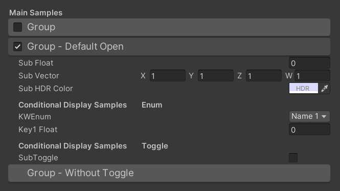
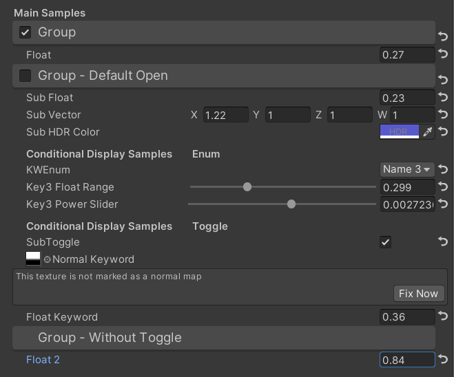
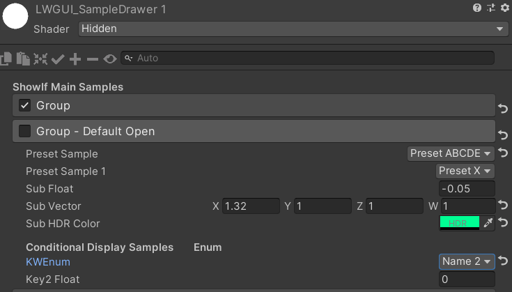
[ Title ( Main Samples ) ]
[ Main ( GroupName ) ]
_group ( "Group" , float ) = 0
[ Sub ( GroupName ) ] _float ( "Float" , float ) = 0
[ Main ( Group1 , _KEYWORD , on ) ] _group1 ( "Group - Default Open" , float ) = 1
[ Sub ( Group1 ) ] _float1 ( "Sub Float" , float ) = 0
[ Sub ( Group1 ) ] _vector1 ( "Sub Vector" , vector ) = ( 1 , 1 , 1 , 1 )
[ Sub ( Group1 ) ] [ HDR ] _color1 ( "Sub HDR Color" , color ) = ( 0.7 , 0.7 , 1 , 1 )
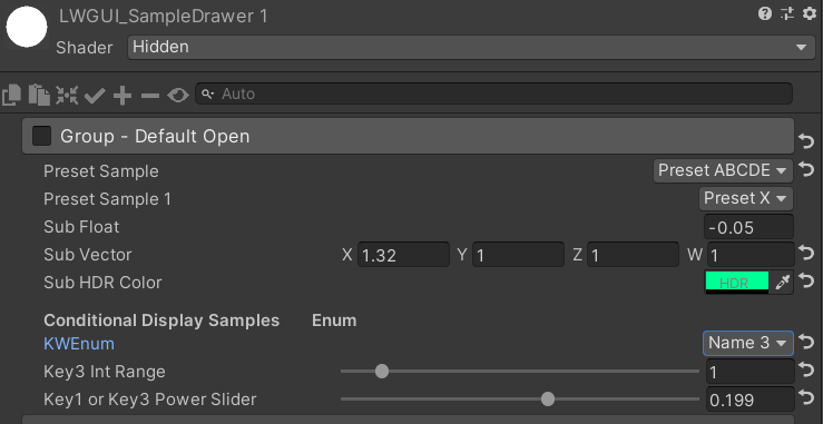
[ Title ( Group1 , Conditional Display Samples Enum ) ]
[ KWEnum ( Group1 , Name 1 , _KEY1 , Name 2 , _KEY2 , Name 3 , _KEY3 ) ]
_enum ( "KWEnum" , float ) = 0
// Display when the keyword ("group name + keyword") is activated
[ Sub ( Group1_KEY1 ) ] _key1_Float1 ( "Key1 Float" , float ) = 0
[ Sub ( Group1_KEY2 ) ] _key2_Float2 ( "Key2 Float" , float ) = 0
[ Sub ( Group1_KEY3 ) ] _key3_Float3_Range ( "Key3 Float Range" , Range ( 0 , 1 ) ) = 0
[ SubPowerSlider ( Group1_KEY3 , 10 ) ] _key3_Float4_PowerSlider ( "Key3 Power Slider" , Range ( 0 , 1 ) ) = 0
[ Title ( Group1 , Conditional Display Samples Toggle ) ]
[ SubToggle ( Group1 , _TOGGLE_KEYWORD ) ] _toggle ( "SubToggle" , float ) = 0
[ Tex ( Group1_TOGGLE_KEYWORD ) ] [ Normal ] _normal ( "Normal Keyword" , 2D ) = "bump" { }
[ Sub ( Group1_TOGGLE_KEYWORD ) ] _float2 ( "Float Keyword" , float ) = 0
[ Main ( Group2 , _ , off , off ) ] _group2 ( "Group - Without Toggle" , float ) = 0
[ Sub ( Group2 ) ] _float3 ( "Float 2" , float ) = 0Standard -Ergebnis:
Dann ändern Sie die Werte:
 /// Similar to builtin Toggle()
/// group: father group name, support suffix keyword for conditional display (Default: none)
/// keyword: keyword used for toggle, "_" = ignore, none or "__" = Property Name +  "_ON", always Upper (Default: none)
/// Target Property Type: FLoat
public SubToggleDrawer ( ) { }
public SubToggleDrawer ( string group ) : this ( group , String . Empty ) { }
public SubToggleDrawer ( string group , string keyWord ) /// Similar to builtin PowerSlider()
/// group: father group name, support suffix keyword for conditional display (Default: none)
/// power: power of slider (Default: 1)
/// Target Property Type: Range
public SubPowerSliderDrawer ( float power ) : this ( "_" , power ) { }
public SubPowerSliderDrawer ( string group , float power ) /// Similar to builtin IntRange()
/// group: father group name, support suffix keyword for conditional display (Default: none)
/// Target Property Type: Range
public SubIntRangeDrawer ( string group ) /// Draw a min max slider
/// group: father group name, support suffix keyword for conditional display (Default: none)
/// minPropName: Output Min Property Name
/// maxPropName: Output Max Property Name
/// Target Property Type: Range, range limits express the MinMaxSlider value range
/// Output Min/Max Property Type: Range, it's value is limited by it's range
public MinMaxSliderDrawer ( string minPropName , string maxPropName ) : this ( "_" , minPropName , maxPropName ) { }
public MinMaxSliderDrawer ( string group , string minPropName , string maxPropName )Beispiel:
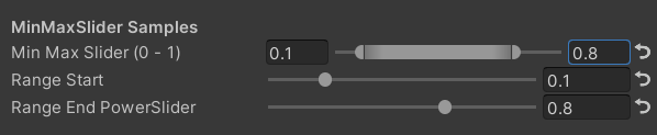
 [ Title ( MinMaxSlider Samples ) ]
[ MinMaxSlider ( _rangeStart , _rangeEnd ) ] _minMaxSlider ( "Min Max Slider (0 - 1)" , Range ( 0.0 , 1.0 ) ) = 1.0
/*[HideInInspector]*/ _rangeStart ( "Range Start" , Range ( 0.0 , 0.5 ) ) = 0.0
/*[HideInInspector]*/ [ PowerSlider ( 10 ) ] _rangeEnd ( "Range End PowerSlider" , Range ( 0.5 , 1.0 ) ) = 1.0
Ergebnis:
 /// <summary>
/// Similar to builtin Enum() / KeywordEnum()
/// group: father group name, support suffix keyword for conditional display (Default: none)
/// n(s): display name
/// k(s): keyword
/// v(s): value
/// Target Property Type: FLoat, express current keyword index
/// </summary>
public KWEnumDrawer ( string n1 , string k1 )
public KWEnumDrawer ( string n1 , string k1 , string n2 , string k2 )
public KWEnumDrawer ( string n1 , string k1 , string n2 , string k2 , string n3 , string k3 )
public KWEnumDrawer ( string n1 , string k1 , string n2 , string k2 , string n3 , string k3 , string n4 , string k4 )
public KWEnumDrawer ( string n1 , string k1 , string n2 , string k2 , string n3 , string k3 , string n4 , string k4 , string n5 , string k5 )

public KWEnumDrawer ( string group , string n1 , string k1 )
public KWEnumDrawer ( string group , string n1 , string k1 , string n2 , string k2 )
public KWEnumDrawer ( string group , string n1 , string k1 , string n2 , string k2 , string n3 , string k3 )
public KWEnumDrawer ( string group , string n1 , string k1 , string n2 , string k2 , string n3 , string k3 , string n4 , string k4 )
public KWEnumDrawer ( string group , string n1 , string k1 , string n2 , string k2 , string n3 , string k3 , string n4 , string k4 , string n5 , string k5 ) // enumName: like "UnityEngine.Rendering.BlendMode"
public SubEnumDrawer ( string group , string enumName ) : base ( group , enumName )
public SubEnumDrawer ( string group , string n1 , float v1 , string n2 , float v2 )
public SubEnumDrawer ( string group , string n1 , float v1 , string n2 , float v2 , string n3 , float v3 )
public SubEnumDrawer ( string group , string n1 , float v1 , string n2 , float v2 , string n3 , float v3 , string n4 , float v4 )
public SubEnumDrawer ( string group , string n1 , float v1 , string n2 , float v2 , string n3 , float v3 , string n4 , float v4 , string n5 , float v5 )
public SubEnumDrawer ( string group , string n1 , float v1 , string n2 , float v2 , string n3 , float v3 , string n4 , float v4 , string n5 , float v5 , string n6 , float v6 )
public SubEnumDrawer ( string group , string n1 , float v1 , string n2 , float v2 , string n3 , float v3 , string n4 , float v4 , string n5 , float v5 , string n6 , float v6 , string n7 , float v7 )
public SubKeywordEnumDrawer ( string group , string kw1 , string kw2 )
public SubKeywordEnumDrawer ( string group , string kw1 , string kw2 , string kw3 )
public SubKeywordEnumDrawer ( string group , string kw1 , string kw2 , string kw3 , string kw4 )
public SubKeywordEnumDrawer ( string group , string kw1 , string kw2 , string kw3 , string kw4 , string kw5 )
public SubKeywordEnumDrawer ( string group , string kw1 , string kw2 , string kw3 , string kw4 , string kw5 , string kw6 )
public SubKeywordEnumDrawer ( string group , string kw1 , string kw2 , string kw3 , string kw4 , string kw5 , string kw6 , string kw7 )
public SubKeywordEnumDrawer ( string group , string kw1 , string kw2 , string kw3 , string kw4 , string kw5 , string kw6 , string kw7 , string kw8 )
public SubKeywordEnumDrawer ( string group , string kw1 , string kw2 , string kw3 , string kw4 , string kw5 , string kw6 , string kw7 , string kw8 , string kw9 ) /// Draw a Texture property in single line with a extra property
/// group: father group name, support suffix keyword for conditional display (Default: none)
/// extraPropName: extra property name (Default: none)
/// Target Property Type: Texture
/// Extra Property Type: Color, Vector
public TexDrawer ( ) { }
public TexDrawer ( string group ) : this ( group , String . Empty ) { }
public TexDrawer ( string group , string extraPropName ) /// Display up to 4 colors in a single line
/// group: father group name, support suffix keyword for conditional display (Default: none)
/// color2-4: extra color property name
/// Target Property Type: Color
public ColorDrawer ( string group , string color2 ) : this ( group , color2 , String . Empty , String . Empty ) { }
public ColorDrawer ( string group , string color2 , string color3 ) : this ( group , color2 , color3 , String . Empty ) { }
public ColorDrawer ( string group , string color2 , string color3 , string color4 )Beispiel:
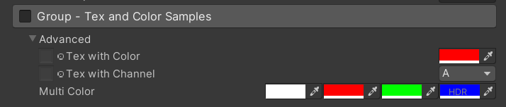
 [ Main ( Group3 , _ , on ) ] _group3 ( "Group - Tex and Color Samples" , float ) = 0
[ Advanced ] [ Tex ( Group3 , _color ) ] _tex_color ( "Tex with Color" , 2D ) = "white" { }
[ Advanced ] [ HideInInspector ] _color ( " ", Color) = (1, 0, 0, 1)
[ Advanced ] [ Tex ( Group3 , _textureChannelMask1 ) ] _tex_channel ( "Tex with Channel" , 2D ) = "white" { }
[ Advanced ] [ HideInInspector ] _textureChannelMask1 ( " ", Vector) = (0, 0, 0, 1)

[ Advanced ] [ Color ( Group3 , _mColor1 , _mColor2 , _mColor3 ) ] _mColor ( "Multi Color" , Color ) = ( 1 , 1 , 1 , 1 )
[ Advanced ] [ HideInInspector ] _mColor1 ( " " , Color ) = ( 1 , 0 , 0 , 1 )
[ Advanced ] [ HideInInspector ] _mColor2 ( " " , Color ) = ( 0 , 1 , 0 , 1 )
[ Advanced ] [ HideInInspector ] [ HDR ] _mColor3 ( " " , Color ) = ( 0 , 0 , 1 , 1 )
Ergebnis:
 /// Draw an image preview.
/// display name: The path of the image file relative to the Unity project, such as: "Assets/test.png", "Doc/test.png", "../test.png"
/// group: father group name, support suffix keyword for conditional display (Default: none)
public ImageDrawer ( ) { }
public ImageDrawer ( string group )
Ergebnis:
 /// Draw a R/G/B/A drop menu:
/// 	R = (1, 0, 0, 0)
/// 	G = (0, 1, 0, 0)
/// 	B = (0, 0, 1, 0)
/// 	A = (0, 0, 0, 1)
/// 	RGB Average = (1f / 3f, 1f / 3f, 1f / 3f, 0)
/// 	RGB Luminance = (0.2126f, 0.7152f, 0.0722f, 0)
///		None = (0, 0, 0, 0)
/// group: father group name, support suffix keyword for conditional display (Default: none)
/// Target Property Type: Vector, used to dot() with Texture Sample Value
public ChannelDrawer ( ) { }
public ChannelDrawer ( string group )
Beispiel:
 [ Title ( _ , Channel Samples ) ]
[ Channel ( _ ) ] _textureChannelMask ( "Texture Channel Mask (Default G)" , Vector ) = ( 0 , 1 , 0 , 0 )

......

float selectedChannelValue = dot ( tex2D ( _Tex , uv ) , _textureChannelMask ) ; 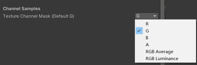
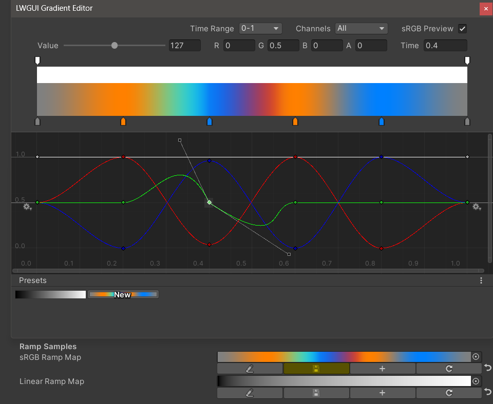
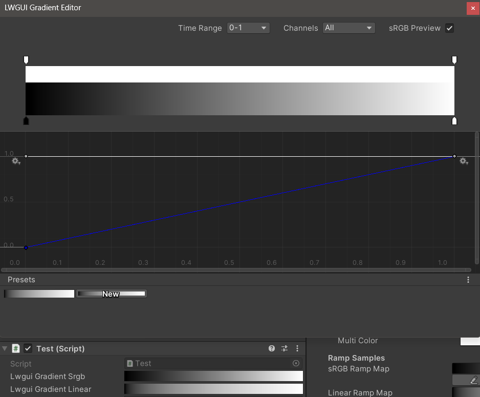
/// Draw an unreal style Ramp Map Editor (Default Ramp Map Resolution: 512 * 2)
/// NEW: The new LwguiGradient type has both the Gradient and Curve editors, and can be used in C# scripts and runtime, and is intended to replace UnityEngine.Gradient
/// group: father group name, support suffix keyword for conditional display (Default: none)
/// defaultFileName: default Ramp Map file name when create a new one (Default: RampMap)
/// rootPath: the path where ramp is stored, replace '/' with '.' (for example: Assets.Art.Ramps). when selecting ramp, it will also be filtered according to the path (Default: Assets)
/// colorSpace: switch sRGB / Linear in ramp texture import setting (Default: sRGB)
/// defaultWidth: default Ramp Width (Default: 512)
/// viewChannelMask: editable channels. (Default: RGBA)
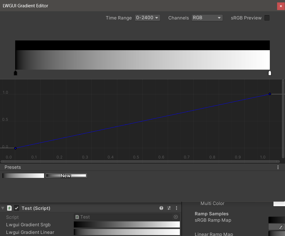
/// timeRange: the abscissa display range (1/24/2400), is used to optimize the editing experience when the abscissa is time of day. (Default: 1)
/// Target Property Type: Texture2D
public RampDrawer ( ) : this ( String . Empty ) { }
public RampDrawer ( string group ) : this ( group , "RampMap" ) { }
public RampDrawer ( string group , string defaultFileName ) : this ( group , defaultFileName , DefaultRootPath , 512 ) { }
public RampDrawer ( string group , string defaultFileName , float defaultWidth ) : this ( group , defaultFileName , DefaultRootPath , defaultWidth ) { }
public RampDrawer ( string group , string defaultFileName , string rootPath , float defaultWidth ) : this ( group , defaultFileName , rootPath , "sRGB" , defaultWidth ) { }
public RampDrawer ( string group , string defaultFileName , string rootPath , string colorSpace , float defaultWidth ) : this ( group , defaultFileName , rootPath , colorSpace , defaultWidth , "RGBA" ) { }
public RampDrawer ( string group , string defaultFileName , string rootPath , string colorSpace , float defaultWidth , string viewChannelMask ) : this ( group , defaultFileName , rootPath , colorSpace , defaultWidth , viewChannelMask , 1 ) { }
public RampDrawer ( string group , string defaultFileName , string rootPath , string colorSpace , float defaultWidth , string viewChannelMask , float timeRange )Beispiel:
[ Ramp ( _ , RampMap , Assets . Art , 512 ) ] _Ramp ( "Ramp Map" , 2D ) = "white" { }Ergebnis:
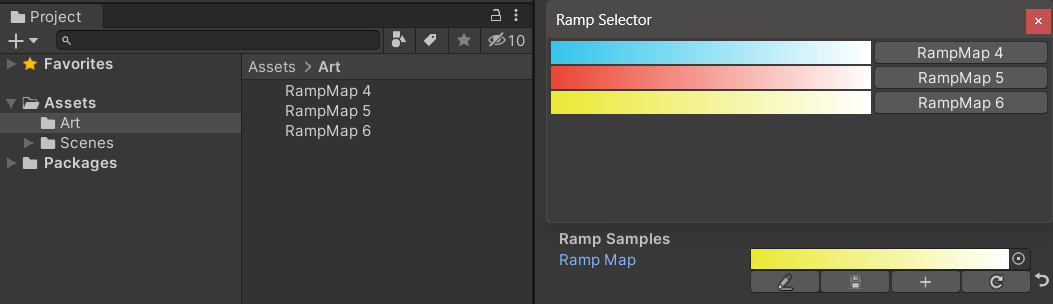
Sie müssen die Ergebnisse bearbeiten manuell speichern . Wenn nicht gespeicherte Änderungen vorliegen, wird die Schaltfläche Speichern gelb angezeigt.
Wenn Sie die Ramp -Karte verschieben oder kopieren, denken Sie daran, zusammen mit der .meta -Datei zu bewegen. Andernfalls können Sie sie nicht wieder bearbeiten!
Beispiel:
 public class Test : MonoBehaviour
{
    public LwguiGradient lwguiGradientSrgb = new LwguiGradient ( ) ;

    [ LwguiGradientUsage ( ColorSpace . Linear , LwguiGradient . ChannelMask . RGB , LwguiGradient . GradientTimeRange . TwentyFourHundred ) ]
    public LwguiGradient lwguiGradientLinear = new LwguiGradient ( ) ;
}
Ergebnis:
Die Standardanzeigeeinstellungen können mit dem Attribut lwguigRadientUSage () festgelegt werden.
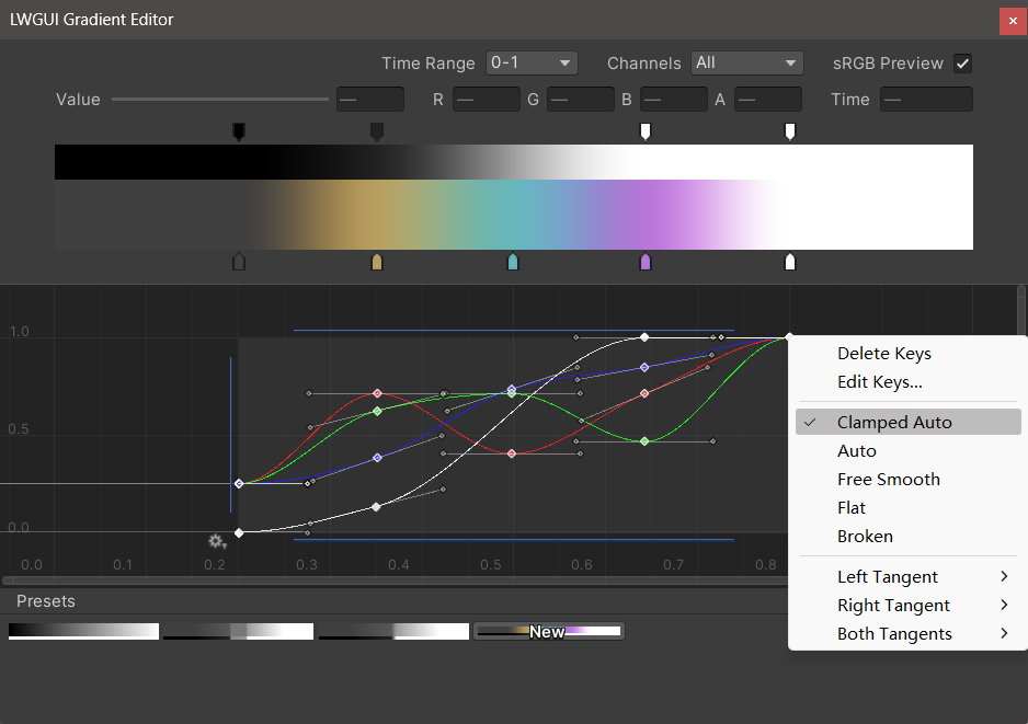
Der neue LWGUI-Gradientenredakteur integriert sich in den integrierten Gradientenredakteur und Curve-Editor von Unity und ermöglicht leistungsfähigere Funktionen als den Gradientenredakteur von UE.
| Editor | Beschreibung |
|---|---|
| Zeitbereich | Der Anzeigebereich der horizontalen Achse, der von 0-1 / 0-24 / 0-2400 ausgewählt werden kann, ist sehr nützlich, wenn die horizontale Achse die Zeit ist. Beachten Sie, dass nur die Anzeige betroffen ist, der tatsächliche Wert, der in der horizontalen Achse gespeichert ist, immer 0-1. |
| Kanäle | Die angezeigten Kanäle. Kann einzeln angezeigt werden. |
| SRGB -Vorschau | Es sollte überprüft werden, wenn der Wert des Gradienten eine Farbe ist, um die richtige Farbe voranzutreiben, andernfalls muss er nicht überprüft werden. Nur beeinflusst die Anzeige, Gradienten und Ramp -Karte werden immer als linear gespeichert. |
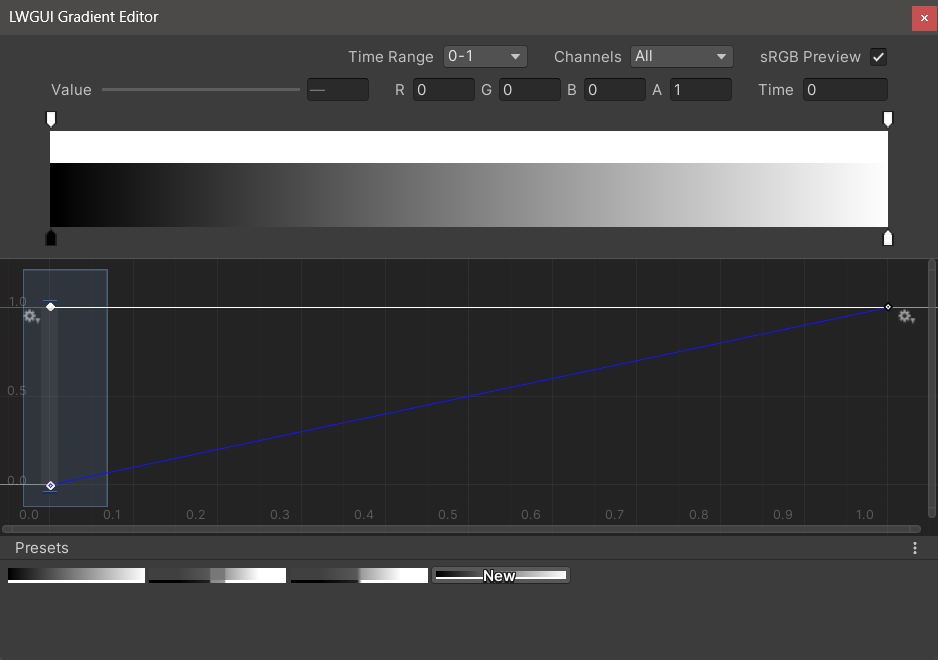
| Wert / r / g / b / a | Wird verwendet, um den Wert des ausgewählten Schlüssels zu bearbeiten, können Sie den Wert mehrerer Schlüssel gleichzeitig bearbeiten. |
| Zeit | Zum Bearbeiten der Zeit des ausgewählten Schlüssels können Sie die Zeit mehrerer Schlüssel gleichzeitig bearbeiten. Wenn Sie eine Nummer manuell eingeben, müssen Sie die Eingabetaste drücken, um die Bearbeitung zu beenden. |
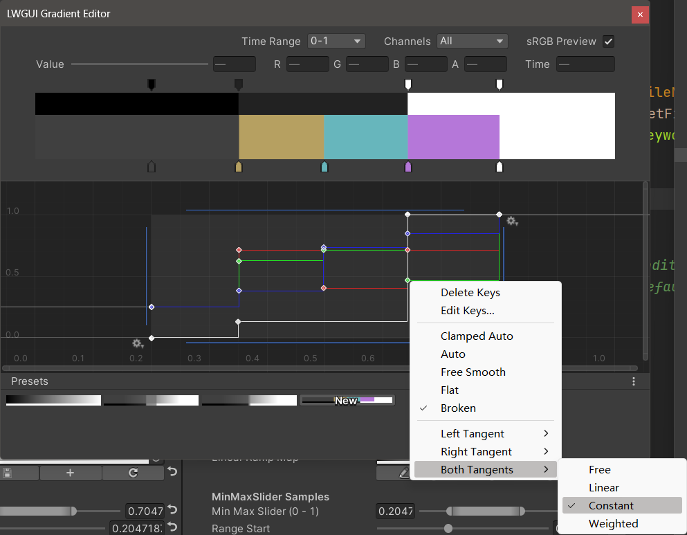
| Gradientenredakteur | Dies ähnelt dem integrierten Gradientenredakteur von Unity, aber die Alpha-Kanäle sind in Schwarz und Weiß getrennt. Beachten Sie, dass das Hinzufügen von Schlüssel aus dem Gradienteneditor auf maximal 8 Tasten beschränkt ist , und das Hinzufügen von Schlüssel aus dem Kurveneditor ist unbegrenzt . Das Überschreiten der Schlüssellimit beeinflusst keine Vorschau oder Verwendung. |
| Kurve Editor | Ähnlich wie bei der integrierten Kurve-Editor von Unity wird der XY 0-1-Bereich standardmäßig angezeigt. Mit dem Bildlaufrad können Sie den Anzeigebereich zoomen oder verschieben. Wie Sie im Bild unten sehen können, verfügt das Kontextmenü über eine Reihe von Funktionen für die Steuerung der Form der Kurve und Sie können die Einheit -Dokumentation konsultieren, um das Beste aus diesen Funktionen herauszuholen. |
| Voreinstellungen | Sie können den aktuellen LWGUI -Gradienten als Voreinstellung speichern und jederzeit anwenden. Diese Voreinstellungen sind zwischen verschiedenen Motorversionen auf dem lokalen Computer üblich, werden jedoch nicht im Projekt gespeichert. |
Bekannte Probleme:
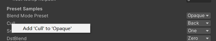
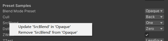
/// Popping a menu, you can select the Shader Property Preset, the Preset values will replaces the default values
/// group: father group name, support suffix keyword for conditional display (Default: none)
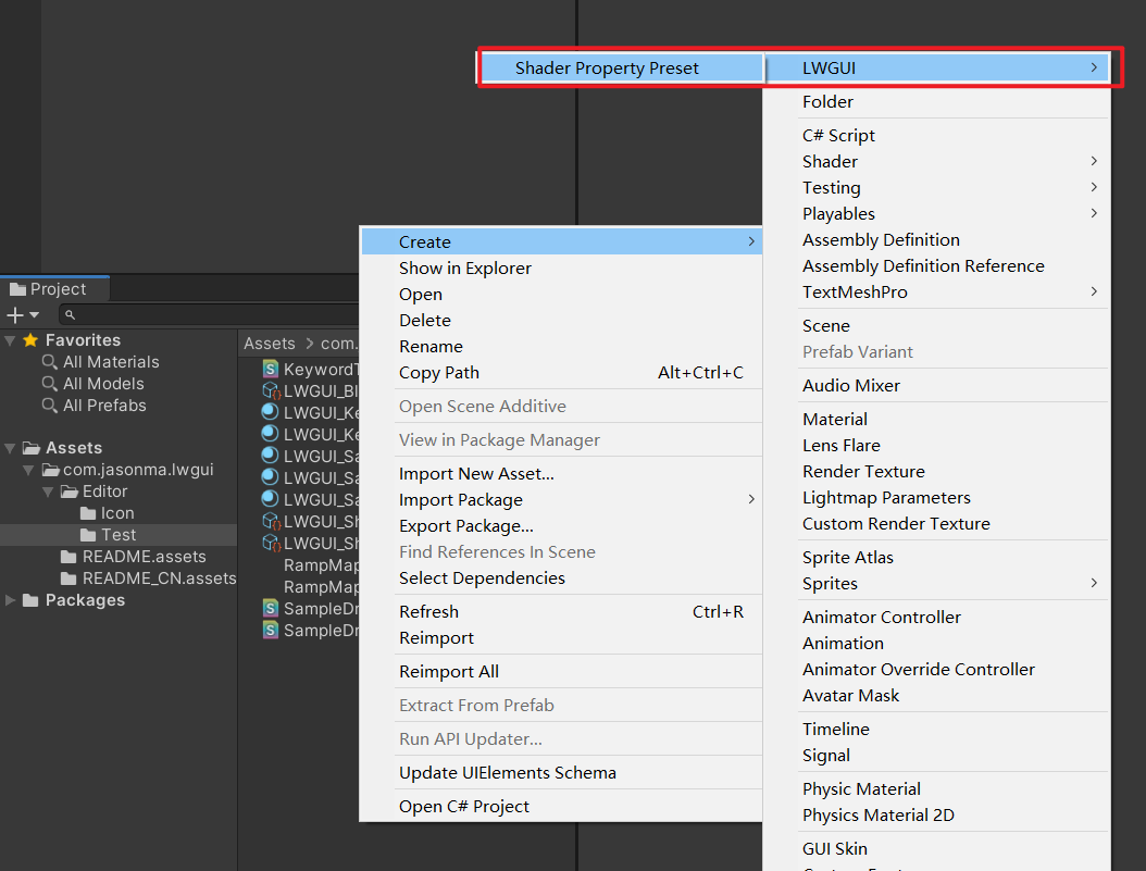
/// presetFileName: "Shader Property Preset" asset name, you can create new Preset by
/// "Right Click > Create > LWGUI > Shader Property Preset" in Project window,
/// *any Preset in the entire project cannot have the same name*
public PresetDrawer ( string presetFileName ) : this ( "_" , presetFileName ) { }
public PresetDrawer ( string group , string presetFileName )Beispiel:
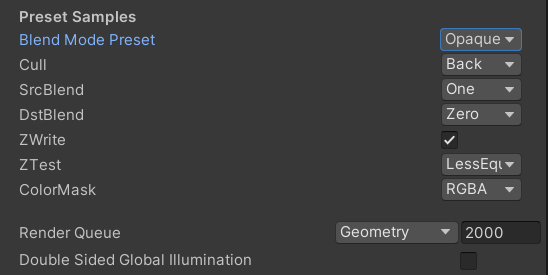
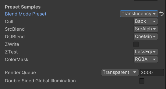
 [ Title ( Preset Samples ) ]
[ Preset ( LWGUI_BlendModePreset ) ] _BlendMode ( "Blend Mode Preset" , float ) = 0
[ Enum ( UnityEngine . Rendering . CullMode ) ] _Cull ( "Cull" , Float ) = 2
[ Enum ( UnityEngine . Rendering . BlendMode ) ] _SrcBlend ( "SrcBlend" , Float ) = 1
[ Enum ( UnityEngine . Rendering . BlendMode ) ] _DstBlend ( "DstBlend" , Float ) = 0
[ Toggle ( _ ) ] _ZWrite ( "ZWrite " , Float ) = 1
[ Enum ( UnityEngine . Rendering . CompareFunction ) ] _ZTest ( "ZTest" , Float ) = 4 // 4 is LEqual
[ Enum ( RGBA , 15 , RGB , 14 ) ] _ColorMask ( "ColorMask" , Float ) = 15 // 15 is RGBA (binary 1111)

``````

Cull [ _Cull ]
ZWrite [ _ZWrite ]
Blend [ _SrcBlend ] [ _DstBlend ]
ColorMask [ _ColorMask ]
Ergebnis:
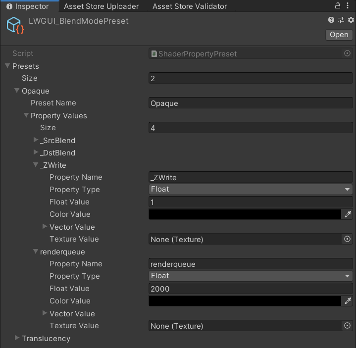
Der Eigenschaftswert im ausgewählten Voreinstellung ist der Standardwert
Renderqueue ist ein hartcodierter Eigenschaftsname. Sie müssen ihn manuell zur Voreinstellung hinzufügen
 /// Draw one or more Buttons within the same row, using the Display Name to control the appearance and behavior of the buttons
///
/// Declaring a set of Button Name and Button Command in Display Name generates a Button, separated by '@':
/// ButtonName0@ButtonCommand0@ButtonName1@ButtonCommand1
///
/// Button Name can be any other string, the format of Button Command is:
/// TYPE:Argument
///
/// The following TYPEs are currently supported:
/// - URL: Open the URL, Argument is the URL
/// - C#: Call the public static C# function, Argument is NameSpace.Class.Method(arg0, arg1, ...),
///		for target function signatures, see: LWGUI.ButtonDrawer.TestMethod().
///
/// The full example:
/// [Button(_)] _button0 ("URL Button@URL:https://github.com/JasonMa0012/LWGUI@C#:LWGUI.ButtonDrawer.TestMethod(1234, abcd)", Float) = 0
///
/// group: father group name, support suffix keyword for conditional display (Default: none)
public ButtonDrawer ( ) { }
public ButtonDrawer ( string group )
Beispiel:
 [ Title ( Button Samples ) ]
[ Button ( _ ) ] _button0 ( "URL Button@URL:https://github.com/JasonMa0012/LWGUI@C# Button@C#:LWGUI.ButtonDrawer.TestMethod(1234, abcd)" , Float ) = 0 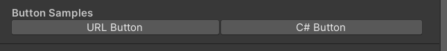
 /// Similar to Header()
/// group: father group name, support suffix keyword for conditional display (Default: none)
/// header: string to display, "SpaceLine" or "_" = none (Default: none)
/// height: line height (Default: 22)
public TitleDecorator ( string header ) : this ( "_" , header , DefaultHeight ) { }
public TitleDecorator ( string header , float  height ) : this ( "_" , header , height ) { }
public TitleDecorator ( string group ,  string header ) : this ( group , header , DefaultHeight ) { }
public TitleDecorator ( string group , string header , float height )


/// Similar to Title()
/// group: father group name, support suffix keyword for conditional display (Default: none)
/// header: string to display, "SpaceLine" or "_" = none (Default: none)
/// height: line height (Default: 22)
public SubTitleDecorator ( string group ,  string header ) : base ( group , header , DefaultHeight ) { }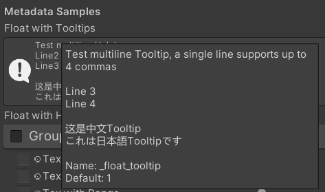
public SubTitleDecorator ( string group , string header , float height ) : base ( group , header , height ) { } /// Tooltip, describes the details of the property. (Default: property.name and property default value)
/// You can also use "#Text" in DisplayName to add Tooltip that supports Multi-Language.
/// tooltip: a single-line string to display, support up to 4 ','. (Default: Newline)
public TooltipDecorator ( ) : this ( string . Empty ) { }
public TooltipDecorator ( string tooltip ) { this . _tooltip = tooltip ; }
public TooltipDecorator ( string s1 , string s2 ) : this ( s1 + ", " + s2 ) { }
public TooltipDecorator ( string s1 , string s2 , string s3 ) : this ( s1 + ", " + s2 + ", " + s3 ) { }
public TooltipDecorator ( string s1 , string s2 , string s3 , string s4 ) : this ( s1 + ", " + s2 + ", " + s3 + ", " + s4 ) { }
public TooltipDecorator ( string s1 , string s2 , string s3 , string s4 , string s5 ) : this ( s1 + ", " + s2 + ", " + s3 + ", " + s4 + ", " + s5 ) { }
 /// Display a Helpbox on the property
/// You can also use "%Text" in DisplayName to add Helpbox that supports Multi-Language.
/// message: a single-line string to display, support up to 4 ','. (Default: Newline)
public HelpboxDecorator ( ) : this ( string . Empty ) { }
public HelpboxDecorator ( string message ) { this . _message = message ; }
public HelpboxDecorator ( string s1 , string s2 ) : this ( s1 + ", " + s2 ) { }
public HelpboxDecorator ( string s1 , string s2 , string s3 ) : this ( s1 + ", " + s2 + ", " + s3 ) { }
public HelpboxDecorator ( string s1 , string s2 , string s3 , string s4 ) : this ( s1 + ", " + s2 + ", " + s3 + ", " + s4 ) { }
public HelpboxDecorator ( string s1 , string s2 , string s3 , string s4 , string s5 ) : this ( s1 + ", " + s2 + ", " + s3 + ", " + s4 + ", " + s5 ) { }
Beispiel:
 [ Title ( Metadata Samples ) ]
[ Tooltip ( Test multiline Tooltip , a single line supports up to 4 commas ) ]
[ Tooltip ( ) ]
[ Tooltip ( Line 3 ) ]
[ Tooltip ( Line 4 ) ]
_float_tooltip ( "Float with Tooltips#这是中文Tooltip#これは日本語Tooltipです" , float ) = 1
[ Helpbox ( Test multiline Helpbox ) ]
[ Helpbox ( Line2 ) ]
[ Helpbox ( Line3 ) ]
_float_helpbox ( "Float with Helpbox%这是中文Helpbox%これは日本語Helpboxです" , float ) = 1 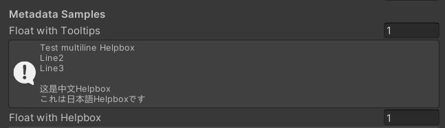
Tipps:
 /// Cooperate with Toggle to switch certain Passes
/// lightModeName(s): Light Mode in Shader Pass (https://docs.unity3d.com/2017.4/Documentation/Manual/SL-PassTags.html)
public PassSwitchDecorator ( string   lightModeName1 )
public PassSwitchDecorator ( string   lightModeName1 , string lightModeName2 )
public PassSwitchDecorator ( string   lightModeName1 , string lightModeName2 , string lightModeName3 )
public PassSwitchDecorator ( string   lightModeName1 , string lightModeName2 , string lightModeName3 , string lightModeName4 )
public PassSwitchDecorator ( string   lightModeName1 , string lightModeName2 , string lightModeName3 , string lightModeName4 , string lightModeName5 )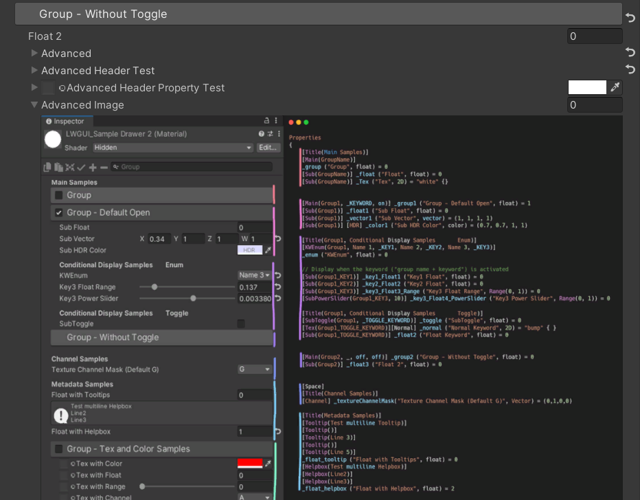
public PassSwitchDecorator ( string lightModeName1 , string lightModeName2 , string lightModeName3 , string lightModeName4 , string lightModeName5 , string lightModeName6 ) /// Collapse the current Property into an Advanced Block. Specify the Header String to create a new Advanced Block. All Properties using Advanced() will be collapsed into the nearest Advanced Block.
/// headerString: The title of the Advanced Block. Default: "Advanced"
public AdvancedDecorator ( ) : this ( string . Empty ) { }
public AdvancedDecorator ( string headerString ) /// Create an Advanced Block using the current Property as the Header
public AdvancedHeaderPropertyDecorator ( )Beispiel:
 [ Main ( Group2 , _ , off , off ) ] _group2 ( "Group - Without Toggle" , float ) = 0
[ Sub ( Group2 ) ] _float3 ( "Float 2 " , float ) = 0
[ Advanced ] [ Sub ( Group2 ) ] _Advancedfloat0 ( "Advanced Float 0 " , float ) = 0
[ Advanced ] [ Sub ( Group2 ) ] _Advancedfloat1 ( "Advanced Float 1" , float ) = 0
[ Advanced ( Advanced Header Test ) ] [ Sub ( Group2 ) ] _Advancedfloat3 ( "Advanced Float 3" , float ) = 0
[ Advanced ] [ Sub ( Group2 ) ] _Advancedfloat4 ( "Advanced Float 4" , float ) = 0
[ AdvancedHeaderProperty ] [ Tex ( Group2 , _Advancedfloat7 ) ] _AdvancedTex0 ( "Advanced Header Property Test" , 2D ) = "white" { }
[ Advanced ] [ HideInInspector ] _Advancedfloat7 ( "Advanced Float 7" , float ) = 0
[ Advanced ] [ Tex ( Group2 , _AdvancedRange0 ) ] _AdvancedTex1 ( "Advanced Tex 1" , 2D ) = "white" { }
[ Advanced ] [ HideInInspector ] _AdvancedRange0 ( "Advanced Range 0" , Range ( 0 , 1 ) ) = 0 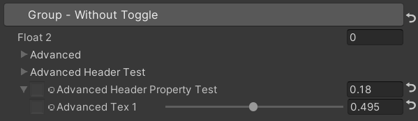
Tipps:
 /// Similar to HideInInspector(), the difference is that Hidden() can be unhidden through the Display Mode button.
public HiddenDecorator ( ) /// Set the property to read-only.
public ReadOnlyDecorator ( ) /// Control the show or hide of a single or a group of properties based on multiple conditions.
/// logicalOperator: And | Or (Default: And).
/// propName: Target Property Name used for comparison.
/// compareFunction: Less (L) | Equal (E) | LessEqual (LEqual / LE) | Greater (G) | NotEqual (NEqual / NE) | GreaterEqual (GEqual / GE).
/// value: Target Property Value used for comparison.
public ShowIfDecorator ( string propName , string comparisonMethod , float value ) : this ( "And" , propName , comparisonMethod , value ) { }
public ShowIfDecorator ( string logicalOperator , string propName , string compareFunction , float value )Beispiel:
 [ ShowIf ( _enum , Equal , 1 ) ]
[ Title ( ShowIf Main Samples ) ]
[ Main ( GroupName ) ] _group ( "Group" , float ) = 0
[ Sub ( GroupName ) ] _float ( "Float" , float ) = 0
[ Sub ( GroupName ) ] _Tex ( "Tex" , 2D ) = "white" { }

.. .

[ SubTitle ( Group1 , Conditional Display Samples       Enum ) ]
[ KWEnum ( Group1 , Name 1 , _KEY1 , Name 2 , _KEY2 , Name 3 , _KEY3 ) ] _enum ( "KWEnum" , float ) = 0
[ Sub ( Group1 ) ] [ ShowIf ( _enum , Equal , 0 ) ] _key1_Float1 ( "Key1 Float" , float ) = 0
[ Sub ( Group1 ) ] [ ShowIf ( _enum , Equal , 1 ) ] _key2_Float2 ( "Key2 Float" , float ) = 0
[ SubIntRange ( Group1 ) ] [ ShowIf ( _enum , Equal , 2 ) ] _key3_Int_Range ( "Key3 Int Range" , Range ( 0 , 10 ) ) = 0
[ ShowIf ( _enum , Equal , 0 ) ] [ ShowIf ( Or , _enum , Equal , 2 ) ]
[ SubPowerSlider ( Group1 , 3 ) ] _key13_PowerSlider ( "Key1 or Key3 Power Slider" , Range ( 0 , 1 ) ) = 0 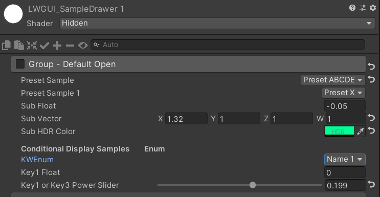
MaterialSpaceDecorator ( float height ) MaterialHeaderDecorator ( string header ) MaterialEnumDrawer ( string n1 , float v1 , string n2 , float v2 , string n3 , float v3 , string n4 , float v4 , string n5 , float v5 , string n6 , float v6 , string n7 , float v7 ) MaterialIntRangeDrawer ( ) MaterialKeywordEnumDrawer ( string kw1 , string kw2 , string kw3 , string kw4 , string kw5 , string kw6 , string kw7 , string kw8 , string kw9 ) MaterialPowerSliderDrawer ( float power ) MaterialToggleUIDrawer ( string keyword ) 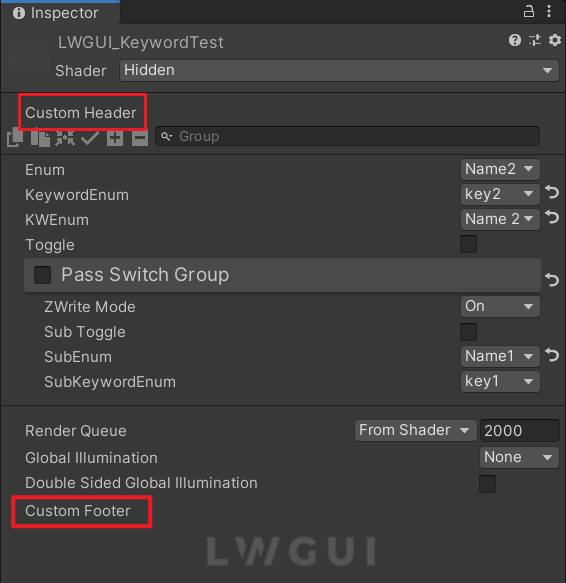
Benutzerdefinierte Header und Fußzeilen ermöglichen es Ihnen, maßgeschneiderte Module oben oder unten im Shadergui zu integrieren, ohne den LWGUI -Plugincode zu ändern.
Abhängig vom gewünschten Speicherort für die benutzerdefinierte GUI, duplizieren Sie das folgende Skript in einen Editorordner in Ihrem Projekt:
Ändern Sie den Dateinamen und den Klassennamen entsprechend.
Implementieren Sie Ihren benutzerdefinierten GUI -Code in den Funktionen docustomheader () / docustomfooter ().
Es ist ratsam, die Definition von LWGUI -Objekte zu untersuchen, um alle erforderlichen Daten zu erhalten.
Todo
Subdrawer in shadeerdrawer.cs um Ihre benutzerdefinierte Schublade zu entwickeln

