tkpf
1.0.0
tkpf 、WPF(Windows Presention Foundation)とAngularの影響を受けたパラダイムにTKinter GUIを構築するためのライブラリです。
主な機能は次のとおりです。
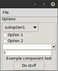
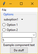
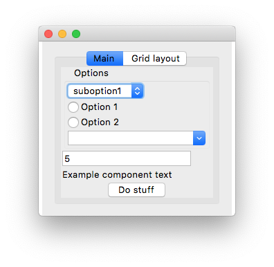
XMLまたはYAML形式でGUIを指定します。これが簡単な例です。 ExampleWindow.xml :
< Frame pack-anchor = " nw " pack-padx = " 5 " >
     < LabelFrame text = " Options " pack-anchor = " w " pack-fill = " x " >
        < Radiobutton pack-anchor = " w " variable = " [(choice)] " value = " option1 " >
            Option 1
        </ Radiobutton >
        < Radiobutton pack-anchor = " w " variable = " [(choice)] " value = " option2 " >
            Option 2
        </ Radiobutton >
        < Combobox pack-anchor = " w " textvariable = " (selected_suboption) " values = " [available_suboptions] "
                  name = " combobox " />
        < Button command = " do_stuff " >Do stuff</ Button >
    </ LabelFrame >
</ Frame >
ご覧のとおり、XMLタグ名はTKINTERウィジェットクラス名に対応し、XMLは引数に起因します。 tkpf 、利用可能な場合は常に見栄えの良いttkテーマウィジェットを使用するという点で意見があります。
pack-anchor="nw"やgrid-row="0"などのオプションは、レイアウトを指定し、適切なTKINTERレイアウトマネージャーメソッド、この場合は.pack(anchor='nw')に渡されます。
YAML形式でGUIを指定する方法については、 example/ExampleWindow.yamlを参照してください。
Windowから派生したクラスを作成して表示することにより、GUIを表示します。コンストラクターにViewModelを提供する必要があります。
 class ExampleWindow ( Window ):
    template_path = 'ExampleWindow.xml'  # 'ExampleWindow.yaml' works too

ExampleWindow ( ExampleModel ()). show ()
このファイルのインラインにレイアウトXMLを保持したい場合は、それを行うこともできます。
 class ExampleWindow ( Window ):
    template = '<Label>Some text</Label>'
または
 class ExampleWindow ( Window ):
    template_yaml = '''
    Label:
      text: Some text
    '''
ウィンドウのタイトルの設定:
    def __init__ ( self , model ):
        super (). __init__ ( model )
        self . title = 'My application'
ビュークラスでは、イベントハンドラーを書くことができます。そのボタンを動作させる例:
    def do_stuff ( self ):
        self . combobox . config ( state = 'disabled' )
これは、Viewクラスの方法で名前でウィジェットにアクセスする方法も示しています。ただし、必要に応じて、このように動的にアクセスできます。
self . named_widgets [ 'combobox' ] class ExampleModel ( ViewModel ):
choice = Bindable ( AutoProperty ( 1 ))
available_suboptions = Bindable ( AutoProperty ())
selected_suboption = Bindable ( AutoProperty ())
def __init__ ( self ):
super (). __init__ ()
self . available_suboptions = ( 'suboption1' , 'suboption2' ) AutoPropertyは、C#自動生成プロパティに似ています。デフォルトでは、そのデータタイプはstrです。デフォルト値またはタイプのいずれかをコンストラクターに提供できます。
Bindable 、任意のプロパティで使用してバインド可能なプロパティを返すことができるデコレーターです。ラップされたプロパティのデータ型を知る必要があるため、型注釈付きのリターンタイプを指定してください。
 @ Bindable
@ property
def foo () -> int :
return 1 AutoPropertyあなたのためにそれを処理します。
Tkinterバインディングでは、 int 、 bool 、 float 、およびstrタイプのみがサポートされていますが、コンボボックス値の場合、python tupleを割り当てることができます。
ビュークラスでイベントハンドラーが見つからない場合、ビューモデルでも調べられます。
XMLでは、Angularのものと同様の構文を使用してデータバインディングの方向を指定します。
values="[available_suboptions]"
ターゲットを表示するためのデータソースからの一元配置バインディングです。
textvariable="(selected_suboption)"
ビューターゲットからデータソースへの一元配置バインディングであり、
variable="[(choice)]"
双方向の結合です。
TKINTERウィジェットクラスから派生したカスタムウィジェットを使用できます。あなたがしなければならない唯一のことは電話することです
Directive . Registry . register ( YourCustomWidgetClass )使用するテンプレートをロードする前に。
tkpf 、GUIをコンポーネントに分割することをサポートしています。これは、独自のViewModelを備えたProgressBarコンポーネントの例です。
 class ProgressbarModel ( ViewModel ):
    value = BindableProperty ( 0 )
    target = BindableProperty ( 100 )


class CustomProgressbar ( Component ):
    template = '<Progressbar name="progressbar" variable="[value]" maximum="[target]"/>'
そして、あなたはこのようにそれを使用することができます:
< CustomProgressbar tkpf-model = " [progressbar_model] " /> progressbar_modelは、メインビューモデルの属性またはプロパティです。
Python 3.5では、コンポーネントを使用する前に登録する必要があります。自動であるPython 3.6+で。
Directive . Registry . register ( CustomProgressbar )このようなコンポーネントにカスタムのバインド可能な属性を追加できるようにすることが計画されています。
 class ExampleComponent ( Component ):
    template = '<Label name="thelabel">Example component text</Label>'

    def config ( self , ** kwargs ):
        self . thelabel . config ( text = kwargs [ 'custom-text' ])
そして、次のように使用します。
< ExampleComponent custom-text = " Custom text " />唯一の要件は、属性名にハイフンが含まれていることです。
tkpf Python 3.5+のみをサポートしています。
これは進行中の作業です。また、ライブラリを作成する私の最初の試み。プロジェクトの問題を見て、まだサポートされていないものを確認してください。


