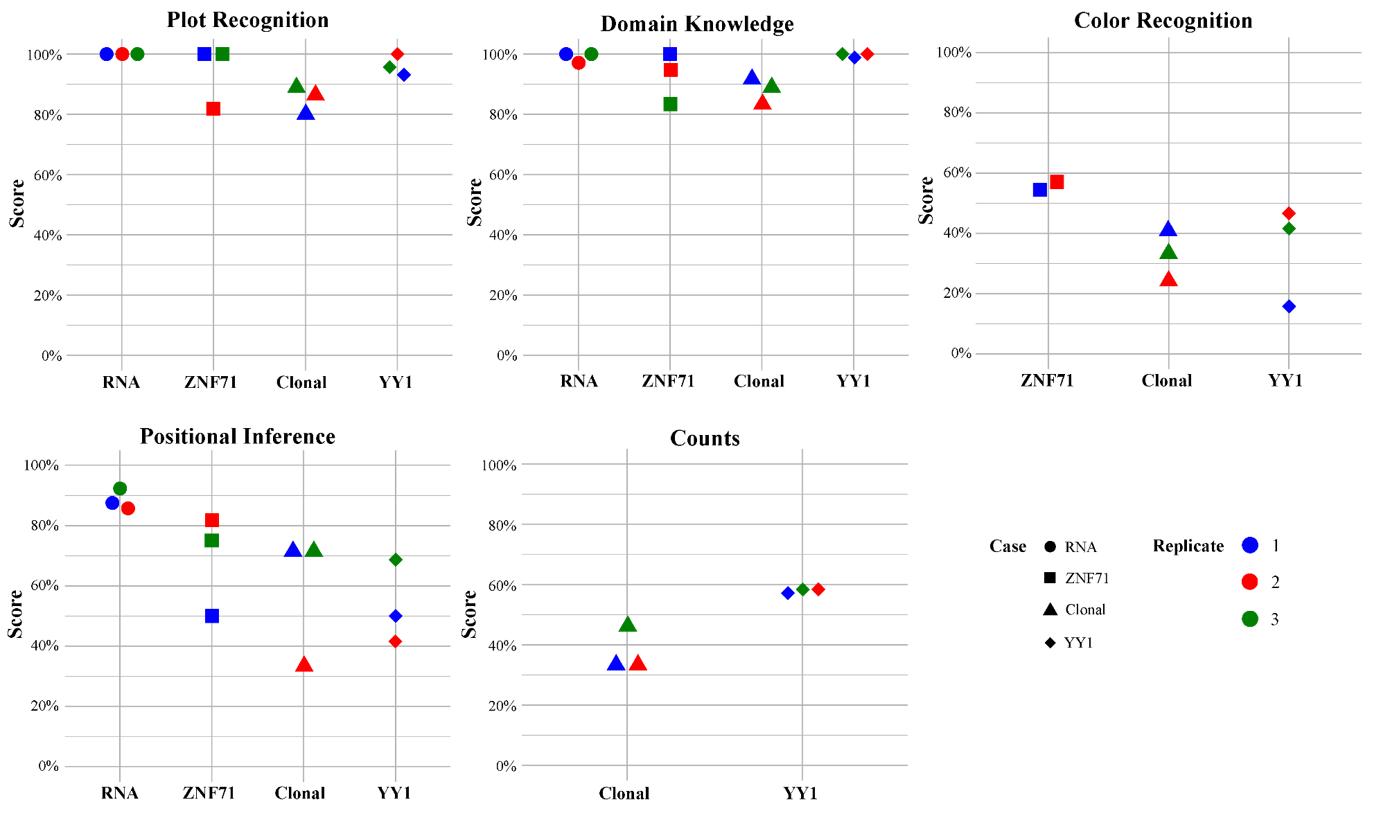
ChatGPT Interprets Scientific Images
1.0.0
? Read the Full Paper
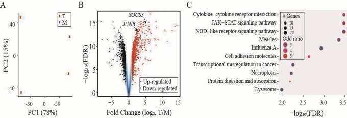
(A) PCA analysis showing two groups of samples: “T” in red and “M” in blue. (B) A volcano plot for FCs and FDRs from differentially expressed gene analysis with up-regulated genes in red and down-regulated genes in black. SOCS3 and JUNB indicated by arrowheads. (C) Dot plot summarizing the top ten hits from KEGG pathway enrichment analysis applied to the up-regulated genes.
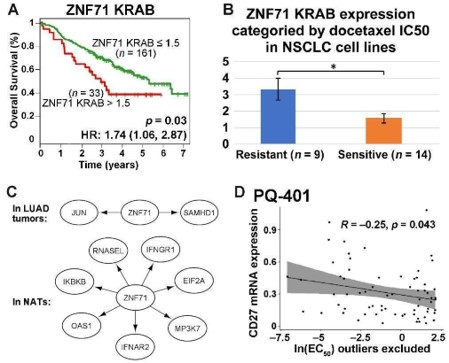
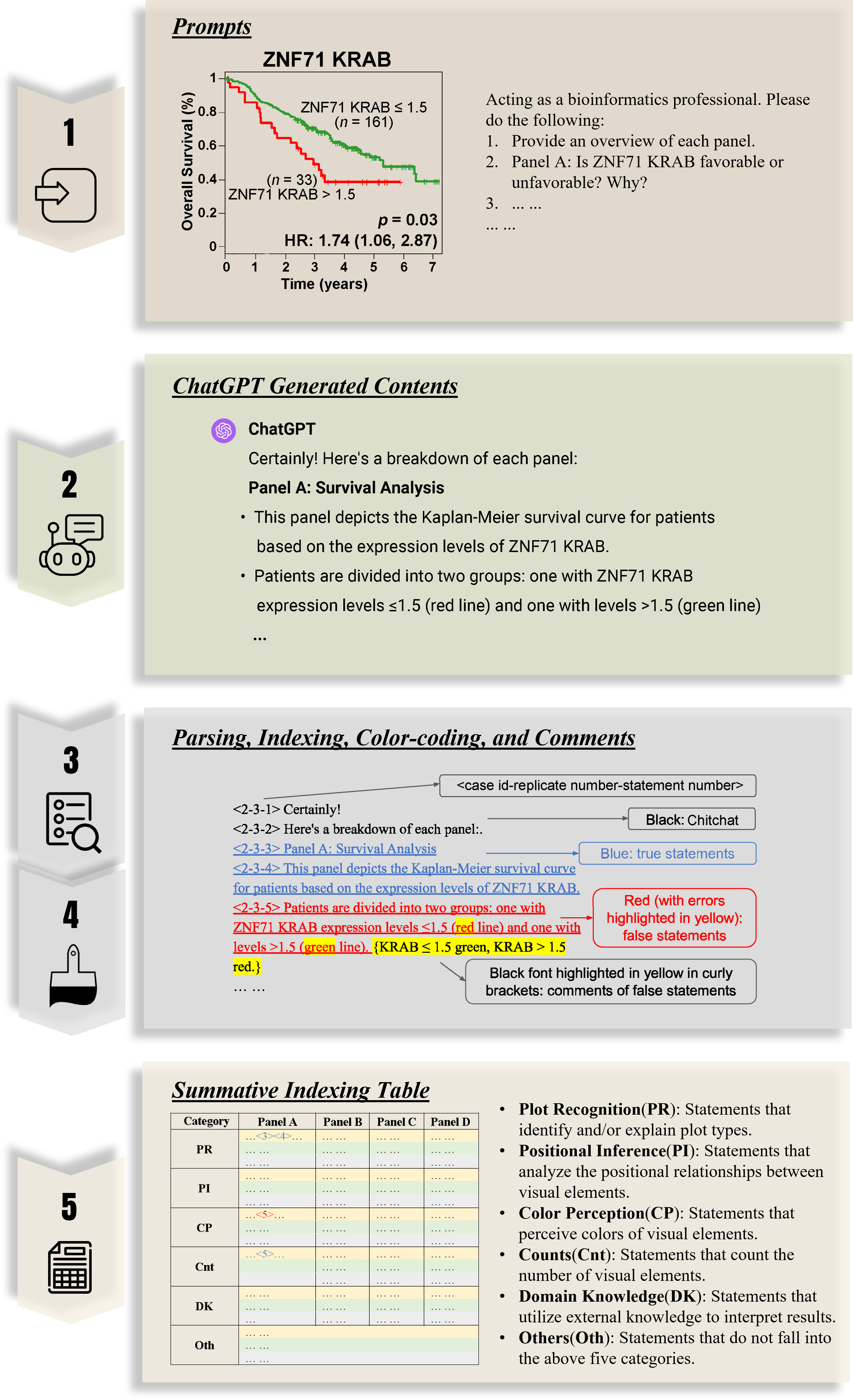
(A) Kaplan–Meier survival plot for NSCLC patients (GSE81089) sorted by ZNF71 KRAB isoform expression. Red: patients with a higher ZNF71 KRAB expression (TPM > 1.5); Green: others; (B) A bar chart for the expression of ZNF71 KRAB isoform among NSCLC cell lines sorted by docetaxel sensitivity. (C) Gene association network of ZNF71 and IIIR genes in LUAD tumors and NATs. (D) Scatter plot for CD27 mRNA expression level and drug response to PQ-401 (EC50) among NSCLS cell lines.
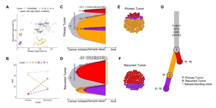
(A) Scatter plot for VAF% contrasting recurrent tumor (y-axis) to primary tumor (x-axis). Each dot is a gene and genes with significant impact are indicated. Primary and recurrent tumors sourced from the same patient. (B) Connected dot plot illustrating the changes of mean VAF of each cluster from the primary tumor to the recurrent. (C) Bell plot illustrating the relative prevalence of each (sub)clone as a function of cancer progression for primary tumor and (D) recurrent tumor. (E) Circle packing plots illustrating cellular composition of the primary tumor and (F) recurrent tumor, exampled with a total of 100 cells. (G) A branch-based tree illustrating the relational and seeding patterns of the (sub)clones between the primary and recurrent samples. Indicated are genes facilitating the growth of the founding clone.
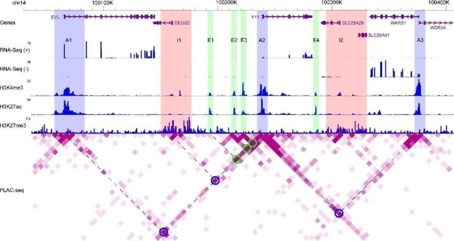
WashU epigenome browser tracks illustrating distributions of strand-specific RNA-Seq reads, ChIP-seq reads for H3K4me3, H3K27ac, and H3K27me3, as well as PLAC-seq reads for chromatin-chromatin interactions. Blue rectangles (A1 to A3): active promoter regions; Pink rectangles (I1 and I2): inactive promoter regions; Green rectangles (E1 to E4): active enhancer regions; Blue circles: promoter regions (A1, I1, and A3) interacting with YY1; Green circles: enhancer regions (E1 to E3) interacting with YY1. Dashed lines shared with one circle on the heatmap: two interacting genome regions. Degree of purpleness on the heatmap indicting interaction strength.
@article{wang2024scientific, title={Scientific figures interpreted by ChatGPT: strengths in plot recognition and limits in color perception}, author={Wang, Jinge and Ye, Qing and Liu, Li and Guo, Nancy Lan and Hu, Gangqing}, journal={NPJ Precision Oncology}, volume={8}, number={1}, pages={84}, year={2024}, publisher={Nature Publishing Group UK London} }


