ControlzEx
v6.0.0
WPF共享控制Z
支持.NET框架(4.5.2,4.6.2及更大),.NET CORE(3.1)和.NET 5(在Windows上)

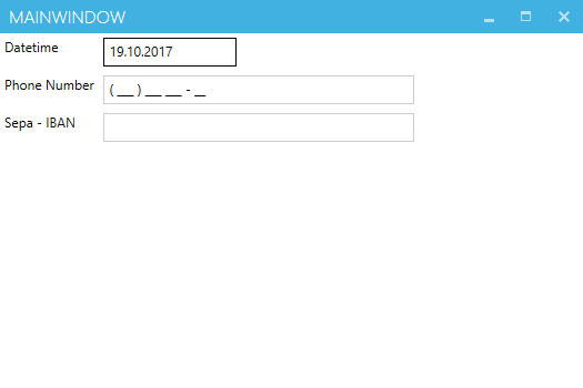
TextBoxInputMaskBehavior可用於在TextBox框中顯示掩碼。
注意:它只是一個掩碼,不驗證您的文本。
< TextBlock Grid.Row= " 0 "
           Grid.Column= " 0 "
           Margin = " 4 "
           Text = " Datetime " />
< TextBox Grid.Row= " 0 "
         Grid.Column= " 1 "
         Margin = " 4 " >
    < behaviors : Interaction .Behaviors>
        < controlzEx : TextBoxInputMaskBehavior InputMask = " 00/00/0000 " />
    </ behaviors : Interaction .Behaviors>
</ TextBox >

< TextBlock Grid.Row= " 1 "
           Grid.Column= " 0 "
           Margin = " 4 "
           Text = " Phone Number " />
< TextBox Grid.Row= " 1 "
         Grid.Column= " 1 "
         Margin = " 4 " >
    < behaviors : Interaction .Behaviors>
        < controlzEx : TextBoxInputMaskBehavior InputMask = " ( 999 ) 000 000 - 00 "
                                             PromptChar = " _ " />
    </ behaviors : Interaction .Behaviors>
</ TextBox >
原始的TextBoxInputMaskBehavior取自Blindmeis的博客。
KeyboardNavigationEx是一個用於常見聚焦問題的助手類。 UI元素本身的重點不是問題。但是,如果我們使用通用的焦點方法,則控件會焦點,但是它不會獲得焦點視覺樣式。
原始的KeyboardNavigation類僅當控件從鍵盤設備獲得焦點或systemParameters.keyboardcues是正確的時才處理視覺樣式。
使用KeyboardNavigationEx您可以通過兩種簡單的方式進行修復。
在代碼背後:
 public partial class MainWindow : Window
{
    public MainWindow ( )
    {
        InitializeComponent ( ) ;
        this . Loaded += ( s , e ) => { KeyboardNavigationEx . Focus ( this . TheElementWhichShouldGetTheFocus ) ; } ;
    }
}
或在XAML中:
< Button controlzex:KeyboardNavigationEx.AlwaysShowFocusVisual= " True " >Hey, I get the focus visual style on mouse click!</ Button >自動移動工具提示。更多信息。
< Button Margin = " 5 "
        Padding = " 5 "
        Content = " Test Button 2 "
        ToolTipService.ShowDuration= " 20000 " >
    < Button .ToolTip>
        < ToolTip local:ToolTipAssist.AutoMove= " True " >
            < ToolTip .Template>
                < ControlTemplate >
                    < Grid >
                        < Border Background = " Gray "
                                BorderBrush = " Black "
                                BorderThickness = " 1 "
                                Opacity = " 0.9 "
                                SnapsToDevicePixels = " True " />
                        < TextBlock Margin = " 5 "
                                    Foreground = " WhiteSmoke "
                                    FontSize = " 22 "
                                    Text = " ToolTipHelper AutoMove sample "
                                    TextOptions.TextFormattingMode= " Display "
                                    TextOptions.TextRenderingMode= " ClearType " />
                    </ Grid >
                </ ControlTemplate >
            </ ToolTip .Template>
        </ ToolTip >
    </ Button .ToolTip>
</ Button > GlowWindowBehavior在您的窗戶周圍增加了光芒。
從Windows 11開始,該行為可用於控製本機窗口邊框的顏色,並在檢測到Windows 11時自動這樣做。
可以通過將PreferDWMBorder設置為false來關閉。
ControlZex為WPF Windows提供了自定義的鉻,並為其提供了其他一些更深層次的修復程序。
它提供了什麼:
WindowStyle ( None , SingleBorderWindow , ThreeDBorderWindow和ToolWindow )IsNCActive屬性CornerPreference )NonClientControlProperties.HitTestResult和NonClientControlProperties.ClickStrategy )大多數修復和改進來自mahapps.metro和fluent.Ribbon。
此處描述的技術的具體實施:
Microsoft的博客條目在自定義窗口上
它是原始的Microsoft WPF Shell Integration庫的叉子。當前的微軟的實現可以找到:
可以在驗證錯誤模板或MaterialialDesignInxAmlToolKit或Mahapps.metro中使用的自定義Popup 。
PopupEx提供了一些其他不錯的功能:
自定義TabControl將TabItem內容保留在VisualTree中的同時將其保留,因此在再次選擇TabItem之後,沒有重新創建噩夢。可見性行為可以通過ChildContentVisibility依賴性屬性來設置。
用法:
< controlz : TabControlEx >
    < TabItem Header = " Lorem " >
        < TextBlock Text = " Lorem ipsum dolor sit amet, consetetur sadipscing "
                   HorizontalAlignment = " Center "
                   FontSize = " 30 " />
    </ TabItem >
    < TabItem Header = " ipsum " >
        < TextBox Text = " Lorem ipsum dolor sit amet, consetetur sadipscing "
                 HorizontalAlignment = " Center "
                 Margin = " 5 " />
    </ TabItem >
</ controlz : TabControlEx >一個基礎類,可幫助驅動在WPF中創建圖標包的常見方法。
要創建一個新的圖標包,請執行以下步驟:
定義一個鍵(通常是enum ):
 public enum PackIconKind
{
    Happy ,
    Sad
}子類PackIconBase ,添加
 public class PackIcon : PackIconBase < PackIconKind >
{
    static PackIcon ( )
    {
        DefaultStyleKeyProperty . OverrideMetadata ( typeof ( PackIcon ) , new FrameworkPropertyMetadata ( typeof ( PackIcon ) ) ) ;
    }

    public PackIcon ( ) : base ( CreateIconData )
    { }

    private static IDictionary < PackIconKind , string > CreateIconData ( )
    {
        return new Dictionary < PackIconKind , string >
        {
            { PackIconKind . Happy , "M20,12A8,8 0 0,0 12,4A8,8 0 0,0 4,12A8,8 0 0,0 12,20A8,8 0 0,0 20,12M22,12A10,10 0 0,1 12,22A10,10 0 0,1 2,12A10,10 0 0,1 12,2A10,10 0 0,1 22,12M10,9.5C10,10.3 9.3,11 8.5,11C7.7,11 7,10.3 7,9.5C7,8.7 7.7,8 8.5,8C9.3,8 10,8.7 10,9.5M17,9.5C17,10.3 16.3,11 15.5,11C14.7,11 14,10.3 14,9.5C14,8.7 14.7,8 15.5,8C16.3,8 17,8.7 17,9.5M12,17.23C10.25,17.23 8.71,16.5 7.81,15.42L9.23,14C9.68,14.72 10.75,15.23 12,15.23C13.25,15.23 14.32,14.72 14.77,14L16.19,15.42C15.29,16.5 13.75,17.23 12,17.23Z" } ,
            { PackIconKind . Sad , "M20,12A8,8 0 0,0 12,4A8,8 0 0,0 4,12A8,8 0 0,0 12,20A8,8 0 0,0 20,12M22,12A10,10 0 0,1 12,22A10,10 0 0,1 2,12A10,10 0 0,1 12,2A10,10 0 0,1 22,12M15.5,8C16.3,8 17,8.7 17,9.5C17,10.3 16.3,11 15.5,11C14.7,11 14,10.3 14,9.5C14,8.7 14.7,8 15.5,8M10,9.5C10,10.3 9.3,11 8.5,11C7.7,11 7,10.3 7,9.5C7,8.7 7.7,8 8.5,8C9.3,8 10,8.7 10,9.5M12,14C13.75,14 15.29,14.72 16.19,15.81L14.77,17.23C14.32,16.5 13.25,16 12,16C10.75,16 9.68,16.5 9.23,17.23L7.81,15.81C8.71,14.72 10.25,14 12,14Z" }
        } ;
    }
}
提供默認樣式(通常在您的generic.xaml中,例如:
< Style TargetType = " {x:Type local:PackIcon} " >
    < Setter Property = " Height " Value = " 16 " />
    < Setter Property = " Width " Value = " 16 " />
    < Setter Property = " HorizontalAlignment " Value = " Left " />
    < Setter Property = " VerticalAlignment " Value = " Top " />
    < Setter Property = " IsTabStop " Value = " False " />
    < Setter Property = " Template " >
        < Setter .Value>
            < ControlTemplate TargetType = " {x:Type local:PackIcon} " >
                < Viewbox >
                    < Canvas Width = " 24 " Height = " 24 " >
                        < Path Data = " {Binding Data, RelativeSource={RelativeSource TemplatedParent}} "
                              Fill = " {TemplateBinding Foreground} " />
                    </ Canvas >
                </ Viewbox >
            </ ControlTemplate >
        </ Setter .Value>
    </ Setter >
</ Style >
您的用戶現在應該有一種簡單的方法來在其應用程序中使用圖標包:
< ns : PackIcon Kind = " HappyIcon " />ControlZex提供了一個ThemeManager ,可幫助您為應用程序提供主題。
有關更多信息,請參見本節。
麻省理工學院許可證(MIT)
版權(C)自2015年Jan Karger,Bastian Schmidt,James Willock
特此免費授予獲得此軟件副本和相關文檔文件副本(“軟件”)的任何人,以無限制處理該軟件,包括無限制的使用權,複製,複製,修改,合併,合併,發布,分發,分發,分發,訂婚,和/或允許軟件的副本,並允許對以下條件提供以下條件,以下是以下條件。
上述版權通知和此許可通知應包含在軟件的所有副本或大量部分中。
該軟件是“原樣”提供的,沒有任何形式的明示或暗示保證,包括但不限於適銷性,特定目的的適用性和非侵權的保證。在任何情況下,作者或版權持有人都不應對任何索賠,損害賠償或其他責任責任,無論是在合同,侵權的訴訟中還是其他責任,是由軟件,使用或與軟件中的使用或其他交易有關的。


