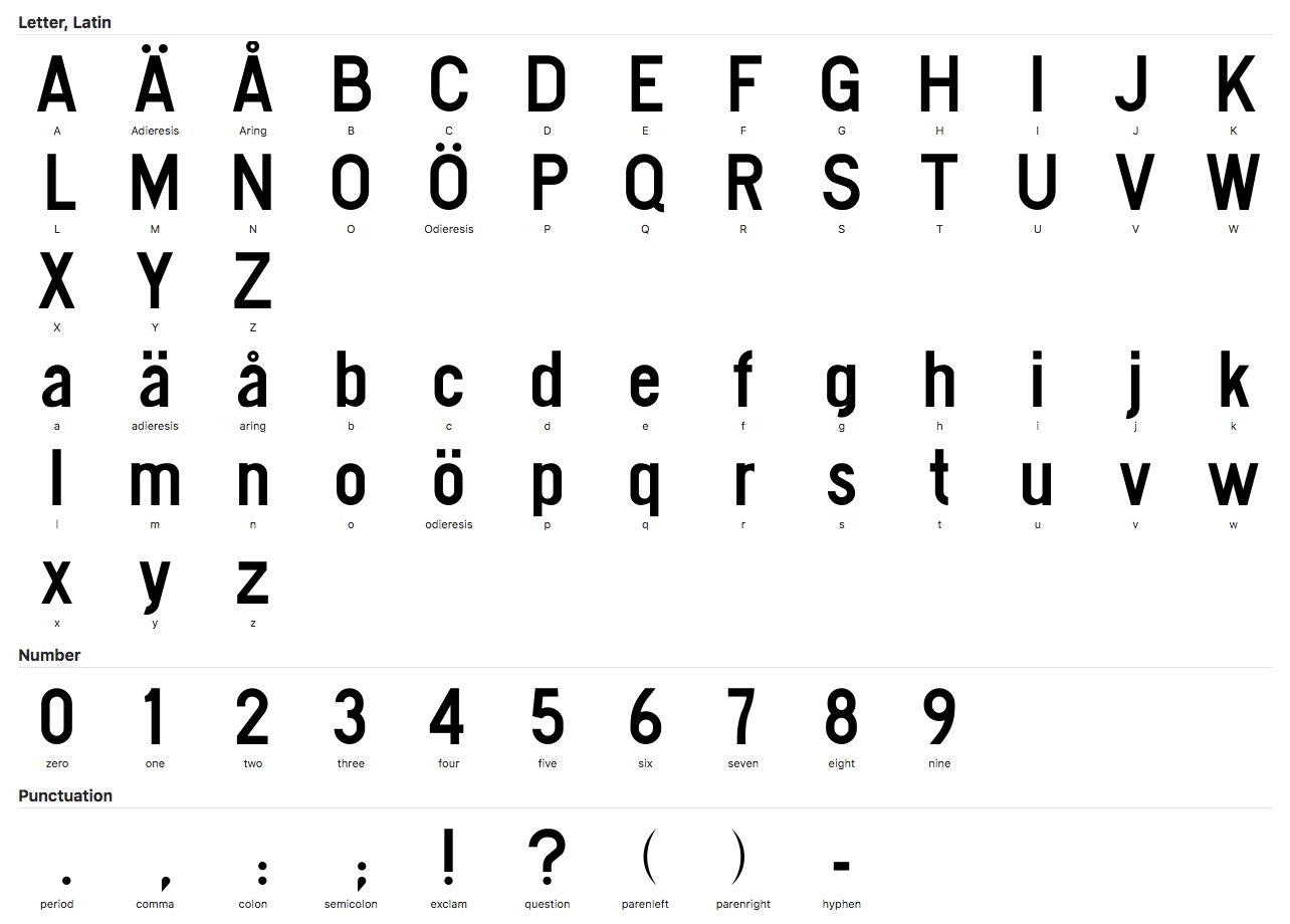
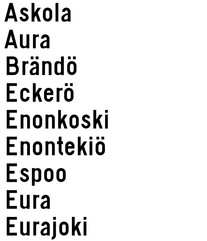
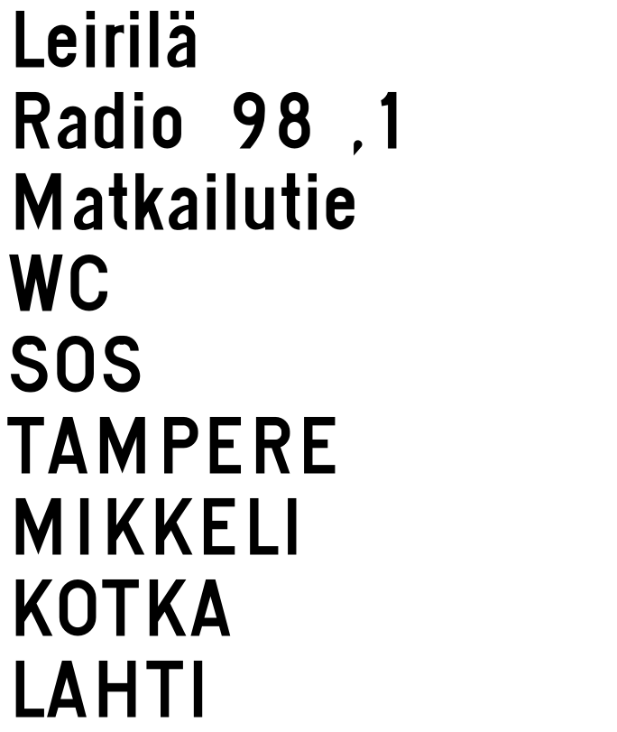
Road - Font Conversion of the Finnish Traffic Sign Typeface
... Based on the Original Images Still Used for Traffic Sign Designs! ... Codenamed: Road! ... NAME IS ACTUALLY NOT KNOWN
Summary in Finnish (Finnish Summary)
Font conversion of the font type used in Finnish traffic signs based on original images. Project code name: Road .
Introduction
- Download from Fonts /Fonts Folder
- Copy fonts to Font Book (OSX) / FONTS (Control Panel) (Windows)
- Open the program you want, such as Word or image editing program - the fonts are at your disposal.
More information
Read more about Wikipedia and the fairway office website.

Preface
The Finnish Traffic Sign Typeface Contains A Lot of Errors and Problems. I ended up as Asking About the Typeface USED for Upcoming Renewed Signs from Finnish Transport Agency (Currently Finnish Transport Infrastructure Agency), and the Conversation in Twitter Lead to a CC0 Release of the Original Typeface Drawn in 1960.
Road is a Typeface Conversion of the Original Finnish Traffic Sign Typeface that is Avatilable at Finnish Transport Infrastructure Agency Page.
USAGE / Installation
- Download the .otf and .woff Versions from the /Fonts Folder of This Repository
- Drag-n-Drop / Copy the Downloaded Files to Font Book (on OSX) / Fonts (Control Panel) (on Windows)
- Open Your Preferred Text / Visual Editor and Start Making Your Own Traffic Signs
Repository Contents
 ├── README.md
├── Tie-Regular.glyphs     > Glyphs editable version of the typeface
├── examples               > Example images
├── fonts                  > Distributable fonts (OTF, WOFF)
└── wordlists              > Wordlists for testing the typeface
Conversion
The Conversion Was Using Adobe Illustrator , by Defining The X-Height, Cap Height, Ascender Height and Descender Height Based On The Following Letters:
The Method is described in a tutorial video is YouTube.
After that, The Letters Were Copied One by One To Glyphs App and Scaled with Same Propions.
Spacing of the Typeface was Done Using the Original Spacing Tables, From Page 287->.
Kerning Tables aren't Done, As I Felt a Bit Unmotivated Singing The Original Kerning is somewhat Bad.
Observations Made During the Conversion
- Intriguingly, the cap height and the Ascender Height Are the Same
- Originals, ESPECIALLY The Lower-Case Ones, Contain a lot of artefacts, and is not Clear How to Fix Them
Problems fixed
I was brave enough to fix some of the problems that exist in the original Typeface
- Letters
a, å, ä and y Had some artefacts, so i remoded them - Spacing (Still Pretty Much Wip)
- Semicolon Spacing is Taken from Colon
- Colon Spacing is Taken from From Period
- ! spacing is from capital i
- ?? spacing is from capital s
Existing Problems and Issues (Todo)
- Artefacts from the Originals Should Be Removed and Fixed
- Kerning is not Done (Feel Free to Contribute, The Information Exists IS on Page 293->)
- Some curves aren't curves - they have angular shapes
- Missing: Cyrillics and their spacing, from Page 298->
Major Improovement Ideas - How To Make ACTUALLY WORK for Traffic Signs
- Design is not pretty by the standards of modern typography
- Design doesn't work Well for Traffic Signs, As the Glyphs Become InterChangeable When Seen from A Distance
- Missing a Lot of Glyphs
-
parenleft , and parenright Sem Like They Are Originally From Another Typeface (Should Have A Thicker Stroke) - There Seems to Be Multiple Originals,
parenleft & parenright - Human Visual Perception Should Be Compensated with Adding An Overshoot (= Placed Below the Baseline) to Letters Such As the Letter
o - ADD Support to More Glyphs
- Add Arrows and Other Signs Used in the Finnish Traffic Signs to the Typeface Self As Ligatures , So Can Be Used Whilst Using The Typeface Helf
- Missing Different Weights and Styles (This Could Improve Readability Depending On The Context)
Tldr: Not Very Well Suitable for the Traffic Sign System At All
Potential benchmarks (some European Wayfinding Typefaces)
- Tratex
- Dansk Vejtavleskrift
- British Road Alphabet
- DIN1451
References
- Traffic signs
- The Finnish Transport Agency is Flickr (Lots of Traffic Signs)
- Readability of Signal Characters - Road Administration (2005)
- Tobias Frere-Jones' Retina Typeface for Maximum Legibility of the Wall Street Journal
- Designing the Ultimate Wayfinding Typeface
More examples


License
CC0
Contributing
Make a pr.
Acknowledgements
This is a pro-bono Hobby Project. If you have any suggestions or wish to contact me, you can create an ISSUE on the repo.

