react native element textinput
Release 2.2.0
من السهل تخصيص TextInput و Native-Native و TagSinput ومكون الإكمال التلقائي لكل من iOS و Android.
npm install react - native - element - textinput -- saveأو
yarn add react - native - element - textinput 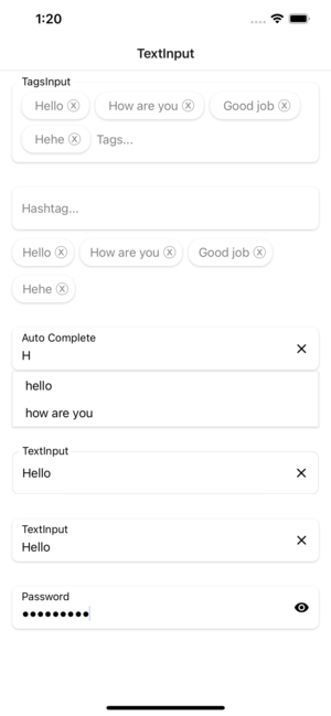
| الدعائم | params | Isrequire | تقصير |
|---|---|---|---|
| وضع | الافتراضي أو الرقمي أو كلمة المرور | لا | التبديل وضع textinput |
| أسلوب | ViewStyle | لا | التصميم لعرض الحاوية |
| ملصق | خيط | لا | تسمية للـ TextInput |
| Labelstyle | TextStyle | لا | تصميم نص الملصق |
| نجم | TextStyle | لا | تصميم للنص النائب |
| InputStyle | TextStyle | لا | تصميم لعرض الإدخال |
| Texterror | خيط | لا | خطأ في النص |
| Texterrorstyle | TextStyle | لا | تصميم خطأ في النص |
| Showicon | منطقية | لا | إظهار أو إخفاء نص واضح |
| أيقونة | الخيال | لا | تصفيف نص رمز واضح |
| FocusColor | خيط | لا | اللون عند التركيز على النصي |
| fontfamily | خيط | لا | تخصيص نمط الخط |
| recnedlefticon | () => jsx.element | لا | تخصيص أيقونة اليسار للتفتيش |
| RenderRighticon | () => jsx.element | لا | تخصيص أيقونة الصحيح للتفتيش |
| الدعائم | params | Isrequire | تقصير |
|---|---|---|---|
| أسلوب | ViewStyle | لا | التصميم لعرض الحاوية |
| ملصق | خيط | لا | تسمية للـ TextInput |
| Labelstyle | TextStyle | لا | تصميم نص الملصق |
| نجم | TextStyle | لا | تصميم للنص النائب |
| InputStyle | TextStyle | لا | تصميم لعرض الإدخال |
| Texterror | خيط | لا | خطأ في النص |
| Texterrorstyle | TextStyle | لا | تصميم خطأ في النص |
| Showicon | منطقية | لا | إظهار أو إخفاء نص واضح |
| أيقونة | الخيال | لا | تصفيف نص رمز واضح |
| FocusColor | خيط | لا | اللون عند التركيز على النصي |
| fontfamily | خيط | لا | تخصيص نمط الخط |
| recnedlefticon | () => jsx.element | لا | تخصيص أيقونة اليسار للتفتيش |
| RenderRighticon | () => jsx.element | لا | تخصيص أيقونة الصحيح للتفتيش |
| بيانات | خيط[] | لا | البيانات هي صفيف عادي |
| علامة التجزئة | ViewStyle | لا | التصميم لعرض حاوية الهاشتاش |
| علامة التجزئة | TextStyle | لا | تصميم نص الهاشتاج |
| onchangevalue | (سلسلة []) => باطلة | لا | رد الاتصال الذي يسمى عند إرسال القيمة |
| Renderhashtagitem | (العنصر ، Unselect؟: () => void) => jsx.element | لا | يأخذ عنصر من البيانات ويعرضه إلى القائمة المحددة |
| الدعائم | params | Isrequire | تقصير |
|---|---|---|---|
| أسلوب | ViewStyle | لا | التصميم لعرض الحاوية |
| ملصق | خيط | لا | تسمية للـ TextInput |
| Labelstyle | TextStyle | لا | تصميم نص الملصق |
| نجم | TextStyle | لا | تصميم للنص النائب |
| InputStyle | TextStyle | لا | تصميم لعرض الإدخال |
| Texterror | خيط | لا | خطأ في النص |
| Texterrorstyle | TextStyle | لا | تصميم خطأ في النص |
| Showicon | منطقية | لا | إظهار أو إخفاء نص واضح |
| أيقونة | الخيال | لا | تصفيف نص رمز واضح |
| FocusColor | خيط | لا | اللون عند التركيز على النصي |
| fontfamily | خيط | لا | تخصيص نمط الخط |
| recnedlefticon | () => jsx.element | لا | تخصيص أيقونة اليسار للتفتيش |
| RenderRighticon | () => jsx.element | لا | تخصيص أيقونة الصحيح للتفتيش |
| بيانات | خيط[] | لا | البيانات هي صفيف عادي |
| TagSstyle | ViewStyle | لا | التصميم لعرض حاوية الهاشتاش |
| tagStextStyle | TextStyle | لا | تصميم نص الهاشتاج |
| onchangevalue | (سلسلة []) => باطلة | لا | رد الاتصال الذي يسمى عند إرسال القيمة |
| Rendertagsitem | (العنصر ، Unselect؟: () => void) => jsx.element | لا | يأخذ عنصر من البيانات ويعرضه إلى القائمة المحددة |
| الدعائم | params | Isrequire | تقصير |
|---|---|---|---|
| بيانات | خيط[] | لا | البيانات هي صفيف عادي |
| أسلوب | ViewStyle | لا | التصميم لعرض الحاوية |
| ملصق | خيط | لا | تسمية للـ TextInput |
| Labelstyle | TextStyle | لا | تصميم نص الملصق |
| نجم | TextStyle | لا | تصميم للنص النائب |
| InputStyle | TextStyle | لا | تصميم لعرض الإدخال |
| Texterror | خيط | لا | خطأ في النص |
| Texterrorstyle | TextStyle | لا | تصميم خطأ في النص |
| Showicon | منطقية | لا | إظهار أو إخفاء نص واضح |
| أيقونة | الخيال | لا | تصفيف نص رمز واضح |
| FocusColor | خيط | لا | اللون عند التركيز على النصي |
| fontfamily | خيط | لا | تخصيص نمط الخط |
| recnedlefticon | () => jsx.element | لا | تخصيص أيقونة اليسار للتفتيش |
| RenderRighticon | () => jsx.element | لا | تخصيص أيقونة الصحيح للتفتيش |
| RenderItem | (البند: سلسلة) => jsx.element | لا | يأخذ عنصرًا من البيانات ويؤدي إلى إعادته إلى القائمة |
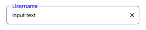
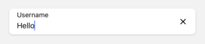
  import React , { useState } from 'react' ;
  import { StyleSheet , View } from 'react-native' ;
  import { TextInput } from 'react-native-element-textinput' ;

  const TextInputComponent = ( ) => {
    const [ value , setValue ] = useState ( '' ) ;

    return (
      < View style = { styles . container } >
        < TextInput
          value = { value }
          style = { styles . input }
          inputStyle = { styles . inputStyle }
          labelStyle = { styles . labelStyle }
          placeholderStyle = { styles . placeholderStyle }
          textErrorStyle = { styles . textErrorStyle }
          label = "TextInput"
          placeholder = "Placeholder"
          placeholderTextColor = "gray"
          focusColor = "blue"
          onChangeText = { text => {
            setValue ( text ) ;
          } }
        />
      </ View >
    ) ;
  } ;

  export default TextInputComponent ;

  const styles = StyleSheet . create ( {
    container : {
      padding : 16 ,
    } ,
    input : {
      height : 55 ,
      paddingHorizontal : 12 ,
      borderRadius : 8 ,
      borderWidth : 0.5 ,
      borderColor : '#DDDDDD' ,
    } ,
    inputStyle : { fontSize : 16 } ,
    labelStyle : {
      fontSize : 14 ,
      position : 'absolute' ,
      top : - 10 ,
      backgroundColor : 'white' ,
      paddingHorizontal : 4 ,
      marginLeft : - 4 ,
    } ,
    placeholderStyle : { fontSize : 16 } ,
    textErrorStyle : { fontSize : 16 } ,
  } ) ;
  import React , { useState } from 'react' ;
  import { StyleSheet , View } from 'react-native' ;
  import { TextInput } from 'react-native-element-textinput' ;

  const TextInputComponent = ( ) => {
    const [ value , setValue ] = useState ( '' ) ;

    return (
      < View style = { styles . container } >
        < TextInput
          value = { value }
          style = { styles . input }
          inputStyle = { styles . inputStyle }
          labelStyle = { styles . labelStyle }
          placeholderStyle = { styles . placeholderStyle }
          textErrorStyle = { styles . textErrorStyle }
          label = "TextInput"
          placeholder = "Placeholder"
          placeholderTextColor = "gray"
          onChangeText = { text => {
            setValue ( text ) ;
          } }
        />
      </ View >
    ) ;
  } ;

  export default TextInputComponent ;

  const styles = StyleSheet . create ( {
    container : {
      padding : 16 ,
    } ,
    input : {
      height : 55 ,
      paddingHorizontal : 12 ,
      borderRadius : 8 ,
      backgroundColor : 'white' ,
      shadowColor : '#000' ,
      shadowOffset : {
        width : 0 ,
        height : 1 ,
      } ,
      shadowOpacity : 0.2 ,
      shadowRadius : 1.41 ,
      elevation : 2 ,
    } ,
    inputStyle : { fontSize : 16 } ,
    labelStyle : { fontSize : 14 } ,
    placeholderStyle : { fontSize : 16 } ,
    textErrorStyle : { fontSize : 16 } ,
  } ) ;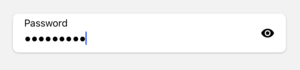
  import React , { useState } from 'react' ;
  import { StyleSheet , View } from 'react-native' ;
  import { TextInput } from 'react-native-element-textinput' ;

  const TextInputComponent = ( ) => {
    const [ value , setValue ] = useState ( '' ) ;

    return (
      < View style = { styles . container } >
        < TextInput
          mode = "password"
          value = { value }
          style = { styles . input }
          inputStyle = { styles . inputStyle }
          labelStyle = { styles . labelStyle }
          placeholderStyle = { styles . placeholderStyle }
          textErrorStyle = { styles . textErrorStyle }
          label = "Password"
          placeholder = "Placeholder"
          placeholderTextColor = "gray"
          onChangeText = { text => {
            setValue ( text ) ;
          } }
        />
      </ View >
    ) ;
  } ;

  export default TextInputComponent ;

  const styles = StyleSheet . create ( {
    container : {
      padding : 16 ,
    } ,
    input : {
      height : 55 ,
      paddingHorizontal : 12 ,
      borderRadius : 8 ,
      backgroundColor : 'white' ,
      shadowColor : '#000' ,
      shadowOffset : {
        width : 0 ,
        height : 1 ,
      } ,
      shadowOpacity : 0.2 ,
      shadowRadius : 1.41 ,
      elevation : 2 ,
    } ,
    inputStyle : { fontSize : 16 } ,
    labelStyle : { fontSize : 14 } ,
    placeholderStyle : { fontSize : 16 } ,
    textErrorStyle : { fontSize : 16 } ,
  } ) ;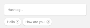
  import React , { useState } from 'react' ;
  import { StyleSheet , View } from 'react-native' ;
  import { HashtagInput } from 'react-native-element-textinput' ;

  const TextInputComponent = ( ) => {
    const [ value , setValue ] = useState < string [ ] > ( [ ] ) ;

    return (
      < View style = { styles . container } >
        < HashtagInput
          data = { value }
          style = { styles . input }
          inputStyle = { styles . inputStyle }
          labelStyle = { styles . labelStyle }
          placeholderStyle = { styles . placeholderStyle }
          textErrorStyle = { styles . textErrorStyle }
          hashtagStyle = { styles . hashtagStyle }
          hashtagTextStyle = { styles . hashtagTextStyle }
          placeholder = "Hashtag..."
          placeholderTextColor = "gray"
          onChangeValue = { value => {
            setValue ( value ) ;
          } }
        />
      </ View >
    ) ;
  } ;

  export default TextInputComponent ;

  const styles = StyleSheet . create ( {
    container : {
      padding : 16 ,
    } ,
    input : {
      height : 55 ,
      paddingHorizontal : 12 ,
      borderRadius : 8 ,
      backgroundColor : 'white' ,
      shadowColor : '#000' ,
      shadowOffset : {
        width : 0 ,
        height : 1 ,
      } ,
      shadowOpacity : 0.2 ,
      shadowRadius : 1.41 ,
      elevation : 2 ,
    } ,
    inputStyle : { fontSize : 16 } ,
    labelStyle : { fontSize : 14 } ,
    placeholderStyle : { fontSize : 16 } ,
    textErrorStyle : { fontSize : 16 } ,
    hashtagStyle : {
      borderWidth : 0 ,
      borderRadius : 16 ,
      padding : 8 ,
      backgroundColor : 'white' ,
      shadowColor : '#000' ,
      shadowOffset : {
        width : 0 ,
        height : 1 ,
      } ,
      shadowOpacity : 0.2 ,
      shadowRadius : 1.41 ,
      elevation : 2 ,
    } ,
    hashtagTextStyle : {
      fontSize : 16 ,
    } ,
  } ) ;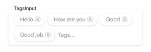
  import React , { useState } from 'react' ;
  import { StyleSheet , View } from 'react-native' ;
  import { TagsInput } from 'react-native-element-textinput' ;

  const TextInputComponent = ( ) => {
    const [ value , setValue ] = useState ( [ ] ) ;

    return (
      < View style = { styles . container } >
        < TagsInput
          data = { value }
          style = { styles . input }
          inputStyle = { styles . inputStyle }
          labelStyle = { styles . labelStyle }
          placeholderStyle = { styles . placeholderStyle }
          textErrorStyle = { styles . textErrorStyle }
          tagsStyle = { styles . tagsStyle }
          tagsTextStyle = { styles . tagsTextStyle }
          label = "TagsInput"
          placeholder = "Tags..."
          placeholderTextColor = "gray"
          onChangeValue = { value => {
            setValue ( value ) ;
          } }
        />
      </ View >
    ) ;
  } ;

  export default TextInputComponent ;

  const styles = StyleSheet . create ( {
    container : {
      padding : 16 ,
    } ,
    input : {
      paddingHorizontal : 12 ,
      borderRadius : 8 ,
      backgroundColor : 'white' ,
      shadowColor : '#000' ,
      shadowOffset : {
        width : 0 ,
        height : 1 ,
      } ,
      shadowOpacity : 0.2 ,
      shadowRadius : 1.41 ,
      elevation : 2 ,
    } ,
    inputStyle : {
      fontSize : 16 ,
      minWidth : 80 ,
    } ,
    labelStyle : {
      fontSize : 14 ,
      position : 'absolute' ,
      top : - 10 ,
      backgroundColor : 'white' ,
      paddingHorizontal : 4 ,
      marginLeft : - 4 ,
    } ,
    placeholderStyle : { fontSize : 16 } ,
    textErrorStyle : { fontSize : 16 } ,
    tagsStyle : {
      borderWidth : 0 ,
      borderRadius : 16 ,
      padding : 8 ,
      backgroundColor : 'white' ,
      shadowColor : '#000' ,
      shadowOffset : {
        width : 0 ,
        height : 1 ,
      } ,
      shadowOpacity : 0.2 ,
      shadowRadius : 1.41 ,
      elevation : 2 ,
    } ,
    tagsTextStyle : {
      fontSize : 16 ,
    } ,
  } ) ;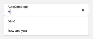
  import React , { useState } from 'react' ;
  import { StyleSheet , View } from 'react-native' ;
  import { AutoComplete } from 'react-native-element-textinput' ;

  const TextInputComponent = ( ) => {
    const [ value , setValue ] = useState ( '' ) ;

    return (
      < View style = { styles . container } >
        < AutoComplete
          value = { value }
          data = { [ 'hello' , 'how are you' , 'complete' ] }
          style = { styles . input }
          inputStyle = { styles . inputStyle }
          labelStyle = { styles . labelStyle }
          placeholderStyle = { styles . placeholderStyle }
          textErrorStyle = { styles . textErrorStyle }
          label = "Auto Complete"
          placeholder = "Placeholder..."
          placeholderTextColor = "gray"
          onChangeText = { e => {
            setValue ( e ) ;
          } }
        />
      </ View >
    ) ;
  } ;

  export default TextInputComponent ;

  const styles = StyleSheet . create ( {
    container : {
      padding : 16 ,
    } ,
    input : {
      height : 55 ,
      paddingHorizontal : 12 ,
      borderRadius : 8 ,
      backgroundColor : 'white' ,
      shadowColor : '#000' ,
      shadowOffset : {
        width : 0 ,
        height : 1 ,
      } ,
      shadowOpacity : 0.2 ,
      shadowRadius : 1.41 ,
      elevation : 2 ,
    } ,
    inputStyle : { fontSize : 16 } ,
    labelStyle : { fontSize : 14 } ,
    placeholderStyle : { fontSize : 16 } ,
    textErrorStyle : { fontSize : 16 } ,
} ) ; 


