file icons
v1.3.2
VSCODE MATERIAL-ICON-TEME을 사용하여 파일 트리의 파일 아이콘.
https://uiwjs.github.io/file-icons/를 방문하고 일반적인 아이콘 이름과 스타일을 식별하는 키워드가있는 검색 기능을 확인하십시오. 예를 들어, "스위프트"를 검색하면 화살표로 사용할 수있는 모든 아이콘을 호출합니다. 또한 개발할 때 쉽게 복사/붙여 넣기를 위해 각 아이콘 클래스 이름을 포함 시켰습니다!
그들은 MIT에 따라 자유롭게 사용할 수 있고 라이센스가 부여됩니다. 적합하거나 개인적 또는 상업적으로 보일 때마다 사용하십시오.
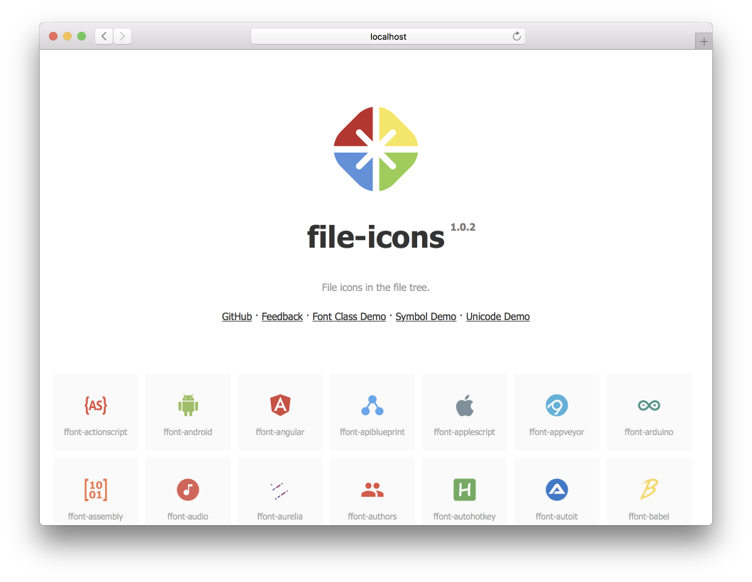
npm install @uiw/file-icons --save https://uiwjs.github.io/file-icons/를 사용하여 사용하려는 아이콘을 쉽게 찾을 수 있습니다. 원하는 아이콘의 CSS 클래스 이름을 복사 한 후에는 apple 과 같은 아이콘과 아이콘의 클래스 이름을 HTML 요소에 추가하십시오.
글꼴 이름이 ffont 로 정의되었다고 가정하고 기본 홈페이지는 unicode 이며 다음을 생성합니다.
font-class.html
index.html
symbol.html
react
ffont.json
ffont.css
ffont.eot
ffont.less
ffont.svg
ffont.symbol.svg
ffont.ttf
ffont.woff
ffont.woff2
미리보기 데모 font-class.html , symbol.html annd index.html . 자동으로 생성 된 스타일 ffont.css 및 ffont.less .
< svg class = " icon " aria-hidden = " true " >
  < use xlink : href = " node_modules/@uiw/file-icons/fonts/ffont.symbol.svg#ffont-javascript " ></ use >
</ svg > < style >
.iconfont {
font-family: "ffont" !important;
font-size: 16px;
font-style: normal;
-webkit-font-smoothing: antialiased;
-webkit-text-stroke-width: 0.2px;
-moz-osx-font-smoothing: grayscale;
}
</ style >
< span class =" iconfont " >  </ span > .less 및 .css 스타일 참조를 지원합니다.
 < link rel =" stylesheet " type =" text/css " href =" node_modules/@uiw/file-icons/fonts/ffont.css " >
< i class =" ffont-javascript " > </ i > 아이콘은 구성 요소로 사용됩니다. v1.3.0+ 지원.
 import { Android } from '@uiw/file-icons' ;
// Or
import { Android } from '@uiw/file-icons/Alipay' ;

< Android style = { { fill : 'red' } } />
< Android height = "36" / >
SVG 이미지를 React 구성 요소로 직접 사용하려면 웹 팩 로더 지원이 필요합니다.
종속성 설치 :
yarn add @svgr/webpack file-loader웹 팩 로더 구성 :
 // webpack.config.js
{
  test : / .svg$ / ,
  use : [
    {
      loader : require . resolve ( '@svgr/webpack' ) ,
      options : {
        prettier : false ,
        svgo : false ,
        svgoConfig : {
          plugins : [ { removeViewBox : false } ] ,
        } ,
        titleProp : true ,
        ref : true ,
      } ,
    } ,
    {
      loader : require . resolve ( 'file-loader' ) ,
      options : {
        name : 'static/media/[name].[hash].[ext]' ,
      } ,
    } ,
  ] ,
  issuer : {
    and : [ / .(ts|tsx|js|jsx|md|mdx)$ / ] ,
  } ,
} ,
그런 다음 SVG를 다음과 같은 반응 구성 요소로 가져올 수 있습니다.
 import { ReactComponent as ComLogo } from '@uiw/file-icons/icon/android.svg' ;

< ComLogo />
사용자 정의 아이콘 구성 요소
Icon 구성 요소를 만듭니다.
 import React from 'react' ;
import svgPaths from '@uiw/file-icons/fonts/ffont.json' ;

const renderSvgPaths = ( type ) => {
  const pathStrings = svgPaths [ type ] ;
  if ( pathStrings == null ) {
    return null
  }
  return pathStrings . map ( ( d , i ) => < path key = { i } d = { d } fillRule = "evenodd" /> )
}

export default class Icon extends React . PureComponent {
  render ( ) {
    const { type , color } = this . props ;
    if ( type == null || typeof type === "boolean" ) {
      return null ;
    }
    return (
      < svg fill = { color } viewBox = { `0 0 24 24` } > { this . renderSvgPaths ( type ) } </ svg >
    ) ;
  }
}
Icon 구성 요소 사용 :
 const demo = ( ) => {
  return (
    < Icon type = "android" />
  )
} 항상 그렇듯이 놀라운 기고자 덕분에!
Github-Action-Contritors와 함께 제작되었습니다.
SVGTOFONT에 의해 생성되었으며 MIT 라이센스에 따라 라이센스가 부여됩니다.


