laravel form components
vel 10 support (#28)
시간을 절약하고 역동적이고, 즉시 사용 가능하며, 완전히 사용자 정의 할 수있는 양식 구성 요소 세트를 활용하십시오.
구성 요소는 LiveWire 호환 가능하며 다음 UI 프레임 워크와 함께 사용할 수 있습니다.
이 패키지가 도움이 되었습니까? 내 작품을 지원하는 것을 고려하십시오!
| 라 라벨 | 라이브 와이어 | PHP | 패키지 |
|---|---|---|---|
| ^9.0 | ^10.0 | ^2.0 | 8.1.* | 8.2.* | ^1.2 |
| ^8.0 | ^9.0 | ^2.0 | ^8.1 | ^8.2 | ^1.1 |
| ^8.0 | ^9.0 | ^2.0 | ^8.0 | ^8.1 | ^1.0 |
뷰에서 필요한 구성 요소를 호출 하고이 패키지가 HTML 생성 시간 소모적 부분을 관리하도록하십시오.
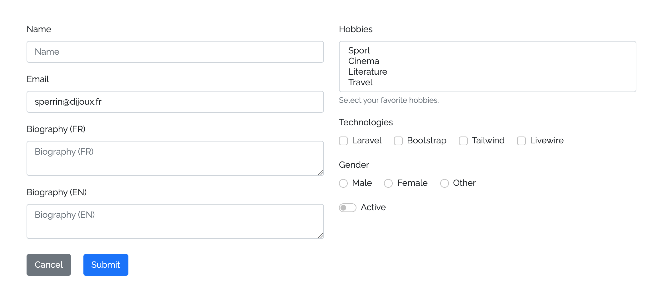
< x:form::form class = " row " method = " PUT " :action = " route('user.update', $user) " :bind = " $user " >
    < div class = " col-md-6 " >
        < x:form::input name = " name " />
        < x:form::input type = " email " name = " email " />
        < x:form::textarea name = " biography " :locales = " ['fr', 'en'] " />
    </ div >
    < div class = " col-md-6 " >
        < x:form::select name = " hobbies " :options = " [1 => 'Sport', 2 => 'Cinema', 3 => 'Literature', 4 => 'Travel'] " caption = " Select your favorite hobbies. " multiple />
        < x:form::checkbox name = " technologies " :group = " [1 => 'Laravel', 2 => 'Bootstrap', 3 => 'Tailwind', 4 => 'Livewire'] " inline />
        < x:form::radio name = " gender " :group = " [1 => 'Male', 2 => 'Female', 3 => 'Other'] " inline />
        < x:form::toggle-switch name = " active " />
    </ div >
    < div class = " col-12 mt-2 " >
        < x:form::button .link class = " btn-secondary me-3 " > {{ __ ( ' Cancel ' ) } } </ x:form::button .link >
        < x:form::button .submit />
    </ div >
</ x:form:form >
이러한 구성 요소를 표시하십시오.
작곡가를 통해 패키지를 설치할 수 있습니다.
composer require okipa/laravel-form-components구성 파일을 다음과 같이 게시 할 수 있습니다.
php artisan vendor:publish --tag=form-components:config구성 중에서이 패키지를 사용하면 사용할 UI 프레임 워크를 선택할 수 있습니다.
이 패키지를 사용하기 전에 사용하려는 UI 프레임 워크를 설치하고 구성해야합니다.
필요한 경우 패키지 뷰를 게시하기 위해 패키지보기를 사용자 정의 할 수 있습니다.
php artisan vendor:publish --tag=form-components:views구성 요소는 양식 구성 요소로 포장 될 수 있습니다.
사용자 정의 메소드가 설정되지 않으면 기본적으로 GET 메소드가 설정됩니다.
정의 된 양식 방법에 따라 숨겨진 CSRF 및 스푸핑 방법 필드가 필요할 때 자동으로 생성됩니다.
@method() 지시문을 정의하고 action 속성에서 직접 PUT , PATCH 또는 DELETE 를 선언 할 필요가 없습니다.@csrf() 지시문을 정의 할 필요가 없으며 POST , PUT , PATCH 및 DELETE 작업으로 자동 선언됩니다. 기본 novalidate HTML 속성으로 양식이 생성되며, 이는 서버 측 유효성 검사 (보안 문제에 대한 모범 사례)에 유리한 브라우저 검증을 방지합니다.
< x:form::form method = " PUT " >
    < x:form::input name = " first_name " />
    ...
</ x:form::form >입력과 텍스트 주변을 양식에 추가하십시오.
사용자 정의 유형을 입력으로 설정하지 않으면 기본 text 유형이 필요합니다.
라디오, 확인란 및 버튼 입력은 동작이 다르기 때문에 자체 구성 요소와 함께 사용해야합니다.
TextArea 구성 요소는 입력 구성 요소와 동일한 방식으로 유형을 선언하지 않고 사용할 수 있습니다.
< x:form::input type = " file " name = " avatar " />
< x:form::input name = " first_name " />
< x:form::input type = " email " name = " email " />
...
< x:form::textarea name = " description " />양식에서 선택 구성 요소를 설정하십시오.
연관 값/레이블 배열을 제공하여 옵션을 자동 생성합니다.
HTML 선택 요소는 기본적으로 자리 표시 자 속성을 허용하지 않지만 선택 구성 요소를 사용하면 자리 표시 자와 같은 옵션을 처리 할 수 있습니다. 이 자리 표시자는 다른 구성 요소와 같이 행동합니다.
기본적 으로이 선택된 자리 표시 자 옵션은 선택, 비활성화 및 숨겨집니다. 그러나 예를 들어 nullable 필드를 설정 해야하는 경우 선택할 수 있습니다. 이렇게하려면 component에 allowPlaceholderToBeSelected 속성을 추가하십시오.
다중 모드 에서이 패키지는 이름을 배열 이름으로 변환하는 데주의를 기울이므로 수동으로 추가 할 필요가 없습니다.
 @php ( $options = [ 1 => ' Laravel ' , 2 => ' Bootstrap ' , 3 => ' Tailwind ' , 4 => ' Livewire ' ] )
< x:form::select name = " hobby " placeholder = " What is your hobby prefered hobby? " :options = " $options " selected = " 1 " />
< x:form::select name = " hobbies " :options = " $options " :selected = " [2, 3] " allowPlaceholderToBeSelected multiple /> {{-- You'll be able to selected the placeholder and the name will be converted to hobbies[] --}}
확인란, 토글 스위치 및 무선 구성 요소를 사용할 수 있습니다.
무선 입력은 혼자 사용되지 않기 때문에 사용 할 때 필요한 group 속성을 선언해야하며 무선 필드가 생성되는 값/레이블 연관 배열을 기다려야합니다.
Checkbox 및 Toggle Switch 입력과 관련하여 단일 또는 그룹 모드에서 사용할 수 있습니다. 그룹 모드에서 사용하려면 group 속성도 선언해야합니다.
그룹 모드 에서이 패키지는 이름을 배열 이름으로 변환하는 데주의를 기울이므로 수동으로 추가 할 필요가 없습니다.
이러한 입력 구성 요소를 인라인으로 표시하려면 inline 속성을 정의하십시오.
< x:form::checkbox name = " newsletter_subscription " :checked = " true " /> {{-- 1 generated checkbox --}}
< x:form::checkbox name = " technologies " :group = " ['laravel' => 'Laravel', 'bootstrap' => 'Bootstrap'] " :checked = " laravel " /> {{-- 2 generated checkboxes --}}
< x:form::toggle-switch name = " active " :checked = " false " inline /> {{-- 1 generated toggle switch with inline mode --}}
< x:form::toggle-switch name = " technologies " :group = " ['tailwind' => 'Tailwind', 'livewire " => 'Livewire']" :checked="livewire"/> {{-- 2 generated toggle switches --}}
< x:form::radio name = " gender " :group = " ['female' => 'Female', 'male' => 'Male'] " :checked = " male " inline /> {{-- 2 generated radios with inline mode --}}제출 및 링크 버튼 구성 요소를 사용할 수 있습니다.
제출 버튼을 사용하면 양식을 트리거 할 수 있으며 정의되지 않은 경우 기본 __('Submit') 본문을 제공합니다.
링크 버튼을 사용하면 버튼과 같은 디스플레이로 링크를 제공하여 양식에서 Back 또는 Cancel 같은 작업을 설정할 수 있습니다. 이 구성 요소는 HTML 링크이므로 본문을 분석하여 기본 제목을 제공합니다.
기본적으로 사용자 정의 클래스 속성이 정의되지 않으면 두 구성 요소 모두 기본 배경색을 설정합니다.
< x:form::form >
    ...
    < div class = " d-grid " >
        < x:form::button .submit >Submit this form</ x:form::submit > {{-- Will provide `btn-primary` class with Bootstrap UI --}}
        < x:form::button .link class = " btn-secondary " href = " {{ back () } } " > {{-- Will auto-generate `title="Back"` --}}
            < i class = " fas fa-undo fa-fw " ></ i >
            Back
        </ x:form::submit >
    </ div >
</ x:form::form >제공 구성 요소는 블레이드 구성 요소를 사용하여 구축됩니다.
블레이드 구성 요소 작동 방식에 따라 HTML 속성 및 클래스를 설정할 수 있습니다.
HTML 요소에 대해 구성 요소 ID를 정의하십시오.
사용자 정의 ID가 설정되지 않으면 Kebab Cased <type>-<name> 값을 사용하여 ID가 생성됩니다.
< x:form::input id = " custom-id " name = " first_name " /> {{-- Default id: `input-first-name` --}}

< x:form::textarea id = " custom-id " name = " first_name " /> {{-- Default id: `textarea-first-name` --}}기본적으로 모든 입력 구성 요소는 양식에 올바르게 배치하기 위해 하단 마진을 선언합니다.
때때로이 기본 하단 마진을 비활성화해야합니다. marginBottom 속성을 false 로 설정하여이를 수행 할 수 있습니다.
< x:form::input name = " first_name " /> {{-- Will declare a bottom margin --}}

< x:form::textarea name = " first_name " :marginBottom = " false " /> {{-- Will not declare any bottom margin --}}모든 입력 구성 요소에서 레이블을 정의 할 수 있습니다 (라디오 제외).
사용자 정의 레이블이 정의되지 않으면 레이블은 __('validation.attributes.<name>) 기본값을 취합니다.
동일한 동작에 따라 placeholder 사용할 수있는 모든 입력 구성 요소 (선택 포함)는 label 값을 취할 기본 자리 표시자를 제공합니다.
사용자 정의 자리 표시자를 설정 하여이 기본값을 무시할 수 있습니다.
또한 자동 생성 레이블과 자리 표시자를 false 으로 숨길 수도 있습니다.
< x:form::input name = " first_name " label = " First Name " placeholder = " Please fill your first name... " /> {{-- Will display the custom label and placeholder --}}
< x:form::input name = " last_name " :label = " false " :placeholder = " false " /> {{-- Will hide the label and placeholder --}}
< x:form::input type = " tel " name = " phone_number " /> {{-- Will display default auto-generated label and placeholder --}}이 패키지를 사용하면 플로팅 레이블 표시를 활성화 또는 비활성화 할 수 있습니다.
config('form-components.floating_label') config로 전역 플로팅 레이블 동작을 설정할 수 있습니다.
이 글로벌 동작을 포함 된 모든 구성 요소에 대해 양식 수준 에서이 글로벌 동작을 무시할 수 있습니다.
< x:form::form :floatingLabel = " true " >
    < x:form::input name = " first_name " /> {{-- Will display a floating label even if it has been disabled in config --}}
</ x:form::form >
마지막으로, 구성 요소 자체의 다른 모든 정의 된 동작을 무시할 수도 있습니다.
< x:form::input name = " first_name " :floatingLabel = " true " /> 입력 및 TextArea 구성 요소에 대한 prepend 정의하고 HTML 애드온을 append 할 수 있습니다.
    < x:form::input name = " " prepend = " <i class= " fas fa-code fa-fw " ></i> " />
    < x:form::input name = " search " append = " <i class= " fas fa-search fa-fw " ></i> " />
참고 : 복잡한 Addon의 관리에 구성 요소 대신 HTML을 직접 사용할 수 있습니다.
결합 된 구성 요소 값을 자동으로 만들기 위해 웅변 모델, 객체, 컬렉션 또는 배열을 바인딩 할 수 있습니다.
양식 구성 요소에 대한 바인딩 데이터는 포함 된 모든 구성 요소의 바인딩을 트리거합니다.
구성 요소에 데이터를 직접 바인딩하고 양식 바인딩을 재정의 할 수 있습니다.
유효성 검사 오류의 경우, 구성 요소는 바운드 값을 무시하는 이전 값으로 다시 채워집니다.
특정 사용 사례의 경우 @bind($boundDataBatch) 및 @endbind 블레이드 지시문을 사용하여 구성 요소 그룹을 바인딩 할 수도 있습니다.
 @php
    $dataBatch1 = [ ' description ' => ' A wonderful description ' ];
    $dataBatch2 = [ ' first_name ' => ' John ' , ' last_name ' => ' Bonham ' ];
@endphp
< x:form::form :bind = " $user " >
    < x:form::input type = " email " name = " email " /> {{-- Will set the value from `$user->email` --}}
    < x:form::textarea name = " description " :bind = " $dataBatch1 " /> {{-- Will set the value from `$dataBatch1['description`] --}}
    @bind ( $dataBatch2 )
        < x:form::input name = " first_name " /> {{-- Will set the value from `$dataBatch2['first_name`] --}}
        < x:form::input name = " last_name " /> {{-- Will set the value from `$dataBatch2['last_name`] --}}
    @endbind
</ x:form::form >구성 요소에서 사용자 정의 값을 설정하여 데이터 바인딩을 상환 할 수 있습니다.
 @php ( $data = [ ' description ' => ' A wonderful description ' ]; )
< x:form::form :bind = " $user " >
    ...
    < x:form::textarea
        name = " description "
        :bind = " $user "
        :value = " $data['description'] " /> {{-- Will set the value from `$data['description`] --}}
</ x:form::form >
유효성 검사 오류가 트리거되면 구성 요소가 성공/오류 상태 및 오류 메시지를 표시하거나 숨길 수 있습니다.
이 동작을 다른 수준에서 제어 할 수 있습니다.
config('form-components.display_validation_success') 로 전역 기본 동작을 정의하고 config('form-components.display_validation_failure')< x:form::form displayValidationSuccess = " false " displayValidationFailure = " false " >
< x:form::input type = " email " name = " email " /> {{-- Disabled success/error statuses and error message --}}
< x:form::textarea
name = " description "
displayValidationSuccess = " true "
displayValidationFailure = " true " /> {{-- Enabled success/error statuses and error message --}}
</ x:form::form >또한 구성 요소의 구성 요소 성공/오류 상태 및 오류 메시지를 결정하는 데 사용해야하는 오류 백을 사용자 정의 할 수도 있습니다.
< x:form::form errorBag = " form_error_bag " > {{-- Error bag for all components within the form --}}
    @errorbag ( ' group_error_bag ' ) {{-- Error bag for a group of components --}}
        < x:form::input name = " first_name " />
        < x:form::input name = " last_name " />
    @enderrorbag
    < x:form::input type = " email " name = " email " errorBag = " component_error_bag " /> {{-- Error bag for a specific component --}}
    ...
</ x:form::form >캡션을 추가하여 구성 요소 아래에 사용자를 돕고 추가 지침을 표시하십시오.
< x:form::input name = " name " caption = " Please fill this input with your full name. " /> input 및 textarea 구성 요소에서 다국어 모드를 활성화하여 다음 기능의 이점을 활용하십시오.
name="description" name="description[<locale>]"__(validation.attributes.name) 번역 기본 레이블 및 오류 메시지를 생성하는 데 사용되는 번역 (<LOCALE>) 이 추가됩니다. < x:form::input name = " name " :locales = " ['fr', 'en'] " />
< x:form::textarea name = " description " :locales = " ['fr', 'en'] " />양식 및 입력 구성 요소는 라이브 와이어 호환입니다.
wire:model HTML 속성 대신이 작업을 수행하려면 wire="<optional-modifier>" HTML 속성을 정의하면됩니다.
각 유선 입력 구성 요소는 자체 name 속성을 사용하여 유효한 wire:model="<name>" .
< x:form::form wire:submit.prevent = " submit " >
    < x:form::input name = " name " /> {{-- Will not be wired --}}
    < x:form::input type = " email " name = " email " wire /> {{-- Will bind the value from the Livewire component `$email` property with no defined Livewire modifier --}}
    < x-form::input name = " description " wire = " lazy " /> {{-- Will bind the value from the Livewire component `$description` property with the the `lazy` Livewire modifier --}}
    < x-form::submit />
</ x:form::form >
동일한 논리에 따라 입력 구성 요소를 포함 된 양식에서 직접 연결할 수도 있습니다.
< x-form::form wire:submit.prevent = " submit " wire >
    < x-form::input type = " email " name = " email " /> {{-- Will bind the value from the Livewire component `$email` property with no defined Livewire modifier --}}
    < x-form::input name = " description " wire = " lazy " /> {{-- Will bind the value from the Livewire component `$description` property with the the `lazy` Livewire modifier --}}
    < x-form::submit />
</ x:form::form >
특정 사용 사례의 경우 @wire($modifier) 및 @endwire 블레이드 지시문을 사용하여 특정 LiveWire 수정 자와 구성 요소 그룹을 연결할 수도 있습니다.
< x-form::form wire:submit.prevent = " submit " wire = " lazy " >
    < x-form::input name = " first_name " /> {{-- Will bind the value from the Livewire component `$first_name` property with the `lazy` Livewire modifier --}}
    @wire ( ' debounce.150ms ' )
        < x-form::input name = " last_name " /> {{-- Will bind the value from the Livewire component `$last_name` property with the `debounce.150ms` Livewire modifier --}}
    @endbind
    @wire ( null )
        < x-form::input type = " email " name = " email " /> {{-- Will bind the value from the Livewire component `$email` property with no defined Livewire modifier --}}
        < x-form::input name = " description " wire = " lazy " /> {{-- Will bind the value from the Livewire component `$description` property with the the `lazy` Livewire modifier --}}
    @endbind
    < x-form::submit />
</ x-form::form >composer test 최근에 변경된 내용에 대한 자세한 내용은 ChangElog를 참조하십시오.
자세한 내용은 기여를 참조하십시오.
보안 취약점을보고하는 방법에 대한 보안 정책을 검토하십시오.
MIT 라이센스 (MIT). 자세한 내용은 라이센스 파일을 참조하십시오.


