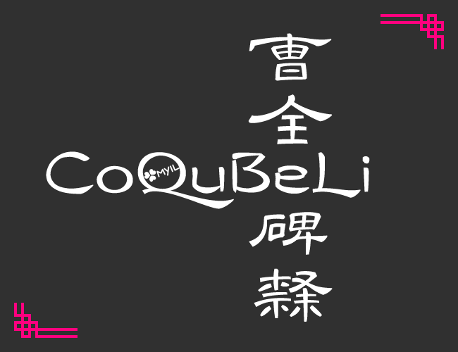
CoQuBeLi
.01x版:大幅更新
At first I wanted to find some free and beautiful fonts of Lishu, but I couldn't find a suitable one, so I created an open source "Bold (?) Han Li" plan, which is equivalent to replicating Cao Quan Monument.
The "CoQuBeLi" in the picture below demonstrates the concept of the Han Li style and Western language. In addition to "』", there are also corresponding strokes of Cao Quanbei. I feel that the Chinese characters in this font are not suitable for horizontal arrangement, so I will focus on vertical arrangement characteristics, and use the OpenType characteristics and expansion zone [SIP, TIP] Chinese characters to support the different styles of official script and ancient seal script...
"Glyph" and "character" do not correspond one by one. There will be a large number of multiplexed glyphs (multiple characters vs. one character) in this font. If the input曹曺is displayed as "Zhu", see the glyph list.txt
Western languages and punctuation are mainly composed of official script strokes, so they will be carved after the characters are sufficient.
In the broad statistics.txt file, lists which glyph of the character corresponding to the stele.
字形列表.txtkernccmp hwid ital vert ; correct …宽泛统计.txtcpct vkrn ; font thumbnails or display as文字美in file manageraalt calt halt salt vrt2 zero ; support paltcase liga lnum onum pnum tnumcase four calculations, add dlig CQBL A new font collaboration Q group 613746416 has been created to facilitate people who want to collaborate but have difficulty accessing github.
aalt replaces full view. This font is used to list all the different forms of a certain Chinese character.calt context replacement, replace the glyph according to the context, similar to my Monu encounter with Qusalt style replacement is a brainless feature that does not look at the context and replaces it without looking at the context.case focuses on capitalization, punctuation vertical positions are case sensitive, numerical capitalization, etc., Western language featuresccmp font reorganization, for example for continuous and uneven dash, centered ellipsiscpct punctuation centered, replace the punctuation centered, East Asian characteristicsfwid full-width character width, and the replacement of the character shape is almost considered a Western language feature of East Asia.hwid half-width character, same as abovepwid proportional characters are wide, the same as above, basically the Western language characteristicshalt character is wide and half-width, East Asian characteristics, only adjust the left and right margins of a single East Asian punctuation. This font is used for punctuation and extrusion.palt font width ratio, same as above, only adjust the left and right margins of a single liter. This font is used to squeeze the full-width Englishital Italian style, the Western language characteristics of East Asia. This font is used to replace 「」 with half- ⸤⸣ in the direction of the stroke⸤⸣ (test)kern adjusts the font spacing, which is basically a Western language feature. This font is also used for punctuation and extrusion (applicable to software that lacks the layout function)liga standard hyphen, enabled by default, for examplefi → fidlig is hyphenated as appropriate and is closed by default, for example !? → ⁉lnum flush digits, replace numeric glyphsonum classical numbers, same as above, numbers are uneven, just like lowercase letterspnum proportional number, replaced by unequal width numbertnum list number, replaced with monospace numbervert replacement, East Asian characteristicsvrt2 vertical row rotates, same as above, I hope to solve the Western vertical row without rotationvkrn vertical font spacing, same as above, I hope to solve the problem of vertical font in Western languages. This font is used for vertical punctuation (test)zero replaces slash 0, just make the difference between 0 and o more obvious, and you don’t have to scratch the slashCQBL This is a custom feature, only this font supports it. Restore the font to the original shape of the Caoquan Monument as much as possible.font-feature-settings:'CQBL';If your software cannot call these features, you can try to solve them manually. For example, some features only automatically replace the glyph, then you can directly copy the replaced glyph to the glyph list.txt.
mark mark positioning, Western phonics or pseudonyms and cloud point use characteristics, this font must of course support Chinese pinyinqwid quad width, this font may only be used for ¼EM wide numberstwid three-minute characters wide, this font may only be used for ⅓EM wide numbersss01 style set #, this font plan supports to ss16vhal characters are half-shaped in height, East Asian characteristics, only adjust the upper and lower margins of a single East Asian punctuation point. This font is used for vertical punctuation point extrusion.vpal character has a high proportion, the same as above, only adjust the upper and lower margins of a single literal It is made to facilitate the identification of a font shape in the font source file.
曺? is considered曹), and only distinguishes individual many於後-one simplified languages with completely different writing methods:于,后,穀谷As for all the files that are distinguished, they are naturally "…strict statistics.txt"...曹×6 indicates that "Cao" ( replica ) appears 6 times on the stele and appears for the first time in the inscription. The character is recorded as曹1 in the source file.全_1 means that only appears once ( solar character ), and the shape of the character is全without distinction by numbers.曹02 is the order, and this character is written as曹2 .之×H , which之×17 , and the shape of the character之1 . By the way: B=11, C=12.怀_2 is a special case. The character shape is written懷. According to the context of the stele, it can be regarded as a different body褱×2 (the character shape is written褱).+ sign. If the word "stele" is recorded as碑+ , I will give priority to making碑隶隸飴綿碑+隸+ has been produced.| is followed by a comment. ≈ means almost synonymous, → means typos, ≠ means that it may be an alias. By the way, Baidu Encyclopedia has too many errors.A list of glyphs that exist in the font, one glyph per line.
宽泛统计.txt to separate the ; .tab符, and some are one-to-many. Without tab符, it means that the glyph has no corresponding character, or it requires an OT characteristic to call it.之fonts appeared in the inscriptions 17 times, so the upper limit of each word variant is set to 16, and the U+E460~EFFF in the private area is convenient for software copying that lacks the layout function. Keep a whole piece of code for each word, and the rule is that某字1~15 corresponds to U+Exx1~ExxF , and某字16 is placed in U+Exx0 (although it does not have so many variations...). The value of xx is done first, first served. Of course, if the private area is not enough in the future, it is okay to add the private area... The shape of the area does not repeat the original monument.fwid hwid twid qwid , among which U+E018~E01F is left for Chinese bent quotation marks (corresponding to U+2018~201F, my Ctrl Zpix is similar) , U+E0B0~E0B3 or leave it blank to avoid Powerline symbols.fwid hwid you will be half-cornered quotes in Chinese.onum pnum osf: OldStyle, classical proportion, that is, the default style of this font. Exception: The font 6 8 's osf is equivalent to lf stylelnum tnum tf: Tabular, equal width flush, exception: This font tf is equivalent to half-width ( hwid ), tf of 6 is equivalent to osf styleonum tnum tosf: monospace classical, exception: this font tosf is also equivalent to half-width, and 6 8 tosf is equivalent to tf stylelnum pnum lf: Lining, proportions are equalzero *num zer0︀: slash (0̸)

