json edit react
v.1.19.1

用於編輯或查看JSON/對像數據的React組件
重要的
破裂的變化:
theme輸入有更改。內置主題現在必須單獨導入並傳遞,而不僅僅是將主題命名為字符串。這是搖樹的更好的,因此未使用的主題不會與您的構建捆綁在一起。查看主題和样式setData Prop,而不是使用onUpdate來外部更新數據。請參閱管理狀態。 npm i json-edit-react
或者
yarn add json-edit-react
 import { JsonEditor } from 'json-edit-react'

// In your React component:
return
  < JsonEditor
    data = { jsonData }
    setData = { setJsonData } // optional
{ ... otherProps } /> (最終用戶)
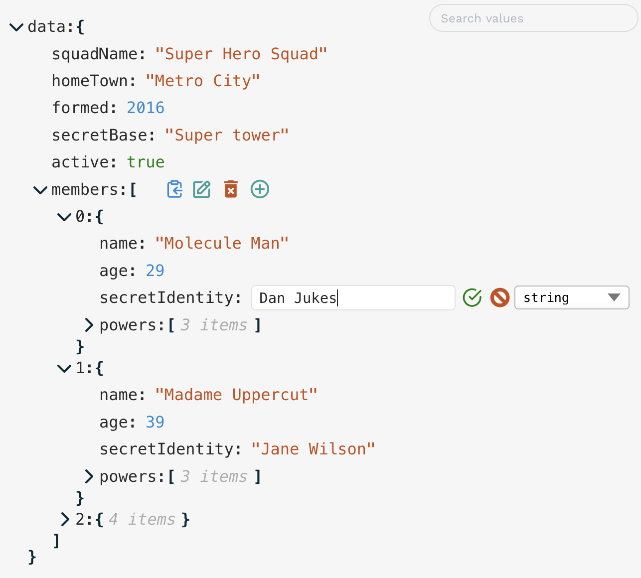
這是非常自我解釋的(單擊要編輯的“編輯”圖標等),但是有一些與編輯者互動的不太明顯方法:
Cmd/Ctrl/Shift-Enter添加新行( Enter提交值)Enter新行,而Cmd/Ctrl/Shift-Enter用於提交Escape取消編輯Cmd/Ctrl會將路徑複製到所選節點而不是其值jsonParse道具。 唯一需要的值是data (儘管您需要提供setData方法來更新數據)。
| 支柱 | 類型 | 預設 | 描述 |
|---|---|---|---|
data | object|array | 要顯示 /編輯的數據 | |
setData | object|array => void | 更新data對象的方法。有關其他註釋,請參見下面的管理狀態。 | |
rootName | string | "data" | 在編輯器中顯示的名稱是數據對象的根。 |
onUpdate | UpdateFunction | 每當在編輯器中更新值(編輯,刪除或添加)時運行的功能。請參閱更新功能。 | |
onEdit | UpdateFunction | 每當編輯值時運行的函數。 | |
onDelete | UpdateFunction | 每當刪除值時運行的函數。 | |
onAdd | UpdateFunction | 每當添加新屬性時運行的功能。 | |
onChange | OnChangeFunction | 用於修改/約束用戶輸入時的函數 - 請參見OnChange函數。 | |
onError | OnErrorFunction | 每當組件報告錯誤時運行的函數 - 請參見OnErrorFunction。 | |
showErrorMessages | boolean | true | 組件是否應顯示自己的錯誤消息(您可能只想在提供自己的onError函數時都禁用此消息) |
enableClipboard | boolean|CopyFunction | true | 是否啟用UI中的“複製到剪貼板”按鈕。如果提供了一個函數,則假定為true ,並且每當複制項目時都會運行此功能。 |
indent | number | 3 | 指定顯示數據中每個嵌套級別的壓痕量。 |
collapse | boolean|number|FilterFunction | false | 定義JSON樹的哪些節點將顯示在負載時的UI中“打開”。如果boolean ,那將是全部或全部。一個number指定了嵌套深度,然後將關閉節點。有關更多良好控制,可以提供函數 - 請參閱過濾器功能。 |
collapseAnimationTime | number | 300 | 倒塌節點時的過渡動畫的時間(以毫秒為單位)。 |
restrictEdit | boolean|FilterFunction | false | 如果是true ,則不允許編輯。可以提供更具體的功能 - 請參閱過濾器功能 |
restrictDelete | boolean|FilterFunction | false | 與restrictEdit一樣,但要刪除 |
restrictAdd | boolean|FilterFunction | false | 與restrictEdit一樣,但要添加新屬性 |
restrictTypeSelection | boolean|DataType[]|TypeFilterFunction | true | 為了限制用戶可以選擇的數據類型。可以是數據類型的列表(例如[ 'string', 'number', 'boolean', 'array', 'object', 'null' ] )或布爾值。可以提供一個函數 - 應採用與上述FilterFunction函數相同的輸入,但輸出應為boolean | DataType[] 。 |
restrictDrag | boolean|FilterFunction | true | 設置為false以啟用拖放功能。請參閱拖動-N-Drop |
searchText | string | undefined | 數據可見性將通過匹配與值匹配,使用以下在searchFilter中定義的方法進行過濾 |
searchFilter | "key"|"value"|"all"|SearchFilterFunction | undefined | 定義應如何匹配searchText以過濾可見的項目。請參閱搜索/過濾 |
searchDebounceTime | number | 350 | searchText更改時匯總時間 |
keySort | boolean|CompareFunction | false | 如果為true ,將訂購對象鍵(使用默認的JS .sort() )。還可以提供比較函數來定義排序行為。 |
showArrayIndices | boolean | true | 是否顯示數組元素的索引(作為屬性密鑰)。 |
showStringQuotes | boolean | true | 是否在“引號”中顯示字符串值。 |
showCollectionCount | boolean|"when-closed" | true | 是否顯示每個集合中的項目數(對像或數組)。 |
defaultValue | any|DefaultValueFilterFunction | null | 當添加新屬性時,它將使用此值初始化。可以提供與FilterFunction s幾乎相同的輸入的函數,但應輸出值。這允許根據數據狀態使用不同的默認值(例如頂級的默認值是一個對象,但在其他地方的字符串。) |
stringTruncate | number | 250 | 字符串值長於該字符將顯示截斷(使用... )。編輯時,完整的字符串將始終可見。 |
translations | LocalisedStrings對象 | { } | UI字符串(例如錯誤消息)可以通過傳遞包含局部字符串值的對象(只有少數)來翻譯。查看本地化 |
theme | ThemeInput | default | 內置主題之一(單獨導入),或指定某些或所有主題屬性的對象。看到主題。 |
className | string | 將CSS類的名稱應用於組件。在大多數情況下,指定theme屬性將更加簡單。 | |
id | string | 主組件容器上的HTML id屬性的名稱。 | |
icons | {[iconName]: JSX.Element, ... } | { } | 通過在此處指定內置圖標來替換內置圖標。看到主題。 |
minWidth | number|string (CSS值) | 250 | 編輯器容器的最小寬度。 |
maxWidth | number|string (CSS值) | 600 | 編輯器容器的最大寬度。 |
rootFontSize | number|string (CSS值) | 16px | 所有其他Sizings均得出的“基本”字體大小(在em s中)。通過更改它,您將擴展整個組件。容器。 |
customNodeDefinitions | CustomNodeDefinition[] | 您可以根據條件功能提供自定義的組件來覆蓋數據樹中的特定節點。有關更多詳細信息,請參見自定義節點。 (在主包裝中提供了一個簡單的自定義組件,用於將URL字符串變成活動鏈接 - 請參見此處) | |
customText | CustomTextDefinitions | 除了定位組件文本字符串外,您還可以根據數據動態更改它。有關更多詳細信息,請參見自定義文本。 | |
customButtons | CustomButtonDefinition[] | [] | 如果您想在數據上執行自定義操作,則可以將自己的按鈕添加到編輯按鈕面板中。請參閱自定義按鈕 |
jsonParse | (input: string) => JsonData | JSON.parse | 直接編輯JSON的一個塊時,您可能希望允許一些“寬鬆”輸入 - 例如'單引號',落後逗號或未引用的字段名稱。在這種情況下,您可以提供第三方JSON解析方法。我推薦JSON5,這是演示中使用的內容 |
jsonStringify | (data: JsonData) => string | (data) => JSON.stringify(data, null, 2) | 同樣,在開始編輯JSON時,您可以覆蓋JSON字符串的默認呈現。您可以向本機JSON.stringify()提供不同的格式參數,也可以提供第三方選項,例如上述JSON5。 |
errorMessageTimeout | number | 2500 | 時間(以毫秒為單位)在UI中顯示錯誤消息。 |
keyboardControls | KeyboardControls | 如上所述 | 覆蓋一些或全部鍵盤控件。有關詳細信息,請參見鍵盤自定義。 |
insertAtTop | boolean| "object | "array" | false | 如果true ,請在頂部而不是底部插入新值。可以通過將"object"或"array"設置為“對象”或對象設置行為。 |
建議您自己在此組件之外管理data狀態 - 只需傳遞setData方法,該方法在內部被稱為更新data 。但是,這不是強制性的 - 如果您不提供setData方法,則將在內部管理數據,如果您不使用數據進行任何操作,那就很好。替代方法是使用更新功能在外部更新data ,但這不建議在特殊情況下使用,因為您可以遇到與內部狀態同步數據(這是顯示的內容)以及不必要的重新貸款的問題。更新功能應僅用於實現副作用,檢查錯誤或在使用setData設置數據之前突變數據。
只要提供數據更新(編輯,刪除或添加),就可以執行回調。您可能希望使用它來更新一些外部狀態,進行API調用,在保存數據之前修改數據,或針對JSON模式驗證數據結構。如果您想要所有更新的功能相同的功能,則只需onUpdate Prop就足夠了。但是,如果您需要不同的編輯,刪除和添加的東西,則可以通過onEdit , onDelete和onAdd Props提供單獨的更新功能。
該函數將作為參數接收以下對象:
 {
    newData ,      // data state after update
    currentData ,  // data state before update
    newValue ,     // the new value of the property being updated
    currentValue , // the current value of the property being updated
    name ,         // name of the property being updated
    path          // full path to the property being updated, as an array of property keys
                  // (e.g. [ "user", "friends", 1, "name" ] ) (equivalent to "user.friends[1].name")
}
該函數無法返回(在這種情況下,數據正常更新),或一個值代表成功/失敗,錯誤值或修改的數據的值。返回值可以是以下內容之一,並相應地處理:
true / void / undefined :數據繼續按正常更新false :將更新視為錯誤,因此數據未更新(恢復為上一個值),並且在UI中顯示了通用錯誤消息string :也考慮了錯誤,因此沒有數據更新,但是UI錯誤消息將是您提供的字符串[ "value", <value> ] :告訴組件使用返回的<value>而不是輸入數據。您可以使用它自動修改用戶輸入 - 例如,對數組進行排序或將時間戳字段插入對象。[ "error", <value> ] :與string相同,但以較長的元組格式。與更新函數類似,隨著用戶輸入更改, onChange函數被執行。您可以使用它來限製或限制用戶輸入 - 例如將數字限制為正值,或者防止字符串中的線路斷裂。該函數必須返回一個值才能更新用戶輸入字段,因此,如果沒有進行更改,請將其返回未修改。
輸入對像類似於更新函數輸入,但是沒有newData字段(因為此操作發生在數據更新之前)。
 // in <JsonEditor /> props
onChange = ( { newValue , name } ) => {
      if ( name === "age" && newValue < 0 ) return 0 ;
      if ( name === "age" && newValue > 100 ) return 100 ;
      return newValue
} onChange = ( { newValue , name } ) => {
if ( name === 'name' && typeof newValue === "string" )
return newValue . replace ( / [^a-zA-Zs]|n|r / gm , '' ) ;
return newValue ;
}通常,每當檢測到錯誤條件時,組件將顯示簡單的錯誤消息(例如,json輸入,重複鍵或onUpdate函數返回的自定義錯誤))。但是,您可以提供自己的onError回調,以實現自己的錯誤UI或運行其他副作用。 (在前一種情況下,您可能也希望禁用showErrorMessages Prop。)回調的輸入類似於其他回調:
 {
    currentData ,  // data state before update
    currentValue , // the current value of the property being updated
    errorValue ,   // the erroneous value that failed to update the property
    name ,         // name of the property being updated
    path ,         // full path to the property being updated, as an array of property keys
                  // (e.g. [ "user", "friends", 1, "name" ] ) (equivalent to "user.friends[1].name"),
    error : {
      code ,       // one of 'UPDATE_ERROR' | 'DELETE_ERROR' | 'ADD_ERROR' | 'INVALID_JSON' | 'KEY_EXISTS'
      message     // the (localised) error message that would be displayed
    }
}
(可以在演示中看到“自定義節點”數據集的自定義錯誤UI的示例 - 當您輸入無效的JSON輸入時,顯示“ Toast”通知,而不是普通的組件錯誤消息。)
每當將項目複製到剪貼板(如果傳遞給enableClipboard prop)時,都會執行類似的回調,但是使用不同的輸入參數:
    key         // name of the property being copied
    path        // path to the property
    value       // the value copied to the clipboard
    type        // Either "path" or "value" depending on whether "Cmd/Ctrl" was pressed
    stringValue // A nicely stringified version of `value`
                // (i.e. what the clipboard actually receives)
由於單擊“複製”時的用戶反饋很少,因此一個好主意是在此回調中介紹某種通知。
除了每個值出現的“複製”,“編輯”和“刪除”按鈕外,如果需要在數據上允許一些自定義操作,則可以添加自己的按鈕。在以下定義結構中,在customButtons Prop中提供一系列按鈕定義:
 {
  Element : React . FC ,
  onClick : ( nodeData : NodeData , e : React . MouseEvent ) => void
}其中NodeData與以前的“更新函數”接收到的數據結構相同。
您可以通過傳遞過濾器功能來控制數據結構的哪些節點可以編輯,刪除或添加到數據類型。這些將在數據中的每個屬性上調用,並且屬性將根據函數返回true還是false ( true編輯)來強制執行。
該功能接收以下對象:
 {
    key ,   // name of the property
    path ,  // path to the property (as an array of property keys)
    level , // depth of the property (with 0 being the root)
    index , // index of the node within its collection (based on display order)
    value , // value of the property
    size ,  // if a collection (object, array), the number of items (null for non-collections)
    parentData , // parent object containing the current node
    fullData // the full (overall) data object
    collapsed // whether or not the current node is in a
              // "collapsed" state (only for Collection nodes)
}例如,倒塌功能也可用於collapse支柱,因此您可以將數據出現,例如,深nest的集合打開,同時折疊了其他所有內容。
對於限制數據類型,(類型)濾波器功能稍微複雜得多。輸入是相同的,但是輸出可以是boolean (將給定節點的可用類型限制為全部或無),也可以將其限制在所有數據類型上)。可用值是:
"string""number""boolean""null""object""array"編輯對象密鑰名稱沒有特定的限制函數,但是它們必須true限制性restrictEdit restrictDelete (以及集合的restrictAdd ),因為更改密鑰名稱等於刪除屬性並添加新的名稱。
您還可以通過將過濾器函數傳遞到defaultValue Prop來設置動態默認值 - 輸入與上面相同,但也將新的key作為其第二個參數,因此新值可以取決於添加的新鍵。
將所有這些限製過濾器一起使用可以使您可以執行相當複雜的數據架構。
 // in <JsonEditor /> props
restrictEdit = { ( { level } ) => level === 0 }id字段進行編輯: restrictEdit = { ( { key } ) => key === "id" }
// You'd probably want to include this in `restrictDelete` as well restrictDelete = { ( { size } ) => size !== null } restrictAdd = { ( { key } ) => key !== "address" && key !== "users" }
// "Adding" is irrelevant for non-collection nodesstring值只能更改為字符串或對象(用於嵌套)null任何地方boolean值必須保持布爾值 restrictTypeSelection = { ( { path , value } ) => {
if ( path . includes ( 'user' ) ) return [ 'string' , 'number' , 'boolean' ]
if ( typeof value === 'boolean' ) return false
if ( typeof value === 'string' ) return [ 'string' , 'object' ]
return [ 'string' , 'number' , 'boolean' , 'array' , 'object' ] // no "null"
} }除了上述所述,動態控制對各種編輯工具的訪問,還可以通過創建將數據傳遞到第三方架構驗證庫(例如AJV)的更新功能來進行完整的JSON模式驗證。然後,這將拒絕任何無效的輸入,並在UI中顯示錯誤(或通過自定義OnError函數)。您可以在演示中看到一個示例,其中包含“ JSON Schema驗證”數據集(以及“自定義節點”數據集)。
一個示例onUpdate驗證功能(使用AJV)可能是這樣的:
 import { JsonEditor } from 'json-edit-react'
import Ajv from 'ajv'
import schema from './my-json-schema.json'

const ajv = new Ajv ( )
const validate = ajv . compile ( schema )

/// Etc....

// In the React component:
return
  < JsonEditor
    data = { jsonData }
    onUpdate = { ( { newData } ) => {
      const valid = validate ( newData )
      if ( ! valid ) {
        console . log ( 'Errors' , validate . errors )
        const errorMessage = validate . errors
          ?. map ( ( error ) => ` ${ error . instancePath } ${ error . instancePath ? ': ' : '' } ${ error . message } ` )
          . join ( 'n' )
        // Send detailed error message to an external UI element, such as a "Toast" notification
         displayError ( {
          title : 'Not compliant with JSON Schema' ,
          description : errorMessage ,
          status : 'error' ,
        } )
        // This string returned to and displayed in json-edit-react UI
        return 'JSON Schema error'
      }
    } }
{ ... otherProps } />筆記
這是一個新功能,應被視為“實驗性”。請提供反饋或建議以改善它。
restrictDrag屬性控制哪些項目(如果有)可以拖到新的位置。默認情況下,這是關閉的,因此您必須設置restrictDrag = false才能啟用此功能。像上面的編輯限制一樣,此屬性也可以採用過濾功能以進行細粒度控制。不過,還有一些其他注意事項:
jsonb (Binary JSON)類型存儲在Postgres數據庫中,密鑰順序是毫無意義的,因此下次加載對象時,將按字母順序列出鍵。restrictDrag濾鏡過濾器適用於源元素(即被拖動的節點),而不是目的地。restrictDelete支架),因為將節點拖動到新目標本質上只是刪除它並將其添加回其他地方。可以根據用戶的搜索輸入過濾顯示的數據。用戶輸入應獨立捕獲(我們在這裡不提供UI),並通過searchText道具傳遞。此輸入在內部拒絕(可以使用searchDebounceTime Prop設置時間),因此也不需要。 searchText文本進行了測試,用searchFilter縮寫規定指定。默認情況下(未定義searchFilter定義),它將與數據值匹配(帶有情況不敏感的部分匹配 - IE輸入“ ILB”,將匹配值“ Bilbo”)。
您可以通過將searchFilter設置為"key" (匹配屬性名稱), "value" (上述默認值)或"all" (均匹配屬性和值)來指定應匹配的內容。對於大多數用例,這應該足夠,但是您可以指定自己的SearchFilterFunction 。搜索功能與上述過濾功能相同,但要為searchText提供另一個參數,即
( { key , path , level , value , ... etc } : FilterFunctionInput , searchText : string ) => boolean有兩個輔助功能( matchNode()和matchNodeKey() ),該軟件包可能會使創建搜索功能更容易(這些是上述"key"和"value"匹配的內部使用的函數)。您可以看到他們在這裡做什麼。
可以在演示中看到一個示例自定義搜索功能,其中“客戶端列表”數據集 - 搜索功能按名稱和用戶名匹配,並在其中一個匹配項時可見整個“客戶端”對象,因此可以使用它來找到特定的人並編輯其特定詳細信息:
 ( { path , fullData } , searchText ) => {
  // Matches *any* node that shares a path (i.e. a descendent) with a matching name/username
    if ( path ?. length >= 2 ) {
      const index = path ?. [ 0 ]
      return (
        matchNode ( { value : fullData [ index ] . name } , searchText ) ||
        matchNode ( { value : fullData [ index ] . username } , searchText )
      )
    } else return false
} 內置主題有一小部分(如演示應用程序所示)。為了使用其中之一,只需將其從包裝中導入並將其作為主題道具傳遞:
 import { JsonEditor , githubDarkTheme } from 'json-edit-react'
// ...other imports

const MyApp = ( ) => {
  const [ data , setData ] = useState ( { one : 1 , two : 2 } )

  return < JsonEditor
    data = { data }
    setData = { setData }
    theme = { githubDarkTheme }
    // other props...
    />
}
包裝中有以下主題可用(儘管實際上,這些主題更多地展示了功能 - 我願意接受更好的內置主題,因此可以隨意創建建議的問題):
githubDarkThemegithubLightThememonoDarkThememonoLightThemecandyWrapperThemepsychedelicTheme但是,您可以通過自己的主題對像或部分傳遞。主題結構如下(這是“默認”主題定義):
 {
  displayName : 'Default' ,
  fragments : { edit : 'rgb(42, 161, 152)' } ,
  styles : {
    container : {
      backgroundColor : '#f6f6f6' ,
      fontFamily : 'monospace' ,
    } ,
    collection : { } ,
    collectionInner : { } ,
    collectionElement : { } ,
    dropZone : { } ,
    property : '#292929' ,
    bracket : { color : 'rgb(0, 43, 54)' , fontWeight : 'bold' } ,
    itemCount : { color : 'rgba(0, 0, 0, 0.3)' , fontStyle : 'italic' } ,
    string : 'rgb(203, 75, 22)' ,
    number : 'rgb(38, 139, 210)' ,
    boolean : 'green' ,
    null : { color : 'rgb(220, 50, 47)' , fontVariant : 'small-caps' , fontWeight : 'bold' } ,
    input : [ '#292929' , { fontSize : '90%' } ] ,
    inputHighlight : '#b3d8ff' ,
    error : { fontSize : '0.8em' , color : 'red' , fontWeight : 'bold' } ,
    iconCollection : 'rgb(0, 43, 54)' ,
    iconEdit : 'edit' ,
    iconDelete : 'rgb(203, 75, 22)' ,
    iconAdd : 'edit' ,
    iconCopy : 'rgb(38, 139, 210)' ,
    iconOk : 'green' ,
    iconCancel : 'rgb(203, 75, 22)' ,
  } ,
} styles屬性是重點關注的主要屬性。每個鍵( property , bracket , itemCount )是指UI的一部分。每個密鑰的值是:
string ,在這種情況下,它被解釋為顏色(在container和inputHighlight的情況下為背景顏色)null )。這使您可以根據內容或結構動態更改各種元素的樣式。null時提供“後備”樣式。 (在陣列中,以後的項目具有更高的優先級)對於一個簡單的示例,如果您想使用“ githubdark”主題,但只需更改幾個小事情,您就會指定這樣的內容:
 // in <JsonEditor /> props
theme = { [
        githubDarkTheme ,
        {
            iconEdit : 'grey' ,
            boolean : { color : 'red' , fontStyle : 'italic' , fontWeight : 'bold' , fontSize : '80%' } ,
        } ,
      ] }
它將從中更改“編輯”圖標和布爾值: 
介入: 
或者,您可以從頭開始創建自己的主題並覆蓋整個主題對象。
因此,總而言之, theme道具都可以採用:
"candyWrapperTheme"fragments , styles , displayName等結構構造,或者只是styles部分(在根級別)[ "<themeName>, {...overrides } ]您可以通過選擇“編輯此主題!”中的“演示應用程序”中的主題進行現場編輯來播放。從“演示數據”選擇器中(儘管您將無法在JSON中創建功能)。
該組件樣式的另一種方法是直接針對CSS類。組件中的每個元素都有一個唯一的類名稱,因此您應該能夠將它們定位在瀏覽器檢查員中並相應地覆蓋它們。所有班級名稱始於前綴jer- ,例如jer-collection-header-row , jer-value-string 。
上面的fragments屬性只是一個方便,允許重複的樣式“片段”一次定義並提及使用別名。例如,如果您希望所有圖標藍色且稍大且間隔稍大,則可以定義這樣的片段:
fragments: { iconAdjust : { color : "blue" , fontSize : "110%" , marginRight : "0.6em" } }然後在主題對像中,只需使用:
 {
    ... ,
    iconEdit : "iconAdjust" ,
    iconDelete : "iconAdjust" ,
    iconAdd : "iconAdjust" ,
    iconCopy : "iconAdjust" ,
}
然後,當您以後要調整它時,您只需要在一個地方進行更新!
片段也可以與其他屬性甚至其他碎片混合在一起,例如:
iconEdit: [ "iconAdjust" , "anotherFragment" , { marginLeft : "1em" } ]在內部,所有尺寸和間距都是在em S中完成的,從不px (除了rootFontSize之外,還設置了“基礎”尺寸)。這使得縮放比較容易得多 - 只需更改rootFontSize Prop(或通過定位類或調整主題在主容器上設置fontSize ),然後相應地觀察整個組件比例。
可以更換默認圖標,但是您需要將它們作為React/HTML元素提供。只需在icons道具中定義任何一個或全部,按照以下方式鍵入:
 icons = { {
  add : < YourIcon />
  edit : < YourIcon / >
  delete : < YourIcon />
  copy : < YourIcon / >
  ok : < YourIcon / >
  cancel : < YourIcon / >
  chevron : < YourIcon / >
} }圖標組件將需要定義自己的樣式,因為主題樣式不會添加到自定義元素中。
通過傳遞translations對象來替換默認字符串來本地化您的實現。鍵和默認值(英語)值如下:
 {
  ITEM_SINGLE : '{{count}} item' ,
  ITEMS_MULTIPLE : '{{count}} items' ,
  KEY_NEW : 'Enter new key' ,
  ERROR_KEY_EXISTS : 'Key already exists' ,
  ERROR_INVALID_JSON : 'Invalid JSON' ,
  ERROR_UPDATE : 'Update unsuccessful' ,
  ERROR_DELETE : 'Delete unsuccessful' ,
  ERROR_ADD : 'Adding node unsuccessful' ,
  DEFAULT_STRING : 'New data!' ,
  DEFAULT_NEW_KEY : 'key' ,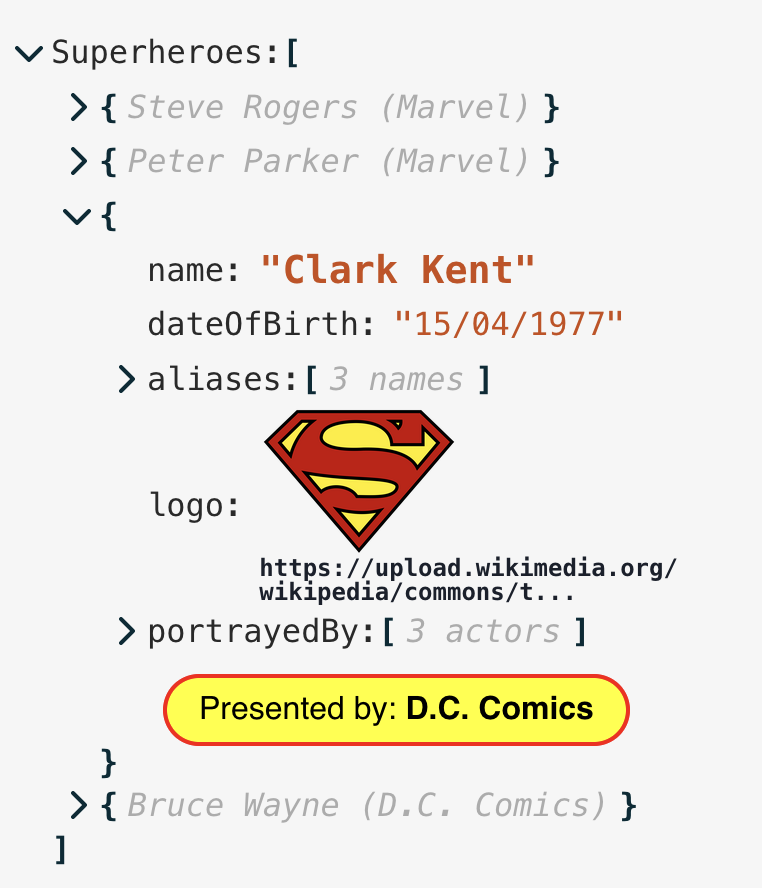
} 您可以用自己的自定義組件替換數據樹中的某些節點。一個示例可能是用於圖像顯示或自定義日期編輯器,或者只是添加一些視覺片段。請參閱交互式演示中的“自定義節點”數據集,以查看其在作用中。 (在其他數據集中編輯ISO字符串時,還有一個自定義日期選擇器。)
自定義節點在customNodeDefinitions Prop中提供,作為以下結構的一系列對象:
 {
  condition ,            // a FilterFunction, as above
  element ,              // React Component
  customNodeProps ,      // object (optional)
  hideKey ,              // boolean (optional)
  defaultValue ,         // JSON value for a new instance of your component
  showOnEdit            // boolean, default false
  showOnView            // boolean, default true
  showEditTools         // boolean, default true
  name                  // string (appears in Types selector)
  showInTypesSelector ,  // boolean (optional), default false

  // Only affects Collection nodes:
  showCollectionWrapper // boolean (optional), default true
  wrapperElement        // React component (optional) to wrap *outside* the normal collection wrapper
  wrapperProps          // object (optional) -- props for the above wrapper component
} condition只是一個過濾器函數,具有相同的輸入參數( key , path , value等),而element是一個反應組件。數據結構中的每個節點都將通過每個條件函數運行,並且任何匹配的任何節點將被您的自定義組件替換。請注意,如果一個節點匹配多個自定義條件(來自多個組件),則將使用第一個條件,因此將其按優先順序將其放在數組中。
該組件將接收與標準節點組件(請參閱代碼庫)的所有相同的道具,但是如果需要,您可以通過customNodeProps對象將其他道具傳遞給組件。演示中使用了自定義日期選擇器的詳盡示例(以及其他幾個更基本的介紹),您可以檢查一下如何利用標準道具和幾個自定義道具。在此處查看源代碼
默認情況下,您的組件將像其他任何值一樣將其屬於屬性密鑰的權利呈現。但是,您可以通過“設置hideKey: true來隱藏密鑰本身,並且自定義組件將進行整個行。 (有關示例,請參見“自定義節點”數據集中的“由”框。)
另外,默認情況下,您的組件將被視為“顯示”元素,即它將出現在JSON查看器中,但是在編輯時,它將恢復為標準編輯接口。但是,通過showOnEdit , showOnView和showEditTools Props,這可以改變這一點。例如,只有在編輯和剩下的AS-IS進行顯示時才需要一個日期選擇器。 showEditTools道具是指在懸停在每個值右側的編輯圖標(複製,添加,編輯,刪除)。如果您選擇禁用這些內容,但您仍然希望組件具有“編輯”模式,則必須提供自己的UI機制來切換編輯。
您可以允許用戶在編輯/添加值時將其選擇為“類型”選擇器中的“類型”來創建特殊節點的新實例。 SET showInTypesSelector: true啟用。但是,如果啟用了此功能,您還需要提供一個name (用戶將在選擇器中看到的內容)和一個defaultValue ,該名稱是用戶選擇此“類型”時插入的數據。 (如果通過condition函數傳遞, defaultValue必須返回true ,以便使用自定義組件立即顯示它。)
一個簡單的自定義組件和定義可以將URL字符串變成可點擊的鏈接,並附有主要軟件包,供您在包裝盒中使用。只是導入和使用:
 import { JsonEditor , LinkCustomNodeDefinition } from 'json-edit-react'

// ...Other stuff
return (
  < JsonEditor
    { ... otherProps }
    customNodeDefinitions = { [ LinkCustomNodeDefinition , ... otherCustomDefinitions ] }
  />
)在大多數情況下,創建自定義節點以匹配值節點(即不是array或object集合節點),這是所有演示示例所顯示的。但是,如果您確實希望針對整個系列節點,那麼還有其他幾件事要知道:
children屬性顯示,它只是您的組件的責任。element道具將顯示在集合支架內(即它作為集合的內容顯示)wrapperElement ,該包裝在集合之外顯示(可以按照wrapperProps如上所述提供道具)。同樣,可以使用React children顯示內部內容(包括您的自定義element )。在此示例中,藍色邊框顯示wrapperElement ,紅色邊框顯示了內部element : 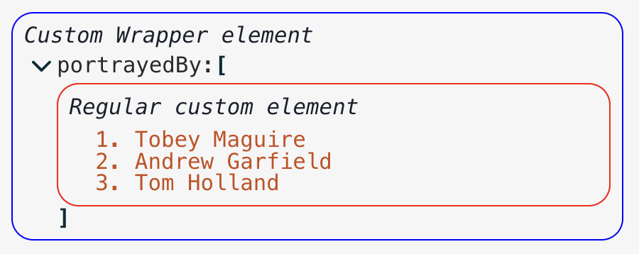
showCollectionWrapper (默認為true ),當設置為false時,它會隱藏周圍的集合元素(即hide/show chevron和括號)。在這種情況下,如果需要的話,您必須在組件中提供自己的隱藏/顯示機制。 可以更改組件顯示的各種文本字符串。您可以將其定位,但也可以指定功能以根據某些條件覆蓋顯示的文本。例如,假設我們希望屬性計數文本(例如6 items (例如6個項目)給出某種類型的節點的摘要,當折疊時看起來很不錯。例如(取自演示):
customText屬性以任何可本地鍵作為鍵的對象,並帶有返回字符串的函數(或null ,這會導致其後備到本地化或默認字符串)。這些功能的輸入與過濾功能相同,因此在此示例中,它將像這樣定義:
 // The function definition
const itemCountReplacement = ( { key , value , size } ) => {
    // This returns "Steve Rogers (Marvel)" for the node summary
    if ( value instanceof Object && 'name' in value )
      return ` ${ value . name } ( ${ ( value ) ?. publisher ?? '' } )`
    // This returns "X names" for the alias lists
    if ( key === 'aliases' && Array . isArray ( value ) )
      return ` ${ size } ${ size === 1 ? 'name' : 'names' } `
    // Everything else as normal
    return null
  }

// And in component props...
. . . otherProps ,
customText = {
  ITEM_SINGLE : itemCountReplacement ,
  ITEMS_MULTIPLE : itemCountReplacement ,
} 上面概述了默認鍵盤控件,但是可以自定義/覆蓋這些控件。只需傳遞keyboardControls孔子支架,您希望覆蓋定義的操作即可。默認配置對像是:
 {
  confirm : 'Enter' ,  // default for all Value nodes, and key entry
  cancel : 'Escape' ,
  objectConfirm : { key : 'Enter' , modifier : [ 'Meta' , 'Shift' , 'Control' ] } ,
  objectLineBreak : 'Enter' ,
  stringConfirm : 'Enter' ,
  stringLineBreak : { key : 'Enter' , modifier : 'Shift' } ,
  numberConfirm : 'Enter' ,
  numberUp : 'ArrowUp' ,
  numberDown : 'ArrowDown' ,
  booleanConfirm : 'Enter' ,
  clipboardModifier : [ 'Meta' , 'Control' ] ,
  collapseModifier : 'Alt' ,
}
如果(例如)您只想將一般的“確認”操作更改為“ CMD-Enter”(在Mac上)或“ Ctrl-Enter”,您只會傳遞:
  keyboardControls = {
    confirm : {
      key : "Enter" ,
      modifier : [ "Meta" , "Control" ]
    }
}注意事項:
stringConfirm , numberConfirm和booleanConfirm指定值,如果它們與您的confirm值有所不同。clipboardModifier )。 即使在大多數情況下可能需要撤消/重做功能,但這並不是組件內置的,其主要原因是:
從軟件包導出了一些可能在您自己的實現(創建過濾器或更新功能或自定義組件)中有用的輔助功能,組件和類型:
themes :包含所有內置主題定義的對象LinkCustomComponent :用於渲染超鏈接的組件LinkCustomNodeDefinition :超鏈接的自定義節點定義IconAdd , IconEdit , IconDelete , IconCopy , IconOk , IconCancel , IconChevron :所有內置圖標組件matchNode , matchNodeKey :用於定義自定義搜索功能的幫助者truncate :功能將字符串截斷為指定的長度。請參閱此處extract :功能是從字符串路徑中提取深嵌套對象值的功能。請參閱此處assign :函數從字符串路徑設置深對象值。請參閱此處ThemeName :字符串字面的內置主題名稱列表Theme :一個完整的主題對象ThemeInput : theme道具的輸入類型JsonEditorProps :JSON編輯器組件的所有輸入道具JsonData :主要data對象 - 任何有效的JSON結構UpdateFunction , OnChangeFunction , OnErrorFunction FilterFunction , CopyFunction , SearchFilterFunction , CompareFunction , TypeFilterFunction , LocalisedString , CustomNodeDefinition ,CustomTextDefinitions,CustomTextDefinitions, CustomTextDefinitions ,CustomTextFunction, CustomTextFunction ,TranslateFunction :獲取本地化鍵並返回翻譯的字符串的函數IconReplacements : icons prop的輸入類型CollectionNodeProps :所有道具內部傳遞給“集合”節點(即對象/數組)ValueNodeProps :所有道具內部傳遞給“ value”節點(即不是對象/數組)CustomNodeProps :所有道具內部傳遞給自定義節點;基本上,與CollectionNodeProps相同,帶有一個額外的customNodeProps字段,用於通過組件獨有的道具DataType : "string" | "number" | "boolean" | "null" | "object" | "array"KeyboardControls :鍵盤自定義道具的結構請打開一個問題:https://github.com/carlosnz/json-edit-react/issues
我想介紹的主要功能是:
該組件受到React-Json-View的啟發,這是我在自己的項目中使用的很棒的軟件包。但是,它似乎現在已經被放棄了,需要一些關鍵的修復程序,因此我決定從頭開始創建自己的工作,並擴展我的功能。
defaultValue函數將新key作為第二個參數overflow: clip設置true以表示成功setData Prop以阻止內部數據狀態管理的依賴useEffect掛鉤null #90時的錯誤修復onError回調可用於自定義錯誤處理rootFontSize prop以設置組件的“基礎”大小onChange Prop以允許用戶輸入鍵入驗證/限制data (防止不必要觸發撤消)wrapperElement道具id道具indexdefaultValue Prop的函數

