Based on daily development experience and relevant information on the Internet, the difference between adaptive and responsive is analyzed in simple and easy-to-understand vernacular. Note: This article only analyzes the difference between adaptive and responsive and understands the background of its origin. It does not discuss the methods of using it.
1. What is adaptive layout?
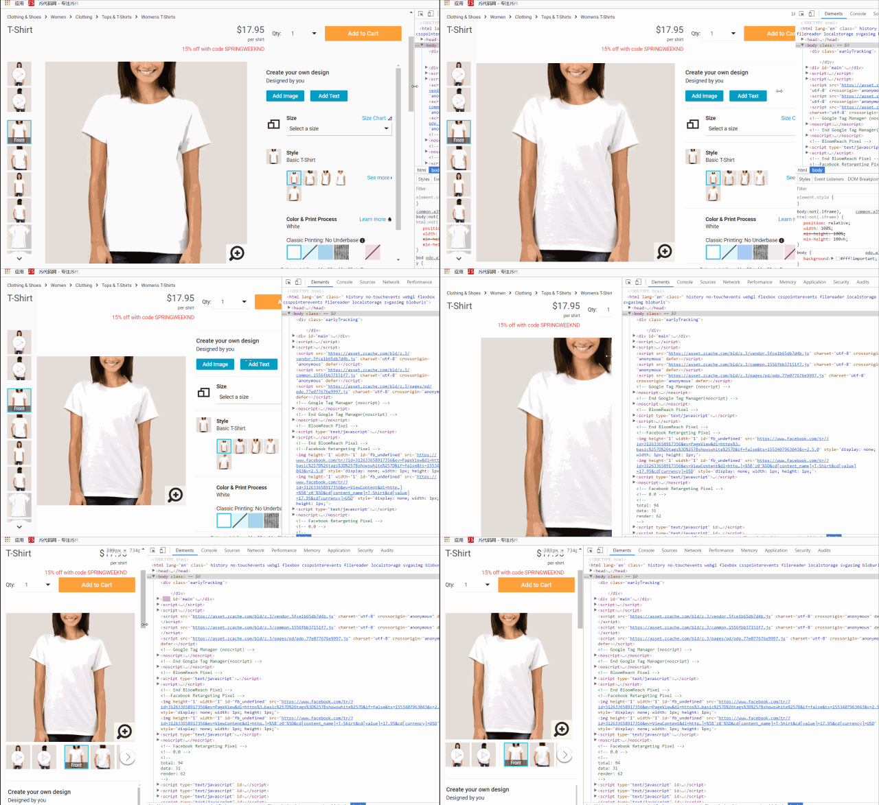
Adaptive layout is a width-adaptive layout. On devices of different sizes, the web page scales its width in an equal proportion, presenting the same main content and layout.
Adaptive layout demonstration diagram:

As the screen width scales, the content of the web page also scales in equal proportions. Regardless of the screen width, the layout of the main body of the web page is always the same.
2. What is responsive layout?
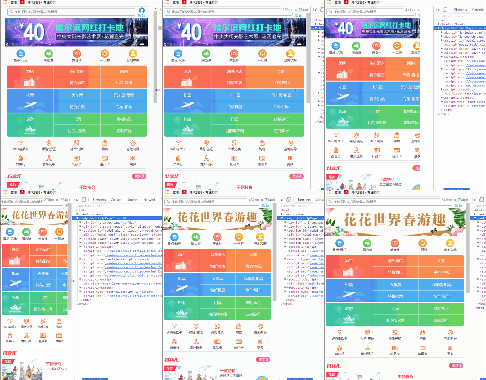
Responsive layout means that the content layout of the page will automatically adjust and change according to changes in screen size, providing a better user experience.
Responsive layout demo image:

As the screen width scales, the page will adjust accordingly, and the layout and displayed content will change.
1. The background of adaptive layout
In the early days of the PC era, web designers would design fixed-width pages. In the beginning, computer monitors did not have many types of resolutions because there were few computers at the time. Later, with the increasing variety of monitors and the popularity of notebooks and tablets, problems with this fixed-width page arose. So a new layout method emerged, width-adaptive layout. The adaptive layout we usually talk about mostly refers to the width adaptive layout.
Later, the Internet war moved from PCs to mobile phones, and the HTML5 standard was released. Adaptive layout has also extended from PC to mobile phones. As a result, adaptive layout has become popular and has become a necessary requirement for web design.
2. The background of the emergence of responsive layout
Although adaptability has become a necessary requirement for web design, it still exposes a problem. If the screen is too small, even if the web content can be adapted to the screen size, when viewed on a small screen, the content will feel too crowded, which reduces the user experience. . At this time, the concept derived to solve this problem is responsive layout. It automatically recognizes screen width and adjusts accordingly. The layout and displayed content of the web page will be subject to change.
The above is the entire content of this article. I hope it will be helpful to everyone’s study. I also hope everyone will support downcodes.com.