react native checkbox tree
1.0.0
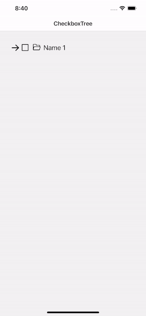
React Native 用のシンプルでエレガントなチェックボックス ツリー。 React-native-vector-icons を使用して実装
npm install react - native - checkbox - tree -- saveまたは
yarn add react - native - checkbox - tree次に、react-native-vector-icons をインストールする必要があります。
npm install react - native - vector - icons -- saveまたは
yarn add react - native - vector - icons react-native-template-components React Native の美しいテンプレート。

| 小道具 | パラメータ | 必須です | 説明 |
|---|---|---|---|
| データ | 配列 | はい | データはプレーンな配列です |
| テキストフィールド | 弦 | はい | データ項目からラベルを抽出します |
| 子フィールド | 弦 | はい | データ項目からフィールドの子を抽出します。 |
| onSelect | (アイテム[])=> 無効 | はい | 選択コールバック |
| スタイル | ビュースタイル | いいえ | コンテナビューのスタイル設定 |
| テキストスタイル | テキストスタイル | いいえ | テキストのスタイル設定 |
| アイコンサイズ | 番号 | いいえ | アイコンのサイズをカスタマイズする |
| アイコン色 | 弦 | いいえ | アイコンの色をカスタマイズする |
| autoSelectChilds | ブール値 | いいえ | 項目を選択するときに自動的に子を選択します。デフォルトは true です。 |
| autoSelectParents | ブール値 | いいえ | すべての子が選択されている場合に親を自動的に選択します。デフォルトは true |
| 開くアイコン | 要素 | いいえ | 開くアイコンをカスタマイズします。反応ネイティブベクターアイコンのみを使用する |
| 閉じるアイコン | 要素 | いいえ | 閉じるアイコンをカスタマイズします。反応ネイティブベクターアイコンのみを使用する |
| チェックアイコン | 要素 | いいえ | チェックアイコンをカスタマイズします。反応ネイティブベクターアイコンのみを使用する |
| チェックアイコンを解除する | 要素 | いいえ | チェックを外すアイコンをカスタマイズします。反応ネイティブベクターアイコンのみを使用する |
| renderItem | (item, isSelect, isOpen, onOpen, onClose, onSelect)=> 要素 | いいえ | データから項目を取得してリストにレンダリングします。 |
| API | 説明 |
|---|---|
| クリア | データを更新する |
| setSelectedItem | 入力値は onSelect から返された結果です |

 import React , { useEffect , useRef , useState } from 'react' ;
import { StyleSheet , Text , TouchableOpacity , View } from 'react-native' ;
import CheckboxTree from 'react-native-checkbox-tree' ;
import AntDesign from 'react-native-vector-icons/AntDesign' ;
import Ionicons from 'react-native-vector-icons/Ionicons' ;

const recursiveData = [
  {
    shopReportName : 'Name 1' ,
    shopCode : '00001' ,
    shopType : '2' ,
    shopId : 1 ,
    shopName : 'Name 1' ,
    childs : [
      {
        shopReportName : 'Name 2' ,
        shopCode : '00002' ,
        shopType : '3' ,
        shopId : 2 ,
        shopName : 'Name 2' ,
        childs : [
          {
            shopReportName : 'Name 3' ,
            shopCode : '00003' ,
            shopType : '4' ,
            shopId : 3 ,
            shopName : 'Name 3' ,
            childs : [
              {
                shopReportName : 'Name 4' ,
                shopCode : '00004' ,
                shopType : '4' ,
                shopId : 4 ,
                shopName : 'Name 4' ,
              } ,
              {
                shopReportName : 'Name 5' ,
                shopCode : '00005' ,
                shopType : '4' ,
                shopId : 5 ,
                shopName : 'Name 5' ,
                childs : [
                  {
                    shopReportName : 'Name 6' ,
                    shopCode : '00006' ,
                    shopType : '4' ,
                    shopId : 7 ,
                    shopName : 'Name 6' ,
                    childs : [
                      {
                        shopReportName : 'Name 7' ,
                        shopCode : '00007' ,
                        shopType : '4' ,
                        shopId : 7 ,
                        shopName : 'Name 7' ,
                      } ,
                    ] ,
                  } ,
                ] ,
              } ,
              {
                shopReportName : 'Name 8' ,
                shopCode : '00008' ,
                shopType : '4' ,
                shopId : 8 ,
                shopName : 'Name 8' ,
              } ,
            ] ,
          } ,
        ] ,
      } ,
    ] ,
  } ,
] ;

export interface Props { }

const CheckboxTreeScreen : React . FC < Props > = _props = > {
  const [ data ] = useState < any [ ] > ( recursiveData ) ;
  const ref : any = useRef ( ) ;

  useEffect ( ( ) => {
    if ( ref && ref . current ) {
      ref . current . setSelectedItem ( [
        {
          shopReportName : 'Name 1' ,
          shopCode : '00001' ,
          shopType : '2' ,
          shopId : 1 ,
          shopName : 'Name 1' ,
        } ,
        {
          shopReportName : 'Name 2' ,
          shopCode : '00002' ,
          shopType : '3' ,
          shopId : 2 ,
          shopName : 'Name 2' ,
        } ,
      ] ) ;
    }
  } , [ ref ] ) ;

  return (
    < View style = { styles . container } >
      < CheckboxTree
        ref = { ref }
        data = { data }
        textField = "shopName"
        childField = "childs"
        textStyle = { { color : 'black' } }
        iconColor = "black"
        iconSize = { 26 }
        openIcon = { < AntDesign name = "arrowdown" size = { 26 } /> }
        closeIcon = { < AntDesign name = "arrowright" size = { 26 } /> }
        renderItem = { ( { item , isSelect , isOpen , onOpen , onClose , onSelect } ) => (
          < View style = { styles . wrapItem } >
            { isOpen ? (
              < TouchableOpacity onPress = { onClose } >
                < AntDesign size = { 30 } name = "arrowright" />
              </ TouchableOpacity >
            ) : (
              < TouchableOpacity onPress = { onOpen } >
                < AntDesign size = { 30 } name = "arrowdown" />
              </ TouchableOpacity >
            ) }
            < TouchableOpacity onPress = { onSelect } >
              < Ionicons
                size = { 26 }
                name = { isSelect ? 'checkbox-outline' : 'square-outline' }
              />
            </ TouchableOpacity >
            < Text style = { styles . name } > { item . shopName } </ Text >
          </ View >
        ) }
        onSelect = { item => {
          console . log ( `Selected ${ item . length } item` ) ;
        } }
      />
    </ View >
  ) ;
} ;

export default CheckboxTreeScreen ;

const styles = StyleSheet . create ( {
  container : {
    flex : 1 ,
    padding : 20 ,
  } ,
  wrapItem : {
    flexDirection : 'row' ,
    alignItems : 'center' ,
    marginVertical : 8 ,
  } ,
  icon : {
    marginHorizontal : 8 ,
  } ,
  name : {
    fontSize : 20 ,
    marginLeft : 8 ,
  } ,
} ) ; 
  import React from 'react' ;
  import { StyleSheet , View } from 'react-native' ;
  import CheckboxTree from 'react-native-checkbox-tree' ;
  import AntDesign from 'react-native-vector-icons/AntDesign' ;

  const recursiveData = [
    {
      shopReportName : 'Name 1' ,
      shopCode : '00001' ,
      shopType : '2' ,
      shopId : 1 ,
      shopName : 'Name 1' ,
      childs : [
        {
          shopReportName : 'Name 2' ,
          shopCode : '00002' ,
          shopType : '3' ,
          shopId : 2 ,
          shopName : 'Name 2' ,
          childs : [
            {
              shopReportName : 'Name 3' ,
              shopCode : '00003' ,
              shopType : '4' ,
              shopId : 3 ,
              shopName : 'Name 3' ,
              childs : [
                {
                  shopReportName : 'Name 4' ,
                  shopCode : '00004' ,
                  shopType : '4' ,
                  shopId : 4 ,
                  shopName : 'Name 4' ,
                } ,
                {
                  shopReportName : 'Name 5' ,
                  shopCode : '00005' ,
                  shopType : '4' ,
                  shopId : 5 ,
                  shopName : 'Name 5' ,
                  childs : [
                    {
                      shopReportName : 'Name 6' ,
                      shopCode : '00006' ,
                      shopType : '4' ,
                      shopId : 7 ,
                      shopName : 'Name 6' ,
                      childs : [
                        {
                          shopReportName : 'Name 7' ,
                          shopCode : '00007' ,
                          shopType : '4' ,
                          shopId : 7 ,
                          shopName : 'Name 7' ,
                        } ,
                      ] ,
                    } ,
                  ] ,
                } ,
                {
                  shopReportName : 'Name 8' ,
                  shopCode : '00008' ,
                  shopType : '4' ,
                  shopId : 8 ,
                  shopName : 'Name 8' ,
                } ,
              ] ,
            } ,
          ] ,
        } ,
      ] ,
    } ,
  ] ;

  const CheckboxTreenScreen = _props => {
    return (
      < View style = { styles . container } >
        < CheckboxTree
          data = { recursiveData }
          textField = "shopName"
          childField = "childs"
          textStyle = { { color : 'black' } }
          iconColor = "black"
          iconSize = { 26 }
          openIcon = { < AntDesign name = "arrowdown" size = { 26 } /> }
          closeIcon = { < AntDesign name = "arrowright" size = { 26 } /> }
          checkIcon = { < View /> }
          unCheckIcon = { < View /> }
          renderItem = { item => (
            < View style = { styles . wrapItem } >
              < AntDesign
                style = { styles . iconItem }
                name = "folderopen"
                size = { 20 }
              />
              < Text style = { styles . text } > { item . shopName } </ Text >
            </ View >
          ) }
          onSelect = { item => {
            console . log ( `Selected ${ item . length } item` ) ;
          } }
        />
      </ View >
    ) ;
  } ;

  export default CheckboxTreenScreen ;

  const styles = StyleSheet . create ( {
    container : {
      flex : 1 ,
      paddingVertical : 40 ,
    } ,
    wrapItem : {
      flexDirection : 'row' ,
      marginVertical : 8
    } ,
    text : {
      fontSize : 18
    } ,
    iconItem : {
      marginHorizontal : 8
    }
  } ) ;

