Monu
典迹⼋⼀・MonuAug1 test.8.1.2
A series of integrated practical fonts produced from 2019 for specific purposes and original ingredients. Monu is the abbreviation of Monument.
These fonts initially addressed personal needs in a certain aspect, and they could be used, so some of them have never been disclosed. Now it is displayed in case someone needs it.
Most of them are OFL1.1 protocols, and the window system can right-click on the font > Properties > Details > License description to view.
It contains the following characters, which are mostly in the sans serif style. You can click the menu button [icon shaped like ⋮≡] not far above this page to jump quickly.
 2 words
 Variable word weight
Purpose: It is matched with Microsoft's Yahei Chinese characters as a system font. Only conventional and bold texts are disclosed, limited variable italics are not disclosed.
At first, it integrates the open source font Montserrat, but it does not have symbols such as Greek letters. I made a set of them and expanded other glyphs and features such as pseudonyms...
introduce:
 1 file
Purpose: Supports unified code to encode all characters that can be encoded now and in the future, so it must be the largest single font in the world (one of them), used to be at the bottom of the system.
Integrated from the open source font Noto series, of course, many of them were originally created by me before Noto.
Undefined plan: "Rules are progressing and Ctrl Next", take out some of my original matching Rule Series from the end of the dictionary.
introduce:
 3 words
Uses are as described. Previously unpublished versions have already been used as subtitles by B station up, and the name is also consistent with the OpenType layout feature titl
introduce:
 2 files
introduce:
 3 files
introduce:
 1 file
introduce:
 1 file, old version of the glyph
introduce:
 1 file
introduce:
Note
The following is not disclosed.
 Several files
Purpose: Display codes containing Chinese characters, as the program's default monospace font, supports limited code hyphens (such as <!-- ), and upright freehand styles.
Future plan: Complete the set of 4 necessary to display the code: regular, bold , italic , bold italic .
 1 file
Purpose: Displays as much content as possible within a limited width, such as for Everything to display file names.
Future plan: Rework narrow-style Western language and pseudonyms.
Note
The following is not very common.
 3 words
 3 characters + 1 regular circle
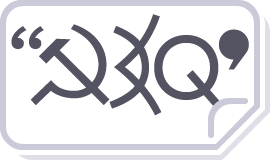
Specially used for vertical comic inline fonts and original comic symbol fonts.
The former is integrated from open source fonts Future Black Wêlai Glow Sans and my Ctrl Ordn and Monu, the latter is original and matched with each other.
Future plan: Use Ctrl Joke to switch to Western languages for a 90° vertical row to meet the needs of long Western languages.
Introduction to B station:
 1 bold
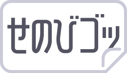
Use: Simulate the "Classic" Japanese comics with a mixed pattern of bold Chinese characters and rough regular Kanna. Antique (antique, antique)
The consideration of the Chinese name of the font is ⸺Antic≈Joke: humor (comic), Antique: antique (replica).
Integrate Ctrl Joke and open source fonts.
Future plans: selectively blended with the black and manga symbols, or used to design comic inline fonts with horizontal rows in proportion to the bold vertical rows and thick regular kana. The name is: "Dianji Longman"
introduce:
Note
The following is the dictionary series.
 1 file
Purpose: Show those symbols that are specified as colored by the unified code? In fact, it is not integrated, it is completely original by me?
introduce:


