ThenKhung
1.0.0
"UoqMunThenKhung" is an open source font suitable for the traditional Chinese environment. It is based on the "Xiexing" font developed by Japan's "Xiexing Project", and is modified to traditional Chinese characters based on the recommended shape of the inherited font standardization file, and supplements the missing Chinese characters.
The latest version is currently version 1.000, released on December 24, 2023. The 5401 words of the Big-5 code "Common Character Area" have been completed and reorganized.
? Yuwen Tianqiong Version 1.000 Download?
Download method: After clicking on the link, press the "Download raw file" button in the upper right corner of the "View raw" column (as shown in the red circle in the figure below). 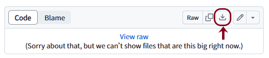
Japan's "Xingxing Project" has developed the "Xingxing" series of open source fonts since 2016, including four thicknesses: Regular, Medium, Bold, and Extrabold. The designer is Kazuo Kanei. The font design can be said to be a combination of the characteristics of bright, black, circle and some calligraphy. The horizontal thin horizontally and thick vertically and the small circle at the end of the horizontal pen are obviously derived from the body. But the upper left corner, upper right corner and lower left corner are clean and refreshing. The curves of the lower right corner and strokes such as strokes such as strokes, strokes, and hooks are combined with the softness and affinity of round characters and even regular script. The original font also has several different styles of kana and Chinese characters for users to choose from. Only the Chinese characters are made with the characters used in Japan as a rope, and only Chinese characters in the Adobe-Japan1-3 range are made, which is not suitable for daily Chinese applications.
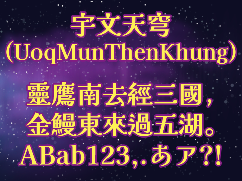
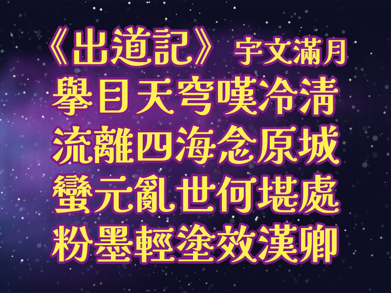
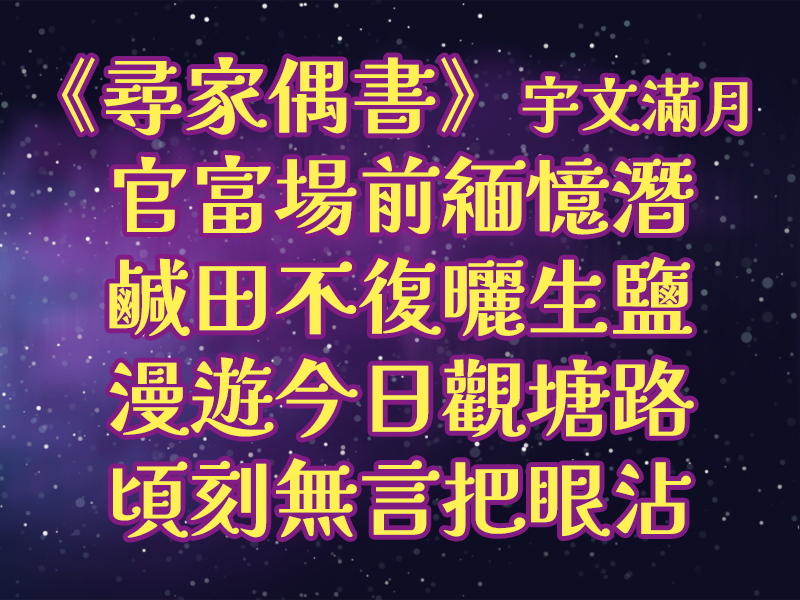
When choosing the main font used by Hong Kong VTuber Yuwen Manyue, he saw that this font is suitable for beauty and harmony, which can not only be elegant but also be friendly. Its small round characteristics also make people think of the starry sky and the universe, so he decided to transform this Japanese font into a traditional Chinese font based on the spirit of open source. Considering the time and ability that an individual can put in, Man Yue first selects a set of fonts in the entire series to modify them. After combining various factors, the full moon selected the thickness of the thickness and matched with the Opti style pseudonym as the basis, and changed it to the font "Yuwen Tianqiong".
At present, Yuwen Manyue has completed and restructured the 5401 words of the Big-5 code "common character area", and will be released publicly first for the public. It will continue to be added and modified in the future.
During the production process, I received the assistance of Ichiro Naiki and Tong Lange. Some of the characters were also referenced to the "Jiangcheng Jiexing" set up in simplified Chinese and reorganized by Liu Peng. I would like to thank you.
The Chinese characters have always been shaped and have different shapes. The aesthetic needs of printing or screen display designs are different from the aesthetic angles of handwritten calligraphy. Traditional regular characters that conform to the origin of characters and vulgar variants that are convenient to write also have their own points. In areas where traditional Chinese and traditional Chinese are used, there are also different educational and non-educational standards or references. These standards or references have their own positions, and have different applicable and unapplicable occasions, which may sometimes make people lose their sense of one thing.
Considering that this font is a printing or screen display design, although it combines some writing characteristics, it still uses printing fonts such as Ming and Hei as the main axis. When making traditional Chinese versions, it mainly refers to the traditional printing font, namely "inheritance font" (or "old font"), and is based on the standardized documents for inheritance font maintained by the open source organization "Dianzifang". Its recommended shape balances the considerations of word source, design aesthetics and conventions, and will not ignore other needs for one of them, which is complete. The recommended shape is also quite consistent with the traditional printed characters seen in various places, and is suitable for all areas, making it convenient for cross-regional applications.
Only because the shape of this character is not completely consistent with the bright and bold, and in response to its design requirements and comprehensive considerations, it has some differences from the recommended shapes on the standardized documents of the inherited characters. include:
Regarding the question of this font, it can be raised on the issue of this project.
Full Moon itself is VTuber, and is active on YouTube and social media on weekdays. Welcome to browse the links of Full Moon: http://lit.link/moonlitowen, subscribe to the Full Moon YouTube channel and social media to track the Full Moon??


