SwiftUIBuddy
ved the README
SwiftUIBuddy is a collection of beautiful, easy-to-use components for your SwiftUI App. It contains custom Buttons, Pickers, Progress Views, Text Fields, and so much more! All of the components are highly customizable and built using 100% SwiftUI.
The framework was designed with simplicity and functionality in mind. It strives to resemble Apple's design style and follow Human Interface Guidelines. For increased stability, SwiftUIBuddy does not depend on any 3rd party libraries or frameworks and is written only using native components provided by SwiftUI.
How to use SwiftUIBuddy Components:
StandardButton

StandardButton("Standard Button") {
    print("Button Tapped")
}
DestructiveButton
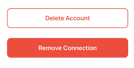
DestructiveButton("Delete Account", style: .bordered) {
    deleteAccount()
}

DestructiveButton("Remove Connection") {
    removeConnection()
}
PlusButton

PlusButton(color: .cyan) {
    addNewFile()
}
DismissButton

DismissButton {
    showingSheet = false
} CapsuleProgressBar

CapsuleProgressBar(currentStage: 4, totalStages: 5) LoadingSpinner

LoadingSpinner() LoginField
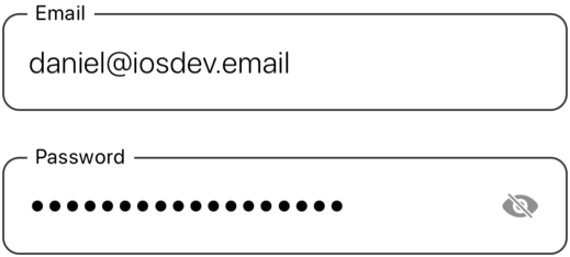
LoginField("Email", text: $email)
LoginField("Password", text: $password, fieldType: .password)
DollarTextField
DollarTextField(9.40, amount: $price) TwitterPicker

TwitterPicker(choices: ["Ramen", "Miso", "Pho"], selectedIndex: $soup) RadioPicker
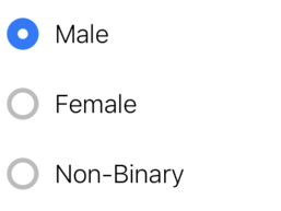
RadioPicker(choices: ["Male", "Female", "Non-Binary"], selectedChoice: $gender) Spacers
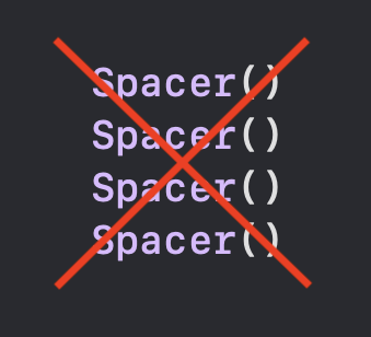

Spacers(4) Dividers
Dividers(6)import SwiftUIBuddyThe minimum deployment target is iOS 15.0. This project is a work-in-progress, so expect it to grow, and feel free to contribute.


