Mobile Development
1.0.0
Refers to the diagonal length of the screen, in inches. Common sizes include: 3.5 inch, 4.0 inch, 5.0 inch, 5.5 inch, 6.0 inch, etc.
Note: 1 inch (inch) = 2.54 cm (cm)
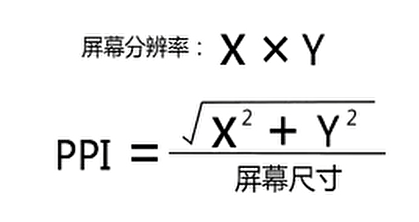
It refers to the total number of physical pixel points on the screen in the horizontal and vertical directions, which is generally represented by n * m. For example: The screen resolution of iPhone6 is: 750 * 1334
| model | Resolution (sum of physical pixels) |
|---|---|
| iPhone 3G/3GS | 320 * 480 |
| iPhone 4 / 4s | 640 * 960 |
| iPhone 5/5s | 640 * 1136 |
| iPhone 6/7/8 | 750 * 1334 |
| iPhone 6p / 7p / 8p | 1242 * 2208 |
| iPhone X | 1125 * 2436 |
| HAWEI P30 | 1080 * 2340 |
| HAWEI Mate40 | 2772 * 1344 |
| Xiaomi 10 | 2340 * 1080 |
| Xiaomi 11 | 3200 * 1440 |
Also known as: screen pixel density, it refers to the number of physical pixel points contained in each inch on the screen. The unit is ppi (pixels per inch). In fact, there is another unit dpi (dots per inch). The calculation methods of the two values are the same, but the use scenarios are different. ppi is mainly used to measure screens, and dpi is mainly used to measure printers, projectors, etc.
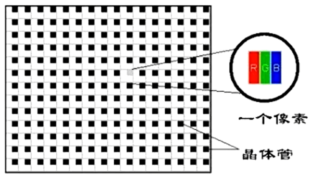
Physical pixels, also known as device pixels , are a unit of length (px). A physical pixel is a physical imaging point on the screen, which is a tiny luminescent physical component (which can be simply understood as a super tiny light bulb), which is the minimum granularity that the screen can display. The physical number of pixel points (resolution) of the screen is an important parameter of the mobile phone screen and is determined by the screen manufacturer and cannot be modified after production . For example, the physical pixels that iPhone6 has in the horizontal direction are 750, and the physical pixels that have in the vertical direction are 1334, which is represented by 750*1334.
css pixel is also known as: logical pixel. The css pixel is an abstract unit of length, and the unit is also px. It is created for web developers to accurately measure the content size on a web page. We use css pixels in writing cssjsless.
Device-independent pixels are referred to as DIP or DP (device-independent pixel), also known as: screen density-independent pixels.
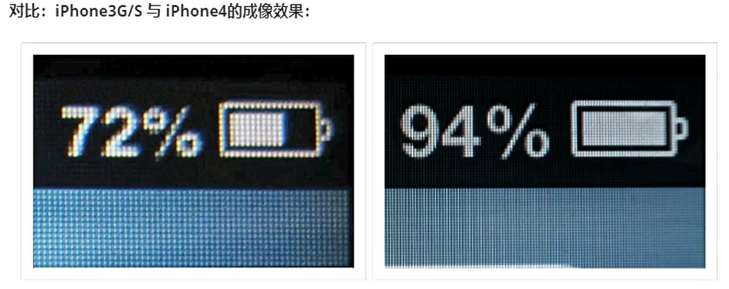
Introduction: In the era when [HD screen] did not appear, 1 css pixel corresponds to 1 physical pixel, but since the emergence of [HD screen], the two are no longer a 1-to-1 relationship. In 2010, Apple launched a new display standard: compress more physical pixel points into a screen while the screen size remains unchanged , so that the resolution will be higher and the display effect will be better and more delicate. Apple calls this screen: Retina screen (also known as Retina screen) , and at the same time launched the epoch-making digital product equipped with this screen - the iPhone 4.
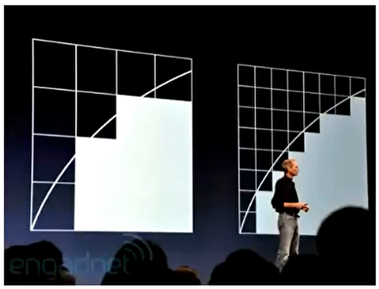
The programmer wrote: width=2px, height=2px box. If a css pixel directly corresponds to 1 physical pixel, since the screen size of iPhone3G/S and iPhone4 are the same as that of iPhone4, the screen of iPhone4 can accommodate more physical pixels, so the physical pixels of iPhone4 are much smaller than that of iPhone3G/S. In theory, this box will be much smaller on the iPhone4 screen than on the iPhone3G/S screen. The fact is that iPhone3G/S is the same size as iPhone4! ! ! , but the iPhone 4 is more delicate and clear. How to do it? This depends on the independent pixels of the device. 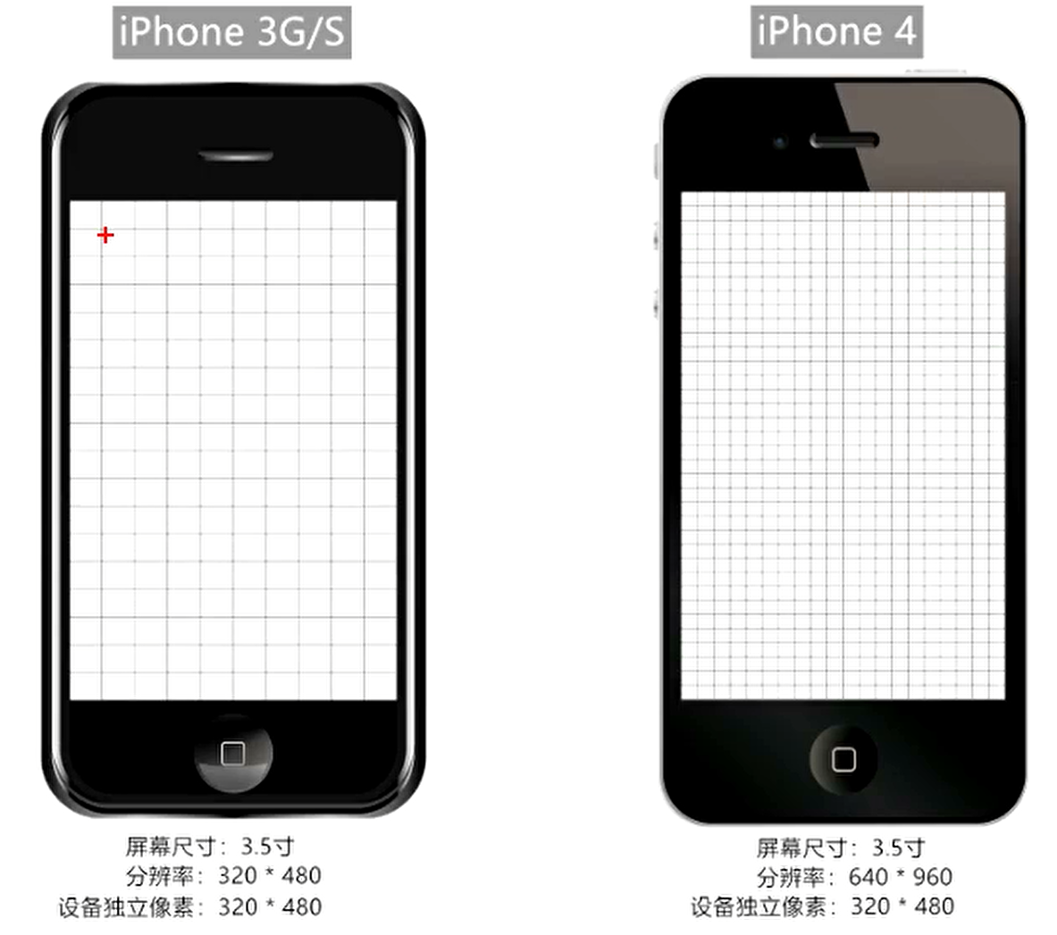
The emergence of independent pixels of the device makes elements have normal sizes even on the [HD screen]. S makes the code not affected by the device. It is set by the device manufacturer according to the screen characteristics and cannot be changed.
Pixel ratio (dpr, device pixel ratio): the ratio of [physical pixel] and [device independent pixel] in a single direction. That is: dpr = physical pixels/device independent pixels
| model | Resolution (sum of physical pixels) | Device independent pixels (dip or dp) | Pixel ratio (dpr) |
|---|---|---|---|
| iPhone 3G/3GS | 320 * 480 | 320 * 480 | 1 |
| iPhone 4 / 4s | 640 * 960 | 320 * 480 | 2 |
| iPhone 5/5s | 640 * 1136 | 320 * 568 | 2 |
| iPhone 6/7/8 | 750 * 1334 | 375 * 667 | 2 |
| iPhone 6p / 7p / 8p | 1242 * 2208 | 414 * 736 | 3 |
| iPhone X | 1125 * 2436 | 375 * 812 | 3 |
https://uiiiiii.com/screen/index.htm
Bitmap and vector diagrams
A bit image pixel is also a unit of length. A bit image pixel can be understood as a "small grid" in a bitmap, which is the smallest unit of a bitmap.
At present, only the logo needs to be displayed in high definition, or the svg format logo can be provided to solve the problem. Otherwise, media query is used:
 @media screen and ( -webkit-min-device-pixel-ratio : 2 ) {
      . logo {
        content : url (.. / imgs / logo@ 2 x.jpg)
      }
    }
@media screen and ( -webkit-min-device-pixel-ratio : 3 ) {
  . logo {
    content : url (.. / imgs / logo@ 3 x.jpg)
  }
}On the PC side, the default width of the viewport is the same as the width of the browser window. In the css standard document, the viewport is also called: initially containing blocks, which is the root cause of all css percentage width calculations. On the PC side, the width can be obtained in the following ways:
    console . log ( '最干净的显示区域' , document . documentElement . clientWidth ) ; // 常用
    console . log ( '最干净的显示区域+滚动条' , window . innerWidth ) ;
    console . log ( '最干净的显示区域+滚动条+浏览器边框' , window . outerWidth ) ;
console . log ( '与浏览器无关,当前设备显示分辨率横向的值' , screen . width ) ; On mobile devices, browser manufacturers face a relatively big problem: how do they present tens of thousands, even hundreds of millions of PC web pages on mobile devices in a complete manner without horizontal scroll bars? Then we need to introduce three concepts of mobile terminals: 1. Layout viewport, 2. Visual viewport, 3. Ideal viewport
Used to solve the problem of early page display on mobile phones. In the early days, we did this: the width of PC web pages is generally: 960px The range of 1024px, even if it exceeds this range, 960px The 1024px area is still the location of the main body.
Browser manufacturers have designed a container for mobile devices. First, use this container to hold the web page on the PC. The width of this container is generally 980px . Different devices may differ, but the difference is not large. Then, the container is compressed equally proportionally to the same width as the mobile phone, so that there is no scroll bar and the page can be fully presented. However, there are still problems doing this: the content of the web page is compressed too small, which seriously affects the user experience.
How to get layout viewports on the mobile terminal: document.documentElement.clientWidth (usually 980px, iPad Pro is 1024px)
Note: After the layout viewport is compressed, the horizontal width is no longer 375px, but 980px, because the layout viewport is compressed, not intercepted.
The visual viewport is the area visible to the user. Its absolute width is always as wide as the device screen, but the value of the css pixels contained in this width varies. For example: Generally, mobile phones will put 980 css pixels into the visual viewport (visual viewport size = layout viewport size) , while iPad Pro will put 1024 css pixels into the visual viewport.
The way to obtain visual viewport on the mobile terminal: window.innerWidth , but it cannot be correctly obtained in Android 2, Opera mini, and UC8. (Generally, the visual viewport is not viewed through the code)
If you take the iPhone 6 as an example, describe the screen:
A layout viewport that is equal to the width of the screen (dp/dip) is called an ideal viewport, so it can also be said that an ideal viewport is a standard: the layout viewport width and the screen (dp/dip) are achieved by meta tags.
Specific methods to set up an ideal viewport:
< meta name =" viewport " content =" width=device-width " >【Summarize】:
1. Description screen: physical pixels: 750p×, device independent pixels: 375px, css pixels: 980px. 2. Advantages: The rendering effect of elements on different devices is almost the same, because they are scaled by layout containers, such as 200 wide boxes: 200/980 3. Disadvantages: The elements are too small, the page text is unclear, and the user experience is not good.
1. Description screen: physical pixels: 750px, device independent pixels: 375px, css pixels: 375px. 2. Advantages: The page is clearly displayed, the content is no longer as small as difficult to observe, and the user experience is better. 3. Disadvantages: The same element has different rendering effects on different screens (devices). For example, the 375-wide box: 375/375 and 375/414 (not equal-to-equivalent display). 4. How to solve it: make adaptation.
When zooming in:
Reduce the size:
Algorithm process: When enlarging, the browser intercepts a certain proportion of area inward, and then immediately fills the remaining picture with equal proportions to the entire viewport, and the elements that cannot be put down will be automatically wrapped.
Monitoring script:
 console . log ( 'pc端视口为:' , document . documentElement . clientWidth )
// pc端, onresize监测的是视口的变化(初识包含块)
window . onresize = ( ) => {
  console . log ( 'pc端视口为:' , document . documentElement . clientWidth )
} When zooming in:
Note: Mobile scaling will not affect the page layout, because the layout viewport size does not change during scaling.
The meta-viewport tag was introduced by Apple in 2007 to control the mobile layout viewport, attempting to change the industry rules of the 980 layout viewport. Viewport related options:
width value can be device-width or specific value, but some Android phones do not support specific value, and the full IOS series supports
width=device-width, initial-scale=1.0 is written together.Maximum scale allowed for user scaling [safari does not support] maximum-scale = screen width (dip independent pixels, dip) / visual viewport width
Maximum scale that allows user to scale minimum-scale = Screen width (dip independent pixels, dip) / visual viewport width
Whether to allow users to zoom the page through their fingers [safari does not support]
Setting to cover can solve the problem of white space in [notch screen]
< meta name =" viewport " content =" width=device-width, initial-scale=1.0, maximum-scale=1.0, user-scalable=0, shrink-to-fit=no, viewport-fit=cover " >1. Why do you need to adapt? Due to the different screen sizes of mobile devices, there will be: the same element will show different effects on two different phones (different proportions). If the same element is displayed on different devices, it needs to be adapted. No matter what adaptation method is used, the central principle is always: equal comparison!
There are three mainstream adaptation methods:
Em and rem are both length units in css. And both are relative length units, but the two are a bit different
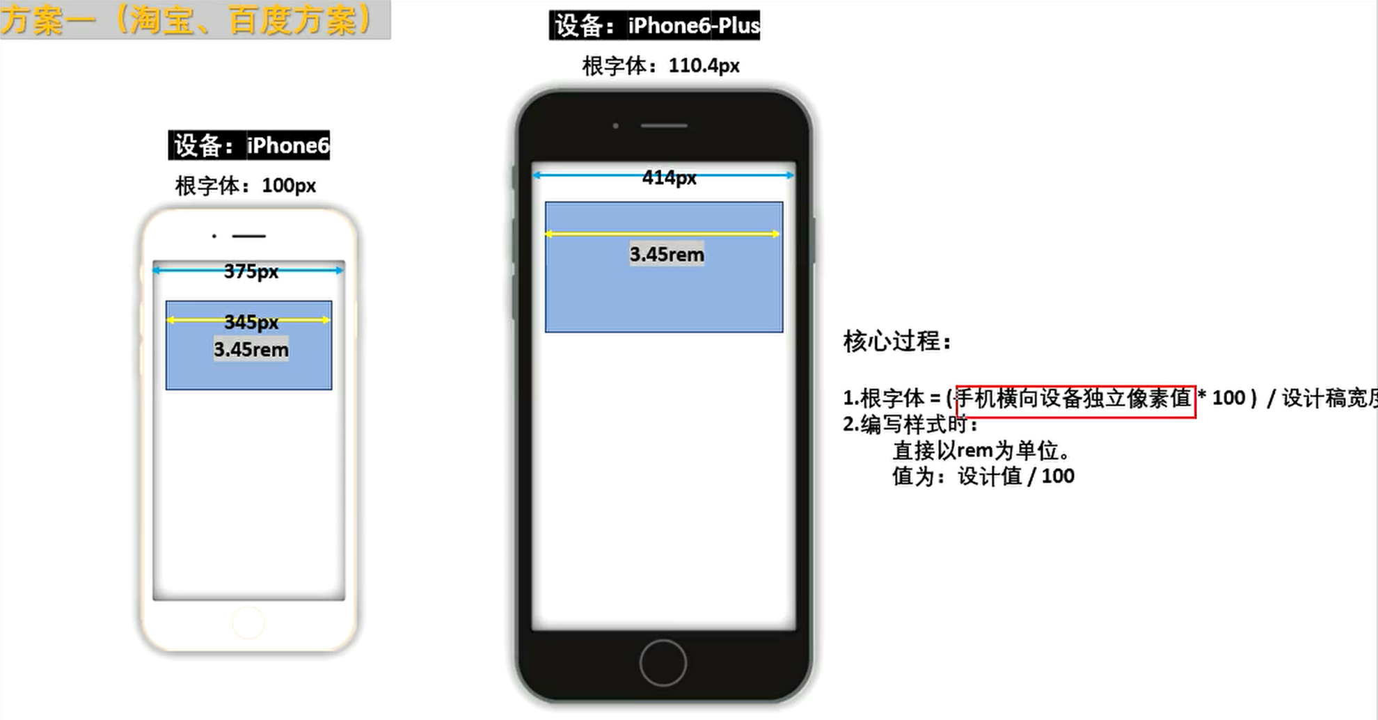
Under the ideal viewport, the design draft (dip is 375px) is used as the standard and the root font is 100px to match the dip of other devices.
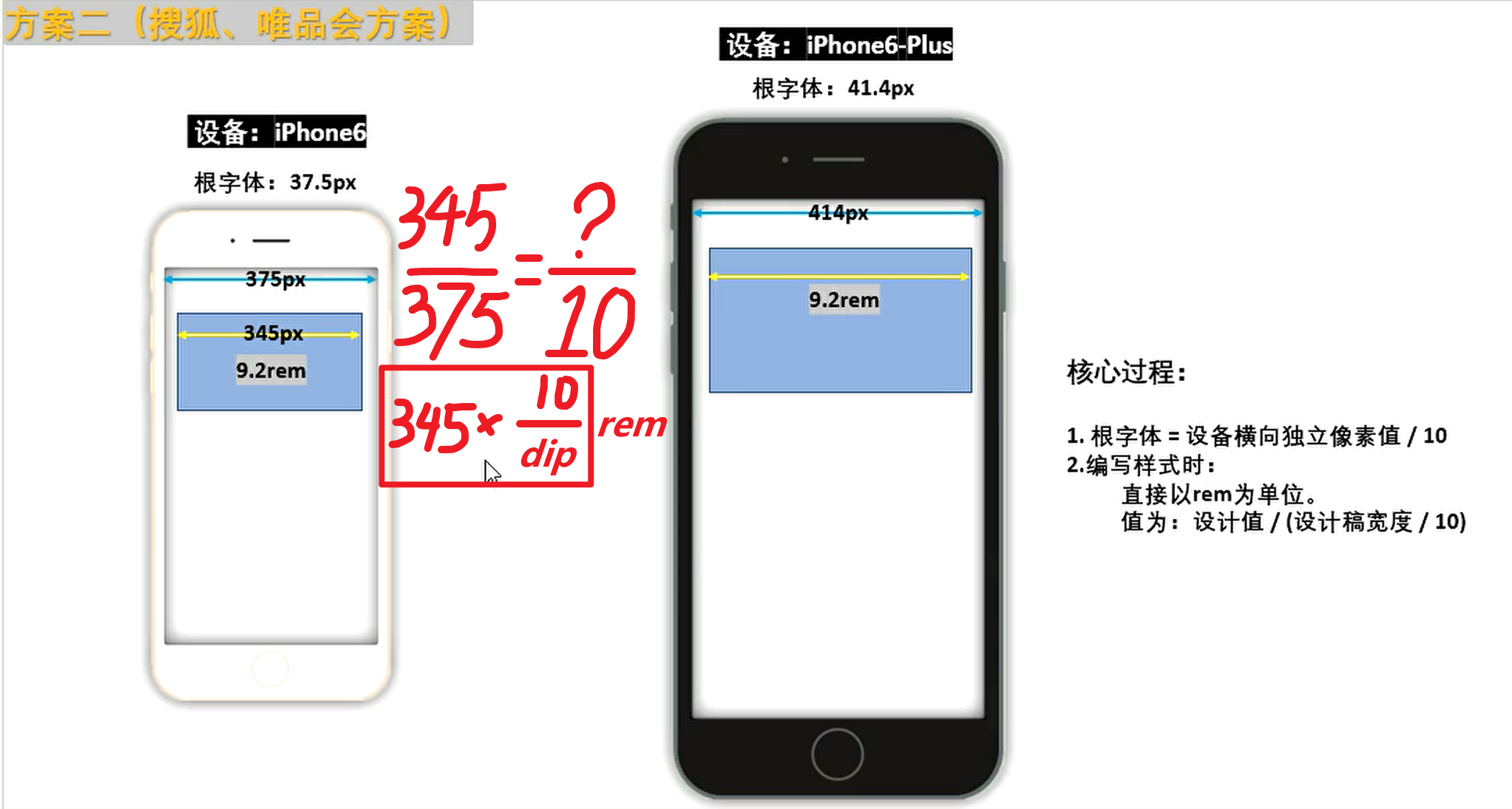
In the ideal viewport, set the root font to dip/10, that is, compare dip to 10 rem, considering how many internal elements are occupied
1 vw = 1% of layout viewport width 2 vh = 1% of layout viewport height
View compatibility: caniuse.com
1px in the HD screen corresponds to more physical pixels (small light bulbs), so the 1-pixel border looks thicker. The solution is as follows:
 @media screen and ( -webkit-min-device-pixel-ratio : 2 ){
      # demo {
        border : solid 0.5 px black;
      }
    }
@media screen and ( -webkit-min-device-pixel-ratio : 3 ){
  # demo {
    border : solid 0.333 px black;
  }
}Mobile event list
The above events first appeared in IOS safari to convey some special information to developers
Notice:
After the touch event is finished, the click event of the element will be triggered by default. If the perfect viewport is not set, the time interval for the event is about 300ms. If the perfect viewport is set, the time interval is about 30ms (depending on the specific device characteristics).
If the touch event causes the element to be hidden, the click action will act on the element behind it, triggering the click event or page jump of the new element. This phenomenon is called click penetration .
Block default behavior
 btn . addEventListener ( 'touchend' , ( event ) => {
      event . preventDefault ( )
      shade . style . display = 'none'
} ) Make the elements behind the scenes not have click characteristics and modify them to normal div tags:
< div id =" baidu " >点我去百度</ div >Use the touchend event and click to jump to the new web page
 baidu . addEventListener ( 'touchend' , ( ) => {
  window . location . href = 'https://www.baidu.com'
} ) Use the pointer-events attribute in css to temporarily lose the click event and restore it after 300 milliseconds:
 # baidu {
      display : block;
      width : 100 % ;
      height : 300 px ;
      background-color : skyblue;

      pointer-events : none;
    }
btn . addEventListener ( 'touchend' , ( ) => {
shade . style . display = 'none'
setTimeout ( ( ) => {
baidu . style . pointerEvents = 'auto' // 恢复正常
} , 300 ) ;
} ) Let the hidden elements delay by about 300 milliseconds before hiding them
 btn . addEventListener ( 'touchend' , ( ) => {
      setTimeout ( ( ) => {
        shade . style . display = 'none'
      } , 300 ) ;
} ) 

