fm recipe page
1.0.0
This is a solution to the Recipe page challenge on Frontend Mentor. Frontend Mentor challenges help you improve your coding skills by building realistic projects.
The brief for this project was to build out the recipe page and get it looking as close to the design as possible, starting with the following assets:
This solution includes three things that were new to me:
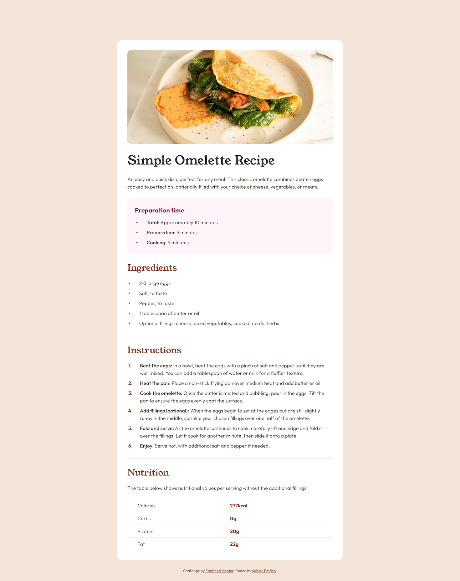
The recipe page contains two unordered lists with preparation time and ingredients, respectively, and an ordered list with the instructions.
For the ordered list, I styled the counters using the ::marker pseudo-element:
.instructions li::marker {
  font-weight: 700;
  color: var(--brown-800);
}
Styling the list markers for the unordered lists was a bit more challenging. In the JPEG design file for the mobile layout, the markers do not sit next to the first line of text but are centered vertically if the text content of the list item wraps over two lines. I used custom markers with the ::before pseudo-element to position the markers with flexbox:
.unordered {
  list-style: none;
  padding-left: 0;
}

.unordered li {
  display: flex;
  align-items: center;
  gap: 1.75rem;
  padding-left: 0.25rem;
}

.unordered li::before {
  content: "•";
  font-weight: 700;
}
For better accessibility, I used role="list" on the <ul> elements in the HTML. Without it, list-style: none would causes the Safari browser to no longer recognize the lists in the accessibility tree, and screen reader would no longer announce information such as the number of items.
I need to learn image optimization! Currently, the largest file in this project is the screenshot I took for this README. I learned how to optimize font files. Now the file size of the screenshot is larger than the size of all font files combined.
This project uses Josh Comeau's CSS reset.
The font families used in this project are Young Serif and Outfit. The fonts are licensed under the Open Font License.


